Da Verpackungsdesign gekoppelt mit Neurodesign ein sehr breit gefächertes Thema ist, habe ich beschlossen, mich in meinem letzten Blogpost auf eine Kategorie bzw. Produkt zu beschränken und diese zu analysieren, um mein gewonnenes Wissen anzuwenden.
Im Folgenden werden gute Verpackungen von Milch dargestellt und analysiert.
Beispiel 1: Unblackit
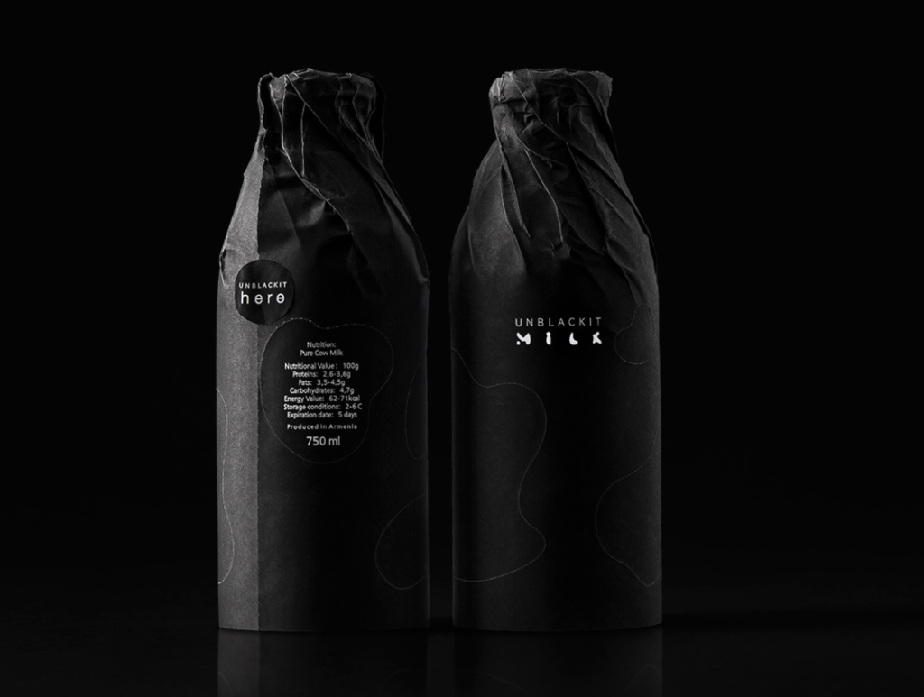
Unblackit spielt mit einer besonderen Art der Verpackung. Wenn man das Papier herunterreißt, befindet sich darunter eine Glasflasche. Da die Verpackung nicht einheitlich aufgebaut ist, sondern schwarze Stellen durch Einkerbungen bleiben, hat man eine gefleckte Glasflasche.
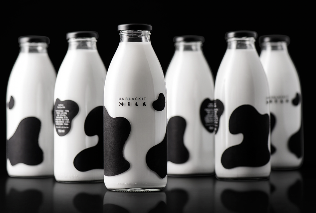
Schwarz & Weiß sind beides Farben, die als schlicht & elegant wahrgenommen werden. Durch die schwarze Verpackung wird Dominanz ausgestrahlt und es zieht die Aufmerksamkeit direkt auf sich, da man eine Milchverpackung nicht in schwarz erwartet. Durch die besondere Art der Verpackung bleibt die Aufmerksamkeit erhalten und weckt Neugierde.
Beispiel 2: Milkin’it
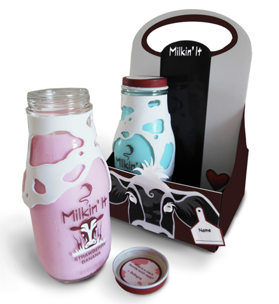
Bei Milkin’ it werden verschiedene Geschmacksorten im Sortiment angeboten. Wie man hier im Bild sehen kann ist das beispielsweise Strawberry Banana (rosa) oder Blueberry Pineapple (blau).
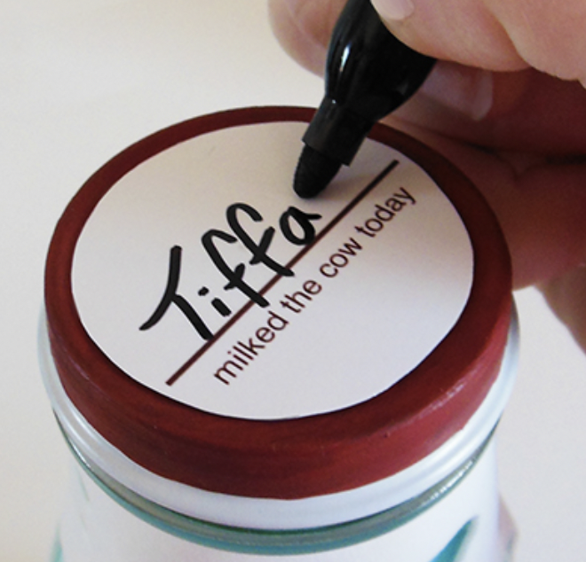
Auf den Deckel kann der Name von der Person, die es trinkt, geschrieben werden. Somit bekommt es einen persönlichen Touch.
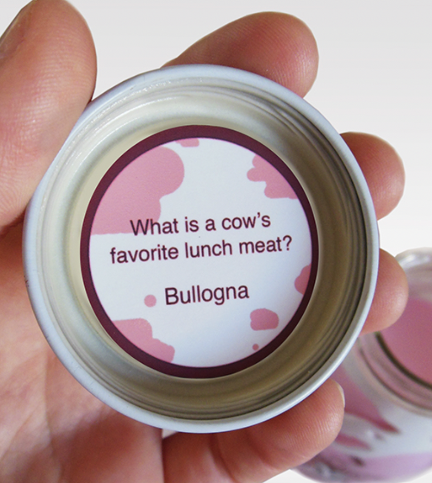
Im Deckel befindet sich ein Witz, um den Tag zu heitern und noch ein besseres Erlebnis zu schaffen.
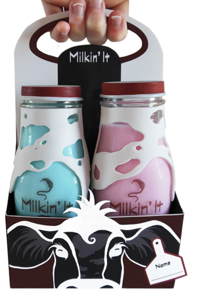
Der Träger der Glasflaschen ist so gestaltet, dass er wie eine Kuh aussieht, die man mit nach Hause nehmen, mit einem Namen versehen und im Kühlschrank aufbewahren kann.
Durch die äußere Aufmachung der Glasflaschen und die fleckige Gestaltung wird auch hier sehr viel Aufmerksamkeit auf das Produkt gezogen. In Andenken an die Kuh, wird hier weiß als Farbe gewählt, was auch für Eleganz & Reinheit stehen kann. Durch die verschiedenen Sorten bekommt die Milch gleich eine ganz andere Bedeutung und ist nicht nur quasi „geschmacklose“ Milch. Durch die Trägerverpackung kann es ideal transportiert werden. Somit ist dieser Art der Verpackung nicht nur ein „Eye-Catcher“, sondern erweist sich auch als sehr nützlich.
Beispiel 3: Gewöhnliche Milchverpackungen im Supermarkt
Als Grundlage zur Analyse muss man natürlich nicht nur „exotische“ Verpackungen in Betracht ziehen, sondern auch die gewöhnlichen Verpackungen, welche man im Supermarkt findet.
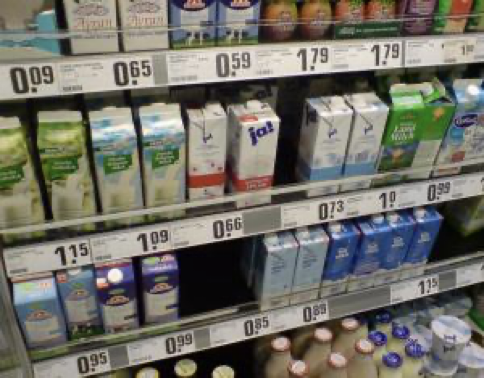
Wie man in dem Milchregal im oberen Bild sehen kann, sind Milchverpackungen für gewöhnlich Blau, Weiß oder Grün und eher schlicht gestaltet. Sie sind meistens im Tretrapack zu finden. Blau zählt zu den beliebtesten Farben und ist von vielen Menschen die Lieblingsfarbe. Vermutlich wird aus diesem Grund verstärkt zu dieser Farbe gegriffen. Des Weiteren wirkt Blau sehr vertrauenswürdig, was einem bei einem Produkt des täglichen Bedarf von Bedeutung sein könnte. Weiß wird vermutlich verwendet, da der Inhalt Weiß ist und es so zum Produkt passt. Mit Grün wird Natur & Bio verbunden, daher ist auch bei Milch diese Farbe sehr passend.
Beispiel 4: Pflanzliche Milchsorten
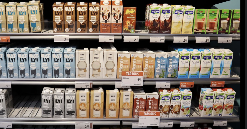
Das obige Foto zeigt die Verpackungen von pflanzlicher Milch. Da vermehrt Menschen zur veganen Lebensweise umschwenken, gewinnen jene Produkte immer mehr an Bedeutung. Die Verpackungen hier sind lebhafter und moderner gestaltet. Es wird überwiegend auch hierbei zu Blau & Weiß gegriffen, jedoch gibt es auch andere Farbvariationen. Zum Beispiel Grau, Braun oder eine Mischung aus Gelb & Orange. Gelb & Orange sind warme Farben und stellen Vergnügen da. Orange steht für Modernität – was zum Image von pflanzlicher Milch passt.
Im nächsten Schritt wäre eine qualitative oder quantitative Forschung von Interesse. Kann man das Kaufverhalten zu einem großen Teil generalisieren und Rückschlüsse auf die Mehrheit ziehen? Was genau ist den Konsumenten beim Kauf wichtig, worauf achten sie bewusst & unbewusst?