Game Design is an essential aspect for the development of every game, independently of the genre or whether its online or offline. While MMORPGs require thorough planning of many different aspects such as keeping the game interesting even after the main story is completed, managing a fair skills and levelling system or managing performance one of the most important aspects is enabling controlled communication that doesn’t restrict the players in their interactions with each other. For this reason, this blog entry will take a closer look to what it needs to design a successful MMORPG.
As explained in a previous blog entry, the flow state can be achieved if the player is challenged enough to be entertained without getting frustrated. While the flow state can be achieved in traditional games if certain rules are followed, achieving the flow state in MMORPGs where there is usually no clear path to follow and a major part of the play time is spontaneous interactions with others player, it is more difficult to guide the player to the flow state.
There are three conditions that need to be met in order to achieve the flow state:
There need to be clear goals defined that the player must know of
The balance between challenges and skill needs to be so that the player is neither frustrated nor bored
The progress on the goals need to be made clear to the player in form of feedback
These conditions can be met by clear directions given to the player, but they can also be goals that the player themselves creates. For example, a player can decide to craft a special item that requires a lot of material and experience, for one of their friends. If the players are given options, they will naturally come up with challenges themselves. This way every player type has their own goals:
Killers: Want to become the best and compete with others
Socializers: Want to communicate with other players
Achievers: Want to progress within the game and level up
Explorers: Want to learn about different systems (e.g., different skill trees) integrated into the game and explore the world
I read up on learning behaviors and came across a lot of theories and myths on how to learn efficiently. I wanted to quickly summarize what I have learned so far to remember everything later.
Learning success isn’t greater under pressure, especially time pressure.
Learning is not like filling a jar in which the acquired knowledge accumulates. Connections between previous knowledge and new knowledge needs to be established to fully comprehend everything.
Learning cannot be planned. The learning environment (location, breaks, repetition phase, etc.) can be planned and thought through, but there is no guarantee that you will actually learn something.
There aren’t gifted and ungifted students. By the time children enter school, they have gone through years of socialization and learning, have developed certain interests, which in turn lead to individual and very different potentials. Not all children are lucky enough to receive adequate support from their family to further develop that potential.
Teachers aren’t among the most impactful influences in learning. Factors created by the teacher, which promote or hinder learning are of greater importance.
The theory that the ability to learn needs to be learned stems from our output orientated education system.
Some of these things took me by surprise and I’m interested in learning more about them. Especially the idea of the gifted and ungifted student or lack thereof is something I never looked at from that perspective. This is important to keep in mind when thinking about possible gamification of nature solutions.
For my next blog article I was looking into how companies are adressing their offered apprenticeships. This time I am keeping it quite short in presenting you my findings.
Well, there were several ways how companies communicate to young adults and teenagers regarding their offered apprenticeships.
Representing the company at fairs and events
Website
Videos (e.g. YouTube, …)
Social Media
Word of Mouth
Bulletin Board (Schwarzes Brett)
Flyers/Poster
Vocational Information Centres (e.g. BIZ, AMS, WKO, … )
Even tough many pronounced the poster as a dead medium, Social Poster Design has not seen any decline in popularity in the last 10 years. Maybe today’s poster have to be a little more versatile (so they can be shared via social media etc.) but the myriad of social problems and injustice issues have kept the poster production going. From Pussy Riot, Black Lives Matter, Je suis Charlie, Brexit and Peta to anti-war protests, the stream of examples does not seem to end.
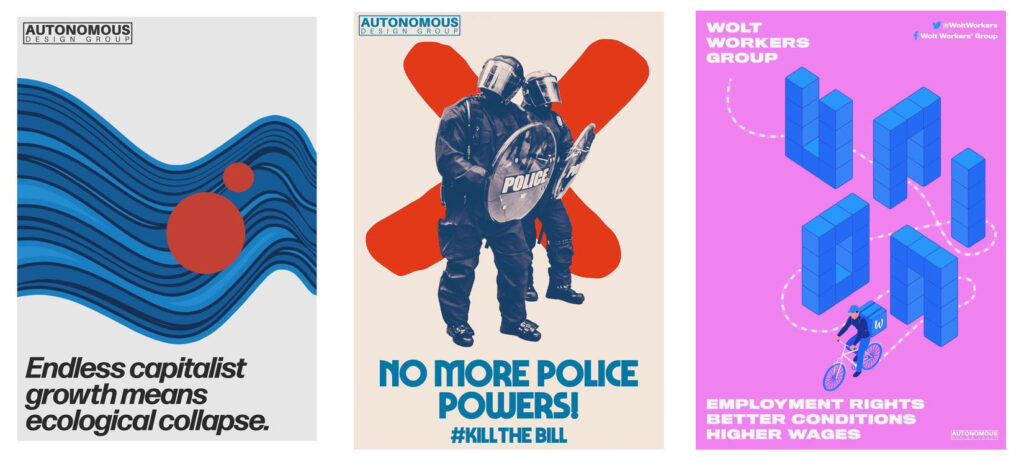
It is difficult to keep track of the may variations of styles and getting an overview of all of today’s social posters might prove impossible. For this reason, I decided to narrow my focus a little bit again and searched for examples that were inspired by famous social poster styles from the past such as Atelier Populaire. In doing so, I came across an article with the title „Designing for social justice: What does it mean to create radical posters for the 21st Century?” in “It’s nice that”. The article featured two artist collectives of young designers working in the social sphere: Labour Party Graphic Designers and Autonomous Design Group (Hingley, 2022a).
The designers from both collectives describe their approach to design as anti-commercial: Sana Iqbal states in the article that “As a result of this commercialisation, ‘the centralisation of design has lost it’s grounding and it feels like a giant sales machine, which I just don’t care for’. It’s this very approach that LPGD are trying to tackle – that being the ephemeral, disposable nature of careless political design” (Hingley, 2022a).
Note. From Autonomous Design Group Posters, by Autonomous Design Group, n.d. (https://designmcr.com/artists/harriet-richardson). Copyright Creative Commons 2021.
For this, the collectives draw inspiration from 20th century design movements and name Atelier Populaire, the See Red Women’s Workshop and the OSPAAAL (Organisation of Solidarity with the People of Asia, Africa and Latin America) as their role models (source 1). With this comes a very distinct poster style: “They see the importance in reinstating a sense of vibrancy, colour and visual distinctiveness in their posters, which is something that will set them apart from the dreary monotony plaguing current political design. And finally, they want to move away from overcomplication, and focus instead on simplicity and accessibility” (Hingley, 2022a).
Also in this direction goes designer Harriet Richardson, who has risen to fame lately for her funny and thought-provoking protest posters (Hingley, 2022b).
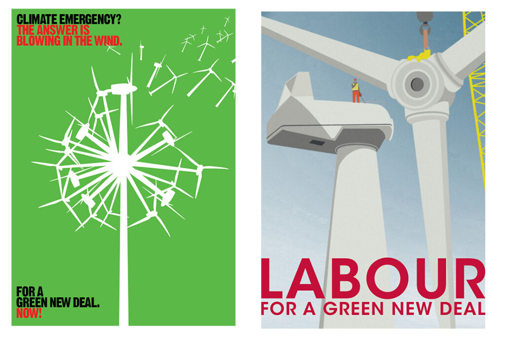
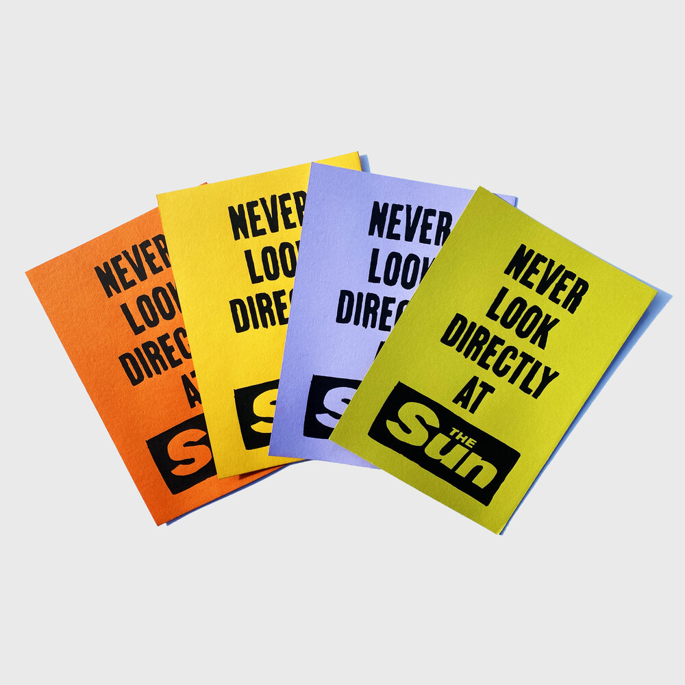
Harriet states in an interview, that simplicity is one of her main methods when coming up with new poster/slogan ideas: “I think conveying a message can be done in so many ways, but simple straightforward ‘punchy slogans’ have been proven to do the job over many years” (Hingley, 2022b). This is especially visible in her poster series “Don’t look directly at The Sun” (referencing the British tabloid paper “The Sun”), which is reminiscent of the simple colored posters from Atelier Populaire.
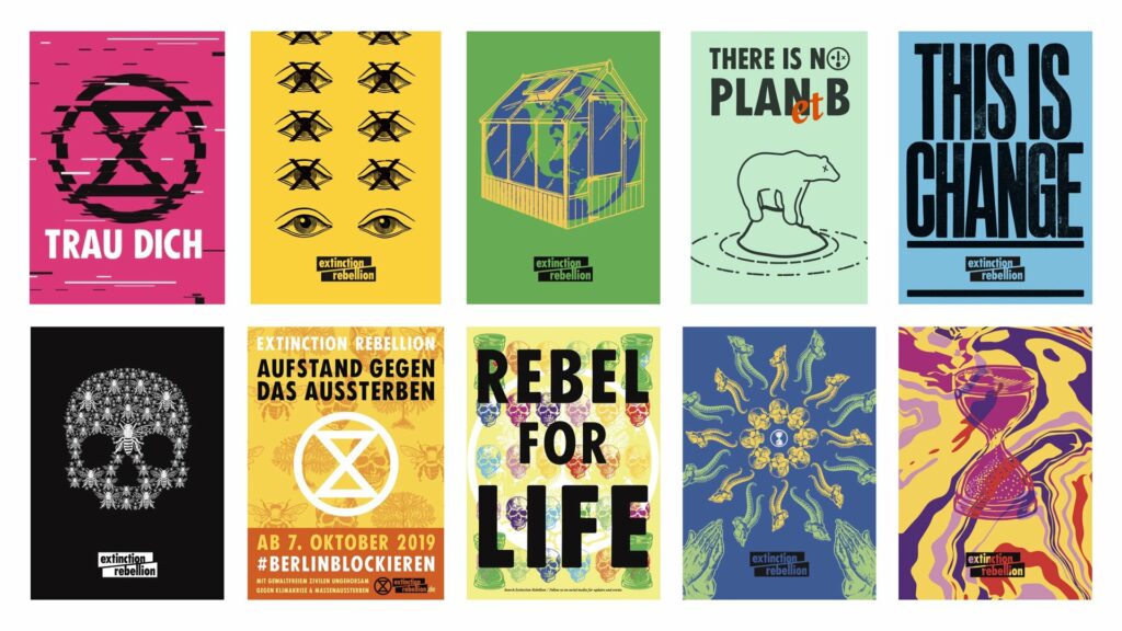
In addition, traces of this very simple graphic language featuring a hand-made look and bold colours one could also name Extinction Rebellion, a group of non-violent climate activists who rose to fame in 2018. Their visual identity was created by the movement’s art group: “This Ain’t Rock’ n’ Roll (identity + activism for culture + causes)” (Bloem & Kempenaars, 2019). When asked about their inspiration, a member of the group states that “[i]n its actual manifestation, we drew a lot of inspiration from Paris ‘68” (Bloem & Kempenaars, 2019, p. 26). This can also be observed when looking at the posters Extinction Rebellion offers for free download on their website:
To sum this up, it seems very difficult to get a general grip of today’s social poster design due to the wide variety of causes and styles. However, some young designers draw inspiration from 20th century examples like the Atelier Populaire and use a simple, bold design style to convey their message. This goes also along with the previous findings about what an effective social poster should look like. Amongst others, a striking visual language and a certain translatory role as well as simplicity were named as positive contributors (see: previous blogposts), which we can definitively observe here.
It seems like the social poster is anything but dead and is constantly evolving and transforming, being an outlet of creativity, rallying for an important cause.
References
Autonomous Design Group. (n.d.). Autonomous Design Group poster works. https://www.weareadg.org/
Bloem, I., & Kempenaars, K. (2019). Branded Protest: The power of branding and its influence on protest movements. BIS Publishers.
Hingley, O. (2022a, May 25). Designing for social justice: What does it mean to create radical posters for the 21st Century? It’s Nice That. Retrieved January 25, 2023, from https://www.itsnicethat.com/features/radical-poster-graphic-design-250522
Hingley, O. (2022b, December 19). From Pentagram to political slogans: Designer Harriet Richardson on her witty and disruptive practice. It’s Nice That. Retrieved January 25, 2023, from https://www.itsnicethat.com/features/harriet-richardson-spotlight-graphic-design-191222
Labour Party Graphic Designers. (2019). LPGD Art Pack Summer ’19 Climate Emergency. https://www.labourdesign.co.uk/art-packs/summer-19-climate-emergency
Richardson, H. (n.d.-a). Harriet Richardson. Design Manchester. https://designmcr.com/artists/harriet-richardson
Richardson, H. (n.d.-b). Sun Mini Set. Harriet Richardson. https://artschoolmembersclub.com/shop/p/sun-minis
For this blog post, I wanted to find out more about techniques on how to create a good balance and relation between pictures and text when it comes to visual storytelling in comic form. First of all, comic artist Will Eisner points out that, in relation to using text or images in comics or about creativity in general, there is no right or wrong way of doing things. An artist can tell a story in different ways, some may choose to tell a certain story in more images than text, and some may use many speech bubbles or use more descriptions. (cf. 1985: 125-127)
Figures: Eisner, Will (1985). Comics and Sequential Art, p. 125
It also depends on whether the artist wants to depict a story in a humorous way, a realistic way, etc. Eisner also does not think of comics as something that has a defined word-to-picture ratio as the words are very often part of the illustration and not just text on the side of an image. (cf. 1985: 125-127)
Placement and Effect of Text
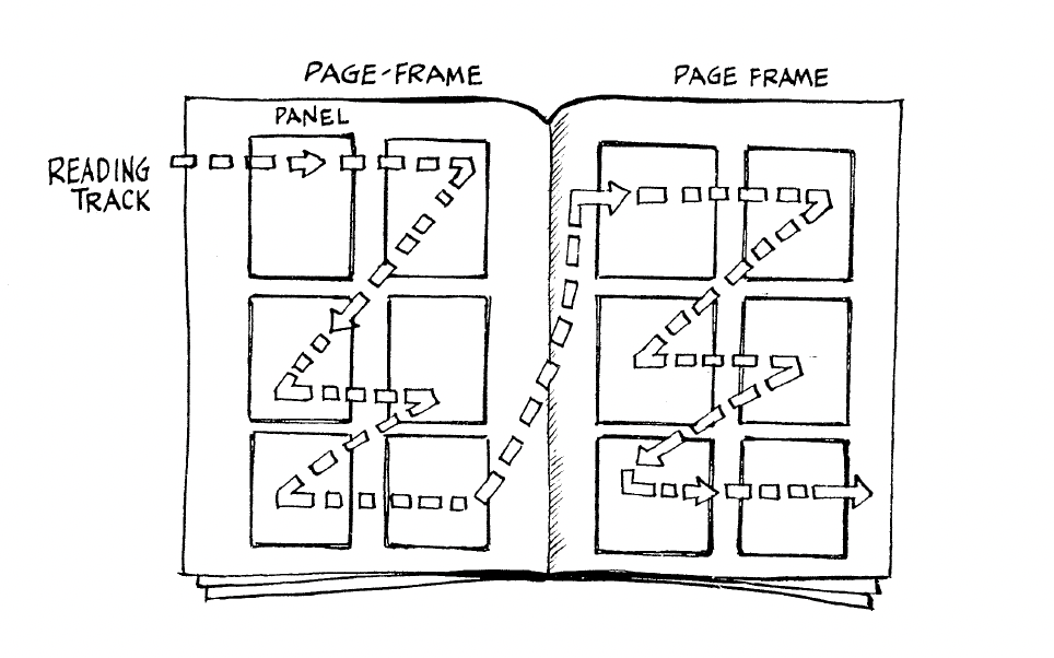
Eisner points out that text needs to be placed in a way so that readers immediately know which text part comes after which text part. It should be clear which character speaks first, which commentary comes before which scene, etc. Text elements and images follow the same conventions as text, so in order to establish a clear sequence, elements that follow each other need to be placed from left to right and from top to bottom in western countries. (cf. Eisner 1985: 26)
Figure: Eisner, Will (1985). Comics and Sequential Art, p. 41
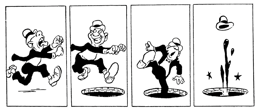
This reading order also applies to text bubbles in a single panel. In the following image, Mateu-Mestre demonstrates how conversations between two people can be shown in speech bubbles in a very clear way:
Figure: Mateu-Mestre, Marcos (2010). Framed Ink: Drawing and Composition for Visual Storytellers, p. 116
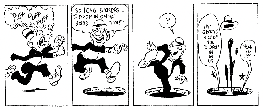
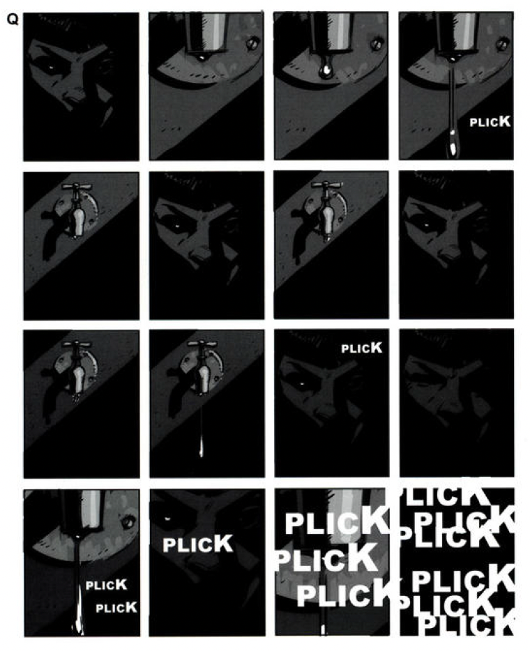
Another commonly used element in comics are onomatopoeias – sounds written out in words. When used right, they supply information about sounds in a scene to the reader in a very natural way that enriches the story. By using many onomatopoeias at once, making them very big, very small, or distorting them, we can strengthen their meaning even more. (cf. Mateu-Mestre 2010: 117) Here, Mateu-Mestre gives one example of how to work with onomatopoeias:
Figure: Mateu-Mestre, Marcos (2010). Framed Ink: Drawing and Composition for Visual Storytellers, p. 117
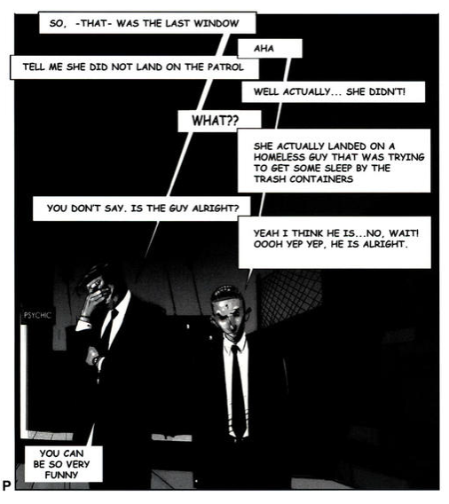
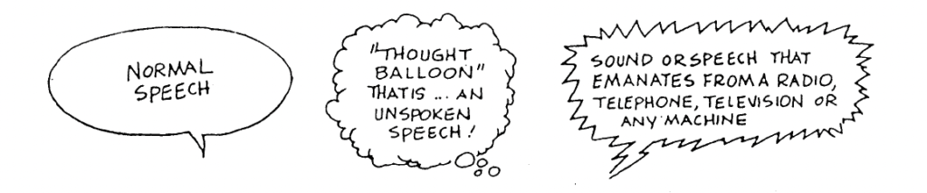
Making sound or speech seem “alive” and truly part of the story can be achieved by using different kinds of balloons or bubbles around it.
Figure: Eisner, Will (1985). Comics and Sequential Art, p. 27
Comics often use hand lettering in speech bubbles. The way letters look and whether they are handwritten (or use a handwritten-looking font) or use a set-type font such as a sans serif font influences the emotion the text conveys. Different kinds of handwriting are not only the personal style of the artist, but they can also express the personality features of characters. So, the choice of font for each text should be considered because it also influences the emotion the whole image portrays. (cf. Eisner 1985: 27)
Figure: Eisner, Will (1985). Comics and Sequential Art, p. 27
Next to using text in an image in the form of squares or speech bubbles on top of the drawing, Eisner points out that text can also be artistically integrated into an image. Designing text or choosing fonts so they match the current emotion in the image can make the text feel more involved in the story and convey emotions stronger. (cf. Eisner 1985: 10-12)
Figure: Eisner, Will (1985). Comics and Sequential Art, p. 11Figure: Eisner, Will (1985). Comics and Sequential Art, p. 12
Bibliography:
Eisner, Will (1985). Comics and Sequential Art. Tamarac, FL: Poorhouse Press.
Mateu-Mestre, Marcos (2010). Framed Ink: Drawing and Composition for Visual Storytellers. Culver City, CA: Design Studio Press.
Beim Durchdruck wird ein Schablonenträger oder Sieb benötigt, welcher anhand von Öffnungen die zu druckenden Stellen auf ein Druckmedium übertragt. Die nicht zu druckenden Stellen müssen farbundurchlässig sein.
Ursprung
Das Wort Risographie stammt aus dem japanischen und griechischen und setzt sich aus riso – ideal und graph – schreiben, zusammen. Frei übersetzt steht er somit für »idealen Drucker«. Entwickelt wurde der Drucker, der optisch einem gewöhnlichen Laserdrucker ähnelt, von der japanischen Firma Riso, welche auch als Namensgeber dieses Druckverfahrens dient. Das 1986 entwickelte Gerät kann als Mischung zwischen Siebdruckverfahren und Kopierverfahren angesehen werden. Zu Beginn wurde es vor allem für Schulen und Behörden eingesetzt, welche günstig und schnell Drucke vervielfältigen wollten. Inzwischen ist es ein beliebtes Druckverfahren welches von Designer:innen, Künstler:innen und Illustrator:innen angewandt wird.
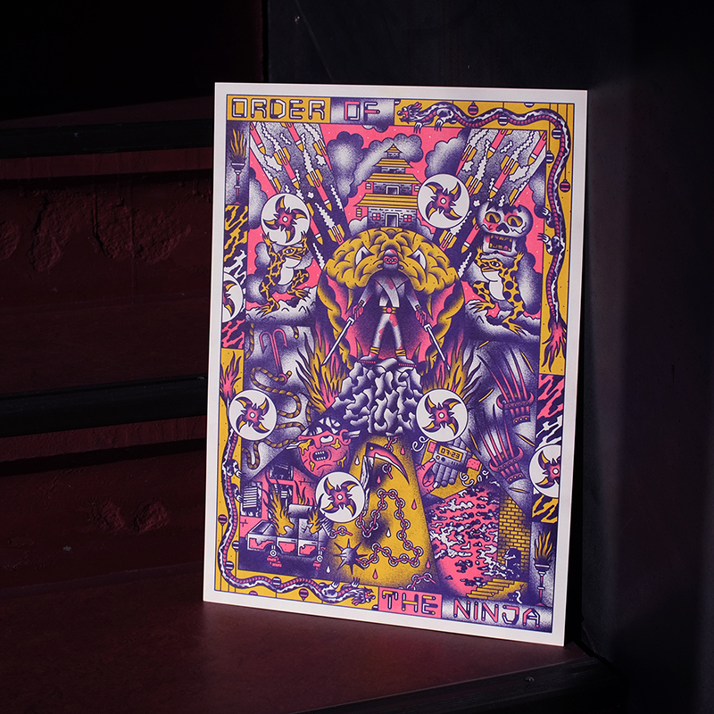
Order of the ninja – Christoph Kleinstück – Riso Print
Technik
Zu Beginn sollten farbseparierte Graustufen-Pdfs vorbereitet werden, welche anschließend als Druckdokumente dienen. Ebenso können durch die integrierte Scaneinheit Motive direkt gedruckt werden. Beim Risographen dienen Masterfolien als Sieb, welche über eine runde Drucktrommel mit sehr feinem Stahlsieb gespannt sind. Die Masterfolien werden je nach Motiv gelasert, damit nur die zu druckenden Stellen mit Farbe versehen werden. Durch Rotation der Drucktrommel wird die Farbe durch den Stahlsieb und durch die thermisch belichtete Masterfolie auf das darunterliegende Papier übertragen. Somit ähnelt der Vorgang dem Siebdruckverfahren.
Die Drucktrommeln sind in ungefähr 20 Standardfarben der Riso-Farbpalette erhältlich. Hier gibt es zum Beispiel klassische Farben wie Schwarz oder auffälligere Farben wie Fluo-Pink.
Mit bis zu 150 Seiten pro Minute ist es ein relativ schnelles Druckverfahren. Je nach vorliegendem Druckermodell können ein bis zwei Farben mit dem Abbild der belichteten Masterfolie im Rotationsverfahren positiv bedruckt werden. Zu bedenken ist, dass die Farbe nur langsam trocknet und somit nur ungestrichene Papiervarianten für das Verfahren angewendet werden können. Somit sind offene Papiere mit einem großen Volumen wie »rough« oder »extra rough« mit 60 bis 350 g/qm bis hin zu A3 optimal für diese Drucktechnik.
Im Vergleich zu Laserdruckern druckt der Risograph somit nicht auf der Basis des bekannten CMYK-Drucksystems. Er druckt mit verschiedenen kräftigen Schmuckfarben, welche diese Technik unter anderem so beliebt macht. Ebenso lebt er durch den Charme der Passerungenauigkeit, Handmade-Charme und spontanen Ergebnissen durch Farbüberlagerungen. Punkt- oder Linienartige Strukturen werden ebenso mit dieser Technik verbunden welche in drei Rasterstufen bis 106 lpi – Lines per Inch – eingestellt werden können. Somit kann ein grobes Raster bis hin zu einem feinen Raster, welches für präzise detaillierte Illustrationen, Typografie oder Fotos verwendet werden kann, eingestellt werden.
Umweltfreundliches Druckverfahren
Besonders erscheint ebenso der ökologische Aspekt des Druckverfahrens, da die Farben des Risopgraphen auf Basis von Soja- oder Hanfkleieöl angefertigt werden und die Masterfolien ihre Herkunft in Bananenblatt- oder Hanfblattfasern finden. Ebenso wird die Farbe nicht durch Hitze am Papier fixiert und ist somit wesentlich energiesparender. Durch die Verwendung von Tinte statt Toner entsteht auch kein Feinstaub.
Constellation – Julia Schimautz – Riso Print – 2020
Alois Senefelder entwickelte 1798 den Steindruck – Lithographie, welcher als Vorreiter des Flachdrucks gilt. Diese Methode war bis Anfang des 20. Jahrhunderts die am häufigsten verwendete Methode des Farbdrucks. Im Gegensatz zu Hoch- oder Tiefdruck liegen hier die zu druckenden Teile auf einer Ebene.
Ursprung
Der Name stammt aus dem griechischen »lithos« – Stein und »graphein« – schreiben.
Wie bereits erwähnt wurde das Druckverfahren von Alois Senefelder entwickelt, welcher Rechts- und Kameralwissenschaften studierte und seine Liebe zum Schauspiel und Theater auslebte. Da die Drucke seiner Dichtungen und Theaterstücke kaum leistbar für ihn waren, wollte er ein Druckverfahren entwickeln, bei dem es ihm möglich war, diese Manuskripte selbst herzustellen. 1798 gelang es ihm schlussendlich die chemische Lithographie anzuwenden, welche auf dem Prinzip von gegenseitiger Abstoßung von Fett und Wasser beruht. Beim Druckverfahren wird eine plan geschliffene Steinplatte verwendet, welche eine fettabstoßende Eigenschaft aufweist. Anschließend wird das Motiv mit einer fetthaltigen Tusche oder Kreide auf den Stein aufgebracht. Es folgt eine Behandlung mit Ätzflüssigkeit. Mit einer Walze wird nun die fetthaltige Druckerfarbe aufgewalzt, welche nur an den Stellen wo das Motiv angebracht wurde, haften bleibt. Durch Pressdruck wird das Motiv auf ein befeuchtetes Papier übertragen.
Senefelder verfasste 1818 sein »Vollständiges Lehrbuch zur Steindruckerey«. Es dient als Lehrbuch in dem er den Weg seiner Entwicklung sowie Anwendungsbereiche detailliert beschreibt.
Vor allem für Plakate für Messen, Ausstellungen oder Produktwerbungen wurde das Verfahren in den darauffolgenden Jahren angewandt.
Ab Mitte des 20. Jahrhunderts löst der Offsetdruck nach und nach die Lithographie ab, welche jedoch weiterhin im künstlerischen Bereich gerne angewandt wird. Die Darstellungen können ohne weiteren Zwischenschritt auf die Steinplatte gebracht werden und somit kann der Charakter des dafür verwendeten Mediums detailgetreu wiedergegeben werden.
Farblithographie von Henri de Toulouse-Lautrec
Technik
Auswahl des idealen Steins
Für die Lithographie werden vor allem Kalksteinplatten verwendet welche ihren Ursprung in Solnhofen – Deutschland, Dijon – Frankreich und Solothurn – Schweiz, finden. Für die Qualität des Druckergebnisses ist die Dichte des Steins entscheidend. Je dichter die Konsistenz, desto schärfer wird der finale Druck. Für jeden neuen Druck müssen die Steine abgeschliffen und anschließend gewaschen werden.
Druckfarben und mehrfarbiger Druck
Wichtig erscheint, dass für jede Druckfarbe eine eigene Steinplatte angefertigt werden muss. So muss für einen dreifarbigen Druck zum Beispiel an drei Steine und drei Druckvorgänge, in genauer Abstimmung der Reihenfolge, gedacht werden. So ist es ratsam auf jeder Platte eine Konturenzeichnung des Motivs anzufertigen und anschließend mit Fetttusche oder Fettkreide nur jene Teile des Motivs zu übertragen welche schlussendlich in dieser Farbe abgebildet werden sollen. Weiters muss bedacht werden, dass die Motive seitenverkehrt wiedergegeben werden. Um einen passgenauen Druck zu erzeugen können Passkreuze oder Markierungen in den Ecken der Steine die Stelle visualisieren, wo das Papier für den Druck angelegt werden soll.
Nachdem die Tusche getrocknet ist, wird der Stein mit Talkumstaub eingerieben, um diese weiters zu ätzen. Es wird eine Mischung aus verdünnter Salpetersäure und Gummiarabikum-Lösung verwendet, welche die Poren des Steins schließt und die Fettzeichnung stabilisiert. Mit einem fetthaltigen Lösungsmittel wie Terpentin wird die Lithokreide oder Tusche aus dem Stein gewaschen. Gummiarabikum stoßt hier die Flüssigkeit ab, während an den Stellen wo sich keine Zeichnung befindet die Flüssigkeit in die Poren des Steins eindringt. So bleibt beim Aufwalzen der Druckfarbe die Farbe nur an den mit Tusche vorgezeichneten Linien haften.
Zigarettenwerbung, Lithografie um 1910
Quellen:
“Flachdruck”: Offsetdruck, Steindruck und Lichtdruck. In:
Nonverbal communication can convey multiple aspects of information such as:
Emotions
Needs
Intentions
Attitudes
Thoughts
As a large part of information is transported through nonverbal cues the communication changes drastically when they are missing. Sarcasm, humor or anger might be missed if facial expressions can not be read properly. However, a major part of nonverbal communication is based on social and cultural habits that can differ from person to person.
“Nonverbal signals are important in many psychological processes, including attachment, attraction, social influence, deception, self-presentation, and interpersonal self-fulfilling prophecies.”
Typical ways of expression emotion or transfer information nonverbally are eye and head movements, gestures, posture, and gait.
Another important aspect that is part of conversations but isn’t communicated through speech are auditory cues like tone of voice, pitch, speed and pace of speech, and volume.
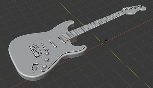
Das Projekt umfasst mehrere Umbauten an der Gitarre. Es werden ausnehmungen in die Gitarre gefräst in welchen Konsolen eingebracht werden, welche die Bauteile tragen. Das gesamte Projekt wird in 3D mittels einer CAD Software (free CAD reicht vollkommen aus) erstellt. Die Gitarre ist bereits als 3D Modell vorhanden.
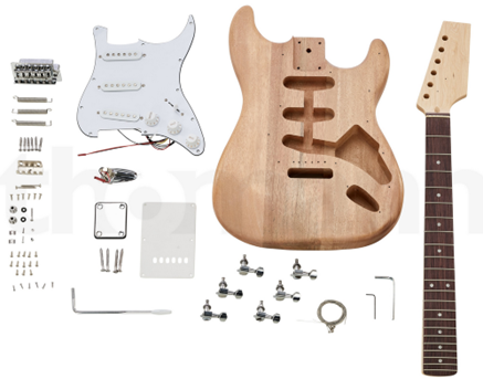
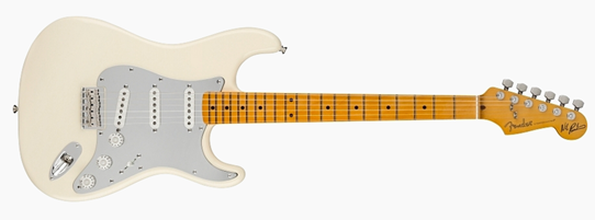
Für das Projekt habe ich mich für einen Gitarrenbausatz entschieden. Diese haben ein angemessenes Preis/Leistungs-Verhältnis und eignen sich ideal für die Umsetzung des Projekts.
Der Bausatz
Die Bauform (Stratocaster)
Es wurde diese Bauform gewählt, da die Solenoiden an der Back-Bridge viel Platz benötigen. Diese Bauform lässt die Modifikation zu und bietet aufgrund der Ebenen Oberflächen wenig Platz für Fehler.
Das 3D Modell
Fertigung der Konsolen für die Erweiterungen des Projekts
Die Entscheidung wie vile Konsolen benötig werden wird im 2. Semester gefällt. Folgende Elemente müssen in Konsolen platziert werden.
Konsolen zugänglich von der Rückseite
Bela MINI
Powerbank
Diverse Kabel und Kondensatoren
Solenoiden
Zugänglich von der Vorderseite
3-Wegeschalter
5-Wegeschalter
Alles in allem 4-5 Potentiometer
Touchfläche
Kontrollerhebel
Der Grund für die Fertigung der Konsolen ist, dass das komplettes System Wartungsfreundlich bleibt. Sollte beispielsweise ein Solenoid schadhaft werden und nicht mehr funktionieren, ist es nicht notwendig die Saiten der Gitarre zu entfernen um an den fehlerhaften Solenoiden zu gelangen. Es kann auf einfachem Wege die betreffende Konsole an der Rückseite der Gitarre demontiert werden und der betreffende Solenoid ersetzt werden. Eine Dokumentation/Betreibsanleitung, welche dem Projekt beigelet wird, ermöglicht es auch Benutzerinnen und Benutzern die keinen Bezug zum Projekt haben die benötigten Schritte zu tätigen.
Um die Konsolen zu fertigen werden die folgenden 3D Drucker verwendet.
Formlap Form2
Formlap Form3
3D-Druck ist ein additiver Prozess, bei dem Teile Schicht für Schicht aufgebaut werden. Ungenauigkeiten können in jeder Schicht vorhanden sein, und die Art und Weise, wie die Schichten aufgebaut sind, beeinflusst die Genauigkeit oder Reproduzierbarkeit der Genauigkeit für jede Schicht. Werfen wir einen genaueren Blick auf gängige 3D-Druckertoleranzen für die gängigsten Kunststoff-3D-Druckverfahren.
Die Toleranzen (Genauigkeiten) eignen sich herforragend für die Fertigung.
Stereolithografie (SLA) und Digital Light Processing (DLP): ±0,2 % (Untergrenze: ±0,1 mm)
Selektives Lasersintern (SLS) und Multi Jet Fusion (MJF): ±0,3 % (Untergrenze: ±0,3 mm)
Weiters ist es möglich “Elastomere” zu printen. Dies ist äußerst vorteilhaft für Elemente, die “beweglich” sein müssen. Die wird für das touchpad verwendet werden, da das selbstgebaute Pad aus Kupferband an den Seitenkanten der Gitarre platziert werden wird und mit der Elastomere eune passende Umrandung geprintet werden kann, damit das Pad geschützt ist und nicht nach einigen Einsätzen verletzt wird. Des weitern sind die Löstellen am Pad damit geschützt.
Die Benötigten 3d / CAD Formate, welche notwendig sind um den Drucker mit Infromastionen zu füttern können mithilfe der Gratissoftware (freCAD) erstellt werden (stl).
Like buttons and comments on Instagram are features that allow users to interact with each other’s content. They are a fundamental part of the platform and have a significant impact on how users experience the platform.
Like buttons, also known as “likes,” are a simple way for users to indicate that they appreciate a post. They are often used as a form of validation and can serve as a measure of the popularity of a post. The number of likes on a post can influence how users perceive the value of the content and how they interact with it. For example, a post with a high number of likes may be considered more valuable or interesting than one with fewer likes. This can also lead users to feel pressure to get more likes on their own posts and create content that they think will be more likely to get likes.
Comments, on the other hand, are a more interactive way for users to express their thoughts and opinions on a post. They can be used to start conversations and to build relationships with other users. However, comments can also be used to bully, harass, or spread misinformation. This can lead to negative experiences on the platform and can have a significant impact on a user’s mental well-being.
Both like buttons and comments have the power to shape how users interact with the platform and with each other. They can be used positively to connect and engage with others, but they can also be used negatively to manipulate or harm others. It’s important for users to be aware of the potential impact of these features and to use them responsibly.