Impulse #6: TED-Talk, Luis von Ahn “How to make learning as addictive as social media”


After soaking in Luis von Ahn’s TED Talk on Duolingo, I’m genuinely impressed by the innovative approach they’ve taken to make language learning engaging and accessible. It’s fascinating to hear his personal story, growing up in Guatemala and recognizing the stark inequalities in education. His journey from receiving a privileged education to envisioning a platform that provides equal access to learning for everyone is truly inspiring. The decision to start with foreign languages, backed by the sheer number of people globally learning languages, especially English, makes a lot of sense. The idea of using a smartphone to reach the masses is brilliant, considering the widespread accessibility of these devices compared to building physical schools.

I appreciate the honesty about the addictive nature of smartphones and how Duolingo has tackled this challenge. The freemium model, where users can learn for free with the option to subscribe for an ad-free experience, is a clever way to balance accessibility and sustainability. The subtle wealth redistribution aspect adds an interesting layer to the model. The discussion on psychological techniques borrowed from social media and gaming to keep users engaged in education is intriguing. The use of streaks and notifications, while reminiscent of addictive app strategies, cleverly applies these principles to foster consistent learning habits. The humorous take on the passive-aggressive owl mascot and the resulting internet memes show a keen understanding of how to connect with users on a cultural level. It’s impressive to see Duolingo not just as an educational tool but as a cultural phenomenon.

In the Q&A, Luis’s vision for extending this gamification approach to other subjects, particularly those requiring repetition, opens up exciting possibilities for the future of education. The acknowledgment that the engagement level might not match that of social media apps but can still be highly effective in meaningful learning is a refreshing perspective. Overall, Duolingo’s journey, as presented by Luis von Ahn, leaves me excited about the potential for technology, gamification, and innovative thinking to reshape the landscape of education on a global scale. It’s a testament to what can be achieved when passion, creativity, and a deep understanding of human behavior come together. Time to revisit my language lessons on Duolingo!
Impulse #4: UX and Gamification of Duolingo, by Reyhan Tamang

Duolingo, as the leading language-learning app, presents a compelling case for the strategic implementation of gamification in UX-Design. Here are some key opportunities the author mentions, highlighted by the app’s success:

  1. Clever Copywriting for Positive User Experience:
    • Duolingo employs attention-grabbing and encouraging copywriting throughout the user journey. This creates a positive and engaging experience, particularly crucial in language learning where users may face challenges. Implementing well-crafted messages can motivate and sustain user interest.
  2. Steady Progression for User Motivation:
    • The app’s approach to incremental progress ensures that users start with simple concepts and gradually advance. Real-time progress tracking and a sense of accomplishment after each lesson contribute to user motivation. Incorporating this steady progression model in UX-Design can make complex tasks more manageable and rewarding.
  3. Powerful Use of Streaks as a Motivational Tool:
    • Duolingo effectively utilizes the psychological concept of loss aversion through streaks. Encouraging users to maintain a daily streak taps into the fear of losing progress, a potent motivator. UX designers can explore incorporating streaks or similar gamified elements to foster long-term user engagement.
  4. Community Building Through Friends Quest:
    • The introduction of a team-oriented feature in Duolingo reinforces the importance of community in language learning. Implementing collaborative elements in UX-Design, such as group challenges or shared achievements, can enhance the sense of community among users and provide additional motivation.
  5. Lessons for Designers:
    • Duolingo’s success with gamification offers valuable lessons for designers. Understanding psychological principles behind gamification, including the fear of loss and the joy of achievement, can guide designers in creating engaging digital experiences. Applying similar strategies, like incorporating levels and rewards, can enhance user engagement across various projects.

In conclusion, Duolingo stands as a testament to the effectiveness of gamification in creating an engaging and effective user experience. UX designers can draw inspiration from its success to incorporate gamified elements that not only make learning enjoyable but also keep users committed to their goals. By understanding the psychological principles behind gamification, designers can craft experiences that resonate with users and drive desired behaviors. Duolingo’s innovative approach offers a wealth of insights for designers seeking to create educational and entertaining digital experiences.

I found this text by Reyhan Tamang pretty inspiring because it could be really helpful for my thesis to focus on the advantages of gamification when designing an educational tool for teenagers and young voters.

Source: https://uxplanet.org/ux-and-gamification-in-duolingo-40d55ee09359

Impulse #5 – How to make Learning as Addictive as Social Media (TedTalk)

Duolingo made a language app so it is accessible for everyone to learn a new language. They choose to make an app since most people have access to a smartphone. But what also comes with a smartphone are addictive social media platforms.

What Duolingo did to keep people using their language app is using the same psychological techniques as social media platforms and games are using to keep people engaged.

  • One of the most powerful ones it’s the notion of a streak.
  • Another mechanism to get people come back to the app are notification. With notifications you shouldn’t be spamming.

When you learn something out of it you get meaning out of it. And when you don’t get that it feels like you have been wasting your time.

I think this way of thinking can by applied to a lot of different things. As on social media content. The content you are making has to be meaningful and has to be a certain way that people want to come back to your page/campaign.

TED. (2023, 26. Oktober). How to make learning as addictive as social Media | Luis von Ahn | TED [Video]. YouTube. https://www.youtube.com/watch?v=P6FORpg0KVo

Impulse #4 – Duolingo’s TikTok Best practice

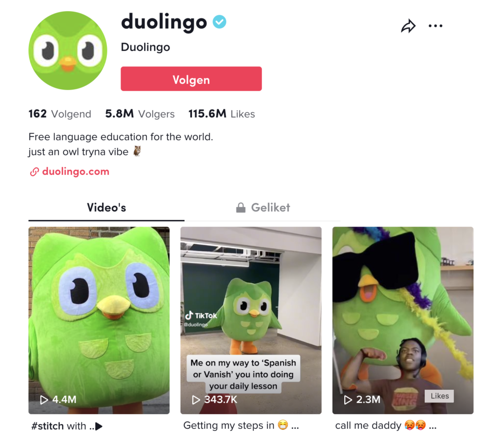
In the podcast 20VC from Harry Stebbings he is interviewing Zaria Parvez – Social media Manager at Duolingo. She is talking about the success of their social media accounts with a special look to TikTok.

Zaria didn’t know a lot about advertising and she had fresh eyes to it. She just started making funny videos with the Duolingo mascot suit that nobody was using at the time. The content she was making was different and unexpected and no other brand was doing that yet. The small human moment is what Zaria thinks which made the TikTok page of Duolingo blow up.

Zaria choose for TikTok as a platform because it felt like a native platform to her. Also TikTok mentioned that they hat 1 billion users (September 2021). “And if People are on TikTok they are not on our app. How do we bring people back to our app.” Zaria. Duolingo doesn’t see other language apps as competitors but apps like TikTok or other social media platforms that are taking attention away from taking your daily language lesion. “How do we bring back the daily lesion or push notification to TikTok” Zaria.

For Zaria TikTok and Reels feels more connected and Shorts feels a bit more distanced. The Content that is made has to be fit with the trends that are going on. “Is the content entertaining to you when you are making it? Or do you have fun making it? Then most likely it has a chance to become viral. Is it sharable?”

Zaria doesn’t believe that the quantity of posting is important what a lot of people suggest but she thinks the quality is far more important.

So, to sum up the things that has been said. Make sure why you are using social media content. And try to be different than all the other main brands.

20VC with Harry Stebbings. (2024b, Januar 21). Behind Duolingo viral success 🔥 [Video]. YouTube. https://www.youtube.com/watch?v=nPBRuzPF7XI

20VC with Harry Stebbings. (2024a, Januar 20). Duolingo’s Owl Origin Story  [Video]. YouTube. https://www.youtube.com/watch?v=cOGv96tYdnE  

Best practice: Right media for right target group

Attracting new users to the world’s most popular language learning app by teaching the meaning of TikTok hashtags.

One really good example is how some brand use TikTok for their Gen-z audience. These brands left the traditional marketing behind. Did research of what the desired target group thinks and acts and make the best media campaigns. One of the big winners is Duolingo

In august 2021, back-to-school season, Duolingo launched a campaign with the objective of increasing awareness and consideration for the brand, in addition to bringing new users to the app. They turned to TikTok to deliver an effective message to both a qualified and massive audience.

In the creative assets, the brand’s owl mascot and other characters teach the meaning of popular hashtags on TikTok, such as #fy, #trend, #stitch and #cringe, and invite the audience to “install now” the app. Using a vocabulary that is common among TikTok users was crucial for the brand to get attention and increase engagement. Now other brands followed this tactic like brand as Ryanair, Paralympics. But as I said before this will only work for a certain target group if you attack the campaign in a way your desired target group is interacting with it.

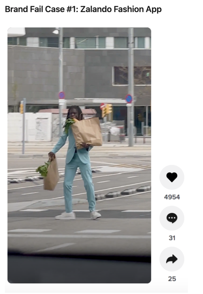
There is this campaign from Zalando that completely flopped because you clearly felt you were watching a tv commercial adapted to a mobile platform. It’s nice but not relatable. Made the way tv commercials are made: to be looked at, not to look at you

Sources:
Duolingo | TikTok for Business Case Study. (2022, March 22). TikTok for Business. https://www.tiktok.com/business/en/inspiration/duolingo-509

Cardoso, L. (2021, May 27). TikTok Language: A Visual Guide To Why Brands Are Failing On TikTok. https://www.linkedin.com/pulse/tiktok-language-visual-guide-why-brands-failing-middleton/