Impulse #5 – Museu de les Ciències (Príncipe Felipe) – Part 2

This blogpost is the second part of my visit at the Museu de les Ciències (Príncipe Felipe). If you did not read the first part, you can follow this link:

Exhibition: Marte

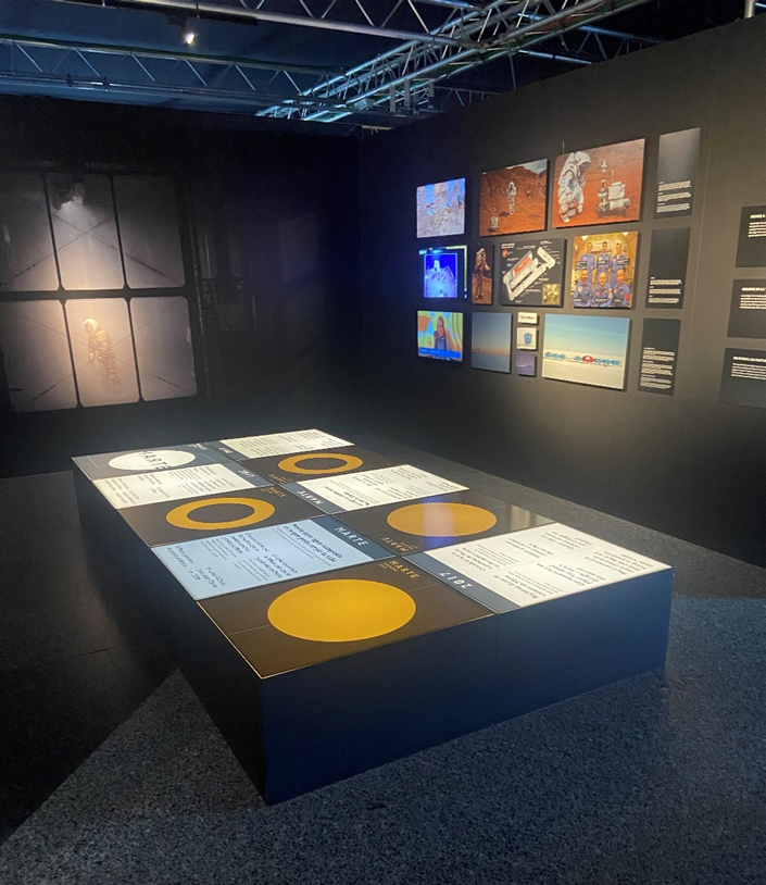
The next exhibition had the topic “Mars” and was in terms of structure and environment very similar to the Terra Extraordinária exhibition. Again, a dark environment with walls colored in black, giving the exhibits a glowing effect. Unfortunately, not all installations were working as intended – a beamer projecting a quiz where one couldn’t read the text and a projection on to a book that was out of service because of technical issues.

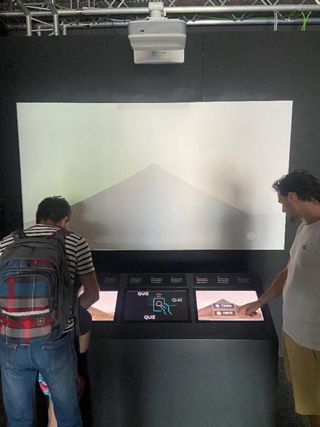
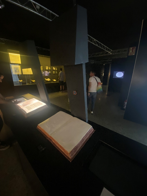
While one projection on to a book didn’t work, there was a second one I wanted to try. The exhibit quickly got my interested as I remembered several projects working with interactive projections on to books. However, the overall impression could be described as a mixture of feelings. In my opinion, instead of the book, the beamer construction cached the eyes of visitors first, as it was not only the biggest object but also the one with the most complex shape. Instead of focusing on the book which should be the center, I began thinking of what the shape of the construction reminds me of.

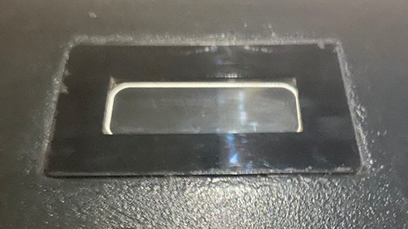
Next to the projection there was a screen which I think let the visitor choose different books being projected. Unfortunately, the installation was occupied for a very long time so I could not try it out. However, I inspected the physical book being projected on. I found a very familiar hand tracking device in front of the books. As I had seen past projects that looked similar, I tried to turn a page with a gesture – unfortunately nothing happened.

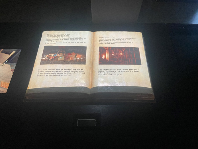
Furthermore, the projection itself was not mapped very accurate, leafing a blank spot on the bottom.

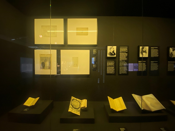
What I liked in this context was, that a lot of physical books were placed around this exhibit letting the visitor connect to. In my opinion this linked the digital projection with real historical books. On the one hand the projection became more meaningful as the visitor could reference to the historical books and on the other hand the historical books being protected behind glass become more alive.

A second exhibit I would like to mention requires no interaction as it only serves to display information. However, it caught my eyes because of its construction. Compared to all the other exhibits in this exhibition, this is the only one being placed at a height of around 50cm ensuring a better accessibility.

Bosque de Cromosomas and Exposición Temporal

Finally, there were two additional smaller exhibitions about different scientific fields in natural science – ranging from chromosomes to human cells. By following the path indicated with numbers, visitors could discover scientific mechanisms.

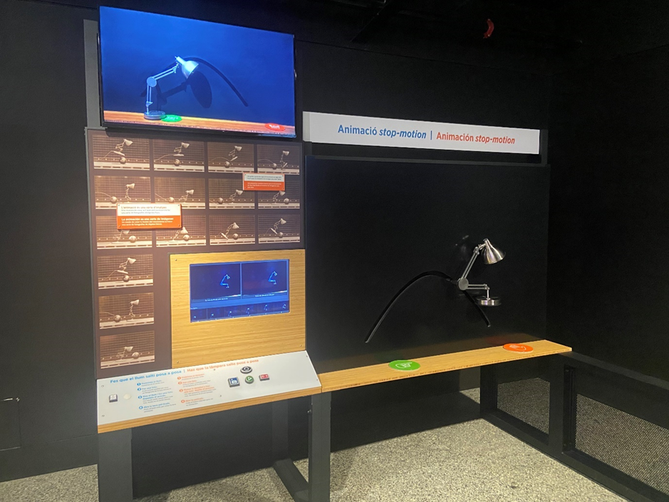
Taking a closer look at the interfaces one could see that the following exhibition could stay for a longer period. Buttons, mouse, frames and actuators – everything was built with a clear focus on durability. The following photos demonstrate how this long-term exhibition was constructed.

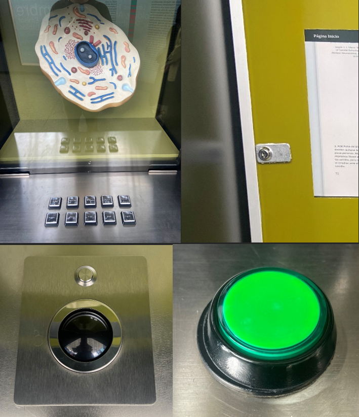
As I was coming from the other exhibitions this one gave me a slightly brutal impression. However, based on the experience I made during the last year I can understand that exhibitions need to be built with durability in mind. In my opinion it can often be hard to find the right balance between visually appealing, sophisticated and durable exhibits that need a minimum amount of maintenance. However, I think a physical button can always be designed more attractive than a simple green knob.

Science Communication

Another important aspect for me was to analyze how the scientific content was being communicated. While complex topics need to be broken down without losing their scientific accuracy, user Interfaces should be as intuitive as possible.

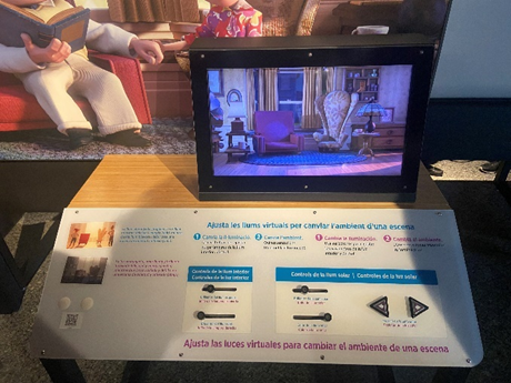
In the “Pixer” exhibitions this was very well made as nearly all interfaces have been designed in the same layout. Button and slider had clear feedback, giving the user a lot of variations to explore without getting lost.

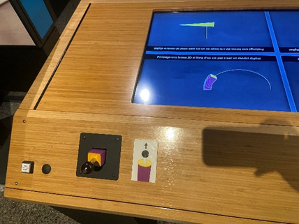
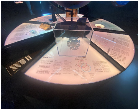
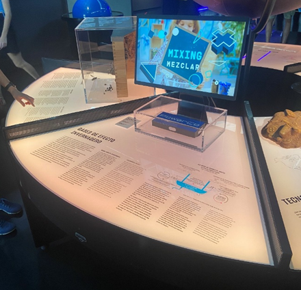
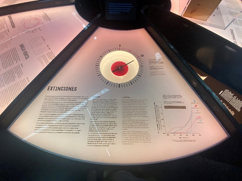
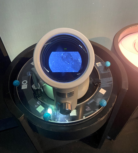
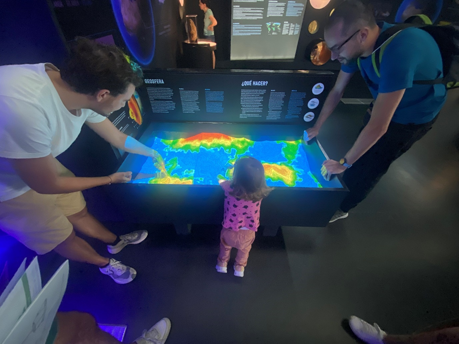
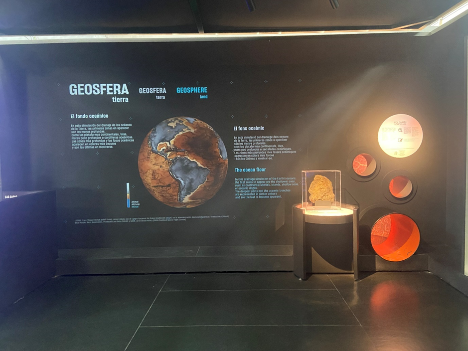
The “Terra Extraordinária” exhibition had a broad spectrum on user interfaces ranging from physical representations protected by glass boxes to tangible user interfaces. One exhibit that I really liked was the microscope showed in the “Terra Extraordinária” exhibition. On the one hand there was a very clear connection to the scientific process and on the other hand the big plate with knobs let people explore the different microscope slides in a pleasant and playful way. However, in terms of accessibility there could be some improvement – for example being able to access the exhibit with a wheelchair.

The “Marte” exhibition was structured like the “Terra Extraordinária” exhibition. One could see historical books but also more complex projections on to physical representations of books. Unfortunately, the experience was not as intuitive as in the previous exhibition – either an interface didn’t work as intended, or I could not connect the exhibit with a scientific context well.

Conclusion

After my visit at the museum, I came to the conclusion that highly sophisticated technical interfaces can in the first moment produce big “wow effects” but when in lack of a good concept become great obstacles. During my stay at the museum, I sometimes felt relieved when interacting with very simple interfaces as the focus shifted away from the interface and back to the actual topic the exhibit dealt with.

Impulse #4 – Museu de les Ciències (Príncipe Felipe) – Part 1

The Museu de les Ciències is a scientific hands-on museum and located in Valencia (Spain). At the time of my visit there have been several exhibitions ranging from topics like chromosomes to the exploration of mars. The following post will be about my experience at the museum.

My focus was to analyze the user experience of the exhibits in the exhibitions. Not only did I document my own experience with photos, but also observe how other visitors interact with exhibits.

Exhibition: Pixar

In this exhibition I experienced a lot of consistency when it comes to the design of the user interfaces. Most of them where not only constructed in the same way but also had strong similarity in the layout of the panels. They shared the same button-, slider- and text layout. The color was used to distinguish between the different subtopics as well as the language.

In the following photo you can see an interface that in my opinion broke this consistency as there is, compared to the other interfaces, no clear labeling. While the icon clearly indicated the user action, there was no panel connecting the user action to theoretical background like the other exhibits did.

A user interface I interacted with and observed several users interacting with was about stop motion animations.

Based on my observation, I don’t think that there was a clear and understandable user journey. By observing four different visitors only one managed to interact with the exhibit as intended.

Possible reasons:

  • Different way of interaction

Compared to most other exhibits in this exhibition this one required the user to actively participate. A camera filmed the lamp on the black canvas on the right side and took snapshots as the user pushed a button on the interface on the left side. By moving the lamp and taking multiple snapshots the user could create a stop motion clip. So, the main problem was that most of the visitors don’t recognize the camera. Since the buttons were located on the left side, the user standing in front of the interface didn’t recognize that there was a camera as it didn’t capture the person at this position. Furthermore, since the buttons were located on the left side, at least two persons were needed to take a snapshot.

  • No clear explanation and misleading symbols

There was no visual explanation of the camera pointing to the lamp indicating that visitors can take photos of themselves. Most of the visitors didn’t understand that they can move the lamp. A few tried to move the lamp but didn’t succeed since it had to much friction. In my opinion the symbols indicating start and finish was also misleading, as the orange hand can be interpreted as “do not touch”. There is also a monitor on the top indicating the movement, unfortunately I only discovered it on the photo as it was placed too high and out of sight when interacting with the interface.

Exhibition: Terra Extraordinária

This exhibition was about the different scientific processes in our ecosystem. It was more diverse as there was no consistency in terms of user interfaces and only a few exhibits could be controlled via user inputs. While a lot of exhibits showed physical representations combined with text and graphs explaining the scientific background, a few let the user interact with gestures or touch.

Here you can see a table showing physical representations as well as scientific background. While the table itself was build in the shape of a circle to provide good accessibility, the boxes protecting the physical objects didn’t match in shape and size. While one box was shaped like a cube another one looked like a cylinder.

The two pictures above show exhibits visitors could interact with. While in one exhibit visitors could rotate the plate and see different microscope slides through the lens of a real digital microscope, in the other exhibit they could build their own geosphere by moving sand and producing rain with gestures.

While both exhibits encouraged visitors to interact with their hands, they included because of the construction different age groups.

While the exhibits offered different degrees of interactivity, I did not get the feeling of being disconnected. In my opinion, the reason for this is the use of similar colors and shapes. However, as you can see on the pictures above the shapes did not always match.

Also different forms of projections (on 3-dimensional and flat surfaces) were part of this exhibition.

Here you can see another installation that projected the earths surface onto a 3-dimensional sphere. Unfortunately, one can’t recognize the 3-dimensional sphere as the room was very dark and the projection itself not in high resolution.

In comparison following picture shows a projection in high resolution on to a wall with a physical representation next to it. Even though the projection was in a brighter environment, the visibility was very good and the text readable. In my opinion, educational installations placed in dark environments can make tired and unfocused. Additionally, high contrasts can be exhausting for the eyes. The projection showed in the following picture on the other hand was very good optimized for the environment.

Photo Credits: Edwin Lang

Enhancing Exhibits with Physical Objects

The Lifelong Kindergarten group at the MIT Media Lab is focused on using technology to support creative learning and playful expression. One of their main research areas is based on a constructivism-based approach, an educational theory that emphasizes the role of active learning and experimentation in the learning process. This approach is one of the key elements that make Lifelong Kindergarten projects accessible and easy to use for people of all ages.

While the Lifelong Kindergarten group’s work is primarily focused on how technology can be used to support creative learning and playful expression, it also overlaps with the field of tangible user interfaces (TUIs). TUIs are a type of user interface that uses physical objects or devices to control and interact with digital information or systems. This can include interactive tables and walls or physical objects such as buttons, knobs, and other controls that can be manipulated by the user.

MIT Media Lab edited by Edwin Lang

Museums and science centers are increasingly incorporating TUIs into their exhibits to enhance the visitor experience. By using physical objects to control digital information and systems, visitors can engage with the exhibit in a more intuitive and natural way. For example, an exhibit about physical forces could be build with a TUI that allows visitors to explore different forces and motion by moving physical objects on a table and visualizing the effects.

Hiroshi Ishii (2008)

One of the key aspects of TUIs is the use of physical objects to control digital information and systems. This is something that the Lifelong Kindergarten group’s approach also involves, as it is based on constructivism, which emphasizes the role of active learning and experimentation in the learning process. This approach makes learning and digital interaction more accessible and tangible, especially for children and others.

References:

interactions: experiences, people technology; Volume XIX.1 2012
Lifelong Kindergarten: Cultivating Creativity through Projects, Passion, Peers, and Play; Mitchel Resnick; 2018
https://tangible.media.mit.edu/vision/
https://courses.media.mit.edu/2015fall/mas834/index.html

Media didactic in museums and science centers

Multimodal learning in the context of social and ecological problems

No matter if old or young, exploring and understanding the unknown is truly one of many characteristics defining human beings. Developing hands-on-exhibits that empower users and touch them emotionally through interactive storytelling matters a lot to me. Participants should be encouraged to be curious – to touch, to hear, to try something out!

I hear and I forget. I see and I remember. I do and I understand.

Confucius

Therefore, I want to explore current state of the art approaches of hands-on and get insight into the latest scientific discoveries in the field of media didactic. By combining my findings, I want to find new ways to raise awareness for social and ecological problems and challenge the observer to rethink the status-quo.

Children ask lots of questions. Their curiosity and thirst for knowledge often seems insatiable – this is the motivation needed for all learning and the driving forces […].

ZOOM children’s museum

The motivation comes truly from my previous bachelor program “Environmental System Science”, as well as workshops, projects and people I met during this time. Experiencing how difficult it is to raise questions of emotional topics, I tried different approaches of science communication. Ranging from podcasts to theater, always trying to combine both scientific evidence and enjoyment. I realized that one should not always force people to talk about problems but rather invite them to a voyage of discovery.

Here I want to show some hands-on approaches that inspire me.
As this collection can be seen as an ongoing process it will be updated from time to time. Maybe this section will also lead to a separate more detailed blog post in the future.

Design Studio: badaboom.berlin
Philosophy: Video
Museum: Futurium
Installation: Video

References:

Das erweiterte Museum – Medien, Technologien und Internet; 2019
Give P’S a Chance: Projects, Peers, Passion, Play; Mitchel Resnick; 2014
Wissenschaftskommunikation – Schlüsselideen, Akteure, Fallbeispiele; 2016
Learning through play – A review of the evidence, The Lego Foundation, 2019