| Aims | Objectives | Methods | Outcomes | Outputs |
|---|---|---|---|---|
| To enhance healthcare inclusion in Benin by examining the impact of digital health solutions on healthcare access, focusing on design and usability to improve adoption. | Analyze the current adoption of digital health in Benin, identify barriers to usage, propose design best practices, and create a prototype demonstrating these practices.. | The method includes literature review, gap analysis, cultural context assessment, user behavior studies, interviews, surveys, analysis of existing solutions, prototype development, and user testing. | Increased understanding of digital health adoption barriers, design principles that encourage usage, and actionable insights for designing user-centric digital health solutions. | A clickable prototype exemplifying design best practices for digital health solutions in Benin and a comprehensive report detailing research findings, methodology, and recommendations for future implementations. |
Tag: Interaction design
Impulse #6: World Usability Day – Accessiblity & Inclusion
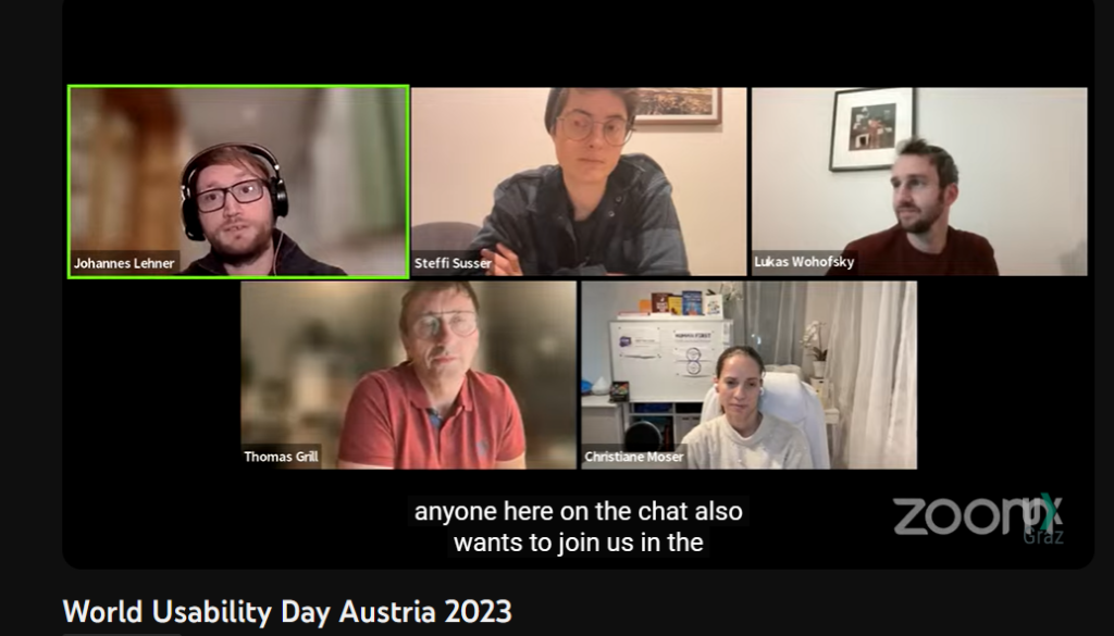
In the digital age, creating products that cater to a diverse range of users has become paramount. World Usability Day serves as an ideal platform for delving into the nuances of accessibility and inclusive design. Recently, UX Graz organized a hybrid event that featured a talk by Steffi Susser, a freelance UX consultant, who shared invaluable insights on this essential topic. Her presentation emphasized the significance of enabling users with various abilities and disabilities to navigate and interact with products, and she was just one of the experts contributing to this enlightening event. In this blog post, we will explore the key takeaways from Steffi Susser’s talk and the broader discussions that took place during this celebration of World Usability Day.
A Glimpse into World Usability Day
The event, organized by UX Graz, celebrated World Usability Day, providing a platform for professionals and enthusiasts to come together and discuss the critical facets of design that revolve around usability, accessibility, and inclusion. The online format broader participation, ensuring a wide-reaching and inclusive conversation.
The Power of Inclusive Design: Insights from Steffi Susser’s Talk and More
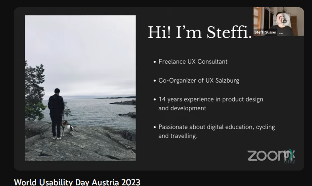
Steffi Susser’s Talk
Steffi Susser’s talk was a highlight of the event. She passionately articulated the importance of inclusive design, emphasizing that it goes beyond merely complying with guidelines. Inclusion, she asserted, is about fostering an environment where all individuals, regardless of their unique differences, feel welcomed, respected, supported, and valued. Her insights on the topic shed light on how designers and creators can go the extra mile to ensure their products resonate with users on a deeper level.
Accessibility vs. Inclusive Design
Steffi Susser’s talk also drew a clear distinction between accessibility and inclusive design. While accessibility focuses on making a design usable by everyone, inclusive design takes it a step further. Inclusive design aims not only to be usable but to be so appealing that everyone desires to use it. It’s a journey that transcends the realm of objective measurements and delves into the subjective and emotional aspects of design, making it a complex and fascinating field.
The Complexity of Inclusive Design
Steffi’s presentation highlighted the intertwined nature of inclusive design. She pointed to real-world examples, such as web forms, which are commonly used online but can present exclusionary challenges. These forms can deter users by requesting unnecessary data or enforcing mandatory fields. Inclusive design, in such cases, means providing a spectrum of choices and considering the multifaceted dimensions of diversity, including culture, language, ethnicity, sexual orientation, family status, religion, and spiritual beliefs.
Diversity in Design
Diversity, Steffi emphasized, encompasses various facets of being human, and designers play a crucial role in promoting inclusivity. Factors such as contrast ratios, color blindness testing, resizable fonts, and support for screen readers were discussed as ways to ensure a design is inclusive. Avoiding autoplay, scrutinizing the necessity of animations, allowing sufficient time for user interactions, employing gender-fair language, collecting only essential data, and avoiding stereotypes all contribute to the overall inclusiveness of a design.
Inclusive Design: A Piece of a Larger Puzzle
Steffi Susser views accessibility as “just a piece of the broader puzzle” that is inclusive design. While fundamental, accessibility does not stand alone; it is part of a holistic approach that addresses the complex and multifaceted needs of users.
Steffi Susser’s talk on inclusive design holds particular relevance for me as an interaction designer but more importanly for my research working on the master’s thesis focused on eHealthcare app solutions. Her insights shed light on the importance of creating designs that resonate with diverse user groups, a vital consideration in the healthcare sector. By delving into the complexities of inclusive design and understanding the emotional aspects that drive user engagement, we can equip ourselves with valuable knowledge to enhance the usability and appeal of our eHealthcare app solution. This understanding will not only contribute to the success of my master’s thesis but also empower me to design a solution that is genuinely tailored to the needs and preferences of a wide range of healthcare app users.
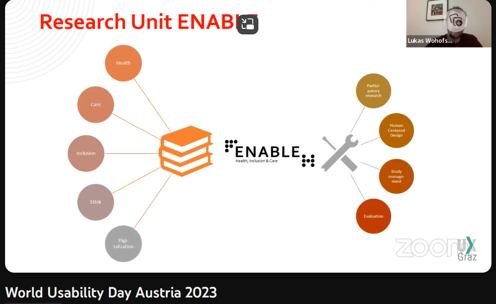
A Glimpse into Research by Lukas Wohofsky
The event also featured research by Lukas Wohofsky, co-lead of the research unit ENABLE for health and inclusion care at FH Carinthia. His work, in collaboration with Daniela Kraine and Sascha Fink, showcased the application of human-centered design in research on their initiative for “inclusion through cooperation: potentials of participatory research in the field of autism”. They underscored the ethical principles and best practices for involving users, emphasizing the importance of valuing data, employing gender-sensitive research design, and building trust with research participants.
Panel Discussion on Accessibility and Inclusion
The event concluded with an engaging panel discussion on accessibility and inclusion. This panel brought together experts from various backgrounds, including Steffi Susser, Lukas Wohofsky, Thomas Grill, and Christiane Moser. The discussion, moderated by Johannes Lehner, provided a rich exchange of ideas and insights, offering a comprehensive perspective on the ever-evolving field of accessibility and inclusive design.
To gain further insights from this informative event, you can watch the recorded panel discussion on YouTube: https://www.youtube.com/watch?v=zw5MG2JP0W8
IMPULSE#8: Game Day 2023: Inspiring Insights and Sustainable Strategies
Game Day 2023 was an event filled with excitement, learning, and inspiration. Game developers and enthusiasts from all around the world gathered to share their experiences, insights, and knowledge. Among the many remarkable talks, three speakers left a lasting impression on me, sharing their journeys, sustainability strategies, and the importance of well-structured processes in game development.
The Struggles Behind MosaMina
One of the most captivating talks of the day was by Joshua Hollendonner, who shared his journey and the hardships he faced in creating the famous game, MosaMina. He provided a firsthand account of the challenges he encountered while striving to make his dream a reality. Hollendonner’s story of perseverance and determination resonated with many of us in the audience. It was a reminder that success in the gaming industry often requires relentless dedication and the courage to push through adversity.
Hollendonner’s insights shed light on the importance of balancing the pursuit of one’s passion with the demands of earning a living. He highlighted the commitment it takes to continue working on a game’s vision and updates, even in the face of financial instability. As game developers or designer, we can draw inspiration from his journey and remember that great games are born out of passion and unwavering persistence.
GGWP – Green Game vs World Problems
Jan Steinhauser’s talk on “GGWP: Green Game vs World Problems” presented a fresh perspective on game development and sustainability. He emphasized the responsibility of game developers in contributing to a more sustainable world. Steinhauser’s insights challenged the traditional mindset of game creation and encouraged us to consider the environmental impact of our projects.
The key takeaway from Steinhauser’s talk was the potential for integrating gamification into applications for underserved rural communities, particularly in the healthcare sector. By adopting eco-friendly practices and considering the long-term consequences of game development, we can create games that not only entertain but also make a positive impact on our planet. This shift in perspective could pave the way for more ethical and sustainable game development practices in the future.
The Power of Structured Processes
In a world where game development is a dynamic and ever-evolving field, Marcus Walhütter’s talk on the importance of implementing structured processes for releasing and updating games was a revelation. Walhütter stressed the significance of organized workflows, from initial concept to final release. He emphasized that efficient processes can prevent chaos and ensure that a game is delivered to its audience as planned.
This insight reminds us that the success of a game doesn’t solely rely on creativity; it also hinges on discipline and structure. Game development teams can benefit greatly from well-defined procedures that streamline the development and launch of their games, reducing the risk of delays or unexpected obstacles.
Game Day 2023 was a treasure trove of wisdom for game developers. The talks by Joshua Hollendonner, Jan Steinhauser, and Marcus Walhütter not only provided valuable insights but also inspired us to think differently about game development. Hollendonner’s story of resilience, Steinhauser’s call for sustainable game design, and Walhütter’s focus on structured processes all contribute to our evolving understanding of what it takes to succeed in this exciting and competitive industry.
As desginer, we can draw from these experiences and perspectives to create not only entertaining games but also eco-conscious and efficient processes. Game Day 2023 was a reminder that our community is continuously evolving and that with each new insight, we have the opportunity to elevate our craft and contribute positively to the world of gaming.
For more information you can watch the recording: Browse – TUbe (tugraz.at)
Impulse #2_”Money Talk” by Ines Mahmoud_Master’s Thesis Review
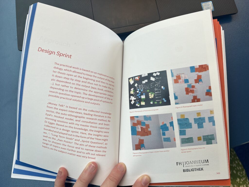
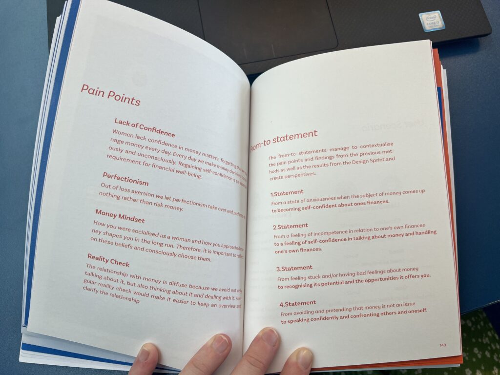
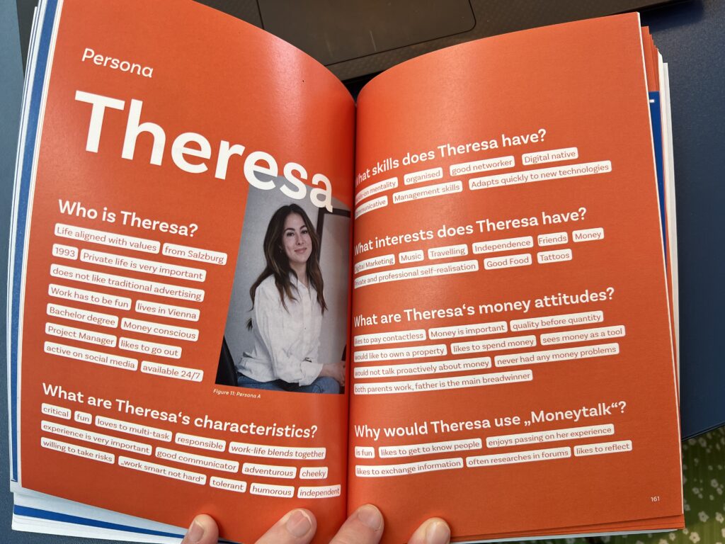
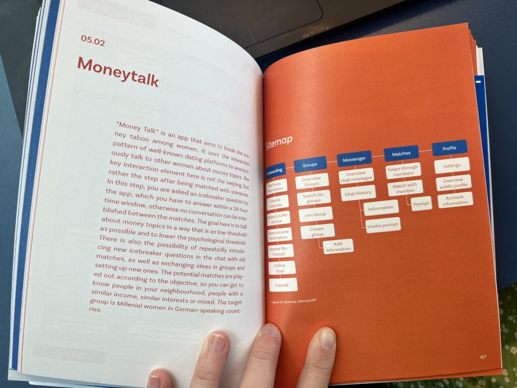
In preparation for writing the master’s thesis next semester, we were asked to review a completed thesis from a past year. I took a look at Money Talk by Ines Mahmoud, and found a lot of inspiration for my own work in the content, structure, and heart of the thesis.
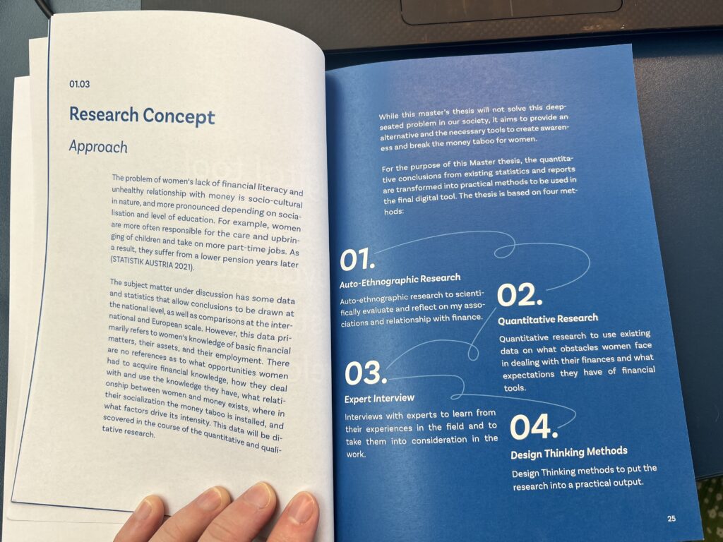
Money Talk analyzes the issue of the financial knowledge disparity between men and women and proposes an intervention in the form of an app. The thesis is broken down into 5 parts, plus the conclusion and reference list. The introduction includes the relevance of research, problem statement, state of research, goal & hypothesis, and approach. The main body of research is titled “Money, Money, Money”, and highlights various belief systems around money, money as a taboo topic, psychological phenomena such as human-money interaction, mental accounting, and materiality of money, and finally the relationship between women, finances, and money, including topics such as pensions, part-time and care work.
The third section is dedicated to expert interviews. The author first interviews Nicole Katsioulis, a political foundation employee and founder of blog “Geldmarie”, which empowers women to understand finances and become financially independent, sustainable investors. Nina von Gayl, the third interviewee, is the curator for Erste Group’s Financial Life Park, and the third interviewee, Maria Mann, is the CEO of a Munich-based start-up called Financery, a “pragmatic tool for women to invest and grow their wealth”.
Following the interviews, the author titles the fourth section “Auto-Ethnographic Observations”, where she dives into her own thoughts, feelings, perceptions, and histories around money and financial management. I found this section particularly interesting because of the method’s inherent bias, which the author addresses on the first page with the following quotes: “Authoethnography is a set of research that seeks to describe and systematically analyse (grafie) personal experience (auto) in order to understand cultural experience (ethno)” (Ellis 2004; Holman Jones 2005). “It challenges canonical practices of conducting and presenting research (Spry 2001) and treats research as a political and social act” (Adams & Holman Jones 2008). I am interested in looking further into this unfamiliar and seemingly unorthodox research method, as I greatly admire the “human-ness” it brings to the work.
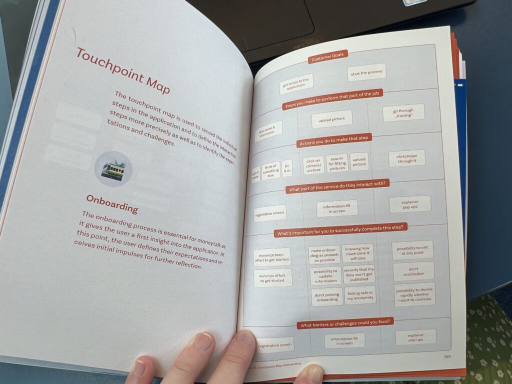
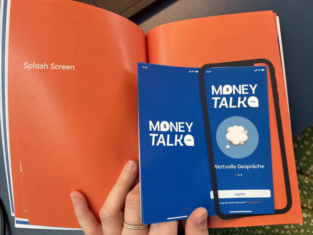
The fifth section of the thesis is dedicated to the practical work, where Mahmoud details her process designing the app, Money Talk, and presents the outcome in a creative and engaging format, utilizing cutouts to showcase the screen design. In this section, Mahmoud details each step of the design process, and walks the reader through every consideration of the screen designs, resulting in a complete and comprehensive analysis.
I really enjoyed sifting through Money Talk. I found myself greatly inspired by the content, structure, and heart of this thesis, and already plan to reference it later on as I continue developing my own thesis. I found Mahmoud’s approach extremely well-organized and thoughtful. Stylistically, the work was beautifully presented, readable but also fun and engaging. The inclusion of research, expert interviews, and practical components was a winning combination in my view, and a format I would consider emulating, or being inspired by, for my own work.
IMPULSE #1 – Healthcare: Equality, Affordability, and Accessibility from Nick Freitas’s podcast Ep26

Nick Freitas, a Green Beret combat veteran who has established himself as a leading proponent of conservative policies and thought throughout the USA, hosts a podcast show called Making the Argument, or MTA. In this podcast, Nick deconstructs the left’s arguments and makes the case for the conservative values and principles that form the foundation of the conservative movement by examining contemporary events, legislation, and political philosophies. His 26ep podcast tackled the issue of Equality, Affordability, and Accessibility in healthcare.
The podcast is a valuable impulse for my research in designing a healthcare app for underserved communities. Let’s break down the key takeaways and how they connect to my research work:
- Healthcare’s Significance: Nick emphasized the importance of healthcare, which is a universal need. This message is crucial for my project, as it underscores the significance of the healthcare app I am planning to designing for underserved populations.
- Government vs. Free Market: Nick discussed the debate about government control in healthcare. While this may not directly relate to my research in providing digital solution to underserved communities, it highlights the significance of understanding the healthcare system’s structure, which can influence the app’s design and functionality.
- Quality and Accessibility: Nick stressed the need for quality and affordable healthcare. This aligns with my project’s goal to improve healthcare accessibility for underserved populations. It highlights that the primary focus should be on delivering quality care efficiently.
- Wait Times: Nick discussed the issue of long wait times in countries with government-controlled healthcare systems. This is seemingly the case in most west African countries. This insight informs on an important feature the app could incorporate by emphasizing timely access to healthcare services, which is crucial for underserved communities.
- Government Regulations: Nick pointed out the impact of government regulations on healthcare in the U.S. This is a reminder that, in my app design, you should consider how to streamline processes and reduce bureaucracy, making healthcare more efficient and accessible.
- Policy Analysis: Nick’s analysis of healthcare policies is valuable. It suggests that while I am designing a healthcare app, I better also explore how government policies may affect the target populations and consider policy-related solutions to improve healthcare access.
In summary, Nick’s podcast reinforces the importance of quality, accessibility, and affordability in healthcare. It emphasizes the need to understand the existing healthcare landscape and policies. This information served as an impulse for my research and design work, prompting me to consider the real-world implications of healthcare policies on the app’s functionality and how it can address the unique challenges faced by underserved communities.
Sources:
- https://www.youtube.com/watch?v=tTkHPrF3wTQ
- The future of healthcare is sustainable: how e-health, robotics, and miot can help tackle the climate crisis – Institute of Design & Communication (netornot.at)
- Researching and Developing a Prototype for Sustainable Healthcare app in Benin – Institute of Design & Communication (netornot.at)
Final prototype – video
If I was to work further on this prototype I am now at the stage where I would get some input from possible users. Doing a few informal tests would most likely give me more information and some new perspectives to further develop my prototype. This would help me to get it to a stage where I can learn more from more “proper” testing.
After this development I would do a more extensive testing round to decide whether or not this is the right direction. I would anyways have new perspectives to bring to a different prototype, so my work would not be lost if I found that a different format would be necessary.
Finalising the prototype
As I have continued working on the prototype I constantly find new needs and possible paths. For now I have focused on placing the prototype in a context which becomes part of the prototype. Instead of just developing the tool I have now made a webpage as an information source.
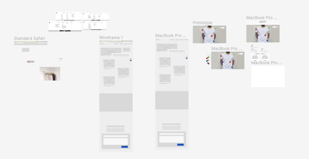
Eventually I started filling in my wireframes with content. I have chosen to not focus on writing texts and rather making titles which give an indicator of what would be there. This way I could have tested my prototype to get a “first impression” from someone without producing text that might not be needed.
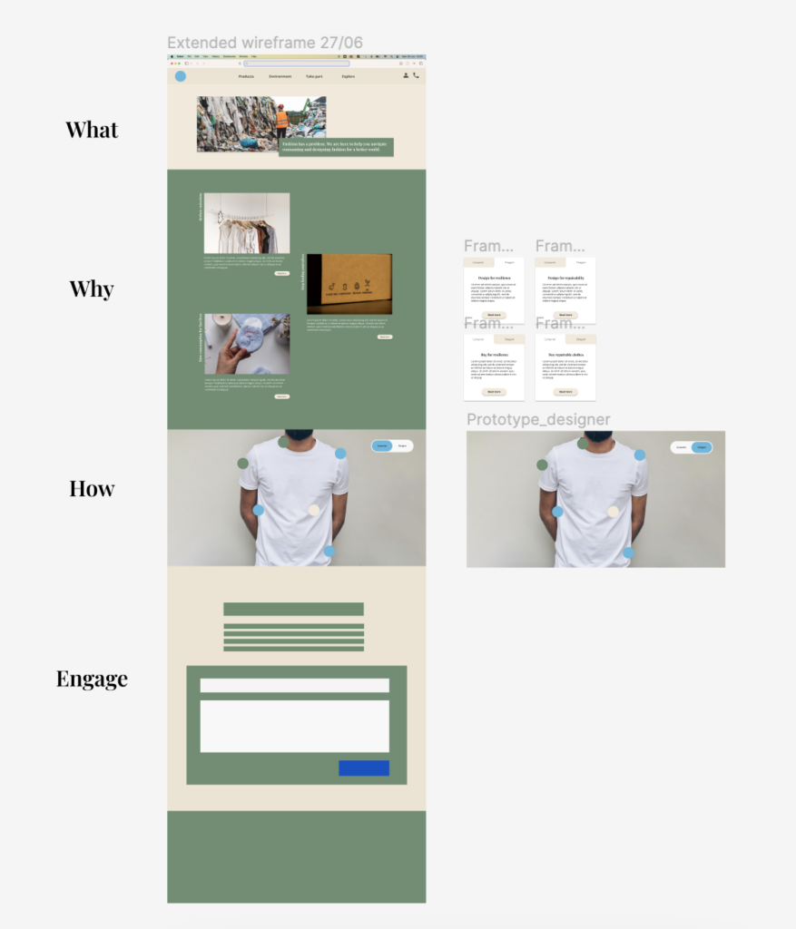
I have created a structure which will work similarly to a storyteller page.
- Header: There is a header on top for navigation.
- What: first the user need to understand what this page does. Two sentences about the goal for this page is enough to communicate this fast.
- Why: Why should the user care? Why should they use this page? Three main goals is mentioned with subpages linked it the user wants to read more.
- How: How can I make a difference? This part is where I assume most user will spend the most time. It is an exploration of what I can do (as a consumer / designer) to reduce the environmental impact of fashion.
- Engage: Call to action to send in feedback and/or taking part in challenges/competitions to create engagement around the page. This part would need more exploration and research to see what creates the most momentum and impact.
- Footer: Footer where I can place the “boring” info. For those interested in going in depth, reading more complex resources, documentation etc. this is a natural place to look in combination with the header.
If I was to test this prototype I would interview 3-5 people of different age and try to explore what information they would expect, wish for and care about. In addition I would interview fashion designers to explore if they could use a page like this in their workflow.
Exploring through the first prototype
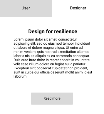
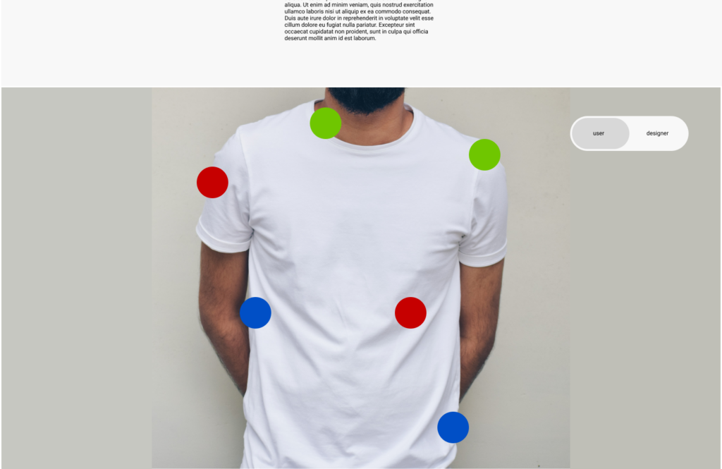
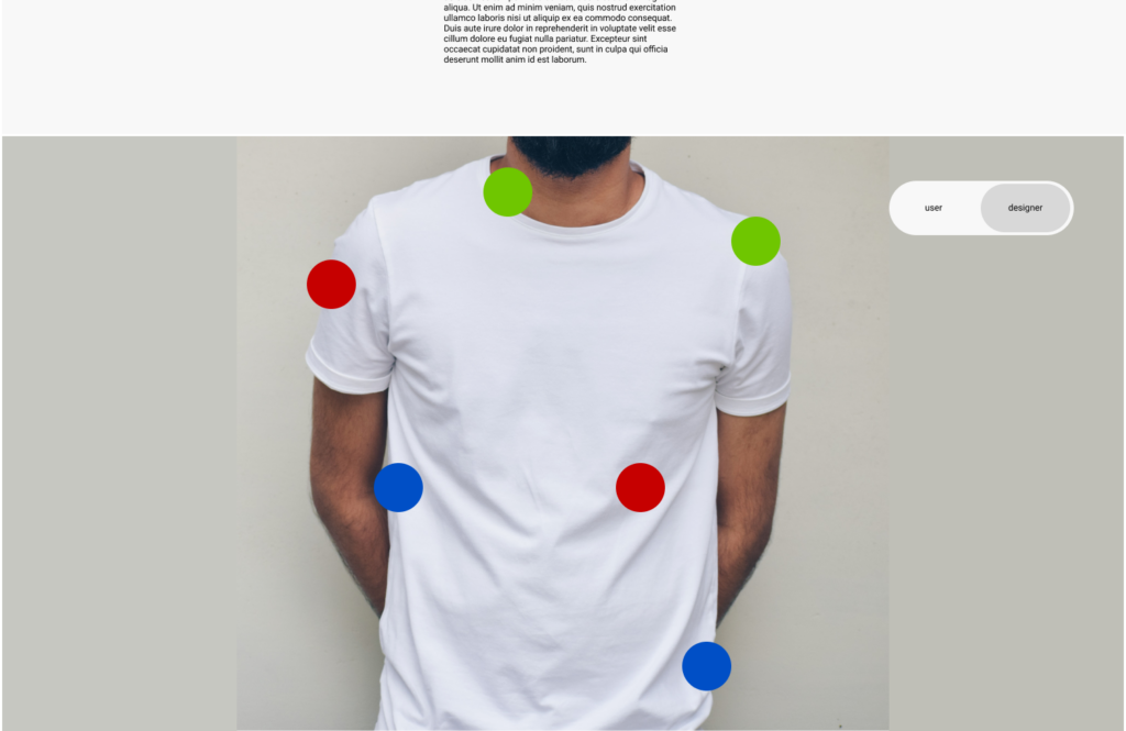
After exploring what I want to communicate on paper I moved on to a Figma prototype. Here I explore which solutions are necessary to show enough information without becoming too overwhelming. I am also testing out different modes of designer-consumer.
I showed and discussed the first prototype with Mrs. Bachler. We found that the prototype need to be placed in a context/story. I will therefore also explore how the webpage can be designed to enhance the importance of the prototype.
As we were discussing more it becomes clear that the “societal” context also will matter a lot. Will this be a certification, “quality stamp” or just information bank? This would need more exploring than I can do this semester, but it should be mentioned.
Closing the information gap and introducing a certification
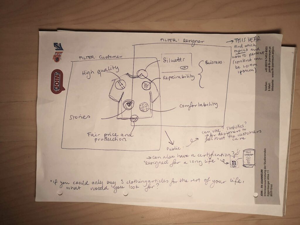
I started working on sketches to understand what my process and exploration should look like. Making an (initial) flowchart for my own workflow and a few persona sketches got my creativity started. My MVP of my product will not be fully populated with the information it needs. This would take way too much time. Therefore I will focus on creating a shell of a product as a prototype. Ideally I will populate one “branch of information” to make it easier to see how it could all end up looking.
I also sketched some ideas for how the information can be presented to the user. By creating a “designer layer” and a “consumer layer” I want the information necessary for each group to be easily available. Still, a consumer should be able to also read and understand what the designers should think of and the opposite.
This thought sparked the idea that this eventually could become a certification of some sort. There are many different certifications (as discussed in last semester’s post about greenwashing) that do not really mean anything. By making the criteria easily available the brands who take sustainability seriously can get this information out in a trustworthy way. This can also work as an incentive for designers to really follow the guidelines of my product.
Creating a prototype as an artefact for exploring
As I started to work on this project this semester I got quite overwhelmed. Fashion is a gigantic and complex industry, and there is no way for me to become an “expert” enough in one semester on how to change this industry. However, as a designer, I can design an artefact and explore solutions, worries, goals etc. of the two main stakeholders: fashion designers and consumers. Therefore I decided to design a prototype earlier in the process than I would have normally wanted. Through this prototype I will explore what information consumers would wish to know about the clothes they buy and what information fashion designers need to design for sustainable, loved, keep-worthy pieces.
As I personally am both a consumer and (want to become) a creator of it I will use myself as a testperson in the beginning of this process. What are the pet-peeves I have as a consumer? Which choices do I (want to) make, what thought go through my head as I try something on? After last semesters research, which problems should designers avoid? Which decisions should they make?
When I am in the role of the consumer the issue is often that I don’t know which decisions have been made when a garment is designed and produced. For a designer who takes sustainability seriously, it can be frustrating that H&M calls something sustainable if they only used recycled polyester which doesn’t create a real impact. I will try to close this information gap with my prototype and see if this can create more trust and a better future for designers who really want to make an impact.
