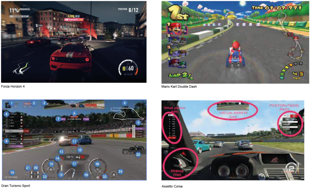
List of User Interface Elements from common video game genres

Racing Games:

  1. Speedometer: Displays the current speed of the vehicle in miles per hour (or kilometers per hour).
  2. Lap Counter: Indicates the number of laps completed or remaining in a race.
  3. Position Indicator: Shows the player’s current position in the race.
  4. Mini-Map: Provides a small map of the track, showing the player’s position and the locations of other racers.
  5. Boost Meter: Represents the amount of boost available to the player for a temporary speed boost.
  6. Power-ups/Pick-ups: Icons or indicators for collectible items that grant temporary advantages, such as weapons or speed boosts.

First-Person Shooters (FPS) / Action Games:

  1. Health Bar: Displays the player character’s remaining health or hit points.
  2. Ammo Counter: Shows the remaining ammunition for the equipped weapons.
  3. Crosshair: Aiming reticle that helps the player aim their weapon.
  4. Skill Bar: Displays icons for available skills or special moves.
  5. Grenade Indicator: Indicates the number of grenades available to the player.

Role-Playing Games (RPG):

  1. Health Bar: Displays the player character’s remaining health or hit points.
  2. Energy Bar: Represents the character’s energy for performing actions.
  3. Experience Bar: Indicates the character’s progress towards the next level or experience points earned.
  4. Skill Bar: Displays icons or indicators for available skills, abilities, or spells.
  5. Buff/Debuff Icons: Visual indicators showing active status effects or negative conditions.

Strategy Games:

  1. Mini-Map: Provides an overview of the game world, showing the player’s units and structures.
  2. Resources Counter: Displays the amount of in-game currency the player has.
  3. Notifications: Pop-up messages or icons that provide important information or updates.
  4. Health Bars: Shows the health of the player’s units or structures.
  5. Objective Tracker: Tracks current mission objectives or tasks.

Adventure Games:

  1. Health Bar: Displays the player character’s remaining health or hit points.
  2. Item Bar: Shows icons or indicators for items or equipment the player character possesses.
  3. Quest Tracker: Tracks current quests or objectives the player needs to complete.
  4. Dialogue Box: Displays text or options during conversations with non-player characters.
  5. Compass: Provides directional information to help with navigation.

https://straitsresearch.com/blog/top-10-most-popular-gaming-genres-in-2020
https://interfaceingame.com/

AI Tools for UX Designers

To get started with the ‘The Plan’ (outlined in my last post), I have compiled a list of AI tools that I will be trying out during this process.

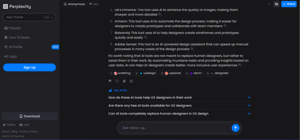
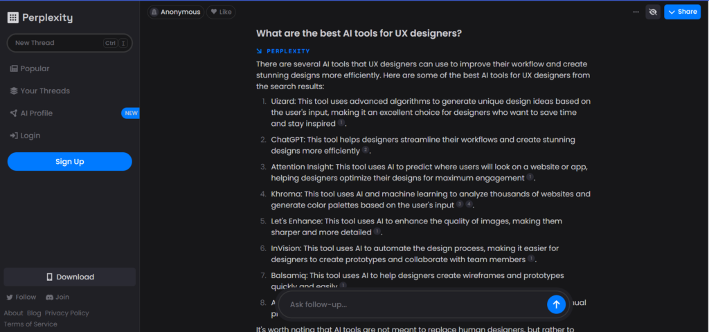
  1. Perplexity https://www.perplexity.ai/

A combination of ChatGPT & bing that answers any question with sources and links.

  1. DocuAsk & PDFgpt

These tools read any uploaded documents and generate summaries and notes, and are able to answer any questions regarding the document in a chat function. These tools would be useful for user research, analyzing data and quickly pulling the important information.

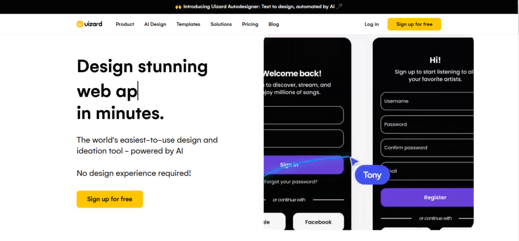
  1. Uizard & Qoqo

“This tool [Uizard] uses advanced algorithms to generate unique design ideas based on the user’s input, making it an excellent choice for designers who want to save time and stay inspired ” – Perplexity.ai

Qoqo generates personas, user journey maps, and interview questions. [Behind a paywall]

  1. Attention Insight

Offers predictive eye tracking in the form of heat maps on your designs.

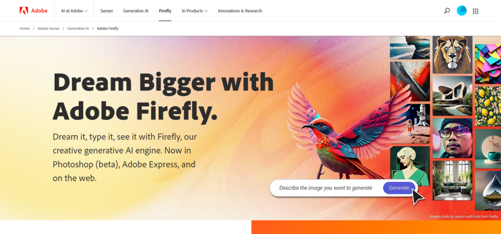
  1. Adobe Firefly

AI image, video & audio generator from Adobe

  1. Tome

AI presentation builder

The Plan

For the remainder of this term of Design & Research, I will develop a mobile application using as many AI tools as possible, and document my experiences here. In order to test the limits of these tools, I will be working with subject matter than runs at the edge of most data sets – the experiences of underprivileged women.

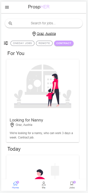
The app is called ProspHER, and was ideated and designed in partnership with Nagyija Bogás, for our course App Design this semester. I will expand on initial designs created in Figma with copywriting and image generation, as well as carry out user research and testing – all with the help of various AI tools.

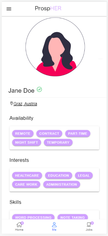
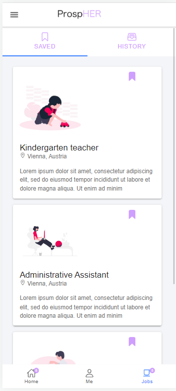
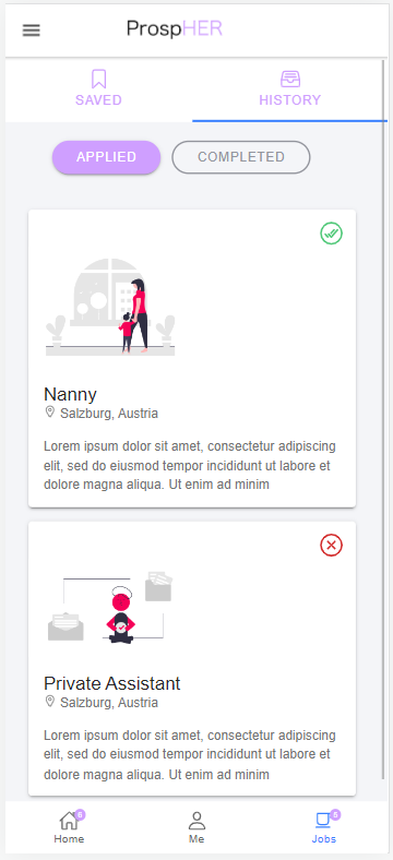
Below are several screens from ProspHER. The app works as a job search platform for women with no or little formal training, and/or unusual working hours. Users can search for jobs based on their available hours, interests, and skills. They can quickly build a CV and add past job experiences easily from the ‘history’ tab.

Design Brief for the second semester

“Designing for keep-worthiness and longevity of a (fashion)object”

Last semester I explored sustainability in fashion. Many companies have some sort of strategy to reduce their carbon footprint, but most of these incentives are not effective. I did however find some examples of companies trying to make a real difference. This in combination to big reports led me to some conclusions of what is important when designing and marketing clothing items:

  • avoiding greenwashing
  • reducing amount of articles sold (worldwide)
  • increase the visual / fashional / material sustainability + increased quality
  • increase keep-worthiness and versatility
  • only focusing on “sustainalble” materials is not effective

Customer behavior and habits are affected by the environment and market the fashion industry creates. Therefore it is important to focus on the industry (in combination with expanding second hand options etc.). 

The focus this semester will therefore be on the fashion designer. This is my user group. My goal is to help designers design for keep-worthiness and longevity (KWL). Included in this is visual/aesthetical sustainability, high quality/durability and versatility. Repairability is also important. 

This semester’s design process will consist of work in the third and fourth part in the double diamond. I will first explore what possible solutions there are and then converge into developing one idea. 

Camera-Based Object Tracking – Part 1

This blogpost is about my first setup for experimenting with camera-based object tracking. I want to explore different tools and technics to get in-depth experience for real time object tracking in 2D and 3D-space.

For my examples I have chosen the following setup:

Hardware:

  • Apple iPad Pro
  • Laptop (Windows 10)

Software:

  • ZigSim Pro (iOS only)
  • vvvv (Windows only)
  • OpenFrameworks
  1. Example: Tracking Marker in ZigSim

As ZigSim uses the inbuild iOS ARKit and calculates the coordinates within the app, we need to follow the documentation on the developer’s homepage.

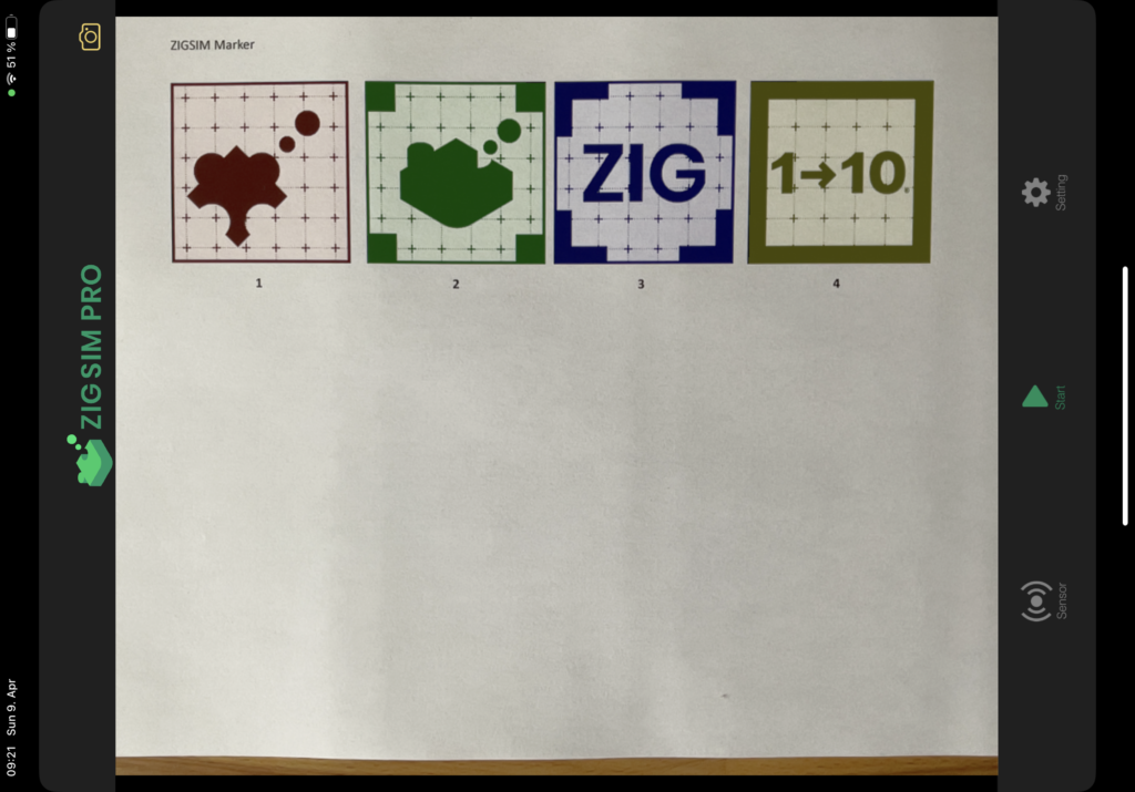
ARKit in ZigSim has 4 different modes (DEVICE, FACE, MARKER and BODY) – for the moment we are only interested into MARKER-Tracking which can track up to 4 markers.

The marker can be found here: https://1-10.github.io/zigsim/zigsim-markers.zip

OSC Address:

  • Position: /(deviceUUID)/imageposition(MARKER_ID)
  • Rotation: /(deviceUUID)/imagerotation(MARKER_ID)
  1. Example: “Hello World”

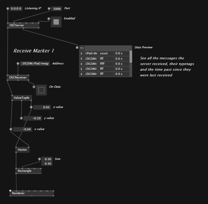
In this example we want to establish a connection via the OSC Protocol between ZigSim (OSC sender) and a laptop running vvvv (OSC receiver) which is a visual live-programming environment.

Here you can see the vvvv patch which is a modification of the inbuild OSC example:

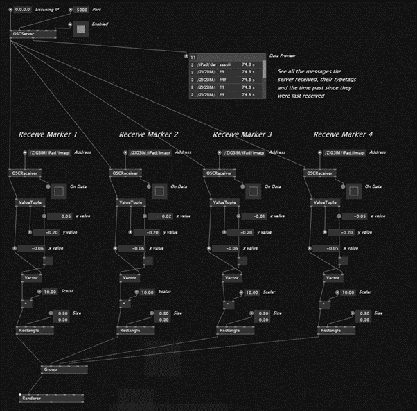
  1. Tracking the marker

In our next step we will track the location of four marker via ZigSim, transfer the coordinates to vvvv and draw a rectangle for each marker.

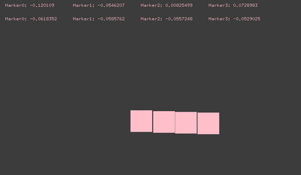
  1. Example: OpenFrameworks

In our last step we will compare the workflow of the node-based environment vvvv with the one from OpenFrameworks which builds on top of the C++ programming language and is being programmed in Visual Studio or Xcode.

void ofApp::update(){
	while (osc.hasWaitingMessages()) {
		ofxOscMessage m;
		osc.getNextMessage(&m);

		if (m.getAddress() == "/ZIGSIM/iPad/imageposition0") {
			osc_0x = m.getArgAsFloat(2) * (-2);
			osc_0y = m.getArgAsFloat(0) * (2);
		}

		if (m.getAddress() == "/ZIGSIM/iPad/imageposition1") {
			osc_1x = m.getArgAsFloat(2) * (-2);
			osc_1y = m.getArgAsFloat(0) * (2);
		}

		if (m.getAddress() == "/ZIGSIM/iPad/imageposition2") {
			osc_2x = m.getArgAsFloat(2) * (-2);
			osc_2y = m.getArgAsFloat(0) * (2);
		}
		
		if (m.getAddress() == "/ZIGSIM/iPad/imageposition3") {
			osc_3x = m.getArgAsFloat(2) * (-2);
			osc_3y = m.getArgAsFloat(0) * (2);
		}
	}
}

Note: While both tools (vvvv and OpenFrameworks) have their own advantages and disadvantages, I am curious exploring both approaches to find the best workflow.

OFFF Barcelona

The OFFF conference was interesting in many ways to me both personally and professionally. I allowed myself to feel for which fields or topics I truly found interesting, and which I admire but do not want to work in myself. This search for what my designer-purpose is has been ongoing for a while, but it was nice to both confirm and learn more about my assumptions.

In addition to this I found that some of the speakers managed to get across that this search will not be finished at the moment my education is finished. For example, Jamhot spoke about their business doing well, but feeling unfulfilled. By choosing to do 50% “socially good” projects, and the rest with a clearer goal on “just making money,” they found a balance they were pleased with. This of course attracted more and bigger meaningful projects, and thereby changing the course of their business completely by first making a small step.

Rubén Alvarez also spoke about the struggle of finding his path. He described his life as doing good work, but feeling like it wasn’t giving him much. Only when he realized that connecting with people was what he enjoyed the most did he switch from doing random illustration work to creating his own coffee shops, winery and working with his illustration there to create conversations.

Overall, I think my biggest take away from the OFFF conference is to keep my own eyes open to opportunities and constantly reflect over my own gratification and interests.

Fashion jobs that doesn’t create more clothes

I have learned in my research that the fashion world needs a complete remodel to become sustainable. To produce slightly less “un-unsustainable” clothing isn’t enough if we keep selling (and buying) big amounts of it. Therefore I want to explore ways to take part of the fashion world that isn’t designing new clothing.

Save Your Wardrobe

The startup Save Your Wardrobe helps people to go shopping in their own wardrobes. It pairs together pieces of clothing in the users wardrobe, guides to find repair services and alteration services. This can help in reducing the feeling of need for something new.

Unmade

To tackle one of the biggest issues in the industry – waste as a result of overproduction – Unmade list demand directly to production. This means there is no “guessing” what the consumers want. The software allowed users to customize clothing before it is produced. The clothing is then made on demand and in smaller batches. With this customization the user will likely also love the product more, as we tend to like things we had part in creating more. This leads to willingness to repair and use until it is worn out.

One of fashion’s biggest issues: overproduction

Fæbrik

A “sewing collective” creating easy sewing patterns which can be altered to perfectly match your body ensuring longevity and keep-worthiness is booming in Norway. By promoting using second hand clothing that has nice fabric, but not a nice fit is a great way to salvage clothing before the last stop. In addition they sell surplus textile from already (quite) sustainable brands to salvage high quality textile in addition to enlighten the public about this issue.

The Norwegian sewing revolution: Women have sown their own “bunad” (traditional dress) of second hand clothing and textile.

Renting / second hand / resale

ThredUp, Tise, Rent the Runway, My Wardrobe and so many other companies are booming. There are issues to take into consideration here as well, eg. transport, getting “the feeling of sustainability” yet still over consuming and changing of trends, but these can be worked on. Helping in designing systems for these companies to be more profitable yet more sustainable would be highly interesting.

Sources

https://www.bbc.com/future/article/20211105-how-carbon-might-go-out-of-fashion

https://faebrik.no/pages/om-oss-1

The effect of Greenwashing and how to avoid it

Greenwashing is defined as “to make people believe that your company is doing more to protect the environment than it really is” (https://dictionary.cambridge.org/dictionary/english/greenwash). This is done to attract customers. Business Wire writes that there is a “significant global paradigm shifts in how consumers view sustainability and the associated generational differences in willingness to pay for sustainable products and services,” (The Global Sustainability Study 2021 by Simon-Kucher & Partners).(https://www.businesswire.com/news/home/20211014005090/en/Recent-Study-Reveals-More-Than-a-Third-of-Global-Consumers-Are-Willing-to-Pay-More-for-Sustainability-as-Demand-Grows-for-Environmentally-Friendly-Alternatives). This leads to a wish for companies to seem sustainable, even though they might not have the right or the knowledge to call themselves that. This leads to a gap between claims and truth. 

Greenwashing

“Research carried out in Europe found that 42% of green claims were exaggerated, false, or deceptive” Harvard Business Review (HBR) writes (2022) about a “sweep” of websites carried out by the European Commission and national consumer authorities. They found this:

  • In 37% of the cases included vague terms like “conscious” and “eco-friendly”
  • In 57% of the cases there was no easily accessible evidence to back up the claims that were made

(https://hbr.org/2022/07/how-greenwashing-affects-the-bottom-linehttps://ec.europa.eu/commission/presscorner/detail/en/ip_21_269)

HBR found that customers realize and are aware of the gap between the claims and actually actions enough to impact their satisfaction levels with the companies. This carries out to affect their relationship with the products and it affects the economy for the company in an impactful way. However, the customers “only care to a point.” If a company is seen as a high quality, innovative etc. brand, the satisfaction levels of the customers were unsignificantly affected even if the company was perceived as greenwashing. This result should, according to HBR, still be read with caution as a bigger or later research could show a greater effect.
(https://hbr.org/2022/07/how-greenwashing-affects-the-bottom-line)

How to avoid greenwashing, but still communicate sustainability

What HBR advices is that managers should pay equal attention towards their communicating their goals outwards and to their companies ability to achieve these. It is better as a company to promise something achievable and overachieve than the opposite. (https://hbr.org/2022/07/how-greenwashing-affects-the-bottom-line) This tactic can be seen in one of my previous posts about Northern Playground, and their communication outwards about how “no fashion is sustainable”. They still manage to communicate that their clothing is of the better alternatives if used right without risking a backlash for not being carbon neutral.

In addition to paying better attention to what is communicated outwards in statements, it can also be useful to use voluntary standards. E.g. EcoLabel Index (https://www.ecolabelindex.com) provides a vide variety of labels which can be used to legitimatize a companies claims. Here there is also room for mistakes, as many of the labels can be completely in-relevant or weak. Using recognizable and well known labels will likely give the best effect.

Avoiding greenwashing should be a high priority, but that doesn’t mean a company shouldn’t strive to reach high. As HBR writes it: “It may well be the case that they (ed. customers) are willing to forgive companies that tried and legitimately failed to implement their goals but customers might also be less forgiving towards those companies that attempted to cheat their way by exaggerating their credentials.” (https://hbr.org/2022/07/how-greenwashing-affects-the-bottom-line)

Design philosophies of Northern Playground and H&M Group

In this blog I will look into two design philosophies from two very different companies. What are the benefits of these strategies, and what are the challenges?

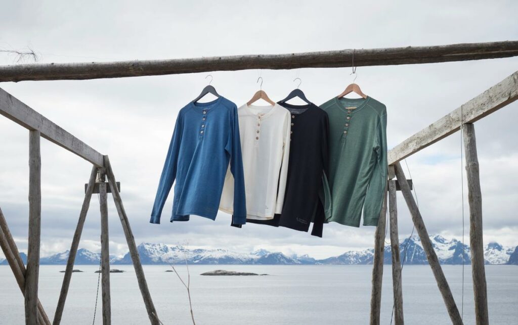
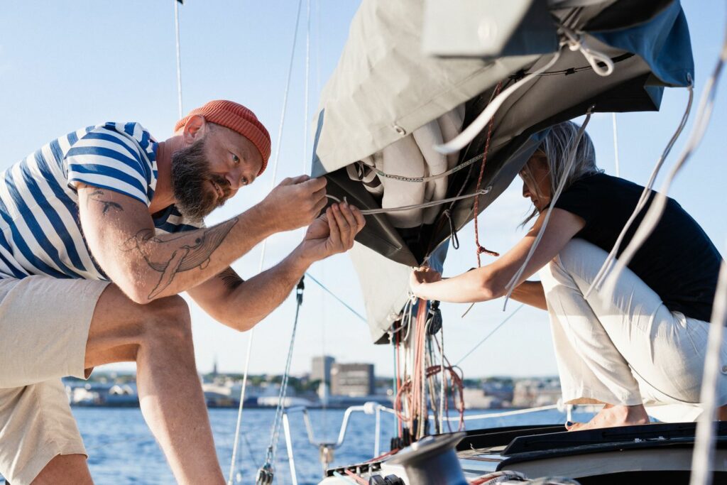
Northern Playground, “Our job is to make it easier and more fun to own less.”

Two main principles:

  • Duration (physical and non-physical)
  • Multi functionality (for all occasions and adventures)

Looks and functionality:

Northern Playground mainly uses one design strategy. This is designing with simple designs, multi functionality and keep-worthiness. Their design process is slow and never puts looks over functionality. Northern Playground never launch something new unless they belive it fills a hole in their collection and that it will stay a classic “forever.”

Quality:

The clothes from Northern Playground should have long lifetime and high quality through repairability, less chemicals, needing less washing and designing the garment first and then setting an appropriate price. The clothes should also be possible to recycle.

Supply chains:

Employees in their supply chain should have more than a living wage. They should have good lives and good working conditions. In addition there is full transparency in who Northern Playground partner with.

Read more:

Read more about Northern Playgrounds design strategy here: https://www.northernplayground.no/en/content/design-philosophy, and more about their buisness models, processes etc. here: https://www.northernplayground.no/en/environment

H&M Group, “…guide to designing more circular products.”

Three pillars, designing products to be:

  • used more
  • made to be made again
  • made from safe and recycled or renewable inputs

Looks and functionality:

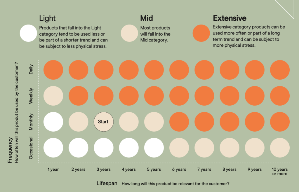
According to H&M Group’s “Circulator Guide” they try to place each product in a “Frequency and Lifespan” diagram before they decide on materials etc. The default before they as themselves a few questions is wear monthly and lasting for 3 years. This is not particualary ambitious.

If we wear 6 garments (pants, undershirt, shirt, sweater, jacket + underwear/socks etc.) every day, one new outfit every day in the month, for 12 months a year that would mean you would have to buy and toss 2160 garments in 3 years. This is excluding pyjamas, home wear, workout clothes etc. If most of these clothes are then placed in H&M Group’s “Mid” category they are not that designed well for recyclability, and most will end up outside of that system anyways as recycling clothes is a very overwhelmed industry.

Quality

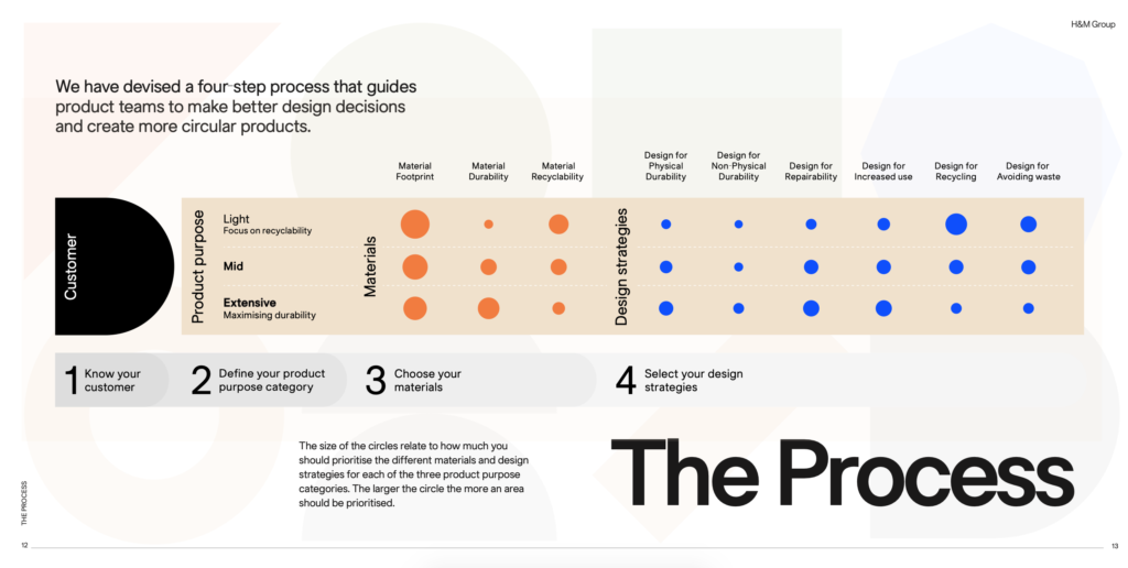
H&M Group has a different approach than Northern Playground when it comes to the quality of their clothes. They argue that clothes which are designed for being in the “Extensive” product category should have physical and some non-physical (eg. lovability) durability. However, products in the “Mid” and “Light” category should NOT be designed for durability, but rather recyclability. They at best put medium pressure on repairability and avoiding waste.

Supply chains:

Ad H&M Group is a giant in fashion is hard to get the overview of all the suppliers and working conditions. They are part of the Transparency Pledge.

Read more:

Design strategy of H&M Group: https://hmgroup.com/wp-content/uploads/2021/11/Circulator_Guide_v1.0.pdf

What to take from this?

  • Northern Playground is designing for “timelessness,” but will probably struggle to target people who want to express themselves through fashion with their muted colors and simple silhouettes.
  • Northern Playground designs every piece in the same spirit. This leads to transparency and trust for the customer
  • H&M Group design with different strategies for how to reduce the overall environmental impact. For as long as we produce clothes ment to only last a short while this is probably a good thing as it reduces emissions. ““Focusing on developing all products to be more durable could potentially lead to us using more resources than a garment requires.” However, this makes it more unclear for the customer what type of garment they are buying. It also drives prices down which lead to overconsumption.

What is interaction design?

Also regarded as the design of the interaction between users and products, Interaction design is a multidisciplinary area that focuses on designing user-friendly goods, services, and systems. It integrates design, psychology, and technological principles to develop user interfaces that are intuitive and efficient. Interaction designers take a user-centered approach to design, which means they begin by learning about the wants, goals, and behaviors of the people who will use the product or service. They then apply this knowledge to design interfaces and interactions that are specific to the user’s wants and preferences.

Websites, mobile apps, consumer gadgets, autos, and even physical venues like museums and public transportation all benefit from interaction design. Interaction designers produce effective interfaces using a range of techniques such as wireframing, prototyping, and user testing. To produce unified and polished products, they often cooperate with other design and development experts such as graphic designers, engineers, and user researchers.

As new technologies and design trends arise, the discipline of interaction design is continually evolving. To build interfaces that are both useful and appealing, interaction designers must keep up with the newest design tools, technologies, and best practices.

“Design is not just what it looks like and feels like. Design is how it works.” – Steve Jobs

Interaction design is a field that integrates design, psychology, and technological concepts to produce user-friendly products and services. As Steve Jobs noted, design is about more than just how something looks; it is also about how it operates. Interaction designers utilize a user-centered design approach to create interfaces that are intuitive and efficient for users. This implies that they begin by gaining an understanding of the objectives, goals, and behaviors of the people who will be using the product or service, and then utilize that information to build interfaces that are personalized to the user’s wants and preferences. In other words, design the experiences people want next.

“Design is not just about aesthetics, it’s about problem-solving” – Jared Spool

“Design should never say, ‘Look at me.’ It should always say, ‘Look at this'” – David Craib

“Design is not just what it looks like and feels like. Design is how it works.” – Steve Jobs

“Design is not just an aesthetic decision, it’s a strategic decision” – Marty Neumeier

“Design is not a thing you do, it’s a thing you are” – Paul Rand

“Design is thinking made visible” -Saul Bass

“Design is not for philosophy, it’s for life” – Issey Miyake

These statements underline the importance of design is about more than simply the visual, as well as functionality, and issue resolution, as well as a strategic and comprehensive approach to the design process. Interaction design is an ever-changing subject, and interaction designers must keep up with the newest design tools, technologies, and best practices in order to develop interfaces that are both useful and beautiful.