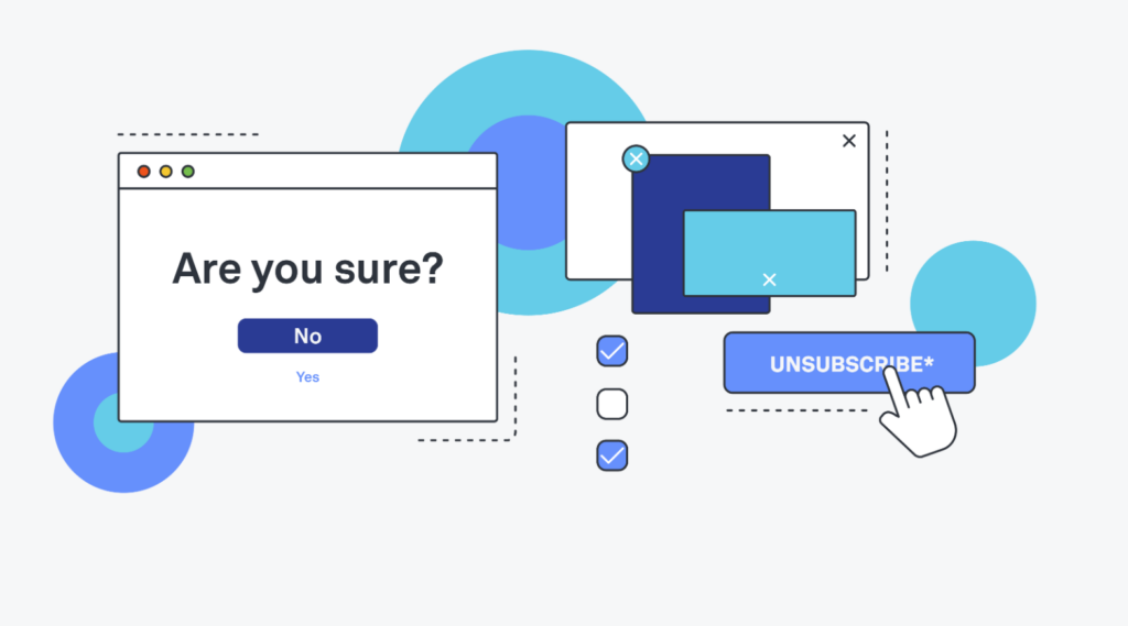
I believe it will be challenging to find participants with various visual impairments to test different HUD variations. Therefore, I have decided to shift my focus to a new topic: dark patterns in app and web design.
What are Dark Patterns?
Dark Patterns refer to user interface elements intentionally designed to mislead users into taking actions they did not intend.
for Example:
- Misdirection:
- Redirecting users to unintended actions or pages.
- Hidden Costs:
- Concealing additional charges until the final steps of a transaction.
- Sneak into Basket:
- Adding extra items to the shopping cart without clear consent.
- Forced Continuity:
- Making it difficult for users to cancel subscriptions or services.
- Roach Motel:
- Easy to get in, but challenging to leave or unsubscribe.
- Confirmshaming:
- Guilt-tripping users into accepting undesirable choices.

The following questions will be addressed in my master’s thesis:
To what extent do Dark Patterns influence user behavior and satisfaction, and how can ethical design principles contribute to promoting positive user experiences?
What types of Dark Patterns exist in various industries, and can they be categorized into specific groups?
How do users react to Dark Patterns? Are they even aware of their existence? What are the effects of Dark Patterns on user behavior?
What design guidelines are particularly effective in ensuring transparent, ethical designs? Are there tools that can detect Dark Patterns? How can users be protected early on from Dark Patterns, and how can they defend themselves against them?
Practical Part
In the practical part of the thesis, user testing will be developed for two apps. Although both apps have a similar structure (presumably apps for online shopping), one app will use Dark Patterns, while the other will not. The goal is to determine how users respond to Dark Patterns, whether they notice them at all, and the overall impact on the user experience.