In the following I would like to talk more about the interface and the user experience of the website. I would analyze from a basic point of view how the website is built and at the end I’ll give suggestions for improvement, show what are important attributes for young people nowadays and give a small preview of my prototype. I will just display two images to proof my suggestions of improvement.
01. Landing page:
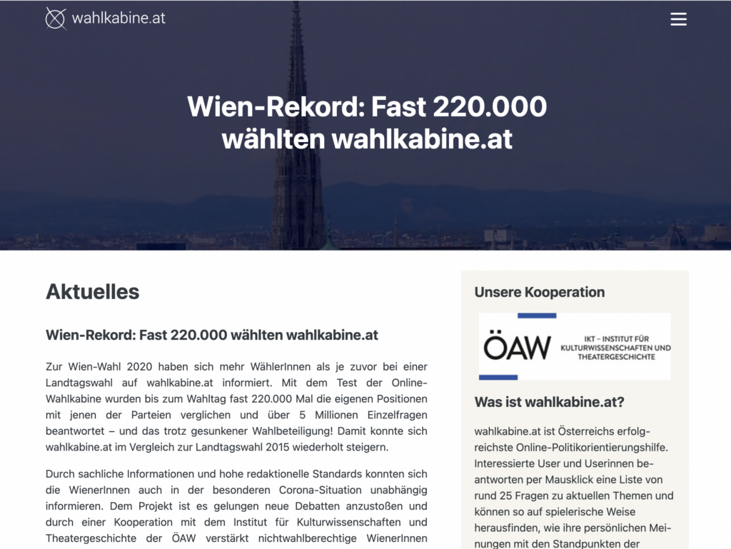
On the start page, one experiences a relatively conservative introduction. If you didn’t know that you were on wahlkabine.at, you probably wouldn’t immediately recognize that it’s about democracy or election information. The many text or the quasi hidden header image make the website seem relatively unemotional or dry. I can imagine that this entrance seems less inviting for children and young people. To get other information, beyond the start page you can reach the other subpages via the citizen menu. A direct link in the direction of the survey or, for example, past results, is not possible directly or only visible after scrolling down for a long time.
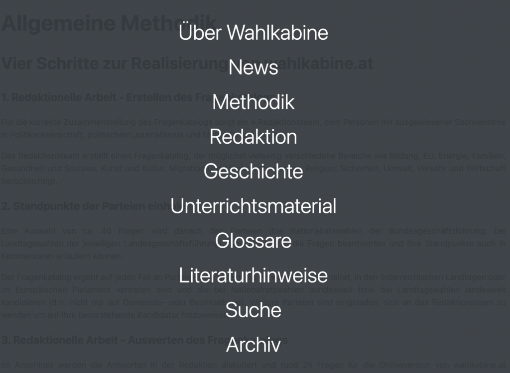
02. Burger menu
The burger menu has a lot to offer. It seems like it was very important for the developers to show all possibilites of the website. Furthermore it would have been possible to sum up several bullet points such as “Über Wahlkabine”, “Redaktion” and “Methodik” and/or “Geschichte”. Also its not really common to place the search function inside a burger menu. The coloring of the whole webpage is probabyl chosen because of its diplomatic color (grey) but it’s also pretty boring and not appealing in the colorful world we do live in.
I would suggest adding more emotion, information, and user-friendliness to the webpage. By incorporating different colors, more images, and providing more possibilities for barrier-free information, the website will become more attractive to users of all ages. By intentionally incorporating interaction options on the website, such as sliders, checkboxes, or hover effects, it creates a mild gamification of the website. This increases engagement, and the dry topics of politics, democracy, and participation appear more modern, friendly, and inviting. After completing my prototype, I would focus on testing it in the next semester to form a well-informed opinion about the “new” wahlkabine.at.