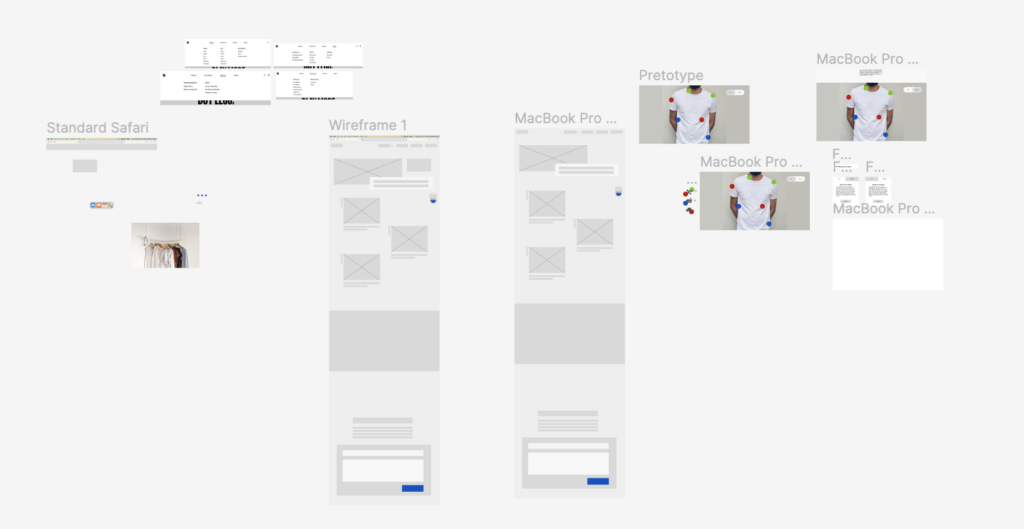
As I have continued working on the prototype I constantly find new needs and possible paths. For now I have focused on placing the prototype in a context which becomes part of the prototype. Instead of just developing the tool I have now made a webpage as an information source.

Eventually I started filling in my wireframes with content. I have chosen to not focus on writing texts and rather making titles which give an indicator of what would be there. This way I could have tested my prototype to get a “first impression” from someone without producing text that might not be needed.

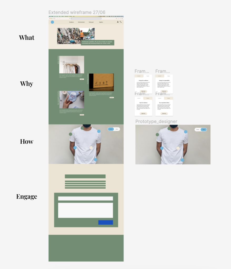
I have created a structure which will work similarly to a storyteller page.
- Header: There is a header on top for navigation.
- What: first the user need to understand what this page does. Two sentences about the goal for this page is enough to communicate this fast.
- Why: Why should the user care? Why should they use this page? Three main goals is mentioned with subpages linked it the user wants to read more.
- How: How can I make a difference? This part is where I assume most user will spend the most time. It is an exploration of what I can do (as a consumer / designer) to reduce the environmental impact of fashion.
- Engage: Call to action to send in feedback and/or taking part in challenges/competitions to create engagement around the page. This part would need more exploration and research to see what creates the most momentum and impact.
- Footer: Footer where I can place the “boring” info. For those interested in going in depth, reading more complex resources, documentation etc. this is a natural place to look in combination with the header.
If I was to test this prototype I would interview 3-5 people of different age and try to explore what information they would expect, wish for and care about. In addition I would interview fashion designers to explore if they could use a page like this in their workflow.