Grungy aesthetics, sketchy lines and colouring outside those lines. All of my favorite stylistic choices which I consider implementing in my ongoing art career. The movie Spiderman: Across The Spider-Verse features ground breaking animations, style changes and served as a huge inspiration to me and many others. In the following few points are summarised points on how this particular art style an animation was achieved:
- Art Style Fusion: Seamlessly blends various animation styles, from hand-drawn to computer-generated, in a single film.
- Color and Texture Experimentation: Disregards traditional color schemes and textures, utilizing bold colors and diverse textures to represent the multiverse.
- Frame Rate Variation*: Plays with different frame rates within scenes, creating a dynamic and energetic feel.
- Aspect Ratio Changes: Shifts aspect ratios between scenes to signify shifts between different dimensions and realities.
- Innovative Typography and On-Screen Text: Integrates typography and on-screen text creatively into the visual storytelling.
- Non-Linear Storytelling: Explores the concept of multiple universes and versions of characters, offering a non-linear narrative structure.
- Experimental Transitions: Employs inventive transition techniques, including comic book-style panel transitions and glitch effects, diverging from standard smooth scene changes.
I want to outline the Frame rate variation because I think this is one of the more essential techniques which I will commonly practice in the further development of my project.
Frame Rate Variation*
- Animating on Ones: Some sequences were animated traditionally on ones, where each frame is shown for a single frame duration. This technique is used for fluid and detailed motion, especially in action-packed scenes or moments requiring smooth movements.
- Animating on Twos or Threes: Other sequences utilized animating on twos or threes. When animating on twos, each drawing is shown for two consecutive frames, resulting in a slightly more staggered or stylized motion. Threes extend this to three consecutive frames, giving an even more distinct and choppy appearance.
- Mixed Frame Rates: The film cleverly combined these different frame rates within scenes, alternating between sequences animated on ones, twos, or threes. This variation created a dynamic visual rhythm, emphasizing specific actions or intensifying the atmosphere of certain scenes.
For more details I highly recommend watching the following 2 videos:
- How ‘Spider-Man: Into The Spider-Verse’ Was Animated (Breakdown): https://www.youtube.com/watch?v=jEXUG_vN540
- How Spider-Verse Broke The Rules of 3D Animation: https://www.youtube.com/watch?v=9jH0wDp5GnQ
Also here is a rather fun video of another artist implementing the Spider-Verse approach into his little animation:
- I Made a Across the Spider-Verse Animation in 24 Styles: https://www.youtube.com/watch?v=iPd-TQnLyS
Inspiration
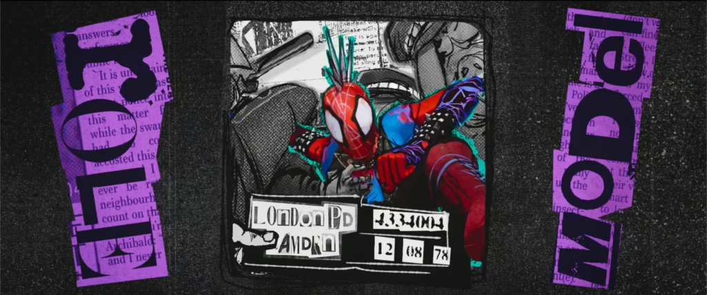
There are so many styles to be inspired from, but I am particularly fond of one aesthetic. The grungy, punk fanzine inspired look for the character Hobie (As you could’ve guessed form the first few lines of this blog entry).
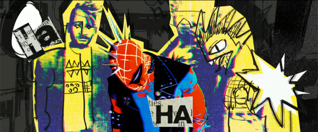
Hobie Brown, known as the Prowler in Spider-Man lore, shares an intriguing link to punk fanzines in some versions of the character. He’s portrayed as a creator of these DIY publications, revealing his artistic side beyond being a superhero. This connection implies his potential involvement or association with the expressive, underground realm of punk culture. Fanzines were pivotal in this culture, serving as avenues for unconventional expression, sharing alternative ideas, and spotlighting underground music, art, and lifestyle. Depicting Hobie as a fanzine artist hints at his possible connection to the rebellious and creative world associated with punk.
Punk Fanzines?
Punk fanzines display a gritty and unpolished style that resonates with the rebellious spirit of the punk movement.
These DIY publications are distinctly handmade, often using basic materials like photocopiers, cut-and-paste techniques, and hand-drawn elements. The layouts appear chaotic, featuring asymmetrical designs, bold fonts, and irregular lettering that convey a sense of urgency and spontaneity.
The visuals within these fanzines are provocative, showcasing raw and gritty imagery such as unpolished photographs, rough illustrations, and photocopied graphics. The content itself is daring, offering radical art, anti-establishment messages, underground music reviews, and personal anecdotes.
With intentionally low-quality printing, the fanzines carry a raw, grainy texture, often containing smudges and uneven ink distribution. Yet, these imperfections are embraced, adding to the authenticity and DIY aesthetic of punk fanzines.
In essence, the rough and grungy aesthetic of punk fanzines captures the untamed energy and counter-cultural defiance that define the punk movement.
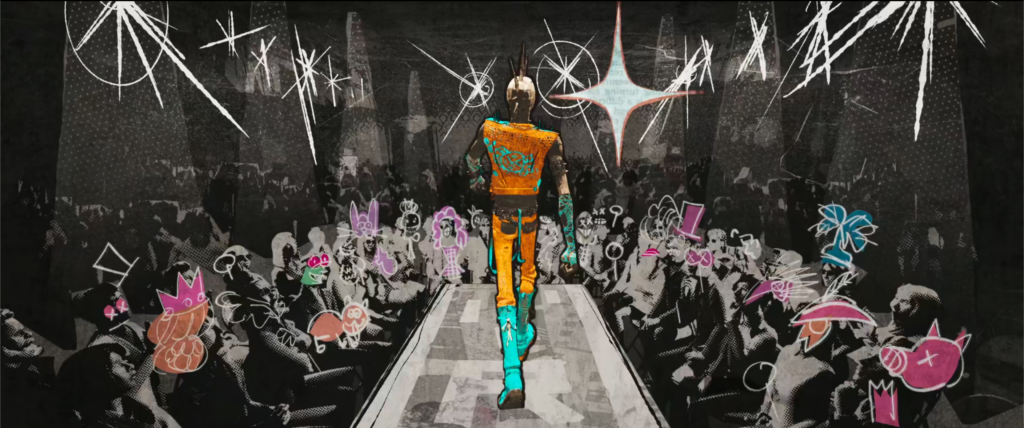
There are multiple lessons which this movie has taught me, story wise I can’t say much, but aesthetically and technically there is a whole lot to unravel. After my initial watch I have gone over the parts I have liked in particular and viewed the sections frame-by-frame. It was quite interesting to see some imperfections in resolution, simple color changes or whacky doodles contribute so much to the whole scene. On its own some frames don’t seem truly spectacular, but given the fact that the average human being won’t go over frame-by-frame for an almost two and a half hour long movie, it is fair to say that every frame could be a poster. This is what I want to achieve, or at least try to achieve in my project.