After my last deep-dive into seeing how I could utilize Midjourney to create letter-forms, I switched to try another tool and tested the newly-released Adobe Firefly. Results using this were more promising, especially when uploading a reference image.
From those experiments it became apparent, that the key to achieving good results with AI is to control the input i.e. training data. The current on-demand software solutions, however, allow for this to be done only in a very limited way – that is by uploading a reference image. As an alternative to this, it is possible to train an open-source AI by oneself. Stable Diffusion is an AI developed by the CompVis Group from the LMU Munich and Runway, and it is one of the deep learning models that can be trained by end-users. I was intrigued by this and decided to give it a try. Unfortunately, after setting up the AI and using DreamBooth to fine-tune it, I was not successful in completing the training of the model.
It appears to me, that when trying to utilize AI to create and set type, the area is still very much in its infancy. While functional ready-made solutions like Midjourney and Adobe Firefly exist for general image-creation, none of them work very well for typography yet. Training an AI oneself seems to require an excessive knowledge of the programming language Python and a rather expensive set-up of equipment.
After this realization, I decided to take a step back and look at my topic again. Should I change it or open my perspective? After some further research and helpful conversations, I came to the conclusion that I am going to change my topic slightly and open it up to research future typographic developments in general. My key question that I would like to follow is…
“What will typography look like in the future?”
I want to tackle the topic from a variety of different perspectives, making forecasts/prognoses for future developments from each perspective in order to get a holistic picture of how the typographic scenes and the practices designers engage with might change in the near future.
Possible perspectives could be:
The future of type is…
Variable?
Kinetic?
Non-binary / feminist?
Inclusive?
Multilingual / multi-script?
Sustainable?
Expressive?
Made with artificial intelligence?
I already looked into the last perspective. In the upcoming days I will begin to research the remaining ones and add to this list.
For a first experiment to explore the application of AI within the typographic context, I decided to have a look at which tools and software already exist in the moment. In an article titled “Artificial intelligence and real type design” published by type.today several tools and their possible uses and limitations have already been highlighted:
Midjourney: Midjourney is a software used to create images with the GAN algorithm, but you cannot control the input you feed the algorithm, but Midjourney rather bases its output on the “entire amount of knowledge it obtained during its lifetime” (Shaydullina, 2023). This makes it difficult to control the output, especially when aiming for creating very specific shapes such as letters. In the article, the author suggests however, that one can get a somewhat functional output by using the Blend command to create an arithmetic mean of two different typefaces (Shaydullina, 2023).
Adobe Photoshop: The author writes that you can use Photoshop’s built-in AI-tool to generate letters that are similar to an uploaded picture, but judges it rather harshly: “Photoshop rarely succeeds in it, however, it usually comes up with recognizable capital letters (Shaydullina, 2023).
In addition, I found several other applications that can be useful in the typographic process:
Monotype AI pairing engine: This tool by Monotype pairs fonts and gives advice on hierarchy, font size, etc. (Jalali, n.d.).
iKern: This software developed by Igino Marini automates the task of kerning, that is the determination of glyph’s relative positioning (Marini, n.d.).
Adobe Firefly: Adobe’s answer to AI allows you (at the moment) amongst other things to generate images from text or apply textures to words (Adobe Creative Cloud, n.d.). However, both features seem to do not add more options to creating typefaces than the aforementioned tools.
Unfortunately, the main problem using software-solutions that are available on the market to date seems to be the lack of control over the input used to train the AI, if we want to create usable letters. Some designers have, however, already tried to train their own AIs, with many of them using StyleGAN, a style-Based Generator Architecture for Generative Adversarial Networks developed by NVIDIA (NVlabs, n.d.).
In order to get a better overview of all the developments in the AI sphere and to broaden my understanding of what is currently possible, I decided to try out different tools. For this experimentation, I began using the arguably most popular text-to-image AI available: Midjourney.
First experiment: Midjourney
To start it off, I gave the Midjourney Bot the simple brief “the letter ‘A’ in black on a white background” leading to this outcome:
Figure 1: An AI-generated image of the letter ‘A’
Note. Image generated using Midjourney from the prompt “the letter ‘A’ in black on a white background”.
Unfortunately, Midjourney returns images that have textures, color splashes or a 3D effect, so I adjusted my prompt to the following: “the letter ‘A’ in black on a white background as a flat shape –no texture or 3D effect”, which lead to clearer shapes.
Figure 2: An AI-generated image of the letter ‘A’
Note. Image generated using Midjourney from the prompt “the letter ‘A’ in black on a white background as a flat shape –no texture or 3D effect”.
As a next step, I tried to give the AI more detailed input on the type of letter it should produce, adding “in a Serif style” to the prompt.
Figure 3: An AI-generated image of the letter ‘A’
Note. Image generated using Midjourney from the prompt “the letter ‘A’ in black on a white background as a flat shape in a Serif style –no texture or 3D effect”.
Midjourney offers several commands other than prompts to play with the images it creates. I tried out creating variations of a letter I liked (Fig. 4) or varying regions (Fig. 5), with the latter leading to the closest thing of typographic variations.
Figure 4: AI-generated variations of the letter ‘A’
Note. Image generated using Midjourney from the prompt “the letter ‘A’ in black on a white background as a flat shape in a Serif style –no texture or 3D effect – Variations (Strong)”.
Figure 5: AI-generated variations of the letter ‘A’
Note. Image generated using Midjourney from the prompt “the letter ‘A’ in black on a white background as a flat shape in a Serif style –no texture or 3D effect – Variations (Region)”.
A little less successful was my attempt at creating a matching letter ‘B’ to the ‘A’ midjourney created, the output was just any kind of ‘B’ with little resemblance to the original letter.
Figure 6: An AI-generated image of the letter ‘B’
Note. Image generated using Midjourney from the prompt “the letter ‘B’ in black on a white background as a flat shape in a Serif style –no texture or 3D effect – Remix”.
Also when asking the AI to create multiple letters within one picture, the software was not able to fulfil my command in the way I imagined it.
Figure 7: An AI-generated image of multiple letters
Note. Image generated using Midjourney from the prompt “the letters ‘A’, ‘B’ and ‘C’ in black on a white background as a flat shape in a Serif style –no texture or 3D effect”.
As a last trial, I uploaded a picture of three sample letters in a decorative style to Midjourney as a reference image (Fig. 8) and prompted the software again to create the letter ‘C’. Sadly, this only lead to a more “creative” 3D output in the first instance (Fig. 9), and when adding the finer definition to the prompt regarding the styling, to some form of usable shape but not letters of the Latin alphabet (Fig. 10).
Figure 8: Reference image of three letters in a decorative style
Figure 9: An AI-generated image of the letter ‘C’
Note. Image generated using Midjourney from the reference image and the prompt “letter C”.
Figure 10: An AI-generated image of the letter ‘C’
Note. Image generated using Midjourney from the reference image and the prompt “letter ‘C’ in black on a white background as a flat shape in the same style –no texture or 3D effect”.
Learnings from this experiment:
As of today, and with the current knowledge I have for using the AI, I can generate letter forms with Midjourney.
However, only single letters can be created and it is difficult to create a second, matching one.
Only minor influence on the style of the letters is possible; adding a reference image is not working properly.
As fun as this first experiment was, it seems to me that Midjourney is in the moment not really of use within the creation of typefaces or type setting, but I will explore the possibilities more deeply in the future.
References
Adobe Creative Cloud. (n.d.). Adobe Firefly. Retrieved November 15, 2023, from https://www.adobe.com/sensei/generative-ai/firefly.html
Jalali, A. (n.d.). Putting AI to work: The magic of typeface pairing. Monotype. Retrieved November 15, 2023, from https://www.monotype.com/resources/expertise/putting-ai-work-magic-typeface-pairing
Marini, I. (n.d.). iKern: Type metrics and engineering. iKern. Retrieved November 15, 2023, from https://www.ikern.space/
NVlabs. (n.d.). GitHub – NVlabs/stylegan: StyleGAN – Official TensorFlow Implementation. GitHub. Retrieved November 15, 2023, from https://github.com/NVlabs/stylegan
Shaydullina, A. (2023, June 7). Artificial intelligence and real type design. type.today. Retrieved November 15, 2023, from https://type.today/en/journal/fontsai
During my previous research, I dived into the topic of web aesthetics and ended my last semester by conducting a small experiment to determine the effect of a small sample of aesthetic variations on users. However, in the meantime my focus and interest has shifted, and I decided to take up a new topic to explore, namely: future developments in the typographic world.
In the moment, new technologies as well as what might be regarded as “new values” in type design cause ripples within the typographic universe. Decolonization efforts as well as the rise of multilingual typography lead to a movement away from the rigid square of the glyph, which stems from the invention of the printing press (Kulkarni & Ben Ayed, 2022). In addition, type becomes more flexible (keyword: variable type), fluid (keyword: kinetic type) or even 3-dimensional. However, maybe the most interesting technological development, and the topic I want to explore further in order to find a possible Master’s topic, might be the continuous rise of Artificial Intelligence.
I am very intrigued to find out, if AI can be used at any point within the typographic process and began my research by asking myself the following key questions:
Can AI be used to design typefaces? If yes, how?
Can AI used in other areas of the editorial production process e.g. for type setting (kerning, sizing, …)? If yes, how?
Can AI replace typographers?
Which tools can be used for this?
As a first step, I began to look at the field with an open perspective and start putting together what research has already been done. During a first session, I stumbled upon a couple of examples, where designers have already tried to use machine learning or automation processes to aid at various points during the design process:
Thesis by Daniel Wenzel (HTWG Konstanz) “Automated Type Design“: Wenzel used any type of automated process to design typefaces, creating over 100 fonts in the process. He used the following five automation processes: “fonts by variation (comparable to Neville Brody’s FF Blur), fonts through limited tools (intentionally using the limitations of generators like FontARk or Prototype), fonts by “Art Direction” (using mathematical formulas to describe fonts rather than drawing curves by hand), fonts with the help of assistive processes (generating new weights, scripts and optical corrections using assistive tools like brush simulations), and fonts with the help of autonomous processes (using machine learning to generate new “AI fonts”)” (Ibrahim, 2019).
Andrea A. Trabucco Campos and Martin Azambuja have formed the publishing house “Vernacular”. Their first publication “Artificial Typography” showcases 52 typographic forms portrayed in the style of various iconic artists, that were created using AI (Thaxter, 2022).
Thesis „Machine Learning of Fonts“ by Antanas Kascenas (University of Edinburgh): Kascenas explores if kerning process can be automated by using machine learning (Kascenas, 2017).
It appears to me, that albeit first trials have been run and a small number of designers have already used AI to create typefaces and set type, the area still appears rather new. Especially when looking at tools and technologies, while AI seems to be rather evolved when it comes to generating images based on text prompts, no completely developed tool exists yet to develop type.
In the upcoming weeks, I want to explore the topic further and see if it is going to provide me with a basis for a Master’s topic. Possibly, I will have to narrow the topic down or widen it, in case I do not find enough material. In addition, I also want to look into the option of using AI myself and apply it to the typographic process. However, this is something I have to research further…
References
Ibrahim, A. (2019, October 14). Daniel Wenzel faces the question of automation in creativity head-on in Automatic Type Design. It’s Nice That. Retrieved November 7, 2023, from https://www.itsnicethat.com/articles/daniel-wenzel-automated-type-design-digital-graphic-design-141019
Kascenas, A. (2017). Machine Learning of Fonts [MInf Project (Part 1) Report]. University of Edinburgh.
Kulkarni, A., & Ben Ayed, N. (2022, June 16). Decolonizing Typography. In Futuress. https://futuress.org/learning/decolonizing-typography/
Thaxter, P. (2022, September 27). Vernacular’s Artificial Typography uses AI to boldly blend together type and the history of art. The Brand Identity. Retrieved November 7, 2023, from https://the-brandidentity.com/interview/vernaculars-ai-typography-is-an-a-to-z-in-typography-and-the-history-of-art-imagined-by-ai
After having created different variations for a trial of an A/B-test for visual web aesthetics and their effect on users, I decided to put those to a small, first test. For this, I showed the variations to 4 test subjects and asked them the following question: “Please grade the pleasantness of the following screens (1= very unpleasant to 5= very pleasant). In this, ignore the context of the app and focus only on the visuals.”
Of course, this tests only the perceived pleasantness, rendering this mini-test neither representative nor complete, with certain obvious limitations (small sample size, way of creation of testable visual web aesthetics, amount and nature of questions, …). Nevertheless, this will be sufficient for a first small trial run.
The test results were as follows:
Subject 1
Subject 2
Subject 3
Subject 4
Average grading
blue-green colour
5
1
5
4
3,75
brown colour
1
3
2
2
2
orange colour
3
4
2
1
2,5
blue colour
3
5
4
2
3,5
magenta colour
2
3
1
3
2,25
yellow-green colour
2
5
5
2
3,5
Roboto
5
5
5
5
5
Raleway
5
5
4
5
4,75
Roboto Slab
4
4
3
4
3,75
Comic Sans
1
1
1
1
1
Playfair Display
3
3
2
3
2,75
Papyrus
1
1
1
1
1
Courgette
1
1
1
1
1
low amount of white space
3
2
1
1
1,75
medium amount of white space
1
3
3
3
2,5
high amount of white space
2
1
2
2
1,75
From this concludes the most beautiful combination of typography, coloring and white space (left) and the three least pleasant options (right), each with an equally low rating.
To summarize this, it can be said that the results from this mini-test were interesting in the sense that the expectations matched the results (especially when regarding the colors). Of course this experiment only determines what is regarded as beautiful by test subjects with a very simple question and no full test of the perceived usability has been tested. This would require a larger-scale test with a functioning prototype that participants can interact with. So there remains a lot of room for further exploration: In the future, I could improve the framework of aesthetic criteria, focus on a specific use case, use more test subjects or focus on the cultural influences. Yet overall I felt that I gained important insights into the puzzle pieces that make up web aesthetics and their connection to UX design. Especially since I come from a communication design background, working at the intersection between graphic and UX design has been eye opening, and I feel that I was able to broaden my horizon.
As a final word, I want to conclude my research for this semester with two interesting notions I came across while researching this topic. Firstly, Brielmann & Pelli (2018, p. 861) note that even though beauty is central to the human experience, it is “also worth bearing in mind that sometimes deliberate deviations from on-average appealing features can hold a special appeal, too”. So it might not be the most “perfect” app design, that is perceived as the most touching, but some imperfections could actually make something even better. And in addition, Redies (2015) makes an even bolder statement by saying that “in a subset of (post-)modern art, beauty no longer plays a prominent role”. If this holds true, will of course still have to be determined, nevertheless, I found it very thought provoking. I am excited to see where my journey into visual web aesthetics will take me in the future…
References:
Brielmann, A. A., & Pelli, D. G. (2018). Aesthetics. Current Biology, 28, 859–863.
Redies, C. (2015). Combining universal beauty and cultural context in a unifying model of visual aesthetic experience. Frontiers in Human Neuroscience, 09. https://doi.org/10.3389/fnhum.2015.00218
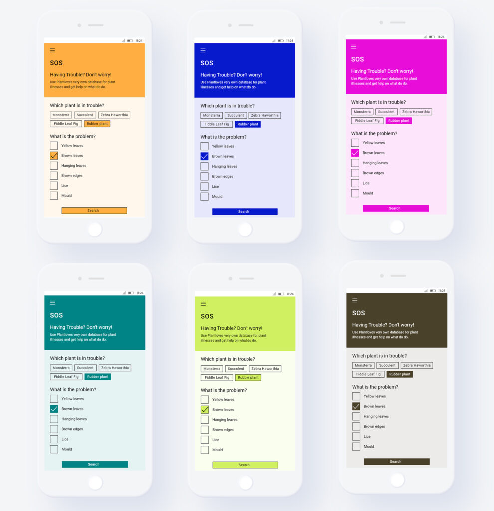
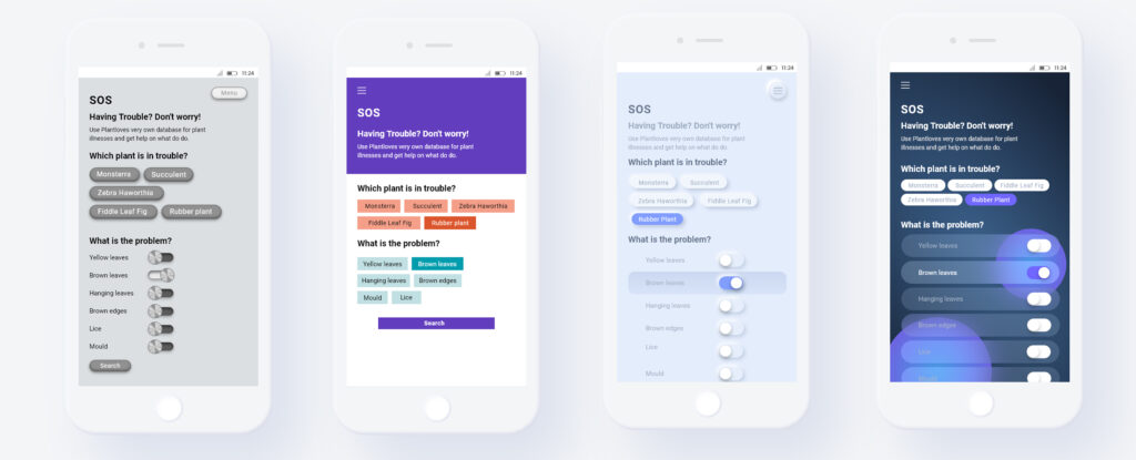
After having selected a testing interface and certain visual variables that I want to experiment with, I developed variations of the original basis interface.
Colour
Starting with colour, I first researched what has been dubbed as the world’s “most beautiful” colour: “Marrs Green” by G.F Smith (n.d.). Secondly, I searched for the world’s “ugliest” colour, which some people claim is the brown hue Pantone 448C (Pathak, 2016). Then I filled up my test palette with several colours from Odushegun’s (2023) research and landed on a trial palette of 6 colours.
Typography
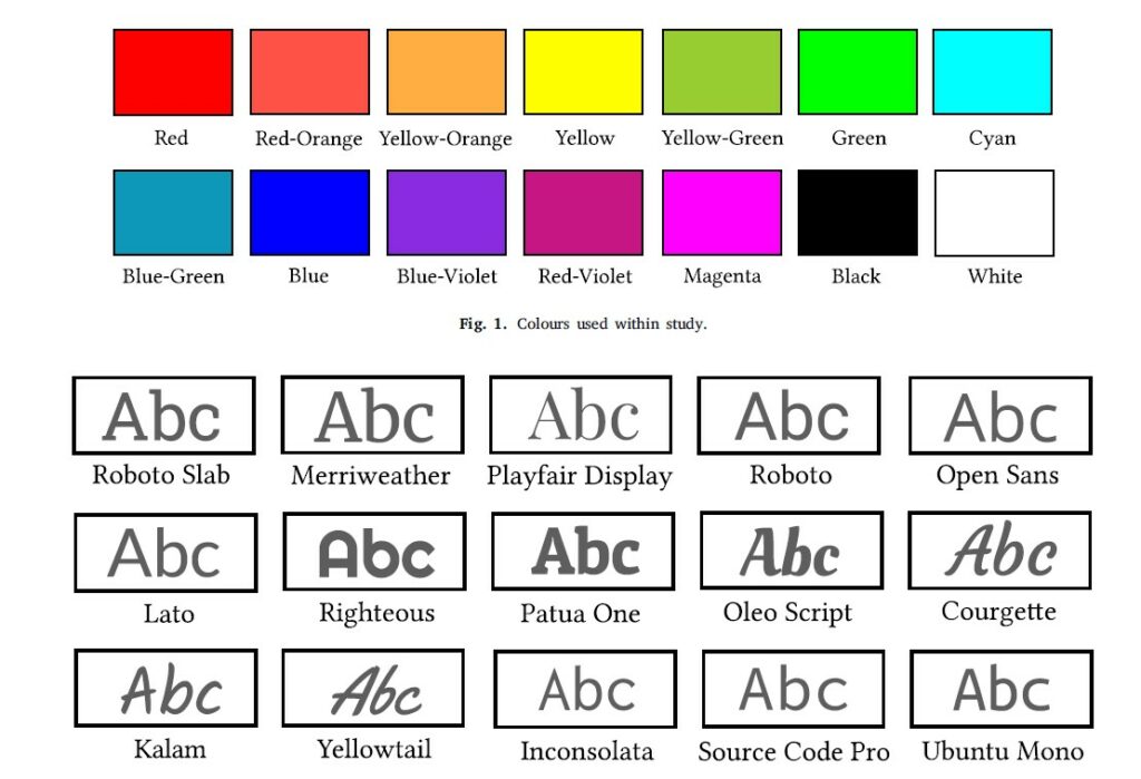
Subsequently, I build a typographic palette. I added some more typefaces from Odushegun (2023) but also included freely selected other fonts. I used the following typefaces: Roboto by Christian Robertson (Google Fonts), Raleway by, Roboto Slab by Christian Robertson (Google Fonts), Comic Sans by Vincent Connare (Microsoft Corporation), Playfair Display by Claus Eggers Sørensen (Google Fonts), Papyrus by Chris Costello (Microsoft Corporation) and Courgette by Karolina Lach (Google Fonts).
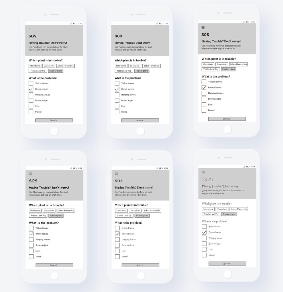
White Space
Then, I adjusted the white space between texts, once trying very little, a medium amount and a lot of white space.
Webdesign Styles
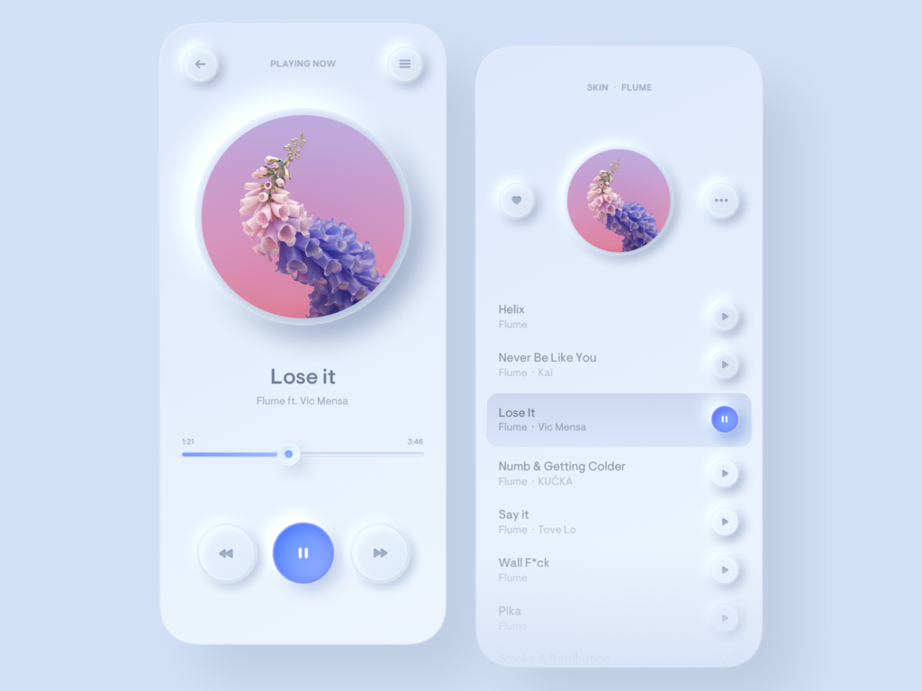
And finally, I moved away from my more serious testing framework and tried to build my testing interface in the different web design styles (see: previous blog posts). I tried out (from left to right) skeuomorphismus, flat design, neomorphism and glassmorphism. However, those did not feature in the following experiment as they were very complex and included not only one isolated change of an aesthetic feature but multiple changes and the addition of stylistic elements like drop shadows, transparency, …
After having build those variations, I decided to put my first trial framework to test. More in the next blogpost…
References:
G.F Smith. (n.d.). G . F Smith Colorplan Marrs Green. Retrieved June 17, 2023, from https://www.gfsmith.com/gf-smith-colorplan-marrs-green
Odushegun, L. (2023). Aesthetic semantics: Affect rating of atomic visual web aesthetics for use in affective user experience design. International Journal of Human-computer Studies, 171, 102978. https://doi.org/10.1016/j.ijhcs.2022.102978
Pathak, S. (2016, June 7). The world’s ugliest colour is Pantone 448C, say experts. Evening Standard. Retrieved June 17, 2023, from https://www.standard.co.uk/lifestyle/the-world-s-ugliest-colour-is-pantone-448c-experts-say-a3265856.html
After having read about what aesthetic experiences are, which different visual aesthetics exist in UX design, how aesthetics can influence usability (or vice versa), it is time for a first trial experiment. My goal for this term is not to build a complete user test to determine the connection, but rather lay the groundwork, experiment, and deepen my understanding for it to build a test hypothesis and prepare for an A/B-test in the future.
For this, I want to build a first trial framework of atomic web aesthetics and try different variations (possibly replicating large-scale UX trends), taking the general principles of “beautiful design” into account. To build a first set of testing variables, I will loosely orient myself on previously conducted research like a study by Odushegun (2023) who tested the affect ratings of atomic visual web aesthetics (see: previous blog posts). Odushegun (2023) tested the effect of different typefaces, colours and animation effects. However, I will leave out motion in my following experiments to simplify the research. In addition to those factors, I will observe the use of white space and the use of stylistic devices (drop shadow and glow, gradients and gloss, transparency) in accordance with previous readings.
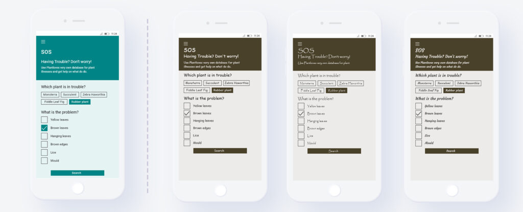
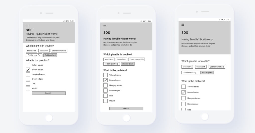
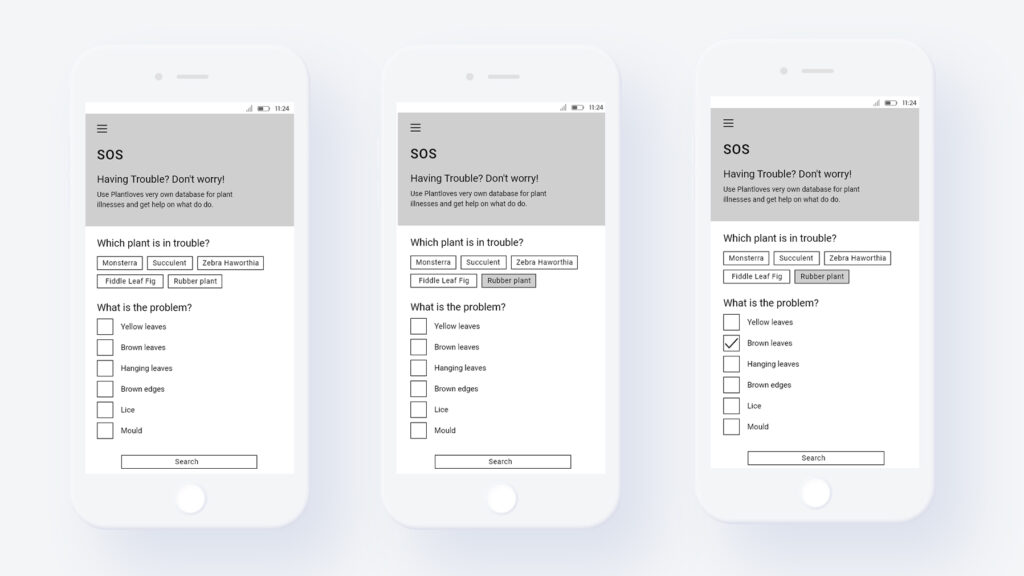
As a first testing interface I am going to use a feature from an old personal project of mine: the app “Plantlove”. The purpose of the app is to help people take care of their house plants and the selected screen depicts a search database where you can enter which plant you own is having problems, select the type of problem the plant encounters and then search for a solution.
Task for the test user:
“Your rubber plant has brown leaves. Search for a solution in the database.”
In the next week, I will experiment with the visual web aesthetics of this basis interface.
References:
Odushegun, L. (2023). Aesthetic semantics: Affect rating of atomic visual web aesthetics for use in affective user experience design. International Journal of Human-computer Studies, 171, 102978. https://doi.org/10.1016/j.ijhcs.2022.102978
After having done some surface-level research about visual web aesthetics and the connection between them and usability, it is necessary to do a deep dive into the underlying processes. Before beginning with experimentation, I will have to wrap my head around what influences our perception of aesthetics and if there is one universal aesthetic we all find beautiful or if aesthetic experiences differ.
For answering those questions, I found an interesting journal article by Brielmann and Pelli (2018) called “Aesthetics”. But beforehand, we must get our terminology straight and make a distinction between aesthetics and beauty. The former is an “inherent property of a visual stimulus” while the latter can be described as “the subjective experience elicited by an artwork, or to the neural processing in the brain relating to that experience” (Redies, 2015). According to Brielmann & Pelli (2018, p. 859), the word “aesthetics” was first used by the German philosopher Alexander Baumgarten and encompasses (as of today’s understanding) “the perception, production, and response to art, as well as interactions with objects and scenes that evoke an intense feeling, often of pleasure”.
Regarding theories surrounding aesthetics, the discourse only developed in recent years with a multitude of models being developed in the early 2000s. However, those theories still remain under scrutiny and there is a certain lack of consensus (Brielmann & Pelli, 2018, p. 860). Brielmann & Pelli (2018, p. 860-861) describe, that those theories can be categorized into stimulus-focused research on the one hand that “aims to identify a set of object properties in the (usually) visual domain that contribute to aesthetic pleasure” and response-focused research on the other hand that “investigates the mechanisms, including their neural processes, that underlie aesthetic judgments”. For my own research, I will only focus on the former category since it is the one relevant for the design of visual interfaces.
Generally, certain determinants of the aesthetic experience are considered as proven. Brielmann & Pelli (2018, p. 861) note the preference for symmetry over something asymmetrical and “averageness in the sense of conformity with a category prototype is usually preferred over more-deviant exemplars”. In addition to this, curvature is preferred over angularity, the Golden Ratio is regarded as “beautiful” and color-wise “blue-green cold hue, relatively high saturation, and lightness” is preferred in Western culture (Brielmann & Pelli, 2018, p. 861).
Concerning the universality of those determinants the authors write that some aesthetic components like curvature and symmetry are actually universal while others like color and ratios depend more on the context and individual preferences. This universality can be traced back to evolution: Many attractive face attributes, like averageness, symmetry, and a reddish skin color, may indicate health and thus higher mate quality for producing children. […]. Similarly, preference for landscapes that include water, forest, and signs of animal life has been explained as attraction to human-friendly habitats” (Brielmann & Pelli, 2018, p. 861).
However, one always has to be cautious because those rules are only true for an average response. How an individual perceives aesthetics depends on “the triad of perception, cognition and emotion” (Redies, 2015) and can differ considerably.
References
Brielmann, A. A., & Pelli, D. G. (2018). Aesthetics. Current Biology, 28, 859–863. Redies, C. (2015). Combining universal beauty and cultural context in a unifying model of visual aesthetic experience. Frontiers in Human Neuroscience, 09.
Usually, design can be classified into different eras, categories and styles. However, when we look at web design, a distinction between different styles seems very difficult. Brage (2019, p.1) writes, that there is a certain “lack of cultural analysis within web design”. She elaborates and describes that indeed the “visual evolution of the world wide web is not sorted into distinct and widely acknowledged periods or categories such as is the case with most other cultural areas like music and art”. In addition to this, the way visuals look in the online space has always been closely interlinked with the technological developments, evolving from the very first web designs in the 1990s to web 2.0 which we have today (Brage, 2019, p.20ff).
However, certain blogs and researchers attempt to distinguish between certain web design styles, albeit more research seems to be necessary to properly differentiate those and put them in their proper context. Generally, those trends differ in terms of the key visual elements used, that are
“Color
Shape
Pattern
Line
Texture
Visual weight
Balance
Scale
Proximity
and Movement” (Nikolov, 2017).
One blogpost on Medium names Skeuomorphism, Flat Design, Neomorphism and Glassmorphism as different design styles.
Skeuomorphism is defined by a use of textures, an interface that mimics real things, the illusion of depth and shiny buttons (Canvs Editorial, 2021).
Note. From UI Kit, by O. Clark, 2011 (https://dribbble.com/shots/306311-UI-Kit). Copyright 2011 by Orman Clark.
Flat design first came into being with Windows 8. It includes brighter colours, no textures, no illustion of depth and the whole design is generally kept in a very minimal and clean style (Canvs Editorial, 2021).
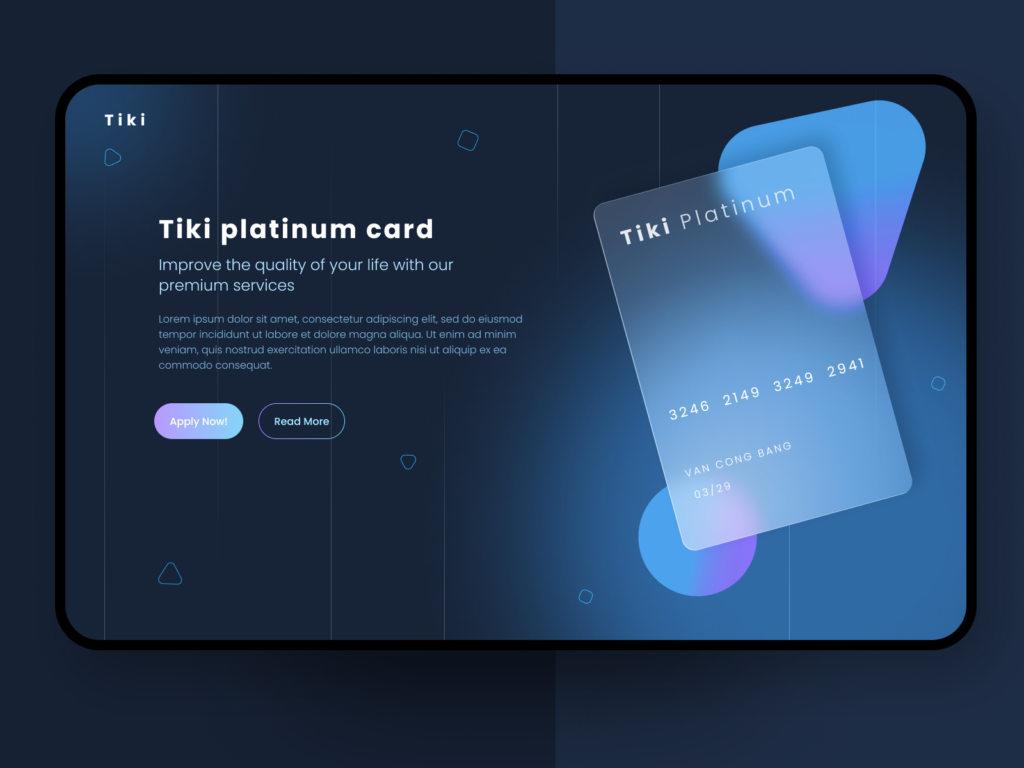
Neomorphism and Glassmorphism are seen as “postmodern” design styles that resulted from a mixture of different influences. Within Neomorphism, background and foreground usually have the same color and everything is given a “soft plastic” texture. Glassmorphism is characterized by transparent, glowy effects, blur and bright colors (Canvs Editorial, 2021).
Note. From Light Mode Simple Music Player, by F. Legierski, 2020 (https://dribbble.com/shots/9517002–Light-Mode-Simple-Music-Player). Copyright 2020 by Filip Legierski.
Note. From Glassmorphism experiment, by N. Van, 2020 (https://dribbble.com/shots/14734973-Glassmorphism-experiment). Copyright 2020 by Nick Van.
Generally, I find the differences in aesthetics very interesting. During a talk with our supervisor, the idea came up to experiment with those aesthetic differences in a free and experimental way. For example, I could create imaginary parameter sliders for characteristics and then take one interface (e.g. the clock app) and design it according to different extremes and in different styles. With remixing and bushing the boundaries of those aesthetics, new insights could be generated, albeit the functionality of all the output designs probably will be limited. However, in exactly those limitations I could possibly test out the boundaries of this. I will explore this topic deeper in the upcoming weeks…
References:
Brage, E. (2019). The rise of brutalism and antidesign and their implications on web design history [BA thesis]. Jönköping University.
Canvs Editorial. (2021, January 30). How visual design trends have evolved over the years. Medium. Retrieved May 9, 2023, from https://uxdesign.cc/how-visual-design-trends-have-evolved-over-the-years-730a8ed43970
Clark, O. (2011, October 31). UI Kit. Dribbble. https://dribbble.com/shots/306311-UI-Kit
Legierski, F. (2020, January 14). Light Mode Simple Music Player. Dribbble. https://dribbble.com/shots/9517002–Light-Mode-Simple-Music-Player
Nikolov, A. (2017, April 23). Design principle: Aesthetics. Medium. Retrieved May 9, 2023, from https://uxdesign.cc/design-principle-aesthetics-af926f8f86fe Van, N. (2020, December 10). Glassmorphism experiment. Dribbble. https://dribbble.com/shots/14734973-Glassmorphism-experiment
Having read about the importance of aesthetics and its influence on the way interfaces are designed, I began to wonder if what I personally perceive as “beautiful” or aesthetic overlaps with other people’s perception? Do people share a sense for aesthetics or does this change from person to person / from culture to culture?
When searching for answers to this question in an UX/UI context, one comes across the term “cross-cultural UX/UI design”, which spans a multitude of conducted studies, research papers and more. Core of this topic is to determine the differences between cultural design preferences and to find rules or guidelines for how to design for each culture or for different ones.
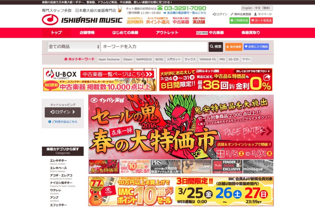
For instance, Rohles describes in a summary in blog post format that not only do design elements evoke different associations in different cultures, but “culture [also] influences what is considered aesthetically pleasing and beautiful” (Rohles, 2019). The author gives the example of the webpage of the Japanese music store Ishibashi, which is shown below.
Figure 1: Webpage of the Japanese music store Ishibashi
Note. From How to do intercultural UX design for the web, by B. Rohles, 2019 (https://rohles.net/en/articles/intercultural-webdesign). Copyright 2019 by Ishibashi.
Here, the site is designed in an arguably quite maximalistic style, using colourful imagery and huge slogans. One might assume, that people from a Western culture would generally prefer a more “airy” layout with white space. In contrast to this, Rohles quotes a study by Choi et.al. that was presented at CHI 2005, which found that Korean and Japanese participants prefer an “efficient use of the available space, showing a lot of information simultaneously” (Rohles, 2019).
When trying to navigate such difficult waters, many UX/UI designers refer back to the works of the Dutch researcher Geert Hofstede. Hofstede build a framework for assessing cultural differences by defining 6 dimensions, in which cultures score differently (Mahanta, 2021). The six dimensions are (see: Mahanta, 2021):
Power distance index
Individualism vs. Collectivism
Masculinity vs. Femininity
Uncertainty Avoidance
Long-term vs. Short-term
Normative Orientation
Indulgence vs. Restraint
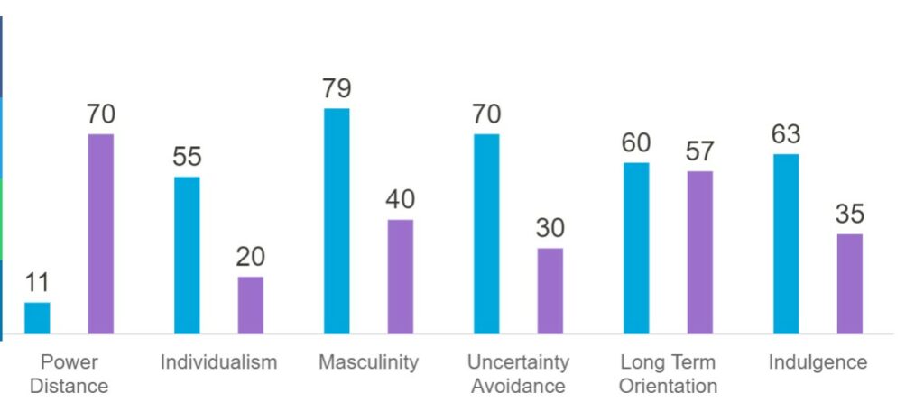
Hofstede Insights offers an online tool, where one can compare the individual scores of two countries with regard to the dimensions given by Hofstede. Below, you can view a comparison of Austria and Vietnam (Hofstede Insights, 2023).
Figure 2: Country comparison tool by Hofstede Insights
Note. From Country Comparison – Hofstede Insights, by Hofstede Insights, 2023 (https://www.hofstede-insights.com/country-comparison/austria,vietnam/). Copyright 2023 by Hofstede Insights.
Personally, I found those new insights fascinating: It is possible that I would design a (in my mind) perfect, beautiful website or app and if I showed this to customers in Vietnam, they might rate it as very ugly, which, in turn could have a negative effect on the perceived usability (see: previous blogposts).
References:
Hofstede Insights. (2023, January 27). Country Comparison – Hofstede Insights. https://www.hofstede-insights.com/country-comparison/austria,vietnam/
Mahanta, A. (2021, October 7). Cross-Cultural Design: Designing for Global Audiences – UX Mastery. UX Mastery. https://uxmastery.com/cross-cultural-design-designing-for-global-audiences/
Rohles, B. (2019, August 5). How to do intercultural UX design for the web. Retrieved April 17, 2023, from https://rohles.net/en/articles/intercultural-webdesign
After having dived deep into the topic of UI aesthetics and having collected sources, I began reading interesting material in more detail. Unfortunately, most studies I found seem to be more than 10 years old. However, I was able to find a fascinating paper by Labake Odushegun, who conducted a study about how users respond affectively to 43 atomic aesthetics, focusing on typography, colour and animation called “Aesthetic semantics: Affect rating of atomic visual web aesthetics for use in affective user experience design” (Odushegun, 2023, p.1).
Odushegun describes that the reason for her close investigation of the topic was that she noticed that many UX designers begin their process by creating a beautiful interface, while they actually should consider the core perceptions for possible aesthetics of choice that users have beforehand (Odushegun, 2023, p.1). Subsequently, she then conducted a study with 1.782 participants from all over the world and measured affective ratings to determine the effect of the aesthetic options presented to the participants (source 1, p.1). Some of those affective ratings for different colours, fonts and animation devices are displayed here:
Figure 1: Colors and fonts tested in the research conducted by Odushegun
Note. From “Aesthetic semantics: Affect rating of atomic visual web aesthetics for use in affective user experience design,” by L. Odushegun, 2023, International Journal of Human-computer Studies, Volume(171), p. 6 (https://doi.org/10.1016/j.ijhcs.2022.102978). Copyright 2023 by L. Odushegun.
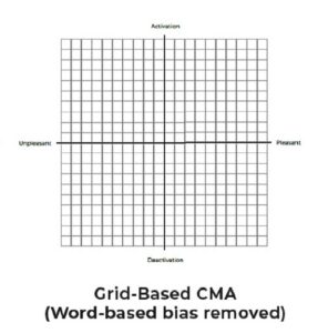
Figure 2: Grid-Based CMA used in the research conducted by Odushegun
Note. From “Aesthetic semantics: Affect rating of atomic visual web aesthetics for use in affective user experience design,” by L. Odushegun, 2023, International Journal of Human-computer Studies, Volume(171), p. 6 (https://doi.org/10.1016/j.ijhcs.2022.102978). Copyright 2023 by L. Odushegun.
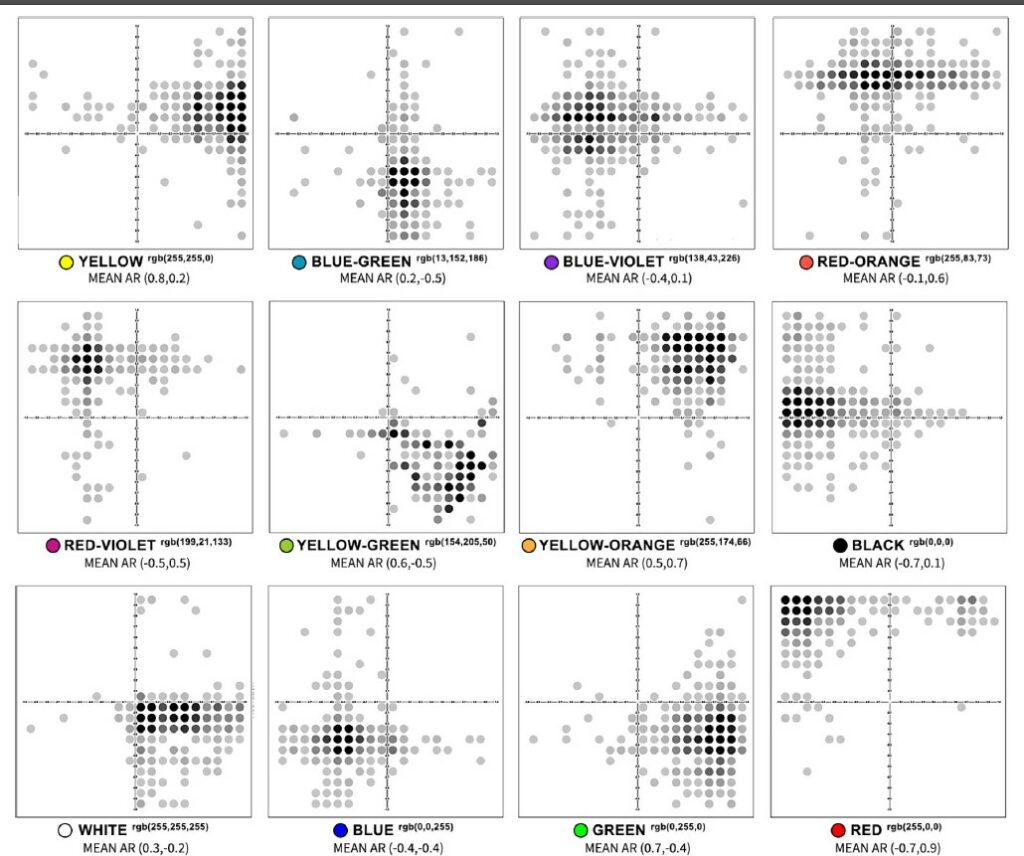
Figure 3: Results for the different colours
Note. From “Aesthetic semantics: Affect rating of atomic visual web aesthetics for use in affective user experience design,” by L. Odushegun, 2023, International Journal of Human-computer Studies, Volume(171), p. 8 (https://doi.org/10.1016/j.ijhcs.2022.102978). Copyright 2023 by L. Odushegun.
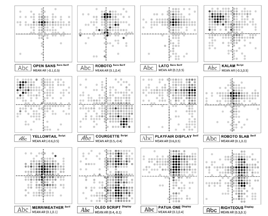
Figure 4: Results for the different fonts
Note. From “Aesthetic semantics: Affect rating of atomic visual web aesthetics for use in affective user experience design,” by L. Odushegun, 2023, International Journal of Human-computer Studies, Volume(171), p. 9 (https://doi.org/10.1016/j.ijhcs.2022.102978). Copyright 2020 by L. Odushegun.
Odushegun concludes her study by stating that “[u]ser-responses were most unanimous in atomic colours, neutral AR typefaces (i.e. Merriweather) showed suitability for unbiased content (i.e. legal and informational sites), and animations as a whole garnered the most user attention. Findings suggest AR has potential use in the affective UX design process, and the data format presented allows for computational application in real-world use cases” (Odushegun, 2023, p.11).
So, it seems like every design choice even on the most detailed level leads to a different aesthetic experience in UX/UI design. This seems very obvious, but I cannot help but wonder whether there were big groups / similarities within her affective ratings. Do people from all cultures perceive the same UX/UI design as aesthetic?
References:
Odushegun, L. (2023). Aesthetic semantics: Affect rating of atomic visual web aesthetics for use in affective user experience design. International Journal of Human-computer Studies, 171, 102978. https://doi.org/10.1016/j.ijhcs.2022.102978