Bookbinding – a change of topic

During the last semester, I researched the history and characteristics of the Arabic language and typography. While I still find the topic of multilingual typography intriguing, I nonetheless decided to switch to a topic that fascinates me far more. Besides, the size of my last subject area has been somewhat overwhelming for me and left me unsure of which direction to proceed in.

Since I spend most of my creative time sitting in front of a computer, I thought I would like to choose a topic that lies more on the analogue side than on the digital side. After the Bonbonniere Alumni workshop day last month, I was enchanted by the art of bookbinding and would therefore like to focus my further design research this semester on this subject.

More specifically speaking, I want to have a closer look at any bookbinding techniques that put the binding in the spotlight.

As of now, these are some techniques I want to look into based on my first brief research:

  • Japanese stab binding
  • Chinese dragon scale binding
  • French link stitch binding

Visual Storytelling Experiment #1: Lighting

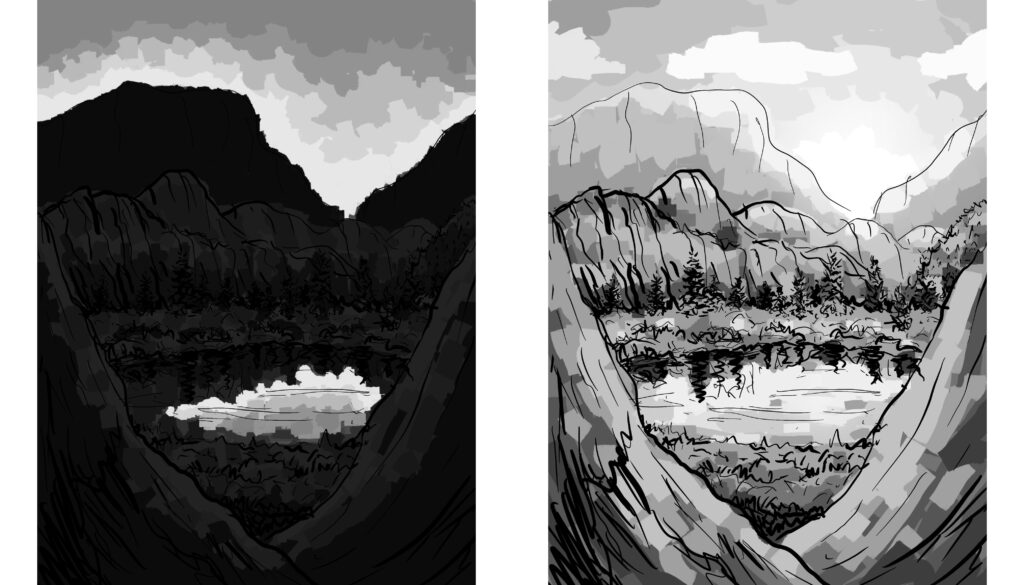
For this blog post, I tried to experiment with the visual storytelling concepts I learned about while doing research last semester. I did two rough sketches to try out how the light situation in an environment can change its mood. Scenes seem more unsettling to us when details of it are hidden, like in the nighttime image the viewer would not know what is hidden in the shadows, creating a sense of uneasiness.

The well-lit image seems more friendly and inviting to us because we can clearly make out all the details. This technique of hiding certain parts of the image to create uncertainty does not only work well for daytime/nighttime situations but it can be used in any context, of course.

1. Schritt für Cyantype

Vorbereitung: Mischen der Cyanotypie-Lösung

Zuerst müsste ich die Lösung für die Materialien vorbereiten.

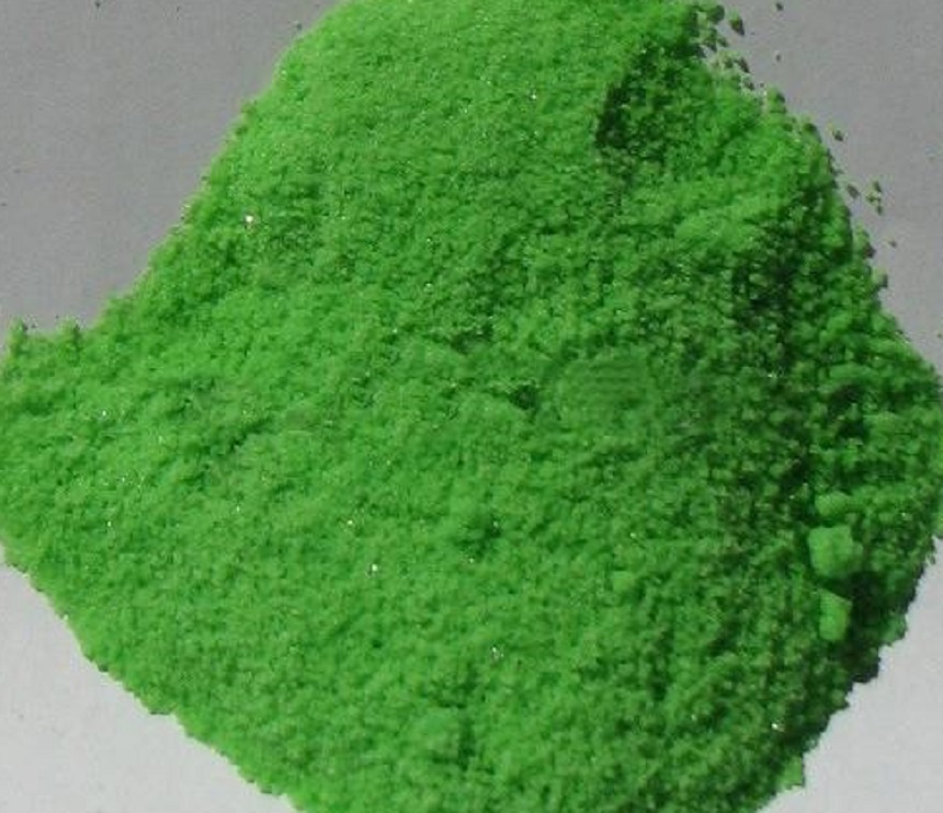
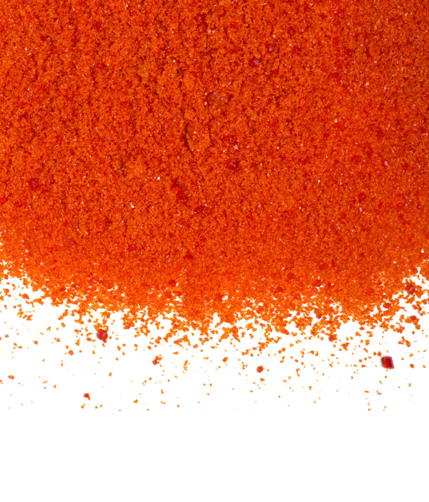
Zuerst muss ich die Lösung für unsere Materialien vorbereiten. Dazu mische ich 20 g Ferric ammonium citrate mit 100 ml destilliertem Wasser in einem Behälter. Anschließend füge ich 10 g Potassium ferricyanide zu 100 ml destilliertem Wasser hinzu und mische es gründlich. Wichtig ist, dass der Arbeitsbereich nur schwach beleuchtet ist, da die Eisensalze auf UV-Licht reagieren, sobald sie gelöst sind.


Kaliumhexacyanidoferrat(III), chemische Zutat, die in der Lebensmittel- und Pharmaindustrie verwendet wird, auf weißem Laboratoriumstisch. Wissenschaftlicher Hintergrund. Draufsicht.

Ferric Ammonium Citrate

Welche Materialien können verwendet werden?

Jedes beliebige Papier, Karton, Textilien oder natürliche Materialien kann ich zum Drucken verwenden. Dabei ist es wichtig, dass das Material wasserfest ist, wenn es gespült wird. Aus diesem Grund sollte das Papier ein Gewicht von ca. 150 g/m2 oder mehr haben.

Ich werde damit beginnen, auf dickem Papier und Aquarellpapier zu drucken und ein maximales Format von A6 zu verwenden.

Blaue Farbe

Die natürliche blaue Farbe der Drucke wird als Preußischblau bezeichnet. Preußischblau wird oft als das erste der modernen Pigmente bezeichnet. Es wurde 1704 von dem Berliner Farbmeister Diesbach hergestellt und wird in Deutschland als Berliner Blau bezeichnet. Es wurde 1724 für Künstler verfügbar und ist seit seiner Entdeckung sehr beliebt.

Was ist KI?

Unter dem Begriff „Künstlicher Intelligenz“ wird der Versuch verstanden, Computern menschenähnliche Intelligenz zu verleihen. Darunter fallen Lernen, logisches Denken, Planen, sowie auch das Imitieren von Kreativität.

Die Anwendung von KI im Alltag ist sehr vielfältig. KI ermöglicht autonome Autos, Intelligente Klimatechnik, Smart Farming, Roboter in Fabriken, Internet der Dinge, Persönliche digitale Assistenten am Smartphone, Automatische Übersetzung usw.

Wie kann dies Designer:innen behilflich sein?

Designer:innen nutzen für ihr kreatives Schaffen Werkzeuge. Was früher Stift und Papier waren, können jetzt IPad, Adobe Programme oder eben auch Künstliche Intelligenz sein. Jedes Werkzeug hat also seine Potenziale und seine Vorzüge, aber eben auch seine Grenzen. Werkzeuge, die auf künstlicher Intelligenz basieren, können also nur innerhalb des definierten Bereiches arbeiten.

Wie funktioniert künstliche Intelligenz?

Kurz erklärt funktioniert maschinelles Lernen durch Algorithmen, also durch genaue Handlungsanweisungen. Algorithmen sind zeitlich begrenzt, müssen nacheinander abgearbeitet werden, sind für den Computer verständlich und lösen ein bestimmtes Problem. Die Algorithmen funktionieren, indem sie vorerst mit Eingabedaten gefüttert werden. Programmierer:innnen müssen beim Erstellen eines solchen Algorithmus jegliche Faktoren die beim Bedienen eintreffen könnten berücksichtigen. Voraussetzung für das maschinelle Lernen ist eine sehr große Menge an Daten. Ein selbstlernender Algorithmus hat den Vorteil, dass er sich im Laufe der Zeit selbst optimiert.


QUELLEN:

OFFF 2023 – Recap

– Elena Waschl

As a small insertion I want to post my insights & learnings from OFFF Barcelona 2023!

Wichtigste Notizen zur & von der OFFF Barcelona
23. -25.4.2023

Bureau Borsche:

  • Colour system of Bairisches Opern House
    • Jedes ahr eine neue Farbe
    • CD weiß / Schwarz
  • Haus der Kunst
    • Animiert

Future Trends, by It`s nice that

1.) Maximalist & Messy

– wirf alle Farben zusammen und sei kreativ beim Weg sie zu kombinieren!
– Collage Style = wild & mixed
– allowed to make mistakes!

2.) Returning to Retro (trendy asthetic)

@ Trè Seals, Washington DC
@Zoè Pully, Rhode Island

3.) Sci-fi Optimisma

                 – creating with art more hopeful future
@Luke Penny, London

4.) Make it More

– MOTION make it MORE!
                 – allow more meaningful messages!

@Pitch Studios

5.) AI & Machine Learning

– Learn & prepare how we can work TOGETHER!
– AI will never replace emotions!

Creation =NOT= Creativity

Marta Cerdon

Life is not linear!
Schönheit hat auch seine Berechtigung … siehe in der Tierwelt & Natur!

Painting letters is like drawing emotions & expressions!
Mit Motion you can push the level of expression!

Take grids!
Why? Wie bei einem Fußballplatz, das Spiel findet auch im Feld statt und nicht sonst wo!
How?

  1. Setz dir ein Feld / Definiere deinen „Spielbereich“
  2. Überlege dir eine Formensprache, eine “Wie fühlt sich das zu Layoutende Projekt an?“ Gib ihm eine Form, reihe sie aneinander, Größe? Häufigkeit?, etc.
  3. Finde Muster, setzte Verbindungslinien, finde eine Regelmäßigkeit! Erstelle ein Grid
  4. Tob dich aus und animiere vl.

Lettering:

Überlege dir:

  • Welches Material passt zu meinem Projekt?
  • Wie könnte ich mit dem Material Buchstaben kreieren?!
  • Inflatable…?
  • Wie kann ich die AI zur Hilfe nehmen?
    • MidJourney
    • Stable Diffusion
    • Dall.e2
    • ChatGPT
  • Suche nach Rythmic?
  • Gibt es Bereits geschichtliches dazu? Wie wurde damals geschrieben?
  • Thin what it look & feel like…?!
  • Little by little!
  • Get abstract!

Communicate Ideas!

5×5 Rule!
We make our decisions in 5 seconds from 5 meter apart!
(Check out your work time by time under this parameters!)

Alejandro Masferres

Self expression = your identity
We all try to find ourself, and we try to find a role.

Everyone has talents, in our jobs we need / try to fit the roles

How to make people getting ideas?
First, people need to understand themselves, then others.

Five patterns how people behave in a creative team:

1. Understand (Kreis)                           o
2. Define (Rechteck)                            []
3. Ideate (offenenes Dreieck)            <
4. Filter (geschlossenes Dreieck)     >
5. Energise (Stern)                                *

Important to have a mix of patterns in a creative team!
Every person might be a mixture too.

BUT REMEMBER:
You can be everything with your pattern! A o< can be a doctor but also a waiter!
As long as you do it in our own way!

You can use all patterns in a design process J

“Do it with your mindset not with your role!

A job is a task = you can do it in many ways!

Gemma O’Brian

  • Be BOLD
  • Be a ReBEL
  • Create JOY

Tipp’s

a.) Collect stuff and put it in your own design book
      =finde vl. einen “roten Faden”

b.) Caligraphie is a process!

c.) BEGIN YOUR VISUAL DIARY

d.) combine your interests!

e.) explore! In REAL Life (Materials, patterns, by nature etc.)

f.) train yourself & draw from real life!

Sarah Boris

“I think we are all a bit like Schwämme – wir saugen auf was uns gefällt”

Knowing when to quit! Don’t be afraid

1.) It is up to us, where we set our boundaries

                 – pandemic told us: There is really nothing in world that is that urgent!

2.) We do not need to be named as a special “position”
Artist vs. Designer? You can be everything!

Never let stop you by others!

Kelly Anna

Figure out:

  • How to make it happen
  • Invest in your relationships!!

If you struggle: Look back and see how you developed so far! J

Larger than life…
we are more capable than we think…
ARE YOU BOLD ENOUGH?!

Never STOP: Exploring & Experimenting!

Road is maybe rough but don’t be shy and go your way
with curiousity and think of a way presenting your work & yourself
             

From Form

  • Forest become our installation area (Vlieland Festival 2016 NE)
  • Sometimes you need to look twice

Brachten einen Spiegel und fotografierten ihn und die Umgebung.

Combi of Beauty & Fear

Pentagram

Identity systems, keep on earth & show analog
play with typo & zerlege sie! Finde den kleinst möglichen nenner! Suche nach bestehender Schrift und untersuche diese!

Überlege wie kann die Schrift im Real Life umgesetzt werden? Bring to Life!
        >>> Material? Größe, 3D? Komposition, Integration? Ums Eck?, etc.

Build a integrative language!

Building a character! Works on- & offline! Multiple Materials!
Own, flexible, forms, typo, etc.

AUDIO!

Integrate the form in various ways!

– Create maps of whatever of J
– Play with dots, solids, squares, etc.!

Information Visualisieren & longlasting

Brian Collins

Exist to make “wahnwitzige” produkte
cancel: Minimalist, variable products!

MAKE MISTAKES PART OF THE SOLUTION
                 = gibt der solution ihre Personality!

Eg. Spotify:

  • Music can change emotions binnen seconds!
  • Colour blocking (break rules!)
  • Music is so much more than b/w

Create a world and a fitting dictionary

Create a tone of voice!

Quotes:

(David Carson)
“If you did not get the money, would you do the job”
“Put your work at places where they are not common”

(Framework)
„I am not failed, I just founded 10.000 way which does not work“
“And sometimes you find what you are not looking for”

(Gemma O’Brian)
“You can be everything!”
“Art is when no one is telling you what to do!”
“Dream baby, dream”
“collect all (weird) words & phrases!

(Sarah Boris)
“I don’t take NO as an answer!”
“There is more in life, than increasing its speed”
“Do not always ask for permittion”
“It is personal freedom to define yourself”

(Kelly Anna)
 “Look up and focus”
“she stole the show”
“Run past the future”
“The game has changed”
“Fuck it, I am doing it anyway”

(From Form)
“into the great wide open”

(Elizabeth Alexander)
“What are the stories we have not heared?”

(Brian Collins)
“the best ideas comes from being open & doing the opposite way we expect to do so”
“change the way you are looking at things”
“Change doesn’t happens overnight, until it does”
“Design is what we make possible!”

 (Antoni Gaudì)
“if you want to be original, you need to get back to origin” / “Originality consists in returning to the origin”
“Glory is light, light gives us joy and joy is happiness of the spirit”
“To to things right, first you need love, then technique”
UX/UI Aesthetics

With my new topic of aesthetics in UX/UI design in mind, I immediately began researching possible sources and interesting aspects. Here are some first touchpoints worthy of further investigation:

Research paper “The influence of design aesthetics in usability testing: Effects on user performance and perceived usability” by Andreas Sonderegger and Juergen Sauer

This paper is written about a study of 60 teenagers that were tasked with several problems using mobile phone apps (Sonderegger & Sauer, 2010). During the test, two identical phones were manipulated regarding the aesthetic appearance of the apps. The study showed that the more appealing phone was seen as more usable and improved performance (Sonderegger & Sauer, 2010).

Research paper “Is beautiful really usable? Toward understanding the relation between usability, aesthetics, and affect in HCI” by Alexandre N. Tuch, Sandra P. Roth, Kasper Hornbæk, Klaus Opwis, Javier A. Bargas-Avila

This is a similar study where 80 participants tested for versions of the same online shop, which differed regarding their aesthetic appearance (Tuch et al., 2012). However, the researches found the opposite case to be true: They found that the aesthetics did not affect the perceived usability. On the contrary: “In contrast, usability has an effect on post-use perceived aesthetics. Our findings show that the ‘‘what is beautiful is usable’’ notion […] (Tuch et al., 2012, p. 1598).

Research paper: “The Effect of Layout and Colour Temperature on the Perception of Tourism Websites for Mobile Devices” by Kiemute Oyibo and Julita Vassileva

This paper is more specific and examines the effect of layout and colour temperature on tourism websites. The authors found a strong corellation between both factors and the perceived usefulness, enjoyment and intention to use (Oyibo & Vassileva, 2020).

To conclude, we can say that from this first, quick research it is already apparent that some research already exists in this area, but there does not seem a lot of common ground. This conclusive statement must be verified in more detail later.

When it comes to what exactly is regarded as “aesthetic”, there are of course certain visual rules and “laws”, which could require further examination. In addition, there are certain design trends in UX/UI design, which constantly change. On the blog “AIGA Eye on Design” I read an interesting article about the “Era of Rebellious Web Design”, which described the current trend of breaking away from traditional web aesthetics of clean responsive designs, moving towards a more experimentation and a splash of nostalgia (Frey, 2022).

This issue fascinates me also very much. How did our sense of “beautiful” UX/UI design change over time? And what do we perceive as aesthetic UX/UI design now? And is there a universal aesthetic or do aesthetics change from culture to culture?

References:

  • Frey, A. (2022, May 18). The Era of Rebellious Web Design Is Here. Eye on Design. https://eyeondesign.aiga.org/the-era-of-nonchalant-web-design-is-here/
  • Oyibo, K., & Vassileva, J. (2020). The Effect of Layout and Colour Temperature on the Perception of Tourism Websites for Mobile Devices. Multimodal Technologies and Interaction, 4(1), 8. https://doi.org/10.3390/mti4010008
  • Sonderegger, A., & Sauer, J. (2010). The influence of design aesthetics in usability testing: Effects on user performance and perceived usability. Applied Ergonomics, 41(3), 403–410. https://doi.org/10.1016/j.apergo.2009.09.002
  • Tuch, A. N., Roth, S. E., Hornbæk, K., Opwis, K., & Bargas-Avila, J. A. (2012). Is beautiful really usable? Toward understanding the relation between usability, aesthetics, and affect in HCI. Computers in Human Behavior, 28(5), 1596–1607. https://doi.org/10.1016/j.chb.2012.03.024

Druckexperiment 01 

Risographie 

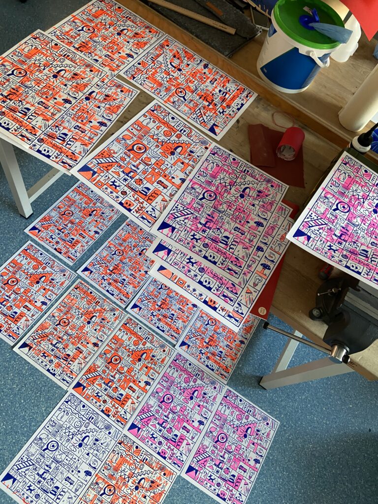
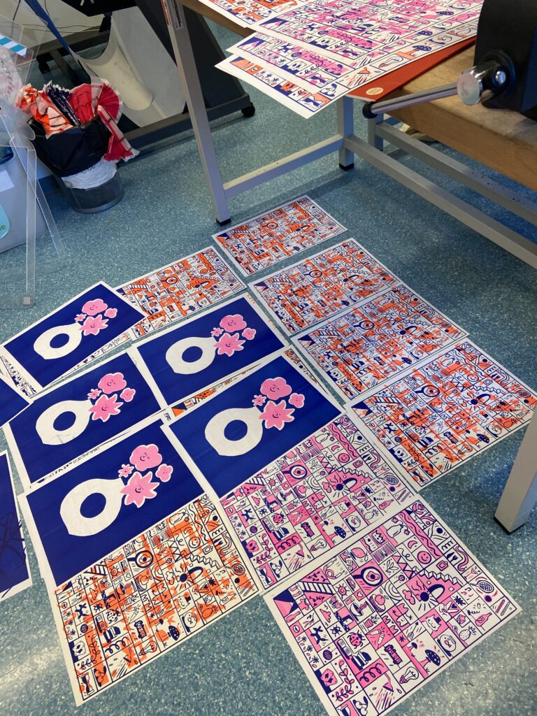
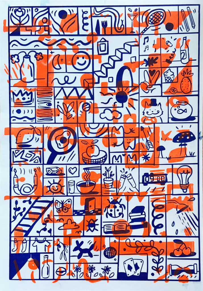
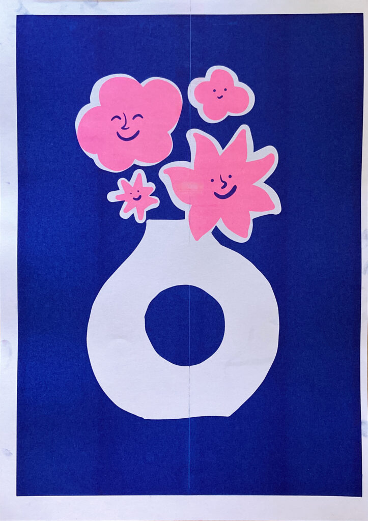
Wie im letzten Semester beschrieben, habe ich mich mit Risographie auseinandergesetzt. Hier habe ich ebenso mit Julia Schimautz gesprochen, die sich mit Riso und einer Kombination mit Animationen beschäftigt. Da ich zuvor noch nie Riso gedruckt habe, habe ich zwei Illustrationen erstellt und diese versucht in verschiedenen Farben zu drucken. Primär ging es für mich darum mich mit der Technik vertraut zu machen und einen Einblick in die Dateivorbereitung, Erzeugung von Eindrücken, sowie die mögliche Farbwelt zu machen. 

Da der Druckprozess am Risograph sehr schnell möglich ist, ist eine Integration mit digitalen Mitteln mit dieser Drucktechnik sehr gut möglich! Besonders ist er vor allem auch durch seine intensiven Farben, welche durch viele andere Drucktechniken nicht erzeugt werden können.

Lighting in exhibition design

Lighting is an integral part of an exhibition. Effective use of lighting makes your exhibition  more visible and sets the ambiance of your stand space. You have likely seen examples of these whenever you’ve visited stores and cafes.

David Dernie defines lighting as “A vital part in the visitor’s experience as it affects the way in which an exhibition structure is perceived, the effectiveness with which it communicates, the rendering of form and color, and the legibility of graphics.”

As an exhibitor, you need to be aware of the best lighting practices such as which are will work best with lights, their level of illumination, and light distribution. You could have a word with your exhibition stand builders as they have a better idea of where to place lights and create the right impression as per your brief.  For example: if you choose a non-even distribution of lighting, then it might help you create a relaxed space. While if you have uniform lighting, it will help in making your space look more capacious.

Lights not only increase visibility, but it also helps in setting a mood. Therefore, while planning for an exhibition, you need to reflect on the atmosphere you want for your stand. Whether you need to create a warm and isolated atmosphere or have a modern and public feel to it, based on it, you would decide the kind of lighting you want for your exhibition stand. For a warm and private look, you could have dim and warm lighting, whereas, for modern and lively appeal, you could go for bright and cool lights. Working on the right lighting solution will help in giving a professional and impressive appearance to your exhibition stand design.

Did you know that people choose to look at walls that are well-lit. A research shows that people are usuallu attracted to spaces with wall luminance.

Effective lighting is about creating a focus. It is about making sure that certain aspects of your exhibition stand design pop out and draw people’s attention. At its most basic, it’s attracting people to the light.

If you think about it, when working over your creative ideas for exhibition stands, every visual aspect is carefully considered, because the intention is to attract attendees and convey the brand message to them instantly. But exhibitors often underestimate lighting and don’t consider it an essential design element, until they reach the venue.

At the fairground, they realize that the lighting for their stand space is not enough, and now their graphics are not being seen. Even if you plan to hire stands for your show appearances, having extra lighting is always better than less lighting. You can always remove extra lighting, but it isn’t very easy to add more during the exhibition.

Well-placed light sources improve the look of your graphics. They enhance the presence of your exhibition stand at the trade show. Lighting can be quite helpful to guarantee that visitors will automatically see the products or marketing messages you wish to stand out. Several studies in user design have shown that people are naturally attracted to bright spaces, especially walls that are well-lit.

So your brand presence will benefit immensely if your exhibition stand incorporates lighting as a part of its theme and stand design.

Lighting and color in exhibition design

   Lighting and color play a very important role in our lives. They can make the space both harmonious and chaotic at the same time. They have a great influence on a person’s thoughts, can change an action or, on the contrary, cause an action. Color and lighting can irritate or soothe the eyes. They can increase yours blood pressure or vice versa decrease your appetite.

“Color! What a deep and mysterious language, the language of dreams.” Paul Gauguin

Indeed, to imagine our life without colors and lights. That’s all If we let it go, it would be difficult for us to distinguish things from each other, ours would be lost sensations, etc.

Do you know what color means in your life and what it would be like for you?

Since color has energy, it is important to know which colors are right for you A living room surrounded by colors that make you feel calm. We can use color combinations to our advantage and get what we want Result. The main thing is to choose them correctly and carefully.

Scientists thought about color combinations centuries ago, and Isaac Newton He was the first to organize colors on a circle, he depicted this circle in 1666, while The introduction of Newton’s color wheel provided the basis for the development of color theory. The color itself In 1490, Leonardo da Vinci used and developed the theory of E. G. Ferta Circle (wheel) theory.

 3 combinations of colors are distinguished:

(1) primary colors,

(2) secondary colors, and

(3) Intermediate colors.

 People usually prefer one or at most two or three colors. That Depending on where we use these colors – when choosing clothes, interior or car. The pleasant or unpleasant feeling that a certain color gives us can change over time change over time. However, the color we prefer It provides extensive information about our character and emotional state.

White – White represents purity, smoothness, tenderness, neutrality, sterility. and youth.

Gray-is a color between black and white. It can express elegance, Cleanliness, respect, stability, tenderness. Often it is associated with pessimism, boredom is associated with.

Black – associated with darkness, secrecy, mystery.

Pink-is the color of life, pink is unacceptable for pragmatic people.

Red – Red is an intense, passionate color.

For Goethe, there were two primary colors, although unlike others, their white and He did not call black, but light and darkness. All other colors for him It is between these two conditions that the darkness or lightness of the color is placed It is measured by proximity or, conversely, distance.

“Color itself is the degree of darkness” – Johann Wolfgang von Goethe

Goethe believed that each color had its own corresponding character and therefore Researched the psychological impact of individual colors on human emotions and mood.

Yellow is the closest color to light and its own It brings gentle and exciting sensations with its bright, flaky nature. However, on the other hand, if it is in a dark tone, for example, It turns sulphurous, leaving an unpleasant effect.

Blue has a peculiar, rather vague influence on people on the mood and it is placed between excitement and relaxation. Often Objects seen through blue glass are gloomy and melancholy appears. However, if the blue color is light, in particular, marine or It turns into green tones, then it gives pleasant sensations gives birth to.

Now something about lighting. Along with the color of the lighting, different types of light flow are used in the interior design. This allows to visually divide the building into separate zones. There are three types of flow: precise, when the lighting has a local character and is concentrated in a certain section , Dispersive, with a wide range of lighting that covers the largest part of the building, Reflected: This kind of flux is reflected from surrounding objects and illuminates a specific area. Due to its soft and diffuse nature, it is better perceived by the human eye. By combining different types of lighting and color, a unique effect is obtained and a special atmosphere is created.

 Lighting can visually increase, emphasize or hide some elements. The optimal distribution of lighting allows you to reduce or increase the space, create a cozy atmosphere and create the desired mood for a person. Lighting in modern design combines with style. Warm colors are used for classic decoration, and cold colors are used for modern or hi-tech. The most important characteristic of any lighting is color. The variety of shades depends on the light source. For example, if there is no violet and blue rays in the light source, the human eye perceives blue and green objects in its light in a completely different way than in natural lighting.

Packaging – Riso Part 3.

Bei meinem neuesten Projekt habe ich eine Kaffeebohnenverpackung mit dem Riso gedruckt. Mein Fokus lag dabei auf einem Blauton, der die Charakteristik des Kaffees widerzuspiegeln. Die lebendige Farbe verlieh der Verpackung eine ästhetische und moderne Wirkung und eine gewisse Einzigartigkeit.

Leider war auch bei diesem Projekt die Farbhaftigkeit nicht so gut und vor allen an gefalzten Stellen ging die Farbe ab.

Die Farbhaftbarkeit spielt bei Kaffeebohnenverpackungen eine entscheidende Rolle, da sie verschiedenen Umwelteinflüssen ausgesetzt sind. Kunden sollen die hochwertige Gestaltung und das attraktive Design der Verpackung genießen können, ohne dass die Farben verblassen oder abfärben.

Gedruckt wurde auf einem 300m/g2 Aquarellpapier, ich denke mit einem dünneren Papier kann man bessere Ergebnisse erzielen. Leider war teilweise die Farbe nicht optimal verteilt.

Das Drucken einer Kaffeebohnenverpackung mit dem Riso ermöglichte mir eine kreative Freiheit und ein einzigartiges Endergebnis. Es ist eine großartige Möglichkeit, das Produktdesign zu individualisieren und den Kaffee auf ansprechende Weise zu präsentieren. Indem man die Farbhaftbarkeit sorgfältig berücksichtigt und die geeigneten Maßnahmen ergreift, können Verpackungen entstehen, die nicht nur visuell ansprechend sind, sondern auch eine langanhaltende Farbintensität bieten.