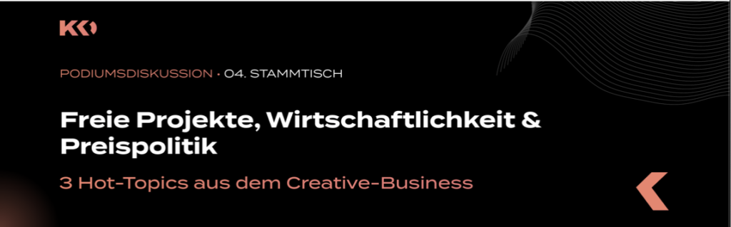
Impuls 2. – Gathering Inspiration – Spiderman: Across the Spider-Verse

Grungy aesthetics, sketchy lines and colouring outside those lines. All of my favorite stylistic choices which I consider implementing in my ongoing art career. The movie Spiderman: Across The Spider-Verse features ground breaking animations, style changes and served as a huge inspiration to me and many others. In the following few points are summarised points on how this particular art style an animation was achieved:

  • Art Style Fusion: Seamlessly blends various animation styles, from hand-drawn to computer-generated, in a single film.
  • Color and Texture Experimentation: Disregards traditional color schemes and textures, utilizing bold colors and diverse textures to represent the multiverse.
  • Frame Rate Variation*: Plays with different frame rates within scenes, creating a dynamic and energetic feel.
  • Aspect Ratio Changes: Shifts aspect ratios between scenes to signify shifts between different dimensions and realities.
  • Innovative Typography and On-Screen Text: Integrates typography and on-screen text creatively into the visual storytelling.
  • Non-Linear Storytelling: Explores the concept of multiple universes and versions of characters, offering a non-linear narrative structure.
  • Experimental Transitions: Employs inventive transition techniques, including comic book-style panel transitions and glitch effects, diverging from standard smooth scene changes.

I want to outline the Frame rate variation because I think this is one of the more essential techniques which I will commonly practice in the further development of my project.

Frame Rate Variation*

  1. Animating on Ones: Some sequences were animated traditionally on ones, where each frame is shown for a single frame duration. This technique is used for fluid and detailed motion, especially in action-packed scenes or moments requiring smooth movements.
  2. Animating on Twos or Threes: Other sequences utilized animating on twos or threes. When animating on twos, each drawing is shown for two consecutive frames, resulting in a slightly more staggered or stylized motion. Threes extend this to three consecutive frames, giving an even more distinct and choppy appearance.
  3. Mixed Frame Rates: The film cleverly combined these different frame rates within scenes, alternating between sequences animated on ones, twos, or threes. This variation created a dynamic visual rhythm, emphasizing specific actions or intensifying the atmosphere of certain scenes.

For more details I highly recommend watching the following 2 videos:

Also here is a rather fun video of another artist implementing the Spider-Verse approach into his little animation:

Inspiration

There are so many styles to be inspired from, but I am particularly fond of one aesthetic. The grungy, punk fanzine inspired look for the character Hobie (As you could’ve guessed form the first few lines of this blog entry).

Hobie Brown, known as the Prowler in Spider-Man lore, shares an intriguing link to punk fanzines in some versions of the character. He’s portrayed as a creator of these DIY publications, revealing his artistic side beyond being a superhero. This connection implies his potential involvement or association with the expressive, underground realm of punk culture. Fanzines were pivotal in this culture, serving as avenues for unconventional expression, sharing alternative ideas, and spotlighting underground music, art, and lifestyle. Depicting Hobie as a fanzine artist hints at his possible connection to the rebellious and creative world associated with punk.

Punk Fanzines?

Punk fanzines display a gritty and unpolished style that resonates with the rebellious spirit of the punk movement.

These DIY publications are distinctly handmade, often using basic materials like photocopiers, cut-and-paste techniques, and hand-drawn elements. The layouts appear chaotic, featuring asymmetrical designs, bold fonts, and irregular lettering that convey a sense of urgency and spontaneity.

The visuals within these fanzines are provocative, showcasing raw and gritty imagery such as unpolished photographs, rough illustrations, and photocopied graphics. The content itself is daring, offering radical art, anti-establishment messages, underground music reviews, and personal anecdotes.

With intentionally low-quality printing, the fanzines carry a raw, grainy texture, often containing smudges and uneven ink distribution. Yet, these imperfections are embraced, adding to the authenticity and DIY aesthetic of punk fanzines.

In essence, the rough and grungy aesthetic of punk fanzines captures the untamed energy and counter-cultural defiance that define the punk movement.

There are multiple lessons which this movie has taught me, story wise I can’t say much, but aesthetically and technically there is a whole lot to unravel. After my initial watch I have gone over the parts I have liked in particular and viewed the sections frame-by-frame. It was quite interesting to see some imperfections in resolution, simple color changes or whacky doodles contribute so much to the whole scene. On its own some frames don’t seem truly spectacular, but given the fact that the average human being won’t go over frame-by-frame for an almost two and a half hour long movie, it is fair to say that every frame could be a poster. This is what I want to achieve, or at least try to achieve in my project.

Impuls 2 – »Explained: Unser Kopf. Kreativität«

»Explained: Unser Kopf« ist eine Netflix Dokumentarreihe die sich mit unserem Kopf, Geist und unserem Gehirn beschäftigt. In dieser Folge handelte es von Kreativität, wie wir sie trainieren können und von was sie abhängt. 

Wir neigen dazu zu denken, dass Kreativität und kreative Menschen eine besondere Gabe haben, die andere nicht besitzen. Jedoch wird in der Serie deutlich, dass Kreativität teilweise erlernbar und ausbaufähig ist. Es gibt Wege, durch die wir unsere Kreativität trainieren und ankurbeln können.

Der Musiker, Musikproduzent, Musiktheoretiker und bildender Künstler Brian Eno hatte zum Beispiel meist einen Stapel Karteikarten mit sich auf denen verschiedene Begriffe oder Phrasen notiert waren, um neue Denkweisen anzuregen. So stand auf den Karten zum Beispiel »Lebenswichtige Verbindung, Gartenarbeit – nicht Architektur oder Wasser«. Diese Übung soll helfen anders zu denken damit man sozusagen einen Gedanken pflanzt und sieht, wie er wächst, anstatt ihn in Bahnen zu lenken und durchzuplanen. 

Man hat auch versucht Albert Einsteins Gehirn zu untersuchen, um Kreativität und Denkprozesse besser nachvollziehen zu können. Jedoch sah sein Gehirn ziemlich normal aus, es konnten keine fassbaren Schlüsse daraus gezogen werden und auch wenn man etwas erkannt hätte, hätte dies nicht bedeutet, dass bei jedem Menschen der ähnliche Hirnstrukturen aufweist die gleiche Genialität zum Vorschein gekommen wäre. Kreativität ist so komplex, dass man sie nicht in einer Hirnregion verorten könnte. Es ist ein Mythos, dass sich links alles Logische und rechts alles Kreative abspielt. Vielmehr geht es bei Kreativität darum, dass verschiedene Hirnregionen miteinander kommunizieren.

Man kann das Gehirn jedoch in zwei Zentren teilen, die maßgeblich in kreativen Prozessen beteiligt sind. Das Ruhezustandszentrum und das Exekutive Kontrollzentrum. Das Ruhezustandszentrum ist dafür zuständig sich nach innen zu fokussieren, Tag zu träumen und Gedanken freien Raum zu lassen – es kann somit spontan neue Verknüpfungen herstellen. Das Exekutive Kontrollzentrum ist hingegen zuständig Dinge zu beurteilen und bewertet ob etwas gut ist. Bei kreativen Menschen sind diese Netzwerke gut miteinander vereint und kommunizieren miteinander. 

Kindliche Vorstellungskraft weist meist vor allem Aktion des Ruhezustandszentrums auf, in der Ideen generiert werden und man ständig Neues probiert. Jedoch fehlt die kulturelle und gesellschaftliche Erfahrung, um diese Ideen zu filtern und zu bewerten. 

Es geht viel mehr, um vorhandenes zu kombinieren und Neues zu schaffen, anstatt immer zwanghaft vollkommen neue Ideen zu kreieren. Auch Misserfolge helfen, um zu filtern was gut ist und daraus zu lernen. Perfektionismus bringt einen nicht immer auf den richtigen Weg Kreativität freien Lauf zu lassen. Manche Menschen, die viele Dinge ausprobieren machen sich Sorgen in nichts wirklich gut zu werden, jedoch hat sich herausgestellt, dass diese ziellose Neugierde die perfekte Grundlage für Kreativität ist. Es ist wichtig sich einen Erfahrungsschatz aufzubauen und Dinge, die vielleicht im ersten Moment nicht miteinander verknüpfbar sind weiterzuverfolgen und Ideen zu generieren. Jede Erfahrung stärkt weiters die Wege Dinge zu betrachten und sie miteinander zu kombinieren. So beeinflussen sich unterschiedliche Projekte auch gegenseitig und sind vielleicht für andere Bereiche nützlich, auch wenn es im ersten Moment nicht so scheint. 

Impuls 4: Kreativkammerl

Das Kreativkammerl Österreich ist der Treffpunkt für Personen die in der Kreativbranche tätig sind. Hier kommen Menschen regelmäßig zusammen, um sich zwanglos auszutauschen, Ideen zu teilen und in Gespräche einzutauchen.

KKO wird von vier Personen der Kreativbranche veranstaltet, die es sich zur Mission gemacht haben, allen Kreativen einen echten Mehrwert zu bieten. Ihr Ziel ist es, eine Plattform für informelle Diskussionen zu schaffen. Hier können sich Menschen ohne den formalen Druck und Zeitstress des Projektsettings austauschen und gemeinsam einige Stunden verbringen. Die Initiative richtet sich nicht nur an Berufstätige, sondern auch an junge Menschen in Ausbildung. Ziel ist es, ihnen Einblicke in die Berufswelt zu ermöglichen und Kontakte zu Ansprechpartnern zu knüpfen, die ihnen bei ihrer beruflichen Entwicklung von Nutzen sein können.

Als großer Fan des Kreativkammerls war ich bereits zum 4. Mal dabei Zu Beginn gibt es jedes mal einen Workshop, Vortrag etc. Beim letzten Kreativkammerl des heurigen Jahres gab es eine große Paneldiskussion.

Die Teilnehmer waren:

  • Nino Groß (Fifteen Seconds)
  • Paul Siegl (Heldentheater)
  • Patrick Haas (En Garde)
  • Wolfang Niederl (Moodley)
  • Fedja Burmeister (ehemaliger Jung von Matt Geschäftsführer)
  • Markus Pirker (Simplease)

Das Themen der Diskussion waren zum Beispiel: Sollten Agenturen ihre Preismodelle und Preise transparent offenlegen? Welche Auswirkungen hat die Preispsychologie auf den Kreativmarkt? Besteht überhaupt noch die Möglichkeit, mit freien Projekten wirtschaftlich zu arbeiten, oder führt dies nur zu einem ruinösen Wettbewerb auf dem Markt und gefährdet die Existenz der Unternehmer?

Spannend war es hier verschiedenste Meinungen von erfahrenen Menschen der Kreativbranche zu hören und auch mit einigen hilfreichen Tipps nach Hause zu gehen.

Impulse #7 – The Local Library – Part 2

The Art and Science of Interface and Interaction Design

In this book experts in the field of interaction design and interactive art outline currently discussed topics in their research. One chapter I would like to focus on is called “Interfaces in Public and Semi-public Space” by Joachim Sauter one of the founders of ART+COM.

Expert Interface vs Non-expert interfaces

According to Joachim Sauter, ART+COM has only realized a small number of interfaces, as the focus lies on installations in the context of mediating information. For example, interactive installations in museums, trade fairs or in an artistic context. These places can also be called public or semi-public spaces and require the user to understand the interface within a short time. As often by the visitors used only once, the interface needs to be intelligent, simple and functional without giving the feeling of banality.

Joachim Sauter presented a selection of realized projects and outlined the importance of prototyping and their ambitions of creating new paradigms of access to information. Furthermore, he noted the importance of making installations endurable, weatherproof and safe from vandalism.

Innovation Is Substituted by Quality

Unfortunately, in the 1990s projects often were acknowledged just because of their innovation and fascinating interface technology – the conveyed content was seen as secondary. However, today the way we see interactive installations has changed. Nowadays, they get acknowledged for their quality of concept and design, quality of experience they evoke, the information mediated by them and their utility.

“Today, you no longer talk about a handle as an interface to a cup (and the incorporation of content this involves), but you talk about the formal and functional qualities of the cup as a whole.” – Joachim Sauter

Media Art Installations – Preservation and Presentation

In this Book, Tiziana Caianiello wrote a chapter with the following title:

“What Is an Interactive Installation? An Attempt at Clarification”

According to her, “interaction” is a fundamental concept in sociological and can be seen as human actions carried out in relation to each other, implying interpersonal communication.

In the 1960s this term was also used by computer scientist to describe the ability of a computers to react to user input within a certain time (delay). While the concept of the interfaces still was based on the model of interpersonal communication, the definition of the term “interaction” shifted to Human-Computer-Interaction (HCI).

Tiziana Caianiello, defines the term “interaction” strictly as human-human or human-medium-human communication, while “interactivity” as human-machine communication.

Furthermore, she states, that human-machine communication should not be equated with interpersonal communication, as it can’t actively construct meaning.

Art Installations should therefore be categorized according to their service they deliver to the visitors.

A second definition from “The Variable Media Network” includes additional participative art forms:

“While the word is most commonly applied to electronic media such as computer-driven installations and Web sites, interactivity also describes installations that allow visitors to manipulate or take home components of a physical artwork” (Permanence Through Change 2003, p. 126).

While most of the cited authors try to define interactivity with a clear definition, Quiring and Schweiger see the term more as gradually classifiable.

Therefore, the author herself presents in cooperation with Julia Giebeler a model for analyzing the interactive characteristics of installations in a qualitative and quantitative way.

The model is called “Model for Registration of Interactive Installations” and can be found at the end of Tiziana Caianiello’s chapter.

Assessment of Master Thesis: “The Effect of Spatial Audio on Immersion, Presence, Physiological Response In Game’s” 

Author: Jacob Junken Larsen and Marc Pilgaard
Supervisor: Martin Kraus
University: Aalborg University in Denmark
Department of Architecture and Media Technology

Level of design:
The thesis provides information about the experiment design used in the study. It mentions that three pilot tests were conducted to optimize an experiment and eliminate design flaws. These trial tests helped them understand how people answered questions and collected data. In the final design, participants wore a virtual reality headset and played a game in a virtual world where they had to find and collect glowing orbs. The goal was to make sure people didn’t feel sick during the simulation, and they also added a system to make the game challenging. The thesis also mentions using surveys to measure how present and engaged people felt. In summary, the thesis shows a careful and step-by-step approach of the experiment, considering potential issues and making improvements based on the trial test

Degree of innovation:
I could not find much information about the innovation in the thesis. The document primarily focuses on the methodology and findings of the study, including the use of questionnaires to measure immersion and presence in virtual environments.

Independence:
The research stands out for its independence, especially with the survey aimed at understanding how spatial audio affects the player’s experience.

Outline and structure:
The author has drawn a good outline. The structure is divided into: Introduction, Previous Work, Objectives, Experimental Design, Data Extraction, Results, Discussion, Conclusion, Future Wok.

Scope of the work:
The main scope of work talks abour how various ways of creating sound affect accuracy on perceiving space and how often unexpected sound events happen. It also checks if our feelings and emotions have any influence on these effects. It looks into how sound is used in video games, and how 3D audio affects different environments.

Degree of Communication:
The thesis communicate clearly the issues when it comes to designing sound for VR experience. It uses clear language and answer the research question, which focuses on investigating the effects of spatial audio on player experience, in terms of immersion and presence

Orthography and accuracy:
The thesis appears to be well-written, when it comes to orthography and accuracy. No issues with spelling or grammatical issues, clear headings and references. 

Literature:
The choice of literature, which consists of 94 positions supports very well the topic of immersive audio in VR and game experience. 

Impuls 1. – Evaluation of the Master’s thesis – “Personal Sound Branding”

Authored by Elisabeth Hacker, Mentored by Astrid Drechsler

This evaluation was a part of Ursula Laggers course Proseminar Master’s Thesis. I have used it as an Impuls blog post because of a critical insight it has provided to my research. The point being that the written master’s thesis is not a plain boring word document, but more of a stylised or self branded book which showcases the research behind your final creation. It should truly be a self reflection of yourself from head to toe.

A.

1. Problem/Question: This study delves into the challenge of merging unique 3D animations with a personalized sound style for Marie Dokter’s brand. Its goal is to develop an accessible sound design that seamlessly integrates with her animations.

2. State of Research: There’s a noticeable gap in research exploring the fusion of sound elements with 3D animations for personal branding. This indicates a need for a tailored sound approach.

3. Objective: The thesis aims to create a sound strategy that enhances Marie Dokter’s brand by providing consistent and adaptable audio for her 3D animations. While promising, improvements are needed, especially in usability, completeness of the audio style guide, and flexibility of the stem pack, currently in prototype status.

4. Theory Reference: This thesis focuses on establishing an original sound framework for media designers and artists, illustrated through Marie Dokter’s 3D animations. Despite a lack of prior literature, it refers to Groves (2011) as a related source, particularly concerning personal sound branding.

5. Method: The thesis methodology involves crafting sound components (Stems) and an Audio Style Guide but lacks specific details on data collection and analysis methods.

6. Material: The thesis draws from the works of media designers and artists, primarily Marie Dokter’s animations. The incorporation of references from existing literature adds depth to the research.

7. Literature: The literature covers various topics such as music theory, sound design, personal branding, usability testing, and electronic music production. While promising, a clearer connection of each source to the thesis would enhance focus.

8. Structure: The thesis is well-organized and visually appealing, adhering to academic standards for clear idea presentation.

9. Result: Test outcomes demonstrate the effectiveness of the approach, yet refinements are essential for practical use. The Audio Style Guide lacks depth, and the Stem Pack requires sound quality and flexibility improvements, currently in a prototype phase necessitating further development.

B.

Why I Chose This Work: Its professional appearance and relevance to sound and design piqued my interest. The coherent writing and visual aids made it engaging.

C.

1. Originality of the Work: This study creatively blends personal branding, sound design, and 3D animation. By integrating Marie Dokter’s works with innovative sound concepts, it explores new avenues.

2. Result of the Work: Test outcomes highlight strengths and areas for development. While the core idea holds promise, both the Sound Guide and sounds need refinement, showing the thesis’s self-awareness.

3. Presentation and External Form: Its professional appearance and readability make it appealing. The integration of visuals maintains engagement and structure.

4. Difficulty of the Task: Incorporating sound into 3D animations for personal branding requires expertise in sound, animation, and branding. The writer navigates these complexities systematically.

In summary, this work shows promise and acknowledges areas for improvement. Successfully managing such complexity demonstrates the writer’s ability to handle diverse challenges effectively.

Analysis of a Master Theses

Thinking in design: principles of design and narrative as creative music production tools by Tuppurainen, Pekka; Royal College of Music in Stockholm, Department of Music and Media Production.2012 (English)Independent thesis Advanced level (degree of Master (Two Years))

The thesis “Thinking in Design: Principles of Design and Narrative as Creative Music Production Tools” by Pekka Tuppurainen focuses on applying design principles and narrative tools to the music production process. It aims to analyze and describe musical processes where design and aesthetic principles, rather than traditional music theory, guide music production. The thesis explores these ideas through editing and mixing in music production, examining how a shift in perspective and principles can influence musical outcomes.

Level of Design

This thesis creatively uses design concepts in music production. It’s like mixing art and music to make something new and interesting.

Degree of Innovation

The idea here is really fresh. The author combines storytelling and design ideas with making music, which isn’t common.

Independence

The writer seems to think for themselves, pulling in different ideas and techniques from various places to create a unique approach to music.

Outline and Structure

The thesis is well-organized, sort of like a well-planned journey. It starts with an introduction, goes through the main ideas, explains how everything was done, and then wraps up with what was learned.

Degree of Communication

The way the thesis is written makes it easy to understand, even though the ideas are complex. It’s like having a friend explain a difficult concept in simple terms.

Scope of the Work

The thesis covers a lot. It’s not just about making music but also about how design and storytelling can change the way music is made.

Orthography and Accuracy

The writing is neat and clear, without mistakes. I assume the author really took care to make sure everything was just right.

Literature

The thesis shows a lot of research. It seems like the author read a lot of books and articles to build their ideas.

Stakeholdermap and What is this

As I want to create a VR experience I examined the following stakeholders:

Young People: As the VR experience will be mainly targeted for young people they would be one of the primary stakeholders for the product. Right after that there would be parents/guardians who will be directly affected through the young people.

Government: The government would be one of the stakeholders in terms of new laws and regulations. Also the chamber of commerce would be a party of interest.

Schools: Another important stakeholder will be schools as they would act as one of the main parties where young people can try out the experience. Educational institutions and educational fairs for instance BeSt could also carry out such experiences.

Employers: Companies are from interest in providing resources and gaining new apprentices and employees. Career Counselors and NGO’s e.g. Bildungsinfo Graz would also benefit from the application.

Stakeholder Map:

For the task: What is this I chose VR Goggles as my product for the task

What is this: VR Goggles

  • What is it for
    • Creating experiences
    • To put it on
    • To immerse
    • To play, watch
  • How did it get there
    • By delivery
    • By carrying it
    • By ship/plane
  • who uses it?
    • People who like to try something new
    • People who don’t get motion sick
    • People who like to immerse themself
    • People who like to play/watch
    • People who like to gather experience
  • What does it do?
    • blinking
    • playing
  • When is it used?
    • Whenever the battery is charged
    • When it is needed
    • When people want to get entertain
    • When people want to get help
    • When people want to research
    • When people want to educate themselves
  • What is it made of?
    • Plastic
    • Metal
    • Aluminium
    • Ruber
    • Fabric
    • Battery
  • Who made it?
    • a company in e.g. China
    • a worker
    • researcher
    • designer
    • software programmer
  • Why does it exist?
    • For “help” purposes
    • For entertainment purposes
    • For research purposes
    • For educational purposes

Evaluation of masters thesis: “Young people and news apps: how attractive is the existing offering for 14 to 18-year-olds?” by Katharina Sunk MA (2014)

To summarize the work of Katharina Sunk i’d like to give you a short overview of her thesis: The text explores the significance of young adults as future decision-makers and their lack of interest in political awareness despite the lowered voting age. With smartphones being an integral part of daily life and information easily accessible, the question arises regarding the attractiveness of news apps in the Austrian media market for adolescents (14-18). The work emphasizes the role of mass media and the growing importance of smartphones for knowledge dissemination. In the empirical phase, six adolescents tested news apps from “Heute” and “Die Presse.” The results indicate that appealing news apps for adolescents need to provide both information and entertainment. Quick navigation to relevant information is crucial, a requirement not adequately met by Austrian news apps. Therefore, the available selection is considered unattractive for adolescents (14-18).

I would like to judge said work according to several criteria:

Level of design:

The thesis exhibits a well-structured design with clear sections, including an introduction, background, research questions, theoretical framework, empirical study, and conclusions.

Degree of innovation:

The thesis introduces an innovative perspective by exploring the intersection of youth engagement, news consumption through apps, and the role of smartphones. The focus on the attractiveness of news apps for adolescents is a unique angle.

Independence:

The thesis demonstrates a degree of independence, especially in the formulation of research questions and the exploration of the relationship between youth, media, and news consumption. Also the empirical approach shows a big load of independence when it comes to implementation.

Outline and structure:

The thesis follows a logical and cohesive structure, progressing from the background to the research questions, theoretical framework, empirical study, and conclusions. This structure aids in understanding the research flow.

Degree of communication:

The thesis effectively communicates all central issues, research questions, and findings. It uses clear language to convey complex ideas, making it accessible to a broad audience.

Scope of the work:

The thesis has a specific scope, focusing on the attractiveness of news apps for youths aged 14 to 18 in Austria. It appropriately delimits the study to this demographic, providing a targeted analysis.

Orthography and accuracy:

The thesis appears well-written, with proper orthography and accuracy. There are no apparent issues with spelling or grammatical errors but a good style of citation.

Literature:

The thesis references studies and literature to support its arguments, demonstrating a research-oriented approach. It incorporates theoretical concepts and compares existing studies to contextualize the research problem. Sunk mentioned a broad spectrum of online and offline-sources. 

Impuls 3: Green Panther

Der „Green Panther“ ist der steirische Landespreis für kreative Kommunikation, bei dem die Verleihung jedes 2. Jahr stattfindet. Kreative Personen und Agenturen können hier in 13 verschiedenen Kategorien ihre letzten Kundenprojekte einreichen. Wer von einer Fachjury nominiert wird, wird bei der Green Panther Verleihung vorgestellt und muss sich dann gegen die anderen Nominierungen durchsetzen, um einen begehrten Green Panther Award in Bronze, Silber oder Gold zu bekommen.

Die diesjährige Feier des 33. Green Panther fand am 23. November in der Seifenfabrik statt und stand unter dem Motto “Thanksgiving”. Es gab 270 Einreichungen von 93 Agenturen und Kreativen, darunter 40 Newcomer. Alle Nominierten Arbeiten kann man im Designforum Steiermark Pop-up bis 9.12.2023 sehen.

Zusätzlich bietet der Green Panthereine ideale Plattform für Networking in der Werbebranche. Auf diesem Event treffen sich Gleichgesinnte, tauschen Ideen aus und knüpfen wertvolle Kontakte für zukünftige Projekte und Kooperationen. Die entspannte Atmosphäre des Abends schafft den optimalen Rahmen, um sich mit Branchenexperten zu vernetzen und das eigene berufliche Netzwerk zu erweitern.