Wenn man sich auf eine Forschungsreise begibt, gibt es oft Momente der Unsicherheit. Kürzlich befand ich mich an einem Scheideweg in meinem akademischen Bestreben, Augmented Reality (AR) im Bereich der Kunst zu erforschen. Da ich unsicher war, ob ich diesen Weg weitergehen sollte, suchte ich Rat und hatte ein anregendes Gespräch mit Gabi Lechner, einer Mentorin, deren Erkenntnisse von unschätzbarem Wert waren.
In unserem Gespräch äußerte ich meine Bedenken, mich weiter mit der AR-Forschung zu befassen, und verwies auf mein schwankendes Interesse an dem Thema. Gabi bot mir mit ihrem Blickwinkel und Erfahrung eine neue Perspektive. Sie nannte überzeugende Gründe, warum meine anderen potenziellen Forschungsrichtungen – Illustrationen und nachhaltiges Design – vielleicht nicht die ideale Lösung sind. Der Bereich der Illustration, so betonte sie, könnte aufgrund eines früheren Hypes seine Neuartigkeit verloren haben, was die Innovation möglicherweise einschränkt. Nachhaltiges Design sei zwar faszinierend, aber es fehle auch der Funke für einen überzeugenden Forschungsschwerpunkt.
Im Laufe unseres Gesprächs kam eine neue Klarheit zum Vorschein. Wir machten ein Brainstorming und fanden einen faszinierenden Mittelweg: AR in Kinderbüchern. Dieses Konzept stellte eine aufregende Verschmelzung meiner Leidenschaft für Illustration mit dem innovativen Potenzial von Augmented Reality dar. Gabis Ermutigung rührte von der Erkenntnis her, dass die Illustration zwar ein Teil der Erzählung bleibt, aber den primären Fokus auf die AR-Technologie in der Kinderliteratur nicht überschatten würde.
Um mir einen groben Überblick über das Thema Social Media Marketing zu verschaffen, habe ich mir das Buch „Social Media Marketing. Praxishandbuch für Facebook, Instagram, TikTok & Co.“ von Corina Pahrmann und Katja Kupka ausgeliehen und gelesen. In diesem Blogeintrag möchte ich die wichtigsten Inhalte des ersten Kapitels zusammenfassen.
Während das Internet ein Informationsmedium zum Netzwerken ist, steht Social Media für schnellen Informationsaustausch. Das wichtigste Social Network ist Meta, das mit den Plattformen Facebook, Instagram und WhatsApp nicht nur im DACH-Raum, sondern weltweit Marktführer ist.
Social Media erfüllt viele verschiedene Zwecke: Menschen teilen, liken und kommentieren, sie informieren sich und kaufen sogar ein. Kleine Unternehmen können mit nur geringen Kosten die große Reichweite von Social Media für sich nutzen.
Wie können Unternehmen Social Media nutzen?
Die Plattformen ermöglichen es, ohne großes technisches Wissen eigene Inhalte zu veröffentlichen und den Kontakt mit Kund:innen und Interessenten zu pflegen. Zusätzlich kann die Bekanntheit des Unternehmens gesteigert und das Image verbessert werden. Im Gegensatz zu klassischem PR und Marketing, ist auf Social Media emotionale, persönliche und vor allem authentische Kommunikation möglich, ohne an Sachlichkeit oder Professionalität zu verlieren.
Social Media trägt außerdem zu einer Veränderung der Unternehmenskultur bei. Unternehmen lernen durch Social Media ihren Kund:innen zuzuhören und versuchen über neue Plattformen junge Mitarbeiter:innen zu gewinnen.
Social Media Plattformen
Eine Studie aus dem Jahr 2021 ergab, dass der durchschnittliche deutsche Internetnutzer in 6 sozialen Netzwerken angemeldet ist und täglich 1,5 Stunden dort verbringt. WhatsApp ist außerdem die meistgenutzte Plattform bei den Nutzer:innen im Alter zwischen 16 und 64. Danach folgen YouTube, Facebook, Instagram, Facebook Messenger und Pinterest.
Videoplattformen erfreuen sich besonders hoher Beliebtheit: 98 Prozent der 14- bis 29-Jährigen schauen mindestens einmal pro Woche Videos auf YouTube oder ähnlichen Plattformen. Sogar bei den über 70-Jährigen sind es noch knapp ein Drittel.
Social Media Marketing
Unternehmen können durch erfolgreiches Social Media Marketing ihre Bekanntheit steigern, den Kundenservice verbessern, Kontakt zu bestehenden Kund:innen halten, neue Kund:innen erreichen und im Austausch von ihnen Neues lernen.
Der erste Schritt auf dem Weg zu erfolgreichem Social Media Marketing ist die Analyse der Ziele und Zielgruppe des Unternehmens. Dies erleichtert später die Wahl der richtigen Plattformen und der Inhalte, die darauf gepostet werden sollen.
Social Media Marketing ist im Gegensatz zu anderen Formen der Werbung mit geringen Kosten verbunden und kann daher in-house betrieben werden. Dazu müssen Unternehmen Zeit investieren in die Strategieentwicklung, die Zielgruppenanalyse, die Content-Planung und in das Management der Social-Media-Verantwortlichen.
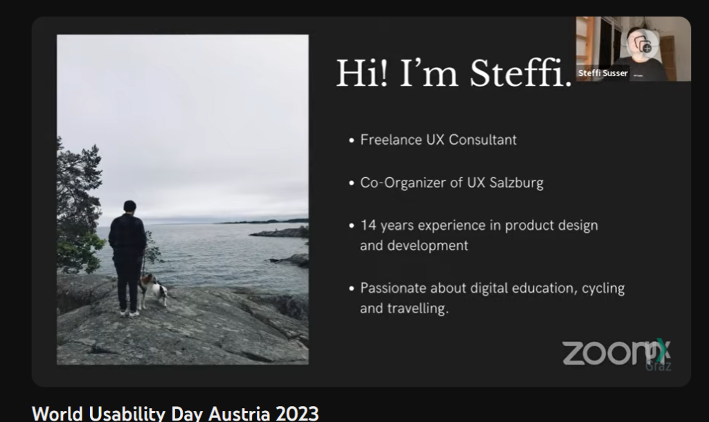
In the digital age, creating products that cater to a diverse range of users has become paramount. World Usability Day serves as an ideal platform for delving into the nuances of accessibility and inclusive design. Recently, UX Graz organized a hybrid event that featured a talk by Steffi Susser, a freelance UX consultant, who shared invaluable insights on this essential topic. Her presentation emphasized the significance of enabling users with various abilities and disabilities to navigate and interact with products, and she was just one of the experts contributing to this enlightening event. In this blog post, we will explore the key takeaways from Steffi Susser’s talk and the broader discussions that took place during this celebration of World Usability Day.
A Glimpse into World Usability Day The event, organized by UX Graz, celebrated World Usability Day, providing a platform for professionals and enthusiasts to come together and discuss the critical facets of design that revolve around usability, accessibility, and inclusion. The online format broader participation, ensuring a wide-reaching and inclusive conversation.
The Power of Inclusive Design: Insights from Steffi Susser’s Talk and More
Steffi Susser’s Talk Steffi Susser’s talk was a highlight of the event. She passionately articulated the importance of inclusive design, emphasizing that it goes beyond merely complying with guidelines. Inclusion, she asserted, is about fostering an environment where all individuals, regardless of their unique differences, feel welcomed, respected, supported, and valued. Her insights on the topic shed light on how designers and creators can go the extra mile to ensure their products resonate with users on a deeper level.
Accessibility vs. Inclusive Design Steffi Susser’s talk also drew a clear distinction between accessibility and inclusive design. While accessibility focuses on making a design usable by everyone, inclusive design takes it a step further. Inclusive design aims not only to be usable but to be so appealing that everyone desires to use it. It’s a journey that transcends the realm of objective measurements and delves into the subjective and emotional aspects of design, making it a complex and fascinating field.
The Complexity of Inclusive Design Steffi’s presentation highlighted the intertwined nature of inclusive design. She pointed to real-world examples, such as web forms, which are commonly used online but can present exclusionary challenges. These forms can deter users by requesting unnecessary data or enforcing mandatory fields. Inclusive design, in such cases, means providing a spectrum of choices and considering the multifaceted dimensions of diversity, including culture, language, ethnicity, sexual orientation, family status, religion, and spiritual beliefs.
Diversity in Design Diversity, Steffi emphasized, encompasses various facets of being human, and designers play a crucial role in promoting inclusivity. Factors such as contrast ratios, color blindness testing, resizable fonts, and support for screen readers were discussed as ways to ensure a design is inclusive. Avoiding autoplay, scrutinizing the necessity of animations, allowing sufficient time for user interactions, employing gender-fair language, collecting only essential data, and avoiding stereotypes all contribute to the overall inclusiveness of a design.
Inclusive Design: A Piece of a Larger Puzzle Steffi Susser views accessibility as “just a piece of the broader puzzle” that is inclusive design. While fundamental, accessibility does not stand alone; it is part of a holistic approach that addresses the complex and multifaceted needs of users.
Steffi Susser’s talk on inclusive design holds particular relevance for me as an interaction designer but more importanly for my research working on the master’s thesis focused on eHealthcare app solutions. Her insights shed light on the importance of creating designs that resonate with diverse user groups, a vital consideration in the healthcare sector. By delving into the complexities of inclusive design and understanding the emotional aspects that drive user engagement, we can equip ourselves with valuable knowledge to enhance the usability and appeal of our eHealthcare app solution. This understanding will not only contribute to the success of my master’s thesis but also empower me to design a solution that is genuinely tailored to the needs and preferences of a wide range of healthcare app users.
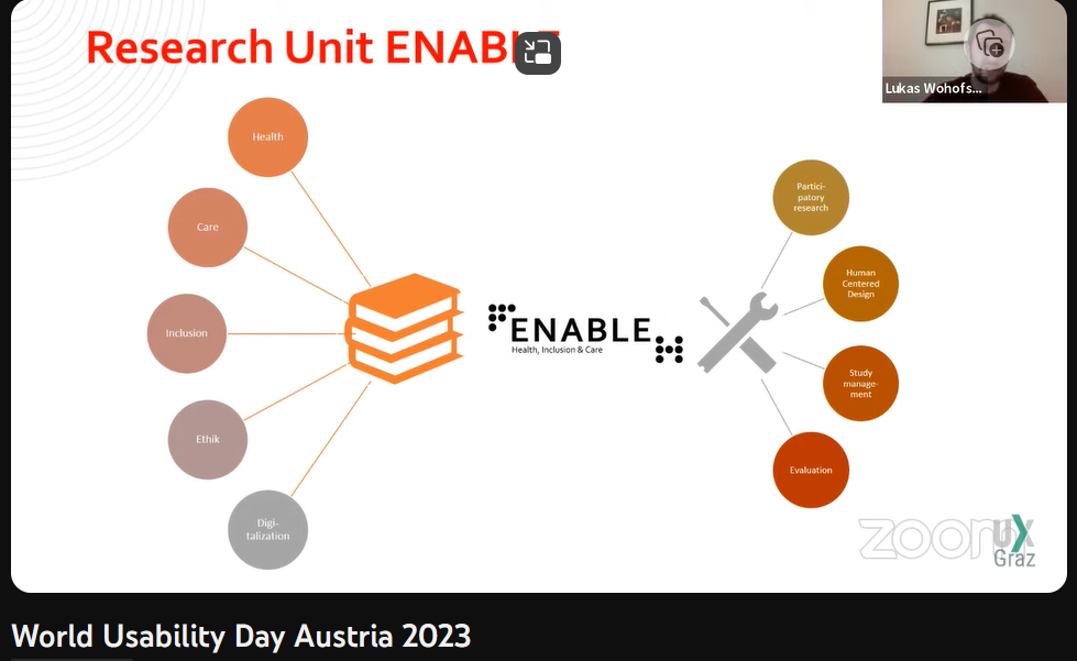
A Glimpse into Research by Lukas Wohofsky The event also featured research by Lukas Wohofsky, co-lead of the research unit ENABLE for health and inclusion care at FH Carinthia. His work, in collaboration with Daniela Kraine and Sascha Fink, showcased the application of human-centered design in research on their initiative for “inclusion through cooperation: potentials of participatory research in the field of autism”. They underscored the ethical principles and best practices for involving users, emphasizing the importance of valuing data, employing gender-sensitive research design, and building trust with research participants.
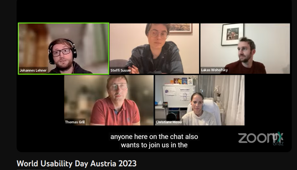
Panel Discussion on Accessibility and Inclusion The event concluded with an engaging panel discussion on accessibility and inclusion. This panel brought together experts from various backgrounds, including Steffi Susser, Lukas Wohofsky, Thomas Grill, and Christiane Moser. The discussion, moderated by Johannes Lehner, provided a rich exchange of ideas and insights, offering a comprehensive perspective on the ever-evolving field of accessibility and inclusive design.
As a light intro to my deep dive into many different new AI tools, I will start with Adobe Illustrator. I want to get Illustrator ‘out of the way’ quickly, since it is the program I will most likely get the least use out of for my master’s thesis, but I for sure wouldn’t want to ignore it.
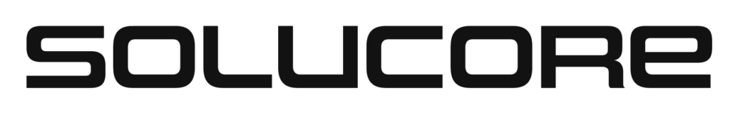
To test it out I will be putting it to the test for a client who have requested a logo for their tech startup “SoluCore” focussed on a sustainable alternative to traditional catalysts (I’m not entirely sure what they actually do but I don’t need to understand anyways). The client has provided a mood board and a sample font they like the style of:
Text to Vector Graphic
Illustrator’s new AI centrepiece and pendant to photoshop’s generative fill gives the user a prompt textbox, the option to match the style of a user specified artboard, artwork or image as well as four generation types to choose from: Subject, Icon, Scene and Pattern.
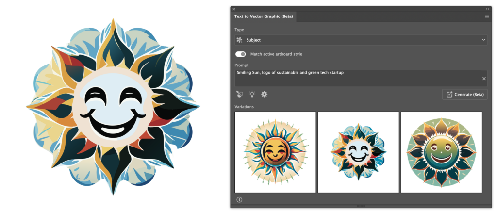
Starting with the ‘Subject‘ mode, I prompted the AI to generate a ‘Smiling Sun, logo of sustainable and green tech startup’:
The results are fine I suppose, they remind me of a similar Photoshop where I also wanted to create a smiling sun, makes sense when considering that both are trained on Adobe Stock images.
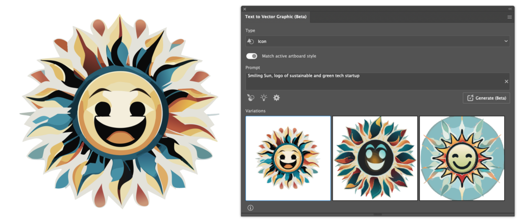
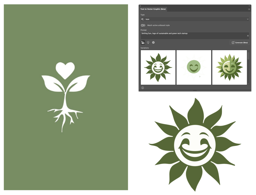
Here is the same prompt using the ‘Icon‘ generation type:
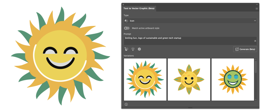
At first I was suprised at just how similar the results were to the previous results, but soon realised that the ‘Match active artboard style‘ option is switched on by default, which I find to be counterintuitive. I must say, though, that the AI did a fantastic job at matching the previous style. Having turned that off, The AI gave me the following results:
The decrease in detail and difference in style is immediately noticeable.
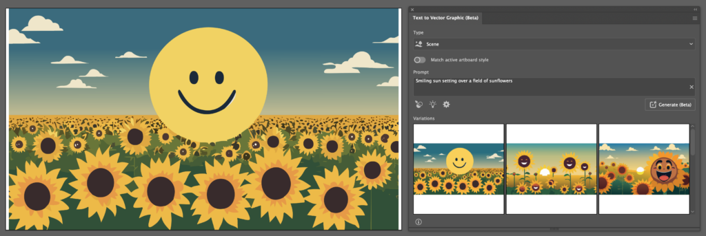
Though not remarkably applicable for my usecase, here are the results for the ‘Scene‘ option:
What becomes apparent here, is that the user can specify the region the AI should generate to using vector shapes or selections. Having specified no region on an empty artboard, the AI defaults to a roughly 512px x 512px square. Selecting the entire artboard and modifying the prompt to describe a scene to “Smiling sun setting over a field of sunflowers” gives these results:
Terrifying, I agree. Here, some inaccuracies of the AI seem to show. Not only did it leave space on either side of my selection, but also what should be a simply designed sun shows imperfections and inaccuracies. Isolating the sun and quickly rebuilding it by hand highlights this:
The artwork the AI generates usually have little anchor points, making them efficient, but these inaccuracies mean that cleanups will be needed frequently. Additionally, the AI has yet to generate strokes or smart shapes and, instead relying on vector shapes entirely.
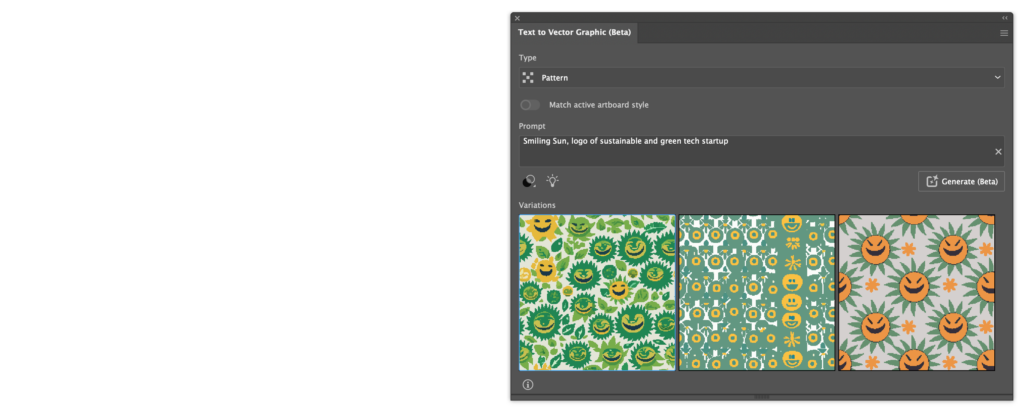
Reverting back to the “Smiling Sun, logo of sustainable and green tech startup” prompt, I used the pattern mode for the next generation:
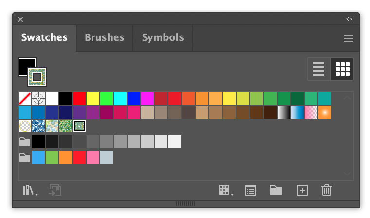
Worryingly, these results look the least promising by far, showing inaccuracies and unappealing results in general. Also, the AI does not generate artwork directly onto the artboard and instead adds the created patterns to the user’s swatches when a prompt is clicked.
Another counterintuitive behaviour, yet, I think a useful one. I personally have not been using the ‘Swatches’ feature myself but I could definitely see it being used by people who rely on Illustrator daily. With a bit of work, or perhaps different prompts, this feature could have great potential.
Next, I wanted to use one of the client’s provided sample logos and the Style picker to tell the AI to generate a sun using its style.
The color is immediately recognised and I can definitely see the shape language carry through as well.
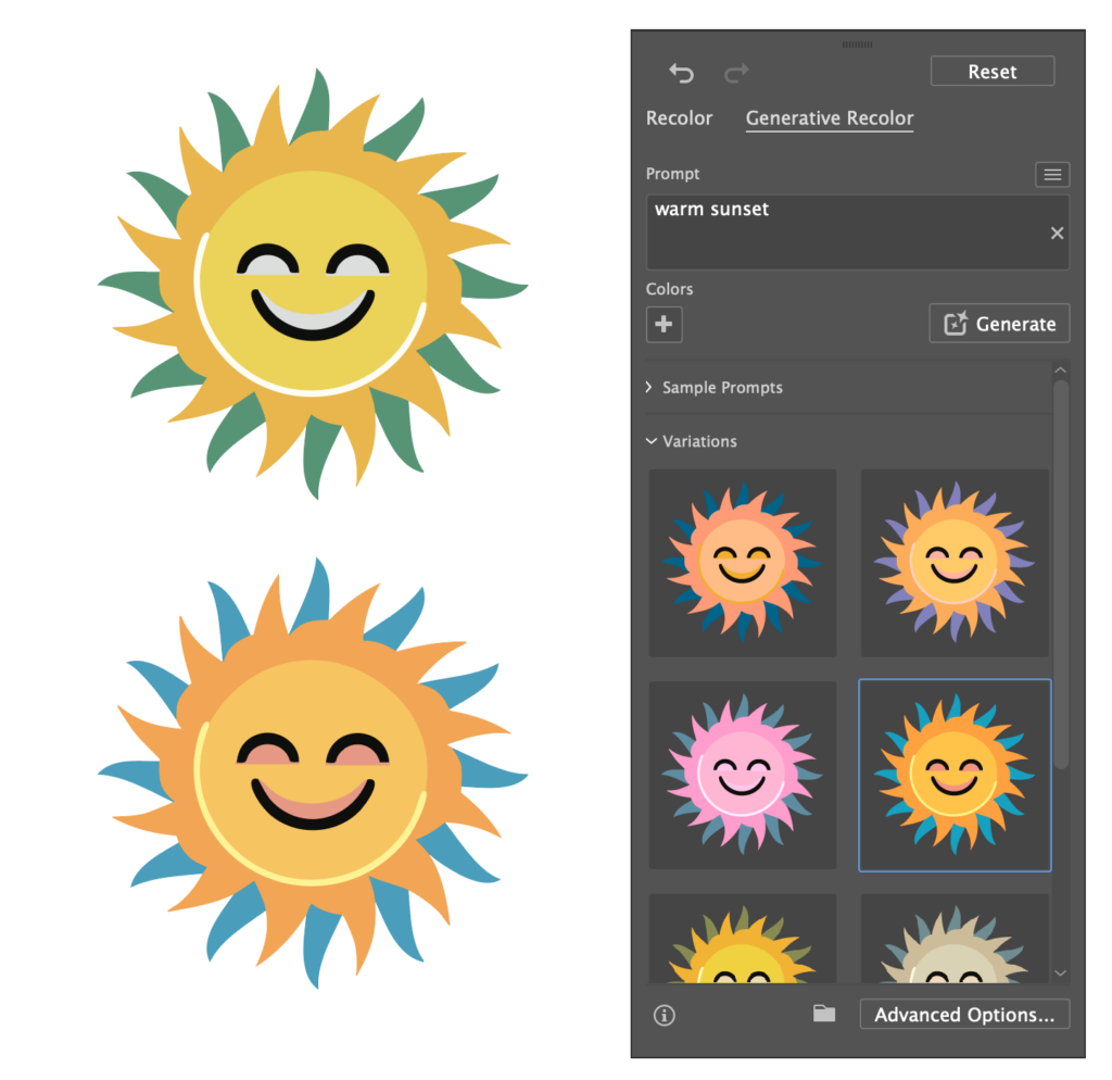
Generative Recolor
An older feature infused with AI I still haven’t gotten around to trying, generative recolor allows the user to provide the AI with a prompt, upon which Illustrater will, well, recolor the artwork. The user can also provide specific colors the generations should definitely include using Illustrator’s swatches.
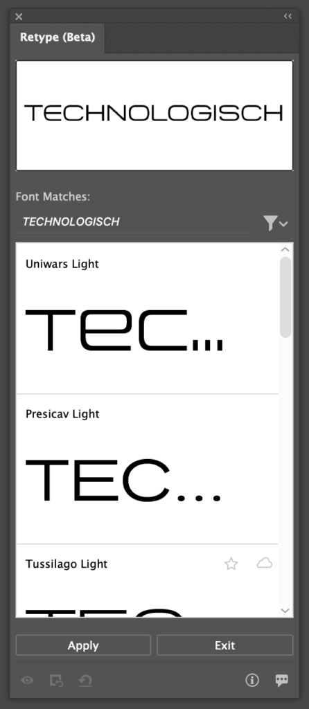
Retype
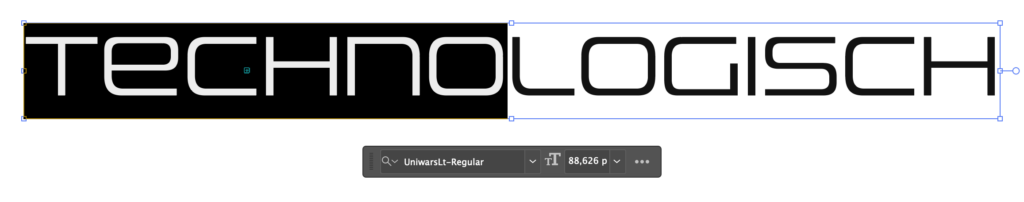
A feature I am particularly excited about, Retype, allows the user to analyse vector or rasterised graphics based on its text contents. Firefly will then attempt to match the font to an installed font as closely as possible and in optimal scenarios even allows the user to edit the text directly. For my example, I provided the AI with the font sample I recieved from the client.
The AI took surprisingly long to analyse the image, however that is only when compared to the rapid speeds of the other AI tools, we are talking about 30 seconds at most here. The AI was not able to find the exact font, but found 6-7 fonts that match the aesthetic of the original very well. In my opinion, it is not a problem at all that the AI was not able to find the exact font used in the image, since I have no way of knowing about the licensing of the original font.
After hitting ‘Apply’, the AI used the font I selected and made the text in the provided image editable. Strangely, the AI only activated the exact Adobe font it detected in the image, not the entire family, leaving it up to me to search for it manually and download the rest for more variety. This behaviour too should be changed in my opinion.
Getting a similar font to what the client requested is a fantastic feature, yet if I could wish for something it would have to be a ‘Text to font‘ generative AI in which a user could input a prompt for a style of font they wanted and have Illustrator provide suggestions based on the prompt. I’m sure Adobe has the resources to train an AI on many different font types to have it understand styles and aesthetics beyond the already existing sorting features inside of Adobe Illustrator.
It is also counterintuitive how to get back to the Retype panel, it’s very easy to lose and upon reopening the project file, the other font types are not shown anymore in the Retype panel. The user can then not select text and have the retype panel suggest similar fonts anymore. A workaround, silly as it may sound, is to convert the text to vector shapes or a rasterised image, and then run the retype tool again to get similar fonts.
Getting to work
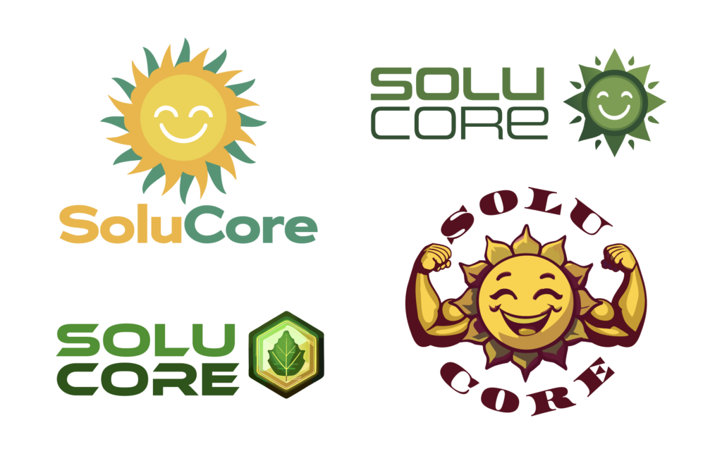
Using the aforementioned tools, I got to work on the client request for the logo of ‘SoluCore’ featuring either a smiling sun or a flexing sun. Here are the results:
Working with the AI for the first time was challenging but engaging and dare I say fun. It allowed me to get access to many different ideas quickly. However, the inaccuracy of the AI forced me to recreate some of the results, especially the ones that use basic shapes and mimic accurate geometric forms. As for the more complex results like the flexing sun, I had to have many iterations be generated until I was happy with a result. The arms looked great but the smiling sun itself was rough. Using the arms as a stylistic input for the AI led to better results. Once I was happy, there was still a lot of cleaning up to do. The generative recolor was also struggling with the more complex generations and still required a lot of human input.
Conclusion
This ultimately led to me not saving a lot of time, if any. The AI was helpful, of course, but the overall time spent on the designs was similar to regular logo design. Also, the font choices were still almost completely dependant on myself, so this could be a place where a potential AI tool could help out a lot. In the end, the client asked me to remove the smile of the smiling suns and went for this result:
Luckily, this result was relatively clean and I did not have to do much cleaning up in order to deliver the logo to the client. If they had chosen another option, I would have had to do a lot of tedious cleanup work, digging through the strangely grouped generated vector shapes. If I’m being honest, I would probably have even considered recreating the more complex designs from scratch had the clients chosen one of those. This cleanup phase is needed in traditional logo work as well, just that the amount of cleanup work required with AI is hard to determine, since the quality and cleanliness of the results differ so much.
All in all, the experience was definitely more positive than negative, my main gripe concerning the cleanup phase could also be a result of my infrequent use of Illustrator and rare occasions where I need to design logos, combined with being spoiled with other AI that need little work post generation. Whenever I will need to use Illustrator, I will definitely include AI into my workflow, even If I’d end up not using any of the results, using it is so quick that it will likely never hurt to try.
During my previous research, I dived into the topic of web aesthetics and ended my last semester by conducting a small experiment to determine the effect of a small sample of aesthetic variations on users. However, in the meantime my focus and interest has shifted, and I decided to take up a new topic to explore, namely: future developments in the typographic world.
In the moment, new technologies as well as what might be regarded as “new values” in type design cause ripples within the typographic universe. Decolonization efforts as well as the rise of multilingual typography lead to a movement away from the rigid square of the glyph, which stems from the invention of the printing press (Kulkarni & Ben Ayed, 2022). In addition, type becomes more flexible (keyword: variable type), fluid (keyword: kinetic type) or even 3-dimensional. However, maybe the most interesting technological development, and the topic I want to explore further in order to find a possible Master’s topic, might be the continuous rise of Artificial Intelligence.
I am very intrigued to find out, if AI can be used at any point within the typographic process and began my research by asking myself the following key questions:
Can AI be used to design typefaces? If yes, how?
Can AI used in other areas of the editorial production process e.g. for type setting (kerning, sizing, …)? If yes, how?
Can AI replace typographers?
Which tools can be used for this?
As a first step, I began to look at the field with an open perspective and start putting together what research has already been done. During a first session, I stumbled upon a couple of examples, where designers have already tried to use machine learning or automation processes to aid at various points during the design process:
Thesis by Daniel Wenzel (HTWG Konstanz) “Automated Type Design“: Wenzel used any type of automated process to design typefaces, creating over 100 fonts in the process. He used the following five automation processes: “fonts by variation (comparable to Neville Brody’s FF Blur), fonts through limited tools (intentionally using the limitations of generators like FontARk or Prototype), fonts by “Art Direction” (using mathematical formulas to describe fonts rather than drawing curves by hand), fonts with the help of assistive processes (generating new weights, scripts and optical corrections using assistive tools like brush simulations), and fonts with the help of autonomous processes (using machine learning to generate new “AI fonts”)” (Ibrahim, 2019).
Andrea A. Trabucco Campos and Martin Azambuja have formed the publishing house “Vernacular”. Their first publication “Artificial Typography” showcases 52 typographic forms portrayed in the style of various iconic artists, that were created using AI (Thaxter, 2022).
Thesis „Machine Learning of Fonts“ by Antanas Kascenas (University of Edinburgh): Kascenas explores if kerning process can be automated by using machine learning (Kascenas, 2017).
It appears to me, that albeit first trials have been run and a small number of designers have already used AI to create typefaces and set type, the area still appears rather new. Especially when looking at tools and technologies, while AI seems to be rather evolved when it comes to generating images based on text prompts, no completely developed tool exists yet to develop type.
In the upcoming weeks, I want to explore the topic further and see if it is going to provide me with a basis for a Master’s topic. Possibly, I will have to narrow the topic down or widen it, in case I do not find enough material. In addition, I also want to look into the option of using AI myself and apply it to the typographic process. However, this is something I have to research further…
References
Ibrahim, A. (2019, October 14). Daniel Wenzel faces the question of automation in creativity head-on in Automatic Type Design. It’s Nice That. Retrieved November 7, 2023, from https://www.itsnicethat.com/articles/daniel-wenzel-automated-type-design-digital-graphic-design-141019
Kascenas, A. (2017). Machine Learning of Fonts [MInf Project (Part 1) Report]. University of Edinburgh.
Kulkarni, A., & Ben Ayed, N. (2022, June 16). Decolonizing Typography. In Futuress. https://futuress.org/learning/decolonizing-typography/
Thaxter, P. (2022, September 27). Vernacular’s Artificial Typography uses AI to boldly blend together type and the history of art. The Brand Identity. Retrieved November 7, 2023, from https://the-brandidentity.com/interview/vernaculars-ai-typography-is-an-a-to-z-in-typography-and-the-history-of-art-imagined-by-ai
A workshop with fuse* design studio focused on generative art installations.
Through a lot of research in the field of machine learning and artificial images I found a design studio from Modena (Italy) named fuse* who hosts a discord server for exchange. Not only do they encourage to ask questions about their design process but also announce new projects.
One week after I joined, they announced a workshop about one of their art installations called “Artificial Botany”. Since I already knew from my previous research what algorithms and tools they might have used, I knew this would be a good opportunity to get insights into the actual design process and more importantly the scale of complexity when applied in a museum like environment.
To summarize, I got insights about the complexity and sub-processes between data collection and the final video. From my first Impulse I already knew how the technical workflow looks like, but I clearly underestimated the process of tweaking and manipulating data sets to produce the desired video output instead of a random generation. As the creation of a single Video already requires a lot of processing power, tweaking and manipulating requires many more cycles and regenerations. After this workshop I see this point in a different way – being more confused because of complexity I simply haven’t seen before.
With this knowledge I ask myself whether this complex, energy hungry and time-consuming process suites my end goal. Are there other simpler approaches to visualize cracking ice in an interactive environment? Is this part of my installation going to be the focus, to justify the time it takes to produce the needed video content with a StyleGAN algorithm?
Whether or not, the videos that are being created with StyleGAN are truly impressive and by taking real iceberg pictures and bringing them to life through machine learning, would greatly fit the dramaturgy of my installation.
After this workshop I have strong concerns about the complexity of my concept. I think I need to get the opinion from an expert in the field of computer vision and maybe come up with simpler alternatives. So far, the following alternatives would greatly reduce the complexity of my project. The list is ordered starting with more abstract solutions up to authentic representations.
Draw the cracks by hand and capture them frame by frame to make a stop motion clip I could layer on top of satellite photo of an ice texture.
Tweak a generative algorithm (for example Random Walk) to recreate a crack structure.
This alternative would animate a generative drawing algorithm that gradually expands. The algorithm should draw a random line that has a structure similar to crack and gets bigger over time. This approach is similar to my first proposal but drawn by an algorithm.
Create a Blender animation with a premade texture.
For the crack structure I have found the following tutorial showing how to produce a procedural cracked earth effect. In a second step I would need to change the earth texture with an ice texture and modify the crack structure to show instead of a dark hole a water texture.
Create the complete ice texture with the help of Stable Diffusion.
A browser interface can be downloaded and run local on the computer: https://github.com/AUTOMATIC1111/stable-diffusion-webui
Cut a plain displaying a satellite image of ice with an 3D object.
In this approach I would create a 3D object and modify its surface with a texture modifier to produce a terrain structure. In the next step I would cut the plain with the satellite image as texture with the 3D object. By moving the 3D object up and down I could animate a melting effect of the ice.
Import GIS data into Blender and animate it over time.
For this alternative I could use a Blender add-on that can import google maps-, google earth- and GIS data. With this approach I would be able to rebuild the structure and its change of a real iceberg.
This addon is extremely powerful as it not only imports the 3D-structure from NASA but also the texture. Finally, I could tweak the texture a little bit with blender’s shader editor and produce multiple renderings for different years.
Although, Google Earth offers the option to view data from previous years, I am not sure if this will work with the Blender add-on.
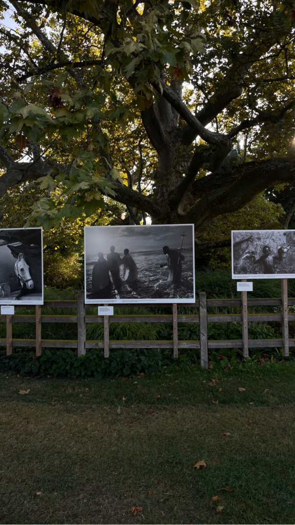
Die Ausstellung behandelt das Thema ORIENT und stellt Fotografen und Fotografinnen aus dem Iran, Afghanistan und Pakistan in den Mittelpunkt. Zu den Künstlern und Künstlerinnen gehören Abbas, Gohar Dashti, Hamed Noori, Ebrahim Noroozi, Maryam Firuzi, Hashem Shakeri, Paul Almasy, Véronique de Viguerie, Fatimah Hossaini, Shah Marai und Wakil Kohsar, sowie Sarah Caron.
Seit seiner Gründung hat das Festival niemals von seinem Auftrag abgewichen, die Schönheit der Natur ebenso zu zeigen wie die Notwendigkeit, sie zu schützen. Die Fotografen und Fotografinnen unseres Festivals möchten entschiedene Zeugen sein und sich aktiv an den Bemühungen beteiligen, unser kostbarstes gemeinsames Gut zu bewahren – den Planeten Erde. Zu den Vertretern dieser Mission gehören Mélanie Wenger, Bernard Descamps, Gabriele Cecconi, Stephan Gladieu, Money Sharma, Reporter ohne Grenzen, Brigitte Kössner-Skoff und Gerhard Skoff, Antonin Borgeaud, Jérôme Blin, Alisa Martynova, Maxime Taillez und Chloé Azzopardi.
Die Fotografie bleibt zweifellos das prägnanteste Werkzeug, um die öffentliche Meinung zu verändern und Momente der Menschlichkeit festzuhalten. In dieser Tradition stehen auch die österreichischen Fotografen Rudolf Koppitz und Horst Stasny. Gregor Schörg wird den zweiten Teil seiner Arbeit über das Wildnisgebiet Dürrenstein-Lassingtal im Rahmen des Festivals präsentieren. Die Ausstellung von Fotografien österreichischer Berufsfotografen und die Präsentation der Siegerfotos des weltweit größten Fotowettbewerbs mit fast 700.000 Bildern aus 170 Ländern, “Our World is Beautiful” von CEWE, werden das Festival ergänzen. Ebenso wird es eine Rückblende auf das Jahr 2022 in Bildern des Artists in Residence Pascal Maitre geben. Ein fotografisches Highlight ist die Auftragsarbeit von Cathrine Stukhard, die das Weltkulturerbe von Vichy besuchte und in den Kontext der elf “Great Spa Towns of Europe” der UNESCO stellte, zu denen auch Baden bei Wien gehört.
Unter dem Leitgedanken “Culture of Solidarity” wird die Zusammenarbeit mit den Festivalpartnern Garten Tulln, Celje in Slowenien und dem Monat der Fotografie Bratislava auch im Jahr 2023
Dieses Semester werde ich mich weiterhin auf Board Game Design fokussieren. Da ich mich bereits letztes Semester mit diesem Thema beschäftigt habe bin ich zur Erkenntnis gekommen, dass ein komplettes Brettspiel zu entwickeln, zu gestalten und zu produzieren vermutlich zu aufwendig und vor allem kostspielig wäre. Besonders die Produktion würde sich für ein Einzelstück wie ich es benötige nicht rentieren und wäre nur unnötig teuer.
Natürlich könnte ich im Rahmen meiner Masterarbeit selbst ein Prototyp basteln, das entspricht allerdings nicht meinen optischen Ansprüchen. Darum werde ich mich dieses Semester hauptsächlich auf Kartenspiele fokussieren. Nicht nur da diese einfacher hochwertig zu produzieren sind, sondern auch weil es eine ganz andere Herausforderung ist ein komplexes Spiel nur mit Karten zu gestalten.
For the first time in my career, I got the courage to go to a networking event, to be honest I did not go to one before because I often felt like I did not have enough experience in the field or I just had no idea what I could talk about, but this event changed my perspective. Yes, there is still some professional feeling to it and most of the people have years of experience but most of the time they’re willing to share how they got their opportunities and how they build their careers.
I had the opportunity to attend UX Graz meetup, right in the midst of the World Usability Congress, where I had the chance of meeting amazing people in the field of design, I find interesting.
There I met the organizers and they talked to me about the community, how it was built and what are their future plans, I also talked to UX professionals based in Graz and Munich, they work in small product development companies, big tool and industrial companies or on a freelance basis.
I would totally recommend attending to a networking event even if it’s just to go out of your comfort zone, you will make amazing connections and engage with professionals who are always happy to guide you.
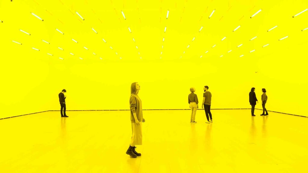
Light is something that connects us, we all witness light independently of where we are, we but our experiences with it differs depending on the time, the season or the location. Thinking about how something like light that we take for granted can change our moods, perspectives and thoughts.
From growing our food, to sleeping or working, light plays such an important role in how we as beings develop in a society, but every community in the world has their own habits and conducts that might be related to the amount & type of light there is in their context, whereas that’s physical or artificial.
You don’t have to be the same in order to share a space. How light changes the experience of every expectant, playing with space and structure you can make the expectant see a certain image even if that is not real in the physical world but real for out minds to see.
In this new chapter of research, I want to find out more about light, color and its implications in the human behavior, and how we can create a new experience in a space just with basic necessity, the need for light.
References:
Rikard Küller , Seifeddin Ballal , Thorbjörn Laike , Byron Mikellides & Graciela Tonello (2006) The impact of light and colour on psychological mood: a cross-cultural study of indoor work environments, Ergonomics, 49:14, 1496-1507, DOI: 10.1080/00140130600858142
Zeldes, J. (Director). (2019). Abstract the Art of Design (Olafur Eliasson, Art Design) [Streaming Platform]. Netflix.