Auf der Website der Evita Agency wird in dem Artikel über die sieben goldenen Regeln für die Gestaltung eines perfekten Werbeplakats gesprochen. Das Ziel dieser Regeln ist es, ein Plakat zu entwerfen, das die Aufmerksamkeit der Betrachter auf sich zieht und die gewünschte Botschaft effektiv vermittelt. Jede Regel trägt dazu bei, das Plakat ansprechend und wirkungsvoll zu gestalten.
Die erste Regel bezieht sich auf die Botschaft des Plakats. Es ist wichtig, eine klare und prägnante Botschaft zu formulieren, die leicht verständlich ist. Eine verwirrende oder zu komplexe Botschaft kann die Betrachter abschrecken und das Interesse an dem Plakat verringern.
Die zweite Regel betont die Bedeutung einer einfachen Gestaltung. Ein überladenes oder zu kompliziertes Design kann die Botschaft des Plakats verwässern. Durch eine einfache Gestaltung mit klaren Linien und wenigen Elementen kann man die Aufmerksamkeit der Betrachter gezielt auf das Wesentliche lenken.
Die dritte Regel dreht sich um die Verwendung von auffälligen Farben. Farben haben eine starke emotionale Wirkung und können dazu beitragen, die Aufmerksamkeit auf das Plakat zu lenken. Es ist wichtig, Farben auszuwählen, die zur Botschaft und zum Stil des Plakats passen und die gewünschte Stimmung oder Assoziation hervorrufen.
Die vierte Regel befasst sich mit dem Layout des Plakats. Ein fokussiertes Layout, das die wichtigsten Elemente prominent platziert, erhöht die Lesbarkeit und die visuelle Anziehungskraft des Plakats. Ein klares und ausgewogenes Layout hilft den Betrachtern, die Informationen schnell zu erfassen und sich auf die Botschaft zu konzentrieren.
Die fünfte Regel betrifft die Auswahl der Schriftart. Eine gut lesbare Schriftart, die zur Botschaft und zum Stil des Plakats passt, ist entscheidend. Es ist wichtig, eine Schriftart zu wählen, die sowohl auffällig als auch leicht lesbar ist.
Die sechste Regel legt Wert auf die Verwendung eines ansprechenden Bildes. Ein Bild kann eine starke visuelle Botschaft vermitteln und die Aufmerksamkeit der Betrachter einfangen. Das Bild sollte zur Botschaft des Plakats passen und eine emotionale Verbindung herstellen.
Die siebte Regel befasst sich mit der Integration einer prägnanten Handlungsaufforderung oder Call-to-Action. Das Plakat sollte den Betrachter dazu ermutigen, eine bestimmte Aktion zu ergreifen, sei es der Kauf eines Produkts, die Teilnahme an einer Veranstaltung oder die Kontaktaufnahme. Eine deutliche und überzeugende Handlungsaufforderung kann die Betrachter motivieren, aktiv zu werden.
Der Artikel bietet auch praktische Tipps und Beispiele, wie diese Regeln in der Praxis angewendet werden können. Durch die Beachtung dieser goldenen Regeln kann man die Wahrscheinlichkeit erhöhen, dass das Werbeplakat seine Ziele erreicht und die gewünschte Wirkung auf das Zielpublikum hat
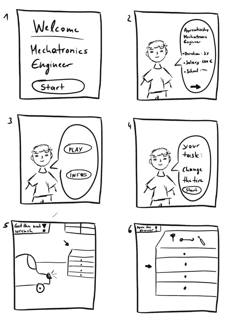
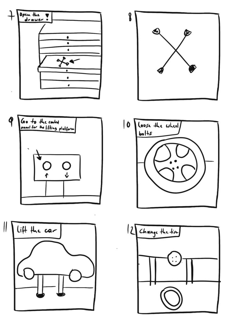
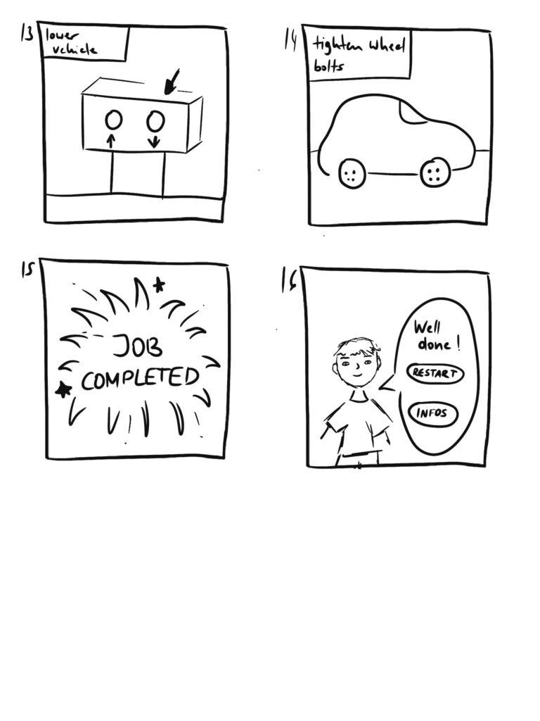
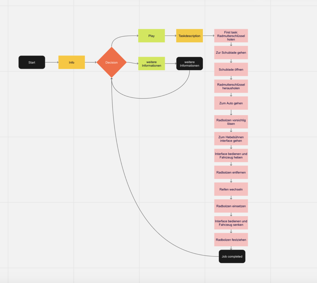
In my previous blog post, I discussed the concept of designing a virtual reality (VR) game experience centered around the theme of an apprentice in a garage. Today, I will delve deeper into the storyline and provide additional details on the gameplay elements. Additionally, I will address the valuable feedback I received from Birgit, highlighting the importance of making the experience more exciting, particularly for teenagers who have shorter attention spans.
The Storyline:
Imagine stepping into a virtual garage as an apprentice mechanic. As soon as you put on the VR goggles, you find yourself surrounded by tools, car parts, and an inviting menu screen. A friendly avatar, your supervisor, appears to greet you and provide an introduction to the world of automotive mechanics. This avatar becomes your guide throughout the game, offering insights into the various tasks and challenges you’ll encounter.
To ensure a comprehensive understanding of the apprenticeship, the avatar presents you with a choice between diving straight into the game or obtaining more information about the apprentice experience. This decision empowers players to tailor their journey based on their preferences and level of curiosity.
Choosing the game path leads you into an immersive adventure where the avatar explains the main task at hand and provides instructions for accomplishing smaller subtasks along the way. Let’s explore a brief example of the story through a storyboard:
Enhancing the Gameplay Flow:
After sharing my progress with Birgit, she raised a valid point about the gameplay potentially feeling too linear, which could lead to boredom, particularly among teenagers. She emphasized the importance of maintaining their engagement throughout the experience. Taking Birgit’s feedback to heart, I recognize the need to inject more excitement and intrigue into the gameplay.
My Next Challenge:
Moving forward, my primary objective is to brainstorm creative ways to make the VR game experience more thrilling and captivating, especially for the target audience of teenagers. This will involve integrating elements such as unexpected twists, timed challenges, and rewarding achievements to keep players motivated and immersed in the virtual world. By addressing this challenge head-on, I aim to create an experience that not only educates but also entertains, ultimately fostering a genuine interest in the world of mechanics.
In my next blog post, I will delve deeper into my research and experimentation phase, sharing my ideas and progress in making the gameplay more exciting and captivating for players of all ages, with a special focus on engaging the teenage demographic.
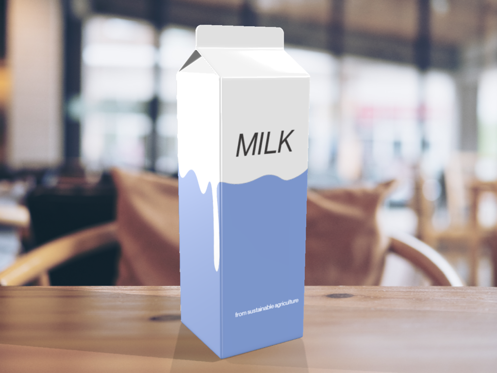
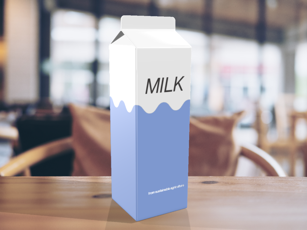
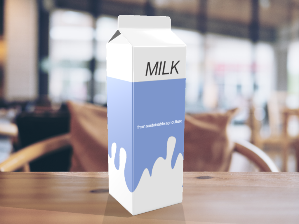
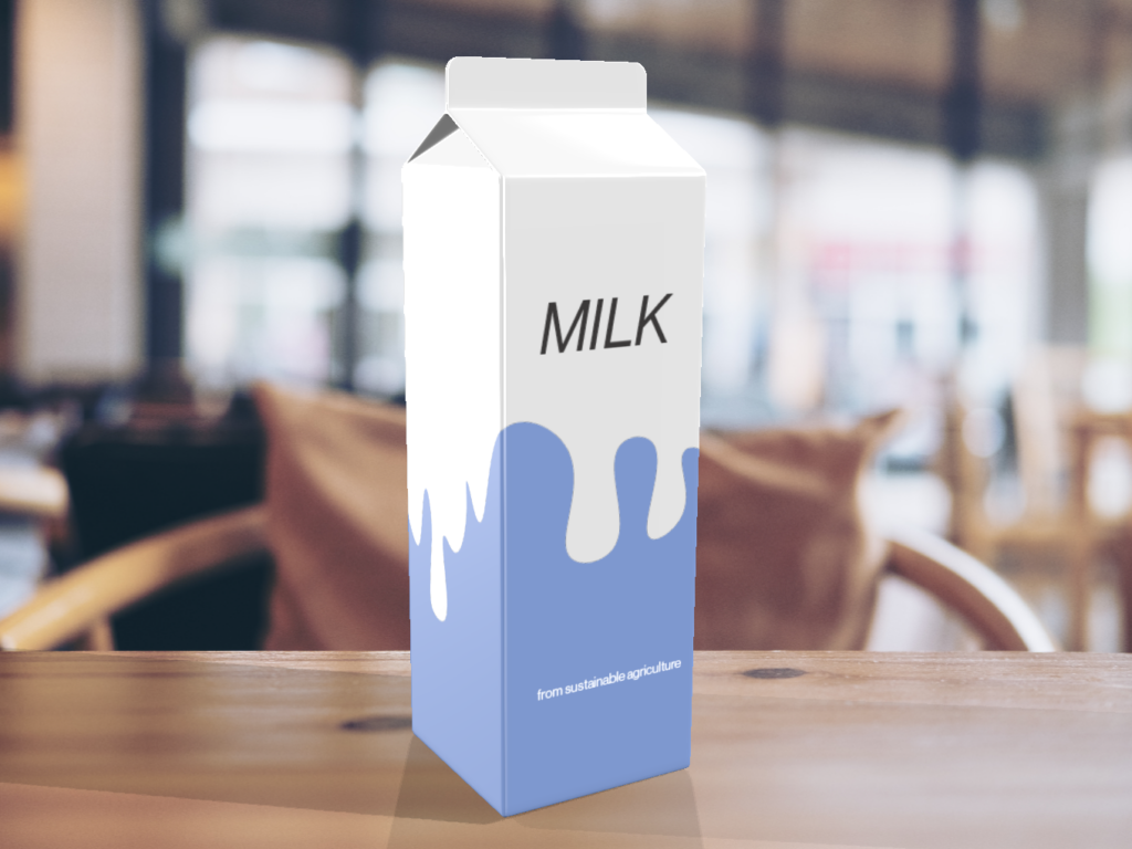
Wie im vorherigen Post erwähnt, habe ich mich in der zweiten Experimentierphase mit ausgefalleneren Designarten für die Verpackung einer Milch, aber doch eher minimalisitschen Ansätzen auseinandergesetzt. Durch diverse Experimente haben sich folgende Designs ergeben:
Analyse der kreierten Verpackungen
Hier habe ich eine seriflosen geometrische Schrift gewählt, um Bodenständigkeit und Verlässlichkeit zu vermitteln. Ich habe Blau als Farbe gewählt, da dies von den meisten Menschen als Lieblingsfarbe genannt wird. Des Weiteren passt die Farbe Blau zu einer Milchverpackungen meines Erachtens nach. Da ich in meinem Moodboard viele Versionen mit Tropfen hatte, habe ich mit den verschiedenen Tropfenarten und -formen herumgespielt.
Das Design ist schlichter, aber doch außergewöhnlich für eine Milchverpackung – somit hebt es sich von anderen Verpackungen ab. Gewöhnliche Verpackungen sind eher überladen, hier habe ich einen aufgeräumten Ansatz verfolgt.
This article seek to present and overiew of the implementation of ehealth in Benin to help us see the opportunities and challenges we might face while trying to present a contextualized framework to “Designing an eHealth App for Sustainable Healthcare in Benin” that can contribute to improve community health but also support the National eHealth Strategy in Benin .
Zouléha Karimou, a 35-year-old housewife and mother of five boys, takes part in a bednet demonstration in her village of Sibongou in the health zone of Bariénou, about 500 kilometers north of Cotonou, Benin, on June 17, 2018
The implementation of eHealth in Benin Republic has been driven by the National eHealth Strategy, which aims to improve the country’s healthcare sector through the use of information and communication technology (ICT). The strategy was adopted in November 2017 and covers the period from 2018 to 2022. The key components of the strategy include the establishment of an eHealth infrastructure, strengthening human resources for health, improving access to healthcare services, enhancing healthcare quality and patient safety, and developing a legal and regulatory framework.
The situational context in Benin Republic reveals that eHealth initiatives have been implemented in the country in the past, mainly through private projects supported by NGOs, international organizations, or bilateral cooperation. However, the Ministry of Health had limited engagement in these programs, and many of them faded away due to a lack of funding and little assessment of their impact on the health system.
To institutionalize the use of digital health, the Ministry of Health assigned the Department of Information Technology and Pre-archiving to develop a national eHealth plan. Two strategic documents on the use of ICT in health have been created. However, the review in 2015 highlighted the lack of a nationwide and uniform network for the Ministry of Health, limited connectivity of health structures, and a lack of ICT infrastructure, particularly in rural areas.
Despite these challenges, the government of Benin has shown strong commitment to eHealth. The national eHealth strategy includes best practices such as government commitment, a favorable institutional and legislative framework, the development of a national eHealth master plan, and engagement with health professionals and the private sector. Lessons learned from previous projects and initiatives are also being applied to the strategy’s implementation.
The national eHealth strategy aims to establish an eHealth infrastructure, enhance human resources for health, improve access to healthcare services, enhance healthcare quality and patient safety, and develop a legal and regulatory framework. The strategy includes the creation of a national health information system, the use of telemedicine, and the development of eLearning programs for healthcare worker training.
The implementation of the strategy faces various challenges, including a lack of funding, insufficient technical human resources, delays in legal and regulatory aspects, poor user confidence, limited ICT infrastructure, and low accessibility to health structures. However, the government’s commitment, favorable institutional environment, and qualified human resource pool provide a solid foundation for the strategy’s implementation.
To ensure accountability and transparency, the strategy has established a monitoring and evaluation system to track the implementation of projects and their impact on the health system. Impact indicators are being developed, and an independent team is responsible for collecting and analyzing these indicators. The strategy also emphasizes the involvement of health professionals and the private sector in the implementation process.
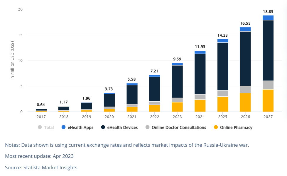
In Benin, the eHealth segment is expected to show positive growth and development. The revenue in the eHealth segment is projected to reach US$9.59 million by 2023. Furthermore, there is an estimated annual growth rate (CAGR 2023-2027) of 18.42%, which would result in a projected market volume of US$18.85 million by 2027. User penetration in the eHealth segment is expected to be 7.77% in 2023, and it is projected to increase to 12.33% by 2027. This indicates a growing adoption of eHealth solutions by the population in Benin. The average revenue per user (ARPU) is anticipated to be US$9.40, reflecting the potential value and monetization opportunities within the eHealth market in Benin. It is worth noting that in global comparison, China is expected to generate the highest revenue in the eHealth segment, with an estimated revenue of US$23,270 million in 2023. These figures highlight the potential and growth prospects of the eHealth segment in Benin, indicating increasing adoption and revenue generation in the coming years.
In conclusion, while challenges exist, Benin Republic is committed to using eHealth to improve its healthcare system. The strategy’s implementation is supported by a favorable institutional and legislative environment, government commitment, and lessons learned from previous projects. With continued efforts and addressing the challenges, eHealth has the potential to improve healthcare access and quality in Benin Republic. The eHealth segment in Benin is poised for significant growth and offers promising opportunities for improving healthcare accessibility and enhancing overall health outcomes in the country.
Reference:
Y. A. A. Sossou, “Status of eHealth in Benin republic,” March 2023. https://www.intgovforum.org/en/filedepot_download/278/24571.
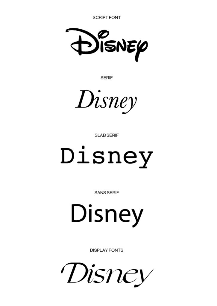
In diesem Experiment widmete ich mich bekannter Wortmarken und versuchte damit zu zeigen, wie wichtig die Wahl der richtigen Schriftart ist und wie diese die Wahrnehmung der Marke maßgebend und nachhaltig beeinflusst und was sie alles über eine Marke aussagen kann:
Disney
Disney ist bekannt für zahlreiche Zeichentrickfilme für Kinder und Jugendliche. Daher lassen sich der Marke den Synonyme wie verspielt, jung, frech, kreativ und emotional zuschreiben. Daher erweist sich eine Script Font als die richtige Wahl um das alles widerzuspiegeln.
Serif & Slab Serif: zu seriös, elegant und markant
Sans Serif: zu langweilig und objektiv
Display Fonts: andere würde eventuell passen, jedoch ist handgeschriebener Charakter ausschlaggebend da erste Cartoons ja auch von Hand gezeichnet wurden
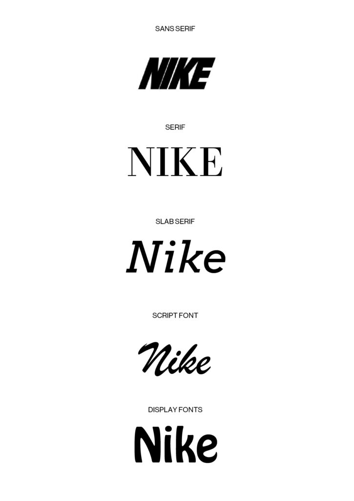
Nike
Nike ist ein weltbekannter Sportartikelhersteller und ein sehr modernes, trendorientiertes Unternehmen und besticht unter anderm mit zahlreichen sehr erfolgreiche Schuhen. Daher erweist sich eine Sans Serif Font natürlich als ideale Wahl aufgrund ihrer Zeitlosigkeit, Modernität, Klarheit etc.
Serif & Slab Serif: zu seriös und elegant
Script Font: zu persönlich, emotional und elegant
Display: zu verspielt, würde eventuell funktionieren aber würde in Kontrast zu Swoosh stehen und sollte in kursiv sein um Bewegung darzustellen.
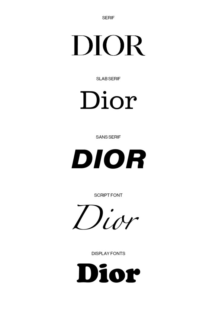
Dior
Dior ist ein 1946 gegründeter internationales Mode-Luxusgüterhersteller und bietet neben Haute Couture auch weitere hochpreisige Linien an. Diese kurze Beschreibung des Unternehmens zeigt warum eine Serif Font die richtige Wahl war: diese ist traditionell, seriös und elegant, welches alles Synonyme die das Unternehmen perfekt beschreiben.
Slab Serif: zu kühn, markant und auch etwas zu verspielt
Sans Serif: zu modern, zu langweilig, zu brav, wirkt eher wie günstigere Unternehmen
Script: zu verspielt, kreativ und persönlich, braucht mehr Stärke und Eleganz
In the 00’s the human attention span was measured at 12 seconds. And fast forward to today out attention span has markedly decreased. As a consequence, short form video is now more popular than before. The average human attention span is now shorter than a goldfish’s, it is estimate to be just around 8 seconds (one second below a goldfish). TikTok, YouTube Shorts and Instagram Reels among many other similar applications are now trending and showing no sign to slow down that decrease. For marketer, this has opened up new avenues to reach the consumer. As a result, that short-form videos are one of the most in-demand social media marketing tools in 2022.
In 2021 Google was the most popular website worldwide. However, towards the end of 2021 TikTok surpassed Google. I now even use TikTok as a search engine rather than I use google.
These videos have higher retention rates, making them more likely to capture the viewers’ attention and for longer in comparison to long-form videos’, notes and graphics. It is difficult to define how short a short video is. As this variates form platform to platform. It differs from 15 seconds long to 60 seconds to 3 minutes. But on YouTube they talk about short-form video when a video is 5-10 minutes long. Research suggest that the length at which engagement is highest is just under 60 seconds.
TikTok There is a possibility to upload 3-minute videos but all indicators show that shorter videos are still dominant. TikTok’s algorithms compute the average watch time.
Facebook Facebook is more a sharing platform rather than a place to build original content. But now competing with Instagram, YouTube shorts and TikTok. With possibility of interacting with websites, this has been seen as a viable medium for marketers to reach the consumers.
YouTube Shorts YouTube has come with a ‘’Short fund” to pay creators for making content for YouTube Shorts. The advantage that YouTube has over other platforms: an extremely wide target group. Shorts’ content has already yielded success in commercial advertising, with brands receiving a high volume in reach and engagement with their intended audiences.
Instagram Reels Following the success of TikTok and YouTube also Instagram also moved towards video. With first IGTV but now changed to Reels. And have plans to focus primarily on growing Reels.
Content Trends User Generated Content Capturing content from followers and fans gives them to have a voice and speak on their behalf of the brand.
Behind the Scenes Consumers are seeking personalization and authenticity from brands. A short video of a normal day in a company could provide insights that would otherwise more often be over looked at.
Educational and informational Tutorials and DIY videos are the key things to consider when passing out educational videos. Short video can provide quick and doable solutions to normal day-to day situations and problems
FAQ’s Commonly asked questions and various commonly misunderstood industry related issues can be easily cleared up with a short video
New product Teasers By announcing a new products and service brand can pull more traffic presenting an opportunity to sell the products and or services.
Starting a Challenge A fun and engaging form of short video. And connects the consumers on a personal level.
Conclusion Short form Videos are all about quick, snackable, digestible content. We are constant learning, and staying on level of improvements, marketing trends and updates to keep the clients ahead of the game.
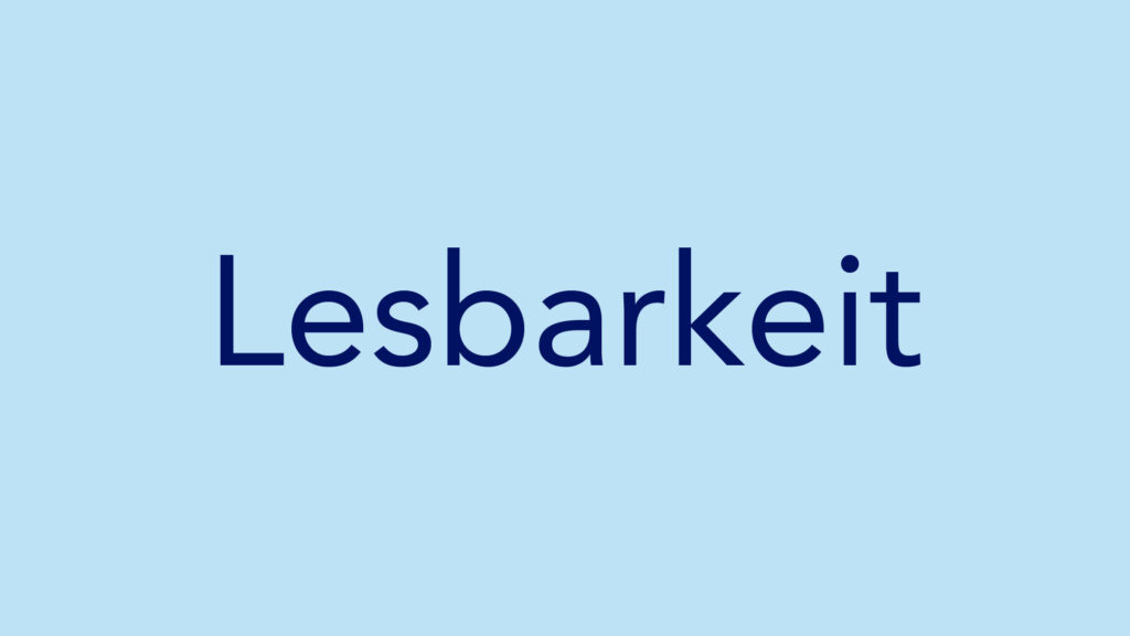
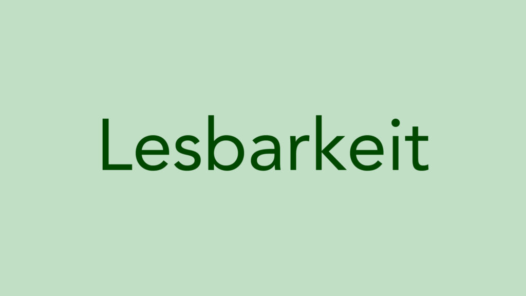
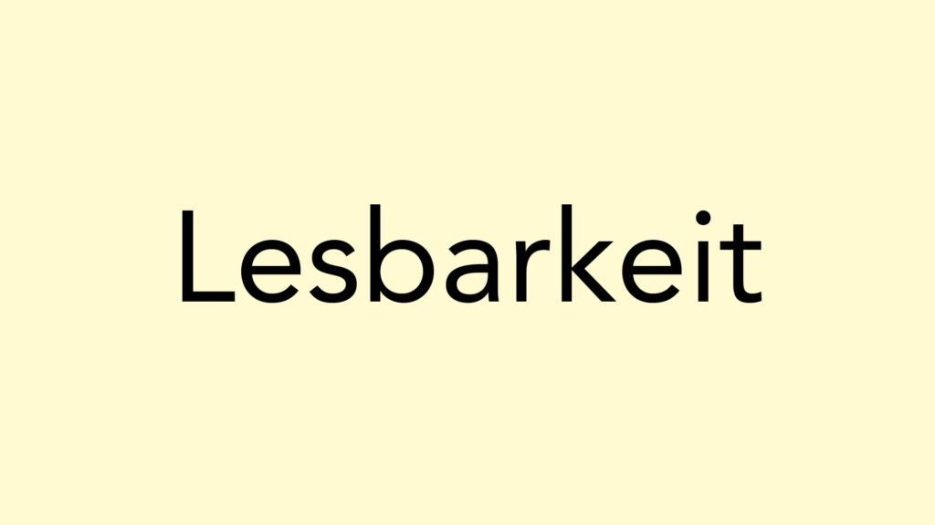
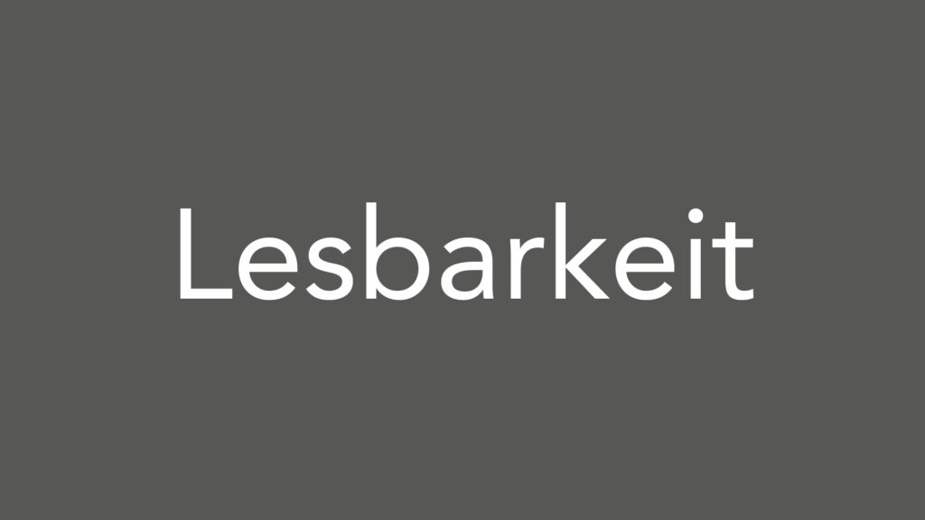
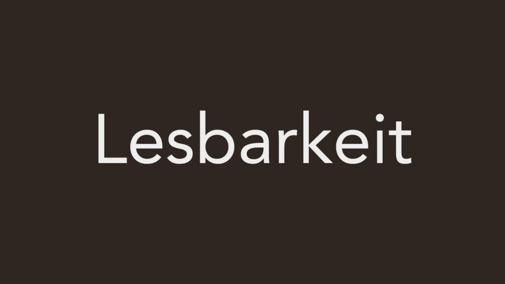
Bei der Auswahl von Farbkombinationen für das Lesen von Text auf einem farbigen Hintergrund sind einige Faktoren zu berücksichtigen, z. B. Kontrast, Lesbarkeit und Zugänglichkeit. Hier sind einige empfohlene Farbkombinationen nach einem Experiment:
1. Schwarzer Text auf weißem Hintergrund: Dies ist eine klassische und gut lesbare Kombination mit hohem Kontrast.
2. Dunkelblauer Text auf hellblauem Hintergrund: Blautöne können gut miteinander kombiniert werden, solange ein ausreichender Kontrast zwischen Vorder- und Hintergrund vorhanden ist.
3. Dunkelgrüner Text auf hellgrünem Hintergrund: Ähnlich wie bei der blauen Kombination funktioniert dies gut, wenn ein ausreichender Kontrast zwischen den Farbtönen vorhanden ist.
4. Schwarzer Text auf einem hellgelben Hintergrund: Gelbe Hintergründe können auffällig sein, und schwarzer Text bietet einen starken Kontrast für die Lesbarkeit.
5. Weißer Text auf einem dunkelgrauen oder marineblauen Hintergrund: Diese Kombination kann ein elegantes und raffiniertes Aussehen erzeugen und bietet einen hohen Kontrast für eine gute Lesbarkeit.
6. Weißer oder heller Text auf einem dunkelbraunen Hintergrund: Wenn sie richtig eingesetzt werden, können dunkelbraune Hintergründe ein warmes und einladendes Gefühl vermitteln, und heller Text sorgt für gute Lesbarkeit.
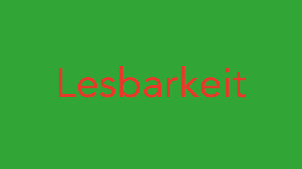
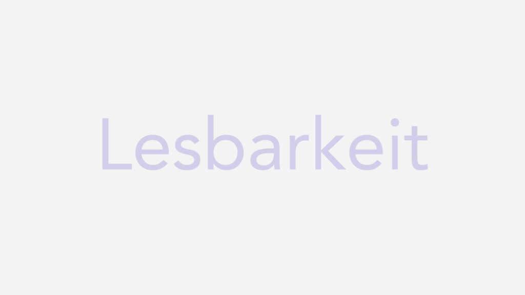
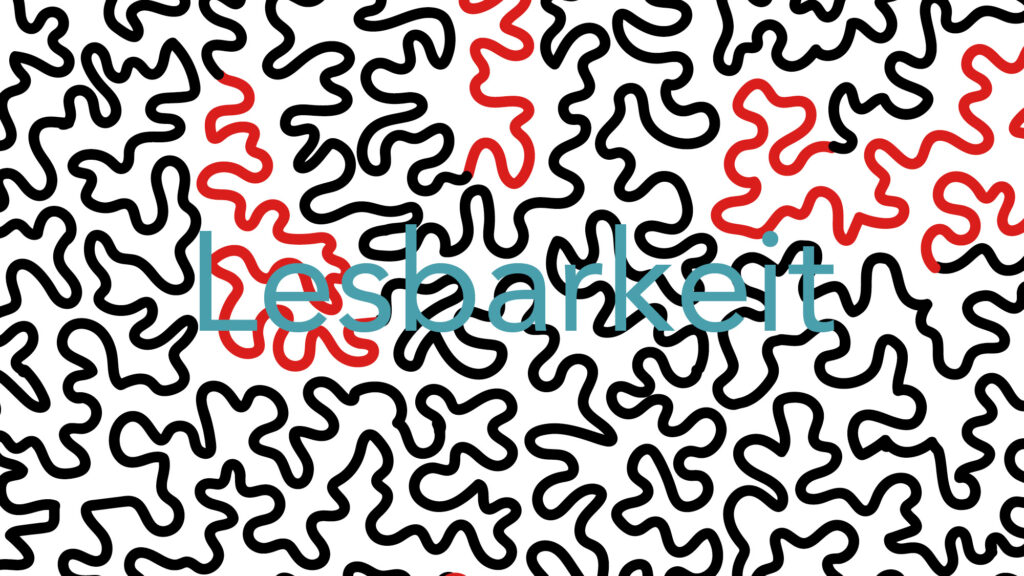
Hier sind einige Farbkombinationen, die allgemein als schlechte Beispiele für das Lesen von Text auf farbigem Hintergrund gelten nach einem Experiment:
1. Roter Text auf grünem Hintergrund: Rot und Grün sind zwar Komplementärfarben, aber sie können zu einer erheblichen visuellen Belastung führen und das Lesen erschweren.
2. Heller Text auf hellem Hintergrund oder dunkler Text auf dunklem Hintergrund: Ein mangelnder Kontrast zwischen Text und Hintergrund kann zu Problemen bei der Lesbarkeit führen, insbesondere für Menschen mit Sehbehinderungen.
3. Vibrierende oder widersprüchliche Farben: Kombinationen wie leuchtend gelber Text auf leuchtend lilafarbenem Hintergrund oder orangefarbener Text auf rotem Hintergrund können visuell störend wirken und das Lesen des Textes erschweren.
4.Kontrastarme Kombinationen: Jede Farbkombination, bei der der Kontrast zwischen Text und Hintergrund zu gering ist, wie z. B. hellgrauer Text auf weißem Hintergrund oder dunkelblauer Text auf schwarzem Hintergrund, kann zu einer Überanstrengung der Augen und einer schlechteren Lesbarkeit führen.
5. Text über komplexen oder unruhigen Hintergründen: Vermeiden Sie es, Text über Bildern oder Mustern zu platzieren, die viele visuelle Elemente enthalten, da sie die Lesbarkeit des Textes erschweren und die Aufmerksamkeit des Lesers ablenken können.
Ca. 87% unseres Lebens verbringen wir in geschlossenen Räumen > Design derer beeinflusst unser Gemüt
Dabei sollten wir beim Design den Mensch in den Mittelpunkt stellen (Empathie*)
Sich fragen „Wie erleben wir einen Raum?“ – wenn man merkt es wurde mit Liebe gemacht fühlen wir uns gleich wohler
* Das wichtigste ist beim Thema Empathie: Fragen stellen, Zuhören & Beobachten = der Mensch hat 2 Augen, zwei Ohren und einen Mund >> Nutzen wir diese im gegebenen Verhältnis!
Material ist unter Kombination und im richtigen Licht zu wählen
Räume schaffen in denen wir uns Wohlfühlen > Hygge (dänisch)
Wellbeing ist zur Philosophie geworden.
Das alltägliche verstehen und aus etwas Gewöhnlichem etwas Außergewöhnliches zu machen.
@Paula Scher (Pentagram NYC)
„Man kann alleine durch eine Schriftart eine ganze Identität schaffen“ Schrift kann man mit Bedeutung aufladen
Identitätsysteme entwerfen = gute sollten auch nach 5-10 Jahre anpassungsfähig / Veränderbar sein!
„Man muss entspannt sein für gutes Design“
Design beinhaltet immer die menschliche Komponente und muss deswegen auch menschliches Verhalten und menschliche Emotionen berücksichtigen!
Design ist eine Kombination aus Strategie und Intuition
Bestehende Philosophien müssen verstanden werden, die Facetten die schon vorherrschen müssen auf einen gemeinsamen Nenner gebracht werden.
Design ist oftmals nicht der schwierigste Teil für einen Selbst – der schwierigste Teil ist oft die Kunden zu überzeugen
In der Vergangenheit wurde am Konzept gearbeitet, versucht das Theremin doch noch zum funktionieren zu bringen (was bisher noch nicht gelang) und einige weitere Versuch mit den klanglichen Möglichkeiten durchgeführt.
Dafür sind zwei Becken mit einem Kontaktlautsprecher ausgestattet worden und in einigen Metern voneinander aufgestellt worden. Die Aufnahme erfolgte mit einem Zoom H4N und integrierten Mikrofonen. Das Signal wurde mit subtraktiver Synthese erstellt, bearbeitet und über ein Interface wiedergegeben. Für eine bessere Vergleichbarkeit wurden sowohl Aufnahmen mit perkussiven und langen Sounds gemacht als auch eine mit meinen Monitoren, um den Effekt der Becken zu beurteilen.
Legato Becken
Legato monitore
Staccato Becken
Zusammenfassend lässt sich feststellen, dass die Becken den Klang einfärben und etwas mehr Nachhall hinzufügen. In der zum Abschluss geplanten Installation wird die Auswahl der Sounds/Synthese ein entscheidender Faktor werden, das die Eigenheiten/Vorteile des Beckenlautsprechersystems betont werden sollten.
I decided to redefine my research topic a bit for this blog post because I wanted to learn about more uses of visual storytelling, not just in a comic or illustration context like in my previous blog posts. As I communication designer, I am also interested in editorial design and how to motivate people to read a booklet, brochure, etc. So, I tried to first gather some aspects or notes on how to use the power of visual storytelling in editorial design projects.
Cover Design
The first thing we notice about any print publication is the cover, so the cover of a magazine or a book sets the tone and invites readers into the content. The cover should hint and connect with the content, themes, or stories within the publication, so it’s good to use compelling imagery, typography, and composition to create a cover that catches the attention of the viewer and appeals to the target audience.
Illustrations and Graphics
Of course, illustrations and other graphics can also enhance the storytelling aspect of an editorial design project. I already wrote a lot about visual storytelling in illustrations and narrative art in my previous blog posts, but in editorial projects, illustrations can also have important roles. They can be used as visual metaphors, add depth to the narrative, or illustrate the essence of the written text in a unique way. They can also be used to show anecdotes or characters, adding another layer of storytelling beyond the written content.
Photos
Some publications need a series of photos, so it’s important to think about how to display them, how to use white space and layout between them, and which photos to use after one another. We can tell a story through a series of carefully curated and visually striking photographs and create a cohesive narrative by selecting images that complement each other and convey the progression of events or emotions.
Typography
The choice of typography is, of course, also one of the key factors that influence how readers perceive a written text. We can experiment with typography to add visual interest and reinforce the narrative. We should consider using different fonts, sizes, or layouts to highlight keywords or phrases, evoke a specific mood, or guide readers through the text.
Section Breaks and Transitions
We can use visual cues, such as different typography, colors, or images, to show transitions between sections or articles within the layout. These visual breaks can help establish distinct stories or themes throughout the book or magazine.
Visual Hierarchy
We can use visual hierarchy to guide readers through the layout and highlight important elements. This can be done by using larger images or bold typography for headlines, including pull quotes, or changing the size and placement of visuals to create a story-like flow.
Grid Layouts
We can try using grid-based layouts to create visual stories within our design. We can play around with how we arrange images, text, and negative space to make the reading experience visually engaging and dynamic.
Infographics and Data Visualization
Infographics or data visualizations can be included to present complex information in an easy-to-understand and visually appealing way. By using creative visual storytelling techniques, we can make data-driven content more interesting and accessible.