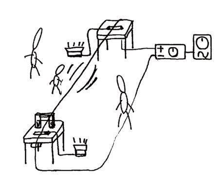
During the studies at the IEM, we realized this project under the supervision of the Professor Winfrid Ritch. The aim of this installation is to play different sine waves through a long metal wire, that resonates within the surrounding space.
Biography:
Alvin Lucier founded the Sonic Arts Union in 1966 together with composers Robert Ashley, David Behrman and Gordon Mumma. Lucier is one of the pioneers of contemporary musical composition and performance. In recent years he has emerged with a series of sound installations as well as compositions for solo instruments, chamber ensembles and orchestra. In these works, sound waves are set into spatial movement through precise voicing. Alvin Lucier works in North America, Europe and Asia. In 1989 he installed his “Music on a Long Thin Wire” in Kyoto. In 1990 he was a guest of the DAAD in Berlin for six months and in 1992 guest composer at the festival “Time of Music” in Viitasaari, Finland.
In his own words (1992): “Music on a Long Thin Wire is constructed as follows: the wire is extended across a large room, clamped to tables at both ends. The ends of the wire are connected to the loudspeaker terminals of a power amplifier placed under one of the tables. A sine wave oscillator is connected to the amplifier. A magnet straddles the wire at one end. Wooden bridges are inserted under the wire at both ends to which contact microphones are embedded, routed to a stereo sound system. The microphones pick up the vibrations that the wire imparts to the bridges and are sent through the playback system. By varying the frequency and loudness of the oscillator, a rich variety of slides, frequency shifts, audible beats and other sonic phenomena may be produced.”[1]
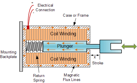
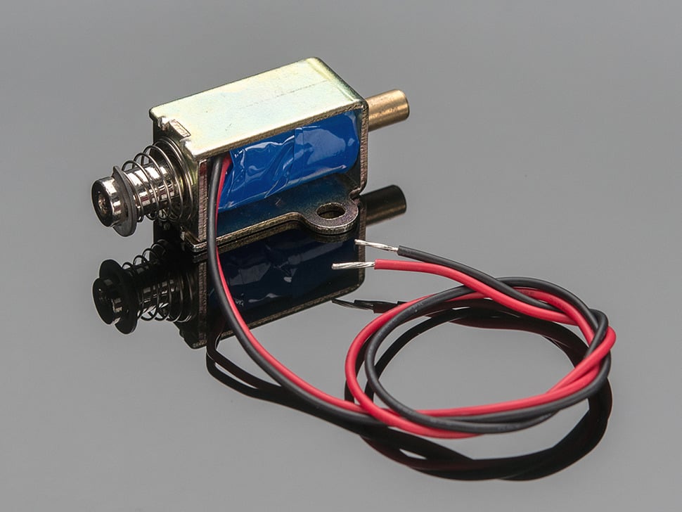
A solenoid is an electromagnetic device that converts electrical energy into linear mechanical motion. It consists of a cylindrical coil of wire, often wrapped around a metallic core, that when energized creates a magnetic field. This magnetic field can then be used to move a metallic rod or plunger that is placed within the coil.
The solenoid works on the principle of electromagnetic induction, where a current flowing through a wire generates a magnetic field. When a current is applied to the coil of a solenoid, it creates a magnetic field around the coil. The strength of the magnetic field is determined by the amount of current flowing through the coil, and the direction of the magnetic field is determined by the direction of the current flow.
The plunger or rod inside the coil is made of a ferromagnetic material, which is attracted to the magnetic field created by the coil. When the current is flowing through the coil, the plunger is pulled into the coil, creating linear motion. When the current is turned off, the plunger is released from the coil, and returns to its original position by a spring or by gravity.
Solenoids can be found in a wide range of applications, such as automotive systems, industrial automation, robotics, and medical equipment. They are used for various purposes such as opening and closing valves, actuating switches, and controlling linear motion. They are also used in combination with other mechanical or electrical components, such as levers, gears, and sensors, to create complex systems.
Additionally, solenoids can be classified into two types, namely, the single-acting solenoid and the double-acting solenoid. The single-acting solenoid has a spring which pulls the plunger back to its original position when the current is turned off. The double-acting solenoid, on the other hand, has a spring at both ends and can pull and push the plunger.
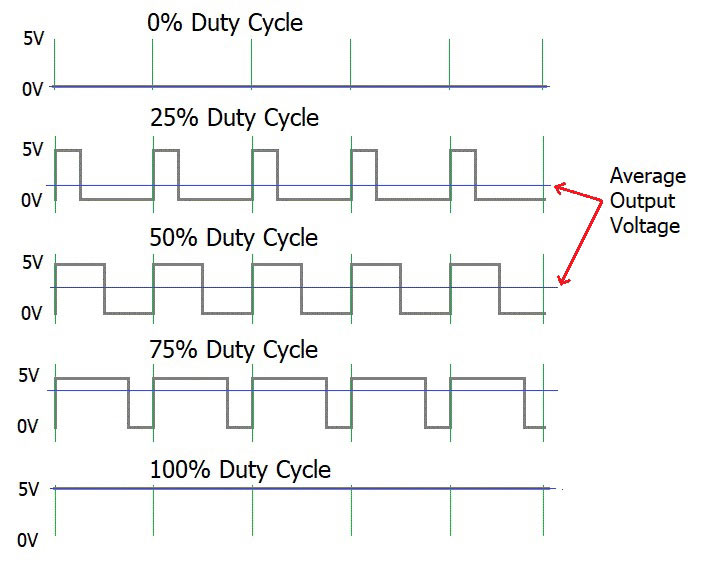
Solenoids can be implemented with PWM in order to control the linear motion of the plunger. By applying a PWM signal to the coil of the solenoid, the average current flowing through the coil is controlled, and thus the strength of the magnetic field is also controlled. This in turn controls the amount of force exerted on the plunger and thus the distance it moves.
By varying the duty cycle of the PWM signal, the average current flowing through the coil is adjusted, which in turn adjusts the position of the plunger. This allows for precise control of the solenoid’s motion, and can be used in applications such as valve control, robotics, and automation. It is also important to note that, the solenoid should be properly sized for the application and the PWM frequency should be chosen accordingly to avoid overheating and damage to the solenoid.
It is important to note that, when a solenoid is controlled using PWM, it will also generate an audible noise, which may be an issue in some applications. Additionally, a suitable low-pass filter may be needed to remove the high frequency noise from the PWM signal to prevent damage to the solenoid or other electronic components.
Pulse Width Modulation (PWM) is a technique used to encode a message into a pulsing signal. The technique consists of modulating the width of a fixed-frequency rectangular pulse wave in direct proportion to a small control signal. The resulting PWM signal can be used to control the power delivered to a load, such as a motor or a light bulb, by adjusting the duty cycle of the waveform. PWM is used in a wide range of applications, including motor control, lighting control, and power regulation.
PWM has some advantages over traditional analog control techniques, such as greater control resolution, and reduced component wear. It also has some disadvantages, such as the need for additional hardware to filter the PWM signal and convert it back to an analog signal, and the generation of audible noise from the PWM signal.
In PWM, the microcontroller sends a series of pulses to the analog circuit. The duty cycle of the pulses, or the ratio of the pulse width to the total period, determines the average value of the signal. For example, if the pulse width is 50% of the total period, the average value of the signal is also 50%. By adjusting the duty cycle of the pulses, the microcontroller can control the average value of the signal, and thus control the power delivered to the load.
PWM can be used to control DC motors, since the average voltage applied to the motor is proportional to its speed.
Julia Schimautz ist Grafikdesignerin, welche in Berlin ein Design und Riso-Studio namens »dtan studio« gegründet hat. Sie hat sich darauf spezialisiert Animationen aus Riso-Drucken zu erstellen, um analoge Druckverfahren mit digitalen Mitteln zu verknüpfen.
Wie bist du zur Risographie gekommen? Weshalb hast du dich entschieden, analoge und digitale Verfahren miteinander zu verknüpfen?
Ich bin durch mein Praktikum bei »dreampress« in Kapstadt zur Risographie gekommen. Hier haben wir an Riso-Drucken, Publikationen, Grafikdesigns und anderen Projekten gearbeitet. Mir war es immer schon wichtig, bei meinen Designprojekten analoge Verfahren in einer gewissen Weise zu imitieren und mit verschiedenen Texturen oder Druckstempeln zu arbeiten. Mich hat die Optik des „Unperfekten“ oder „Spontanen“ angesprochen und genau das wollte ich in meinen Arbeiten aufnehmen.
Inwiefern verändert sich dein Designprozess bei der Integration analoger Druckverfahren? Was gilt es in der digitalen Verarbeitung und Nachbearbeitung der analogen Designs zu beachten?
Es ist wichtig, darauf zu achten, dass man nicht zu komplizierte, detailreiche Formen darstellt. Ebenso ist es wichtig, daran zu denken, dass nur eine limitierte Anzahl an Farben zur Verfügung steht – was in meinem Fall sechs spezielle Farben der jeweiligen Riso-Farbtrommeln sind. Bei meinen Animationen achte ich im Druck auch darauf, dass diese so platzsparend wie möglich am Papier platziert werden, damit Ressourcen geschont werden können. Ebenso versuche ich aus Testdrucken weitere Produkte, wie zum Beispiel Notizblöcke oder Ähnliches, anzufertigen. In der digitalen Nachbearbeitung werden die Farben in Photoshop angepasst oder kleinere Änderungen vorgenommen, damit nicht alles nochmals neu gedruckt werden muss.
Könntest du dir vorstellen, auch andere analoge Drucktechniken (Linolschnitt, Siebdruck..) mit digitalen Umsetzungen zu verknüpfen?
Prinzipiell würde ich diese Frage mit ja beantworten, jedoch muss man sich überlegen, welchen Effekt man erzeugen will. Ich habe zum Beispiel schon versucht, mit Siebdruck zu arbeiten, jedoch war hier für mich der Effekt sozusagen zu „sauber“ – der analoge Eindruck ging fast verloren. Es ist immer spannend, mit verschiedenen Medien zu experimentieren. Ich habe auch bereits darüber nachgedacht, Animationen aus gecuttetem Papier zu erstellen.
Würdest du sagen, entsteht ein Mehraufwand durch die Verwendung analoger Druckverfahren?
Eindeutig, bei einem Projekt, das in der Designphase zehn Stunden benötigt, kann man bestimmt zusätzlich mit fünf Stunden Druckaufwand rechnen. Ebenso ändern sich durch den Druck sehr häufig die Pläne. Manchmal bemerkt man erst in diesem Schritt, dass gewisse Dinge nicht so funktionieren, wie man es erwartet hat oder es entstehen neue Effekte die einen weiters inspirieren. Risodruck ist häufig auch sehr praktisch, da man auch Fotos mit mäßiger Qualität im Druck super verwenden kann und es mit dem Effekt nicht auffällt.
Inwieweit verändert sich der Charakter des Designs durch Verwendung analoger Verfahren für dich?
Für mich ist es eine große Veränderung. Der Druck verleiht dem Design einen gewissen Charme und Persönlichkeit, welcher meist digital nur sehr schwer erzeugt werden kann. Der Druckprozess selbst bringt auch immer Überraschungen und neue Ideen mit sich, wodurch Anpassungen und neue Entscheidungen entstehen. Im digitalen Designprozess hat man meist eine gewisse Vorstellung, die man versucht umzusetzen und an das gewünschte Ziel hinzuarbeiten. Im Druck ist dies eher ein zufälliger Prozess, der neue Ideen hervorbringt und somit auch völlig neue Kreationen entstehen lässt.
Starting a game in CoD: Warzone requires six steps, which is a significant amount of interaction costs. Interaction costs refer to the mental toll that each added step takes on the player, causing fatigue or frustration. To provide the best player experience, it is important to minimize interaction costs as much as possible. Unfortunately, in Warzone, the process of even understanding the mode or version of the game one is entering requires reading through a multitude of confusing panels, adding to the interaction costs and potentially causing fatigue. To improve the player experience, it is crucial to simplify and streamline the process of starting a game, reducing the interaction costs and reducing the risk of player frustration.
Red Dead Redemption 2
Red Dead Redemption 2
The control system in Red Dead Redemption 2 is a problem. Control systems play a critical role in shaping the player‘s experience, similar to lighting in movies or balance in music recordings. The control system in RDR2 has been criticized for its awkward finger movements required to use the selection menu and its added complexity using triggers to navigate through options and different menus, leading to unintended results. In the game, the player is punished for unintended actions such as firing a weapon in the wrong place or removing a mask at a critical moment. The controls vary based on the context of the player‘s actions, causing confusion and increasing the risk of mistaken actions.
The Half Life 2 HUD is praised for its simple, clean and unobtrusive design that complement the game‘s overall aesthetic. The monochromatic amber palette gives it a distinctive look and makes it a part of the game‘s identity. The HUD is simple and effective, as it only displays necessary information. The Half Life 2 HUD shows that a game‘s HUD can be more than just a necessary element and can be both beautiful and functional.
Assassin‘s Creed
Assassin‘s Creed
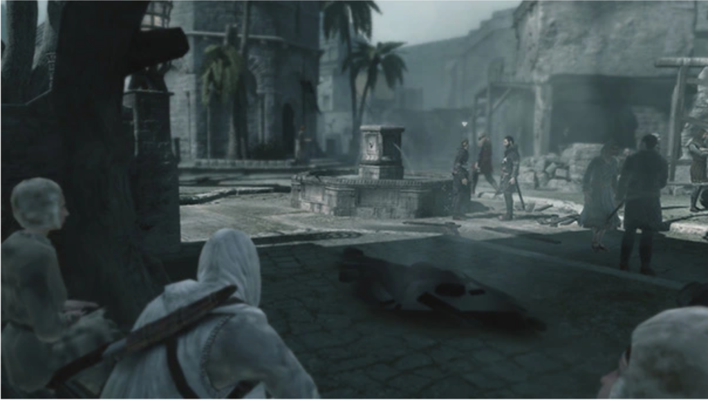
The game was designed without a HUD in mind, and the pure presentation of the action creates a more engaging and rewarding experience compared to having icons on a mini-map. The absence of a HUD requires a specific approach to environment design, mission design, and dialogue writing, making the game more interactive and allowing players to learn the city and find their goals.
Dead Space
Dead Space
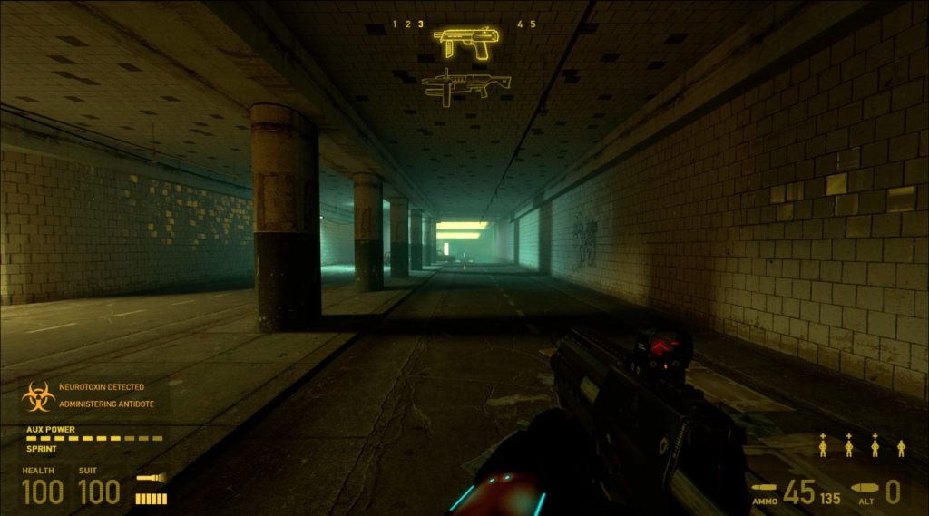
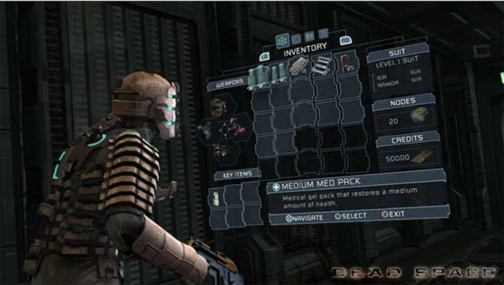
Dead Space teaches that a HUD can be effectively integrated into the game to maintain player immersion without sacrificing functionality. The game is praised for its unique approach to the HUD, which was a mix of shooter and survival horror genres and helped keep players focused in the moment. The health bar and map projection contributed to the mood and tension, while also guiding players through complicated levels and making them vulnerable when they stop to review their objective. This made the player experience more engaging and added to the suspense of the game. Dead Space demonstrates that good design can transform the HUD into an integral part of the game world.
The animation industry has evolved for over a century, with several animation studios emerging across the world. Generally, animation studios are companies that create animated media for different purposes. There are different types of animation studios – on the one hand there are large corporate animation studios that develop and distribute their own intellectual properties (for example animated films), thus owning the rights to the technologies and characters they created. Large animation corporations, such as The Disney Corporation, often own multiple subsidiary studios (Disney, for example owns Walt Disney Animation Studio, 20th Century Animation or Pixar Animation Studios), and are made up of a number of specialized departments and units. As these companies tend to work with high standards in terms of technologies and equipment, they are well-suited for working on high budget productions or films that require certain special techniques. Other companies, on the other hand, work for clients on a contract basis. Small contractor studios are often private-owned businesses and create animated content while not owning the digital merchandise copyrights. (cf. deedeecourse, n.d.)
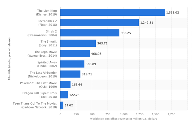
Over the course of the past couple of decades and even in recent years, the animation industry has seen a rapid growth and development. In 2021 alone, the global animation market grew by five percent to more than 372 billion U.S. dollars, reflecting the constantly rising demand for animated content. For example, six out of 10 of the highest-grossing animated movies in North American history originated from the mid to late 2010s. (cf. Statista Research Department, 2023)
The studios with the top-grossing animated feature films of all time are Disney, Pixar (run by Disney since 2006) and DreamWorks. (cf. Statista Research Department, 2023)
Figure 1: Top Grossing Animated Feature Films
The following paragraphs will include a couple of facts about one of the world’s largest animation corporations and the animation studios owned by it: The Walt Disney Company. Founded in 1923 as „Disney Brothers Cartoon Studios“, Disney is among the most successful animation companies today, owning subsidiary studios such as „Pixar“ and „Walt Disney Animation Studios“. Disney is very well known due to the fact that they set many of the standards and developed a number of animation techniques that are still being used today. (cf. Kizer, 2022)
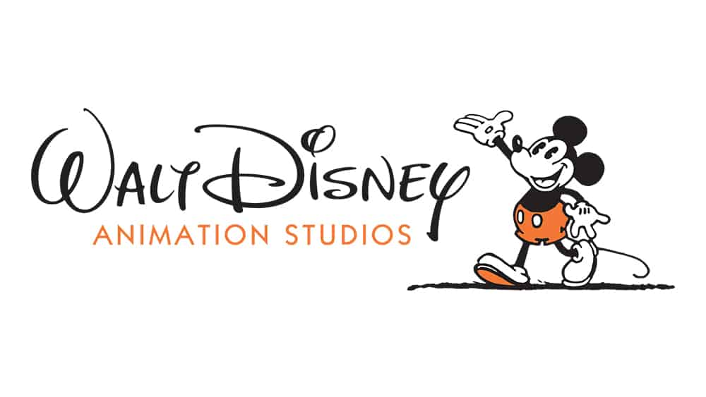
Figure 2: Walt Disney Animation Studios
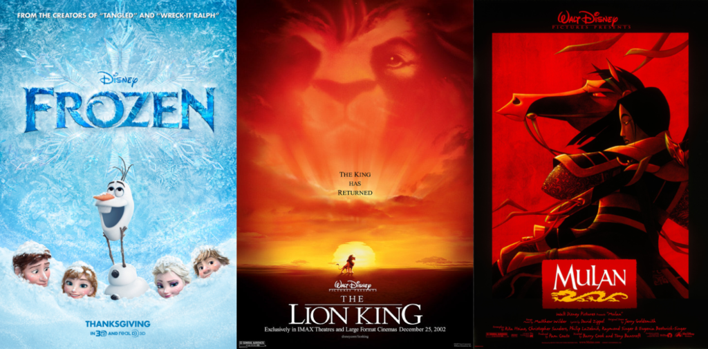
Walt Disney Animation Studios is the Disney Company’s most successful animation studio, having produced movies like „Frozen“, „The Lion King“ or „Mulan“. Also, they were the ones to define the 12 principles of animation and developing the multiplane camera, which then became a standard in traditional animation. (cf. Bailey, 2019)
Figure 3,4,5: Frozen, The Lion King and Mulan
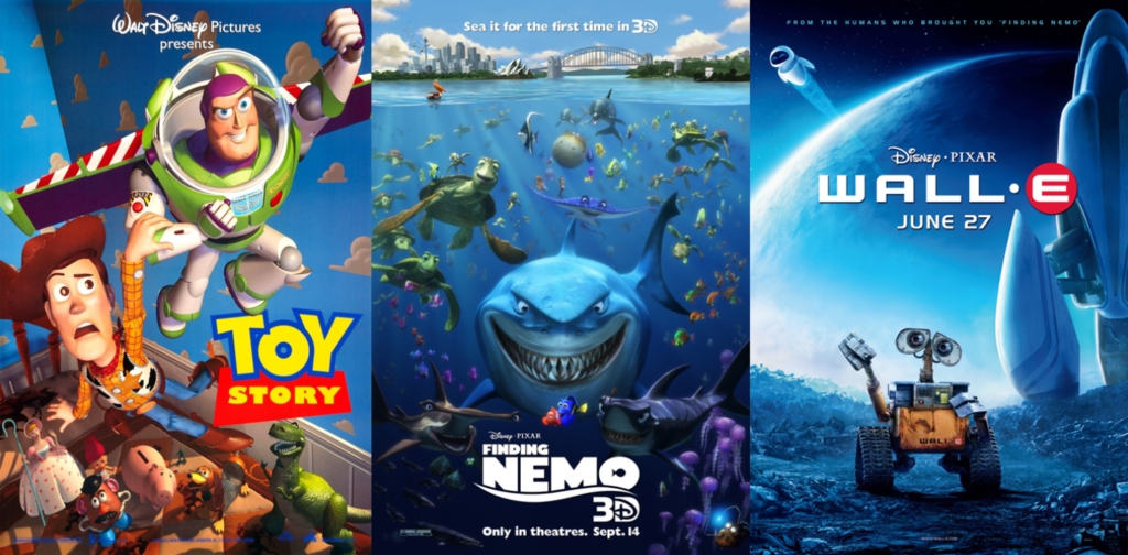
Pixar is especially known for its computer-generated 3D animations (CGI), using its own rendering software „RenderMan“. (cf. deedeecourse, n.d.)
It is a renderer developed by Pixar Animation Studios used for rendering VFX and animation. It has been the core rendering technology of the company for more than 30 years. (cf. Pixar, n.d.)
With „Toy Story“, Pixar released the world’s first feature-length computer animated feature film in 1995, receiving multiple Academy Awards for it, including Best Original Screenplay, making it the first animated film to be recognized for screenwriting. Other movie productions by Pixar include „Monster Inc.“, „Finding Nemo“, or „WALL-E“. The studio was bought by the Walt Disney Company in 2006. Other film studios owned by the Disney Company include 21st Century Fox, Lucasfilm Ltd., and Marvel Entertainment. (cf. Pixar, n.d.)
There is a vast variety of animation techniques that have developed over time. The following blog entry is dedicated to introducing the reader to the different types and techniques of animation.
Traditional Animation
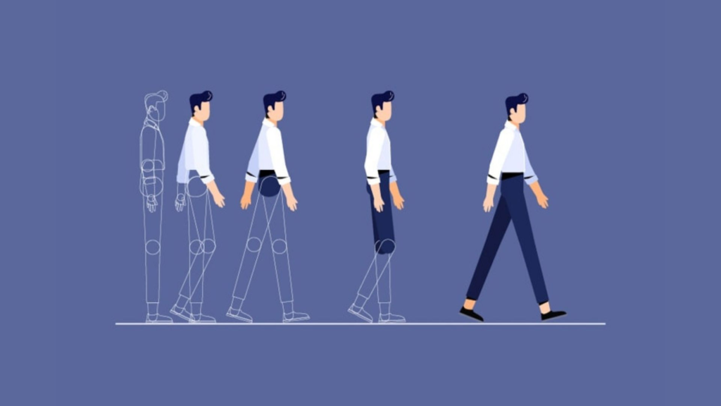
The process most frequently used for animated film productions in the 20th Century was Traditional Animation. This technique consists of creating a hand-drawn, individual picture for each frame, slightly altering the drawings in each to create the illusion of movement. (cf. Alhumaidhi, 2020)
Each component that needs to be animated is painted on a separate transparent sheet (also known as cels), so that the layers such as backgrounds, characters and moving objects can later be animated individually. (cf. Wall, 2022)
Figure 1: Traditional Animation
This technique, therefore also known as „Cel-Animation“, allows the animator to gain full control over the characters’ movements and expressions. However, it is a very time consuming method, since most animated films have a frame rate of at least 12 frames per second (FPS). Still, results of traditional animation techniques can be rather impressive and are nowadays often paired with modern digital software to achieve the special look and feel of frame-by-frame animation. (cf. Parker, 2022)
Examples of movies using the traditional animation technique would be classics like „Snow White and the Seven Dwarfs“ or „Sleeping Beauty“. (cf. Wall, 2022)
2D Animation
2D-Animation describes the creation of movement by stringing together an array of images in a two-dimensional space. While generally, one second of an animation equals 24 frames/images, most 2D-animatiors only draw every second image, resulting in a total of 12 frames for one second of animated content. This is a common practice since 12 frames are enough to generate the illusion of movement. While in the past, this style had to be hand drawn, nowadays there is a variety of modern software such as Toon Boom Harmony or Adobe After Effects, and with that, techniques such as keyframing and character rigging, that make the workflow indefinitely easier. (cf. Wall, 2022)
Figure 2: 2D Animation
Keyframing means defining certain frames such as the beginning, middle and end point of, for example, a character’s movement with so called „key frames“ and letting the software render the images between these pre-defined frame. This makes for a very time-saving and flexible workflow. (cf. Parker, 2022)
Character rigging basically means creating a digital skeleton of the character, defining its individual body parts, which the software can then animate in accordance. This, just as key framing, saves the animator a lot of work, since a character doesn’t have to be redrawn for each frame. (cf. Wall, 2022)
The style originally gained popularity through the works of Disney. Nowadays, 2D-Animation is a very popular and widely used technique for explainer videos, ads or promotional videos.
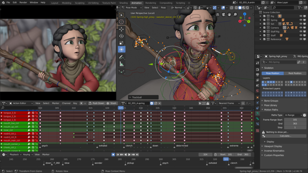
3D Animation
3D-Animation is a type of digital animation, virtually creating characters, objects and entire scenes in 3D-space. For this technique, various assets such as 3D-models and more complex character rigs are needed, making it a more technical, mechanical in its workflow. (cf. Wall, 2022)
However, it also allows the creation of an entirely new dynamic when it comes to animating different settings, characters, lighting situations or textures. Most modern animation movies, such as „Frozen“ or „Moana“ use 3D-animation techniques. (cf. Parker, 2022)
Figure 3: 3D Animation
3D, as opposed to 2D animation, makes it possible to create characters and assets that can be viewed from any angle, which makes it incredibly useful for the navigation through 3D worlds such as in games like „Grand Theft Auto“, where the player can walk around in a 360° angle and view assets from all sides. (cf. Wall, 2022)
Software used for 3D-Animation would for example be Autodesk Maya, Blender or Cinema 4D.
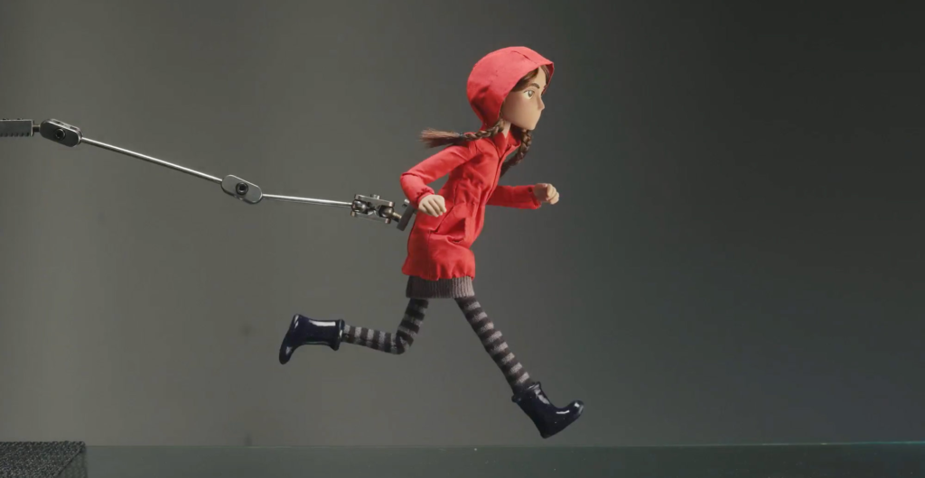
Stop Motion
In stop motion animation, the illusion of movement is generated through combining and rapidly replaying a sequence of photographs where real physical objects are moved in tiny increments, creating a scene. (cf. Parker, 2022)
Figure 4: Stop Motion
This style can be created with actual people but also clay figurines, toys, or other materials. Popular examples would be Tim Burton’s „Nightmare before Christmas“ or Burl Ives’ animated cartoon „Rudolph the red-nosed Reindeer“. (cf. Wall, 2022)
Stop motion is one of the oldest and most popular animation techniques. (cf. Movsisyan, n.d.)
Motion Graphics
While traditionally, animated films resolve around characters or a specific setting, motion graphics are a type of animated graphic design. They use graphics, typography and different shapes to create a kind of visual storytelling. (cf. Parker, 2022)
Figure 5: Motion Graphics
Motion graphics are commonly seen in logo animations, TV graphics, credits or explainer videos and can be made in both 2D and 3D. (cf. Wall, 2022)
Sources
(1) Alhumaidhi, Hind Ali [IDOSI Publications] (2020): Animation Techniques and Styles [online] https://idosi.org/wasj/wasj38(5)20/7.pdf [accessed on 21.01.2023]
I have learned in my research that the fashion world needs a complete remodel to become sustainable. To produce slightly less “un-unsustainable” clothing isn’t enough if we keep selling (and buying) big amounts of it. Therefore I want to explore ways to take part of the fashion world that isn’t designing new clothing.
Save Your Wardrobe
The startup Save Your Wardrobe helps people to go shopping in their own wardrobes. It pairs together pieces of clothing in the users wardrobe, guides to find repair services and alteration services. This can help in reducing the feeling of need for something new.
Unmade
To tackle one of the biggest issues in the industry – waste as a result of overproduction – Unmade list demand directly to production. This means there is no “guessing” what the consumers want. The software allowed users to customize clothing before it is produced. The clothing is then made on demand and in smaller batches. With this customization the user will likely also love the product more, as we tend to like things we had part in creating more. This leads to willingness to repair and use until it is worn out.
One of fashion’s biggest issues: overproduction
Fæbrik
A “sewing collective” creating easy sewing patterns which can be altered to perfectly match your body ensuring longevity and keep-worthiness is booming in Norway. By promoting using second hand clothing that has nice fabric, but not a nice fit is a great way to salvage clothing before the last stop. In addition they sell surplus textile from already (quite) sustainable brands to salvage high quality textile in addition to enlighten the public about this issue.
The Norwegian sewing revolution: Women have sown their own “bunad” (traditional dress) of second hand clothing and textile.
Renting / second hand / resale
ThredUp, Tise, Rent the Runway, My Wardrobe and so many other companies are booming. There are issues to take into consideration here as well, eg. transport, getting “the feeling of sustainability” yet still over consuming and changing of trends, but these can be worked on. Helping in designing systems for these companies to be more profitable yet more sustainable would be highly interesting.
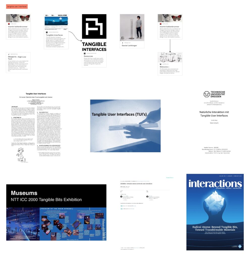
I expanded the mind map by adding the topic “Tangible User Interfaces” which I already discussed in my previous post. Now the mind map consists of 84 sources and is categorized in 6 main topics. In the next semester I will continue with this format by adding new relevant sources as I see great value in it.
Here you can see the topic named “Tangible User Interfaces”, which has been added to the mind map recently:
Final Presentation
As this is the last blog post for this semester, I would like to take the opportunity and share the slides I made for my final presentation. By doing so, this not only gives a great overview of all the topics I did research on but also underlines my current vision and goals for the next semester.
The presentation will be presented in a very restricted format called “Pecha Kucha” and consists of 10 slides á 20 seconds. Despite being very challenging, this format forces me to condense my research topic even further.
So without further ado, here you can take a look at my final presentation:
For the next Semester, I want to explore different media technologies to discover the “sweet spot” between the digital and analog medium. Therefore I am looking forward to all the upcoming lectures giving me new insights into programs and concepts.