Impulse #4 – Museu de les Ciències (Príncipe Felipe) – Part 1

The Museu de les Ciències is a scientific hands-on museum and located in Valencia (Spain). At the time of my visit there have been several exhibitions ranging from topics like chromosomes to the exploration of mars. The following post will be about my experience at the museum.

My focus was to analyze the user experience of the exhibits in the exhibitions. Not only did I document my own experience with photos, but also observe how other visitors interact with exhibits.

Exhibition: Pixar

In this exhibition I experienced a lot of consistency when it comes to the design of the user interfaces. Most of them where not only constructed in the same way but also had strong similarity in the layout of the panels. They shared the same button-, slider- and text layout. The color was used to distinguish between the different subtopics as well as the language.

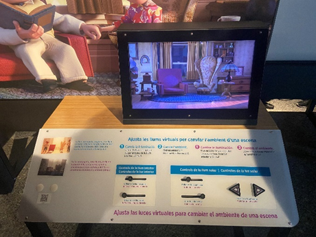
In the following photo you can see an interface that in my opinion broke this consistency as there is, compared to the other interfaces, no clear labeling. While the icon clearly indicated the user action, there was no panel connecting the user action to theoretical background like the other exhibits did.

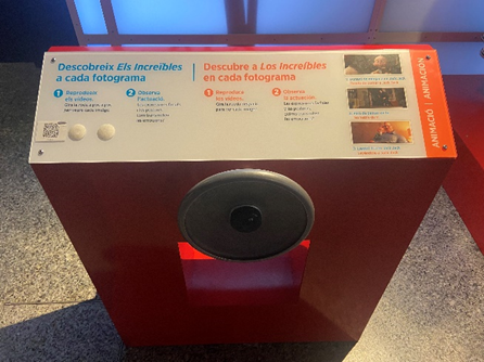
A user interface I interacted with and observed several users interacting with was about stop motion animations.

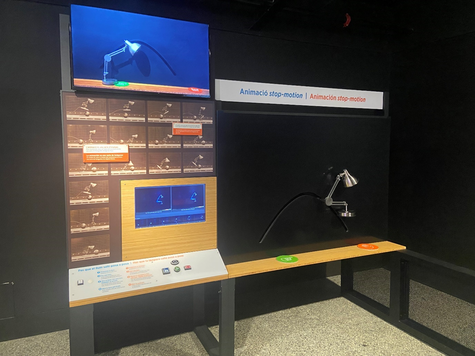
Based on my observation, I don’t think that there was a clear and understandable user journey. By observing four different visitors only one managed to interact with the exhibit as intended.

Possible reasons:

  • Different way of interaction

Compared to most other exhibits in this exhibition this one required the user to actively participate. A camera filmed the lamp on the black canvas on the right side and took snapshots as the user pushed a button on the interface on the left side. By moving the lamp and taking multiple snapshots the user could create a stop motion clip. So, the main problem was that most of the visitors don’t recognize the camera. Since the buttons were located on the left side, the user standing in front of the interface didn’t recognize that there was a camera as it didn’t capture the person at this position. Furthermore, since the buttons were located on the left side, at least two persons were needed to take a snapshot.

  • No clear explanation and misleading symbols

There was no visual explanation of the camera pointing to the lamp indicating that visitors can take photos of themselves. Most of the visitors didn’t understand that they can move the lamp. A few tried to move the lamp but didn’t succeed since it had to much friction. In my opinion the symbols indicating start and finish was also misleading, as the orange hand can be interpreted as “do not touch”. There is also a monitor on the top indicating the movement, unfortunately I only discovered it on the photo as it was placed too high and out of sight when interacting with the interface.

Exhibition: Terra Extraordinária

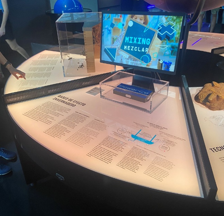
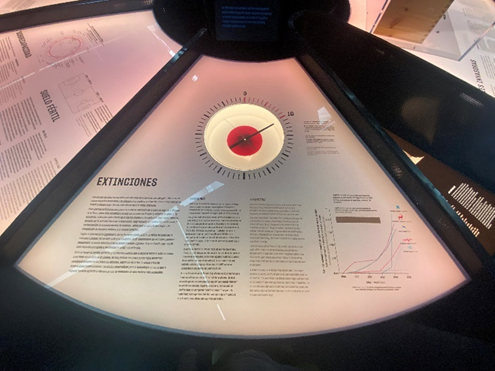
This exhibition was about the different scientific processes in our ecosystem. It was more diverse as there was no consistency in terms of user interfaces and only a few exhibits could be controlled via user inputs. While a lot of exhibits showed physical representations combined with text and graphs explaining the scientific background, a few let the user interact with gestures or touch.

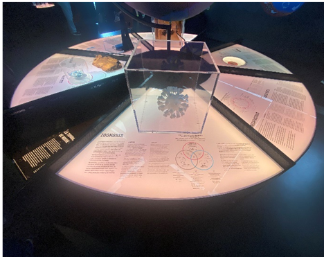
Here you can see a table showing physical representations as well as scientific background. While the table itself was build in the shape of a circle to provide good accessibility, the boxes protecting the physical objects didn’t match in shape and size. While one box was shaped like a cube another one looked like a cylinder.

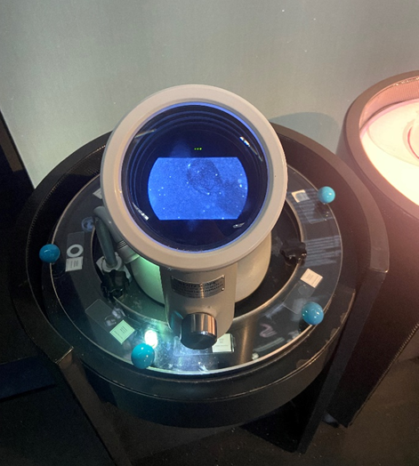
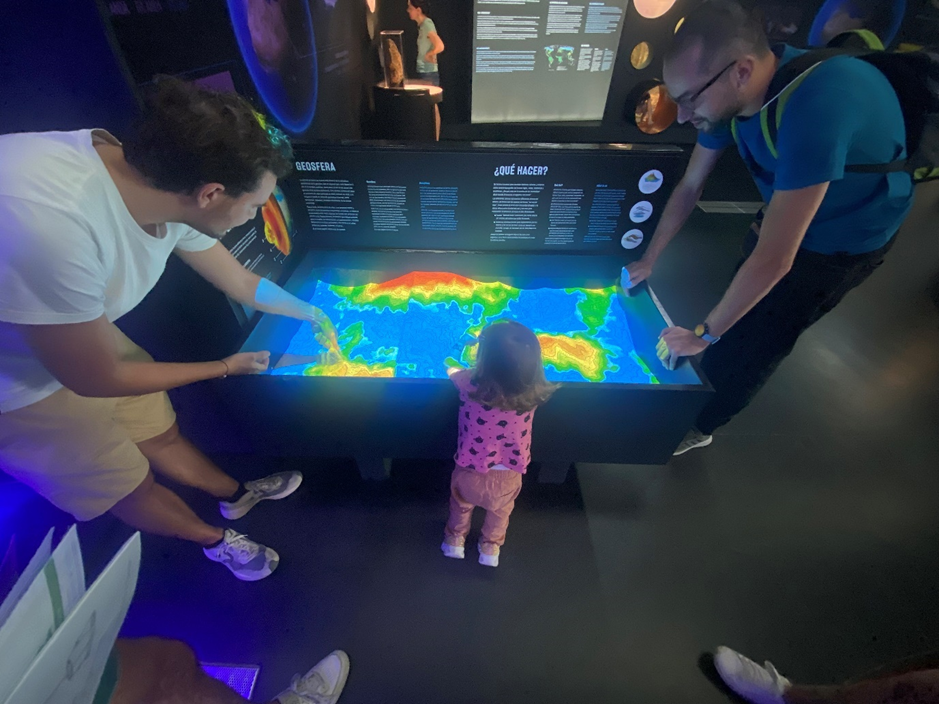
The two pictures above show exhibits visitors could interact with. While in one exhibit visitors could rotate the plate and see different microscope slides through the lens of a real digital microscope, in the other exhibit they could build their own geosphere by moving sand and producing rain with gestures.

While both exhibits encouraged visitors to interact with their hands, they included because of the construction different age groups.

While the exhibits offered different degrees of interactivity, I did not get the feeling of being disconnected. In my opinion, the reason for this is the use of similar colors and shapes. However, as you can see on the pictures above the shapes did not always match.

Also different forms of projections (on 3-dimensional and flat surfaces) were part of this exhibition.

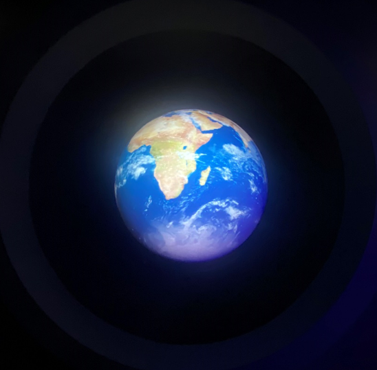
Here you can see another installation that projected the earths surface onto a 3-dimensional sphere. Unfortunately, one can’t recognize the 3-dimensional sphere as the room was very dark and the projection itself not in high resolution.

In comparison following picture shows a projection in high resolution on to a wall with a physical representation next to it. Even though the projection was in a brighter environment, the visibility was very good and the text readable. In my opinion, educational installations placed in dark environments can make tired and unfocused. Additionally, high contrasts can be exhausting for the eyes. The projection showed in the following picture on the other hand was very good optimized for the environment.

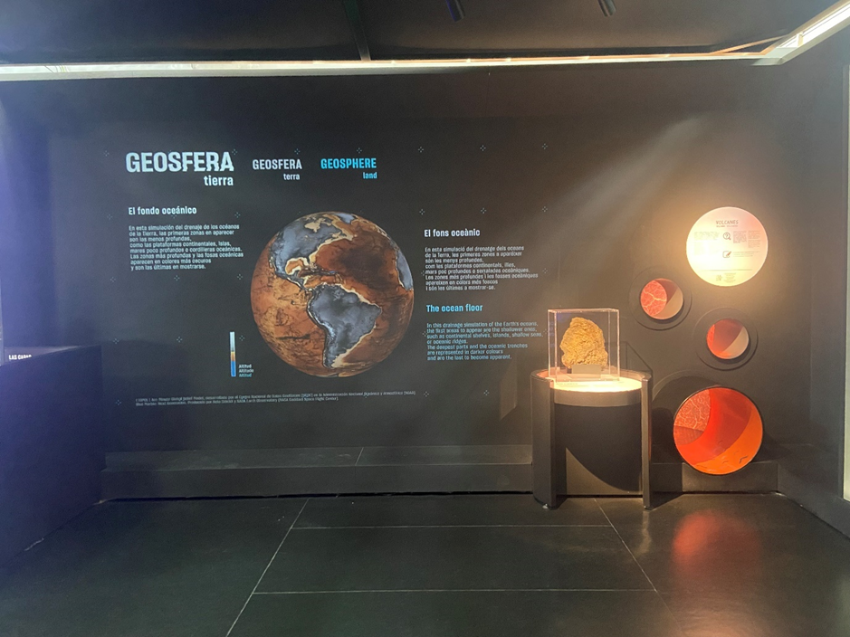
Photo Credits: Edwin Lang

Impulse #3 – Audio Workshop

I got the chance to take part in a music workshop where we build three types of microphones:

  1. Binaural Microphone
  2. Piezo Microphone
  3. Electromagnetic Field Microphone

If you want to build one of the microphones on your own, you will need the following parts.

Binaural Microphone:

  • 2x electret capsule mod. CME-12 (or similar omnidirectional)
  • 1x mini stereo jack male solderable aerial 3.5 mm
  • 1m coaxial audio stereo cable

Piezo Microphone:

  • piezoelectric ceramic disc buzzer model 27EE41
  • 1 mini mono jack male solderable aerial 3.5 mm
  • 1m coaxial audio stereo cable (separate each channel into two we only need one channel)

Electromagnetic Field Microphone:

  • 1 magnetic inductor (choose the one with the highest power)
  • 1 mini mono jack male solderable aerial 3.5 mm
  • 1m coaxial audio stereo cable (separate each channel into two we only need one channel)

Additional Equipment:

  • soldering iron
  • solder wire
  • electrical tape

While the piezo- and electromagnetic microphones will be connected via mono audio cable and jack, the binaural microphone needs a stereo cable and jack. The following soldering example refers to the piezo microphone but will be for all three microphones the same.

At the beginning you need to remove at the endings of the cable a small part of the outer insulation (see image below). Now you can see a red insulated wire and a loose wire around it. While the loose wire when twisted together acts the negative pole, the red insulated wire acts as the positive pole.

After this step you can start to solder one end of the cable on to the piezo microphone. The red wire should be soldered on to the silver area and the other one on to the golden area. It is important that each cable is only connected to one of the areas and doesn’t overlap with the second one.

Note: For additional protection of the solder points you can put hot glue on the entire surface, as the contact surface for the microphone is the back side.

The final step will be to solder the second end of the audio cable on to the audio jack. The red wire (positive pole) needs to be soldered in the inner part of the jack and the loose wire (negative pole) needs to be soldered on to the outer part (see image below).

Now put the cover back on the audio jack and test your new microphone.

Here you can listen to an example recording I made by scratching on a wooden plank.

Impulse #2 – fuse* Workshop

A workshop with fuse* design studio focused on generative art installations.

Through a lot of research in the field of machine learning and artificial images I found a design studio from Modena (Italy) named fuse* who hosts a discord server for exchange. Not only do they encourage to ask questions about their design process but also announce new projects.

One week after I joined, they announced a workshop about one of their art installations called “Artificial Botany”. Since I already knew from my previous research what algorithms and tools they might have used, I knew this would be a good opportunity to get insights into the actual design process and more importantly the scale of complexity when applied in a museum like environment.

To summarize, I got insights about the complexity and sub-processes between data collection and the final video. From my first Impulse I already knew how the technical workflow looks like, but I clearly underestimated the process of tweaking and manipulating data sets to produce the desired video output instead of a random generation. As the creation of a single Video already requires a lot of processing power, tweaking and manipulating requires many more cycles and regenerations. After this workshop I see this point in a different way – being more confused because of complexity I simply haven’t seen before.

With this knowledge I ask myself whether this complex, energy hungry and time-consuming process suites my end goal.  Are there other simpler approaches to visualize cracking ice in an interactive environment? Is this part of my installation going to be the focus, to justify the time it takes to produce the needed video content with a StyleGAN algorithm?

Whether or not, the videos that are being created with StyleGAN are truly impressive and by taking real iceberg pictures and bringing them to life through machine learning, would greatly fit the dramaturgy of my installation.

After this workshop I have strong concerns about the complexity of my concept. I think I need to get the opinion from an expert in the field of computer vision and maybe come up with simpler alternatives. So far, the following alternatives would greatly reduce the complexity of my project. The list is ordered starting with more abstract solutions up to authentic representations.

  • Draw the cracks by hand and capture them frame by frame to make a stop motion clip I could layer on top of satellite photo of an ice texture.

  • Tweak a generative algorithm (for example Random Walk) to recreate a crack structure.

This alternative would animate a generative drawing algorithm that gradually expands. The algorithm should draw a random line that has a structure similar to crack and gets bigger over time. This approach is similar to my first proposal but drawn by an algorithm.

  • Create a Blender animation with a premade texture.

For the crack structure I have found the following tutorial showing how to produce a procedural cracked earth effect. In a second step I would need to change the earth texture with an ice texture and modify the crack structure to show instead of a dark hole a water texture.

Tutorial: https://www.youtube.com/watch?v=oYEaJxw4pSo&list=PLOY1I6t4tn5CUFdRrko352uxnNTGYavV-&index=3

  • Create the complete ice texture with the help of Stable Diffusion.

A browser interface can be downloaded and run local on the computer: https://github.com/AUTOMATIC1111/stable-diffusion-webui

  • Cut a plain displaying a satellite image of ice with an 3D object.

In this approach I would create a 3D object and modify its surface with a texture modifier to produce a terrain structure. In the next step I would cut the plain with the satellite image as texture with the 3D object. By moving the 3D object up and down I could animate a melting effect of the ice.

  • Import GIS data into Blender and animate it over time.

For this alternative I could use a Blender add-on that can import google maps-, google earth- and GIS data. With this approach I would be able to rebuild the structure and its change of a real iceberg.

Blender add-on: https://github.com/domlysz/BlenderGIS

Tutorial: https://www.youtube.com/watch?v=Mj7Z1P2hUWk

This addon is extremely powerful as it not only imports the 3D-structure from NASA but also the texture. Finally, I could tweak the texture a little bit with blender’s shader editor and produce multiple renderings for different years.

Although, Google Earth offers the option to view data from previous years, I am not sure if this will work with the Blender add-on.

Link to the studio: https://www.fuseworks.it/

Impulse #1 – Artificial Images Lecture

As a big fan of NYU TISCH and their two programs named Interactive Telecommunications Program and Interactive Media Arts, I often search for their teachers GitHub Accounts as many of them provide open access to lecture materials. By doing so they give people who are not studying at this institution the chance of getting in touch with state-of-the-art research for artistic expression.

One of these teachers is Derrick Schultz who not only shares his code and slides but also uploads his entire classes on YouTube. By doing so I was able to follow his Artificial Images class and learn the basics of artificial image creation and state-of-the-art algorithms working under the hood.

Derrick Schultz introduced in his class the following algorithms that are currently used to generate images:

  • Style Transfer
  • Pix2Pix Model
  • Next Frame Prediction (NFP)
  • CycleGAN / MUNIT
  • StyleGAN

He also gives his opinion on the difficulty of each model and orders them from easiest to hardest.

  1. Style Transfer
  2. SinGAN
  3. NFP
  4. MUNIT/CycleGAN
  5. StyleGAN
  6. Pix2PIX

After comparing the different models, I found two algorithms that could produce the needed video material for my installation.

  • Pix2Pix
  • StyleGAN

Unfortunately, those are also the ones rated to be the most difficult ones. The difficulty is not only the coding but also data quality and quantity, GPU power and processing time.

In the following section I will analyze the two algorithms and give my opinion whether they could help me generating the visuals for the interactive iceberg texture of my project.

Pix2Pix

As already mentioned, this algorithm can take either image or a video as input and produces according to the training data a fixed output. I could use images of icebergs from NASA or Google Earth as my data set and detect with canny edge algorithm the edges of my images. By doing so, I get from every image in my data set the corresponding edge texture and therefore train the Pix2Pix algorithm to draw iceberg texture by giving edge textures as input.

Source: Canny edges for Pix2Pix from the dataset-tools library: https://www.youtube.com/watch?v=1PMRjzd-K8E

Problem:

  • The need to develop an algorithm that generates interactive edges.
  • Depending on the training set the output can look very different and in the worst case can not be associated with iceberg texture. A lot of training and tweaking results in many iterations of model training.

StyleGAN

In this scenario I could again use iceberg textures from NASA or Google Earth as training data and produce an animation of cracking iceberg texture that shrinks. Since this algorithm produces no fixed output, one can produce endless variations of image material.

A sample animation made by the teacher can be seen here:

Problems:

  • Getting in control of the output data of the algorithm is very difficult as it produces random interpolations based on the training data.
  • Heavy manipulation of training data might be needed to get the desired outcome. This results in many iterations of model training and therefore a lot of time, computer power, heavy GPU processing and costs.
  • Big data set of at least 1000 images recommended.

Link to the Lecture: https://www.youtube.com/@ArtificialImages

Current State

In my last blogpost for this semester, I will summarize my findings and ideas, introduce the second version of my prototype and give a short outlook on my plans for the next semester.

I started working on tangible user interfaces in the beginning and shifted my focus from image recognition and marker detection as a potential user interface to the question how data visualization can be made more physical.

So, the topic I will focus on are icebergs.

How did their mass change over time?
How are we as humans responsible?
How can we provoke change and call to action?

Moreover, I have found various Experts who currently research on icebergs. To get insights into their latest research findings I am planning to conduct expert interviews with them soon.

Miro Board

To merge my current research findings with those from last semester I made a Miro Board where I summarize my findings from both semesters. It can be accessed with the following link:

https://miro.com/app/board/uXjVP407Veo=/?share_link_id=883470200121

Video

I also made a short video where I introduce my project:

https://fhjoanneum-my.sharepoint.com/:v:/g/personal/edwin_lang_edu_fh-joanneum_at/ESRrN2lxslBLhFFnyQT7HxQBDw0QcxsXDfowIXVzM4KJ3A?e=WLhvvb

Prototyping Overview

Until now the focus of my research was about communicating social and environmental problems with the help of tangible user interfaces. In this blogpost I want to concretize my current topic of my master thesis and focus on one specific environmental problem – “melting ice sheets and their impact on sea level rise – starting a so called “chain reaction”.

So how should such an exhibit be designed, to not only offer great experience but also stating a call to action?

What is the perfect symbiosis between the digital and analog medium for communicating sensitive topics like climate change?

Staying true to the concept of multisensory experiences I would like to create an exhibit that has the following layers of abstraction:

Physical feedback

For the physical representation of an ice cap, I want to build a three-dimensional model out of sticks covered by an elastic mesh. The height of the sticks can be controlled separately with a motor, giving the impression of a shape changing constantly.

c Edwin Lang

Audio feedback

By recording the cracking of an ice bucket with contact microphones, I want to create a sound similar to a cracking ice cap.

https://freesound.org/embed/sound/iframe/268023/simple/large/

Video feedback

In terms of video, I want to project morphing organic shapes onto the physical representation of the ice cap. The shapes could be generated with programs like OpenFrameworks and real data sets of melting caps[1]. With the help of machine learning and algorithms the complexity of the data sets could be drastically reduced – however further research and testing is needed[2].

Credits images: https://pin.it/4OqiwA6


User Interface

The visitors should be able to see changes of the ice cap based on their ecological footprint. The ecological footprint gives an indicator on the greenhouse gas emissions, can be converted to emitted energy and further be linked to the capability of melting ice.

The interface itself has yet to be explored but will be of great importance to successfully link the individual ecological footprint with the ice cap and make the visitors emotionally bonded to the exhibit.

References:

[1] https://umap-learn.readthedocs.io/en/latest/
[2] Algorithmus: https://umap-learn.readthedocs.io/en/latest/

Image Processing

In this blogpost we are looking into a second feature of ZigSim which uses a video-over-IP protocol called NDI™ to transmit video and audio captured by the device. The data can be received with any NDI client apps – in our case we use vvvv and OpenFrameworks to get familiar with the corresponding workflows.

Setup:

The goal is to setup a connection between our sender (iPad Pro) and receiver (Laptop) to have a second possibility for tracking physical objects via a local network.

First, we need to install the NDI® Tools which can be found here:

https://www.ndi.tv/tools/

They contain several applications (like Test Patterns and Screen Capture) to create NDI Sources on the computer.

For our first test we run the Studio Monitor app and select the broadcast from the ZigSim iOS app.

Note: After some debugging, I found out that ZigSim does not always connect successfully with the computer – without raising an error. So if your device does not show up, just force close the ZigSim app and open it again.

1. Example: Setup for vvvv

For displaying video content within vvvv we need an addon called VL.IO.NDI which can be downloaded under the following link:

https://github.com/vvvv/VL.IO.NDI

Be aware that this addon needs the latest vvvv preview build (5.0) to work properly!

2. Example: Setup for OpenFrameworks

For testing the connection in OpenFrameworks we use the ofNDI addon which can be downloaded under the following link:

https://github.com/leadedge/ofxNDI

After opening the project with the OpenFrameworks project generator we need to build the app in Visual Studio. While running, the app searches for available sources and lets us display the video output within the app.

With the help of various image detection, tracking or machine learning tools like TenserFlow or OpenCV this video source can be processed within vvvv or OpenFrameworks.

The following prebuild vvvv example shows how the Yolo3 algorithm successfully recognizes objects within a picture. The amount and accuracy depends on the data set which could also be custom made to suite the use case of a given exhibit.

Workshop Week

This blogpost is about my experience I made in a workshop about “Tangible Scientific Concepts” and the Design Process it is based on. The Workshop was held by Carla Molins Pitarch who is based in Barcelona and currently finishing her PhD at the Pompeu Fabra University (Spain).

How can a code with only four letters (A, C, G, and T) create so many different proteins necessary for your body? Could we humans encode it better? The one-week workshop aims to question the current systems for encoding DNA and reconsider an infinite array of interactive visual systems with a hands-on approach and critical thinking.

In the following section I will describe the prototyping process of my group and outline what I learned during this intensive week.

The project was developed together with Theresa Dietinger and focuses on the exploration of the DNA Bases “Letters“ by trying out how the physical representations fit together.

First Phase: Ideation

In this phase we wrote all our ideas on a flipchart, clustered our interests and focused on one idea.

Second Phase: Testing

In this phase we created a wireframe prototype and performed the first user tests with our colleges to get new insights and discover problems we didn’t think of.

Third Phase: Prototyping

In this phase we developed the logical states needed to indicate whether the physical representations of the DNA Letters fit together. If the Letters don’t fit together (for example A and T) a red light will be switched on. If the Letters fit together (for example A and C) a green light will be switched.

Forth Phase: Final Prototype

Here you can see our finished prototype with the installed LEDs on both sides of the physical DNA Letters.

In this workshop I experienced the importance of simplifying complex topics as much as possible. Focusing on one specific part and making sure you don’t overwhelm your audience is the key to make them excited and raise interest for further reading at home.

An Overview on existing Frameworks for Tangible User Interfaces

The following post gives insights into my research about existing frameworks for Tangible User Interfaces (TUI) in the context of museums, schools and public places. In total, I want to summarize five different papers published between the years 2006 and 2019 in which the authors developed different guidelines for designing TUIs.

Tangible User Interfaces in Learning and Education

This framework is designed for the application in schools and learning activities. The original model called “Cybergogy Model” by Wang and Kang was developed in 2006 for autonomous and collaborative learning in a virtual environment and consists only of three dimensions – emotion, cognition and social factors. The authors of “Tangible User Interfaces in Learning and Education” adapted this model and added a fourth dimension called body factors.

Getting a Grip on Tangible Interaction: A Framework on Physical Space and Social Interaction

This paper was published during the Conference on Human Factors in Computing Systems (CHI) 2006 and focuses on the social interaction of TUIs. The authors provide concepts and perspectives for considering the social aspects of tangible interaction and summarize their ideas in the following framework.

Embodied Engagement with Narrative: A Design Framework for Presenting Cultural Heritage Artifacts

The authors have developed a framework called “Tangible and Embodied Narrative Framework (TENF)” providing a conceptual structure to design elements of physical engagement, narrative role, and narrative consequences. While the authors focus on creating an immersive experience in the field of cultural heritage artifacts, their concept could also be applied for various other use cases.

A Framework for Designing Interfaces in Public Settings

In this paper an analytic framework for public interfaces was developed, showing how current design approaches can be related through a few underlying concepts. It provides a range of examples – analyzing interfaces and studies of interaction especially from interactive art and performance. The framework acts as a way of mapping a design space, and as a series of constraints and strategies for a broad range of design communities.

Social Immersive Media: Pursuing Best Practices for Multi-user Interactive Camera/Projector Exhibits

The authors articulate philosophical goals, design principles, and interaction techniques that create strong emotional responses and social engagement through intuitive interaction. Their work builds on camera-based interactive research in interactive arts, tangible interfaces, and interactive games.

What is the language of this social medium? How do we control and modulate people’s responses and behavior? How can we design experiences for the greatest educational and cultural impact?

References:

“Tangible User Interfaces in Learning and Education” by Yuxia Zhou and Minjuan Wang (2015)

“Getting a Grip on Tangible Interaction: A Framework on Physical Space and Social Interaction” by Eva Hornecker and Jacob Buur (2006)

“Embodied Engagement with Narrative: A Design Framework for Presenting Cultural Heritage Artifacts” by Jean Ho Chu and Ali Mazalek (2019)

“A Framework for Designing Interfaces in Public Settings” by S. Reeves (2011)

“Social Immersive Media: Pursuing Best Practices for Multi-user Interactive Camera/Projector Exhibits” by Scott S. Snibbe and Hayes S. Raffle (2009)

Camera-Based Object Tracking – Part 1

This blogpost is about my first setup for experimenting with camera-based object tracking. I want to explore different tools and technics to get in-depth experience for real time object tracking in 2D and 3D-space.

For my examples I have chosen the following setup:

Hardware:

  • Apple iPad Pro
  • Laptop (Windows 10)

Software:

  • ZigSim Pro (iOS only)
  • vvvv (Windows only)
  • OpenFrameworks
  1. Example: Tracking Marker in ZigSim

As ZigSim uses the inbuild iOS ARKit and calculates the coordinates within the app, we need to follow the documentation on the developer’s homepage.

ARKit in ZigSim has 4 different modes (DEVICE, FACE, MARKER and BODY) – for the moment we are only interested into MARKER-Tracking which can track up to 4 markers.

The marker can be found here: https://1-10.github.io/zigsim/zigsim-markers.zip

OSC Address:

  • Position: /(deviceUUID)/imageposition(MARKER_ID)
  • Rotation: /(deviceUUID)/imagerotation(MARKER_ID)
  1. Example: “Hello World”

In this example we want to establish a connection via the OSC Protocol between ZigSim (OSC sender) and a laptop running vvvv (OSC receiver) which is a visual live-programming environment.

Here you can see the vvvv patch which is a modification of the inbuild OSC example:

  1. Tracking the marker

In our next step we will track the location of four marker via ZigSim, transfer the coordinates to vvvv and draw a rectangle for each marker.

  1. Example: OpenFrameworks

In our last step we will compare the workflow of the node-based environment vvvv with the one from OpenFrameworks which builds on top of the C++ programming language and is being programmed in Visual Studio or Xcode.

void ofApp::update(){
	while (osc.hasWaitingMessages()) {
		ofxOscMessage m;
		osc.getNextMessage(&m);

		if (m.getAddress() == "/ZIGSIM/iPad/imageposition0") {
			osc_0x = m.getArgAsFloat(2) * (-2);
			osc_0y = m.getArgAsFloat(0) * (2);
		}

		if (m.getAddress() == "/ZIGSIM/iPad/imageposition1") {
			osc_1x = m.getArgAsFloat(2) * (-2);
			osc_1y = m.getArgAsFloat(0) * (2);
		}

		if (m.getAddress() == "/ZIGSIM/iPad/imageposition2") {
			osc_2x = m.getArgAsFloat(2) * (-2);
			osc_2y = m.getArgAsFloat(0) * (2);
		}
		
		if (m.getAddress() == "/ZIGSIM/iPad/imageposition3") {
			osc_3x = m.getArgAsFloat(2) * (-2);
			osc_3y = m.getArgAsFloat(0) * (2);
		}
	}
}

Note: While both tools (vvvv and OpenFrameworks) have their own advantages and disadvantages, I am curious exploring both approaches to find the best workflow.