Overview of what AI can do in a typographic context + first experiment

For a first experiment to explore the application of AI within the typographic context, I decided to have a look at which tools and software already exist in the moment. In an article titled “Artificial intelligence and real type design” published by type.today several tools and their possible uses and limitations have already been highlighted:

  • Midjourney: Midjourney is a software used to create images with the GAN algorithm, but you cannot control the input you feed the algorithm, but Midjourney rather bases its output on the “entire amount of knowledge it obtained during its lifetime” (Shaydullina, 2023). This makes it difficult to control the output, especially when aiming for creating very specific shapes such as letters. In the article, the author suggests however, that one can get a somewhat functional output by using the Blend command to create an arithmetic mean of two different typefaces (Shaydullina, 2023).
  • Adobe Photoshop: The author writes that you can use Photoshop’s built-in AI-tool to generate letters that are similar to an uploaded picture, but judges it rather harshly: “Photoshop rarely succeeds in it, however, it usually comes up with recognizable capital letters (Shaydullina, 2023).

In addition, I found several other applications that can be useful in the typographic process:

  • Monotype AI pairing engine: This tool by Monotype pairs fonts and gives advice on hierarchy, font size, etc. (Jalali, n.d.).
  • iKern: This software developed by Igino Marini automates the task of kerning, that is the determination of glyph’s relative positioning (Marini, n.d.).
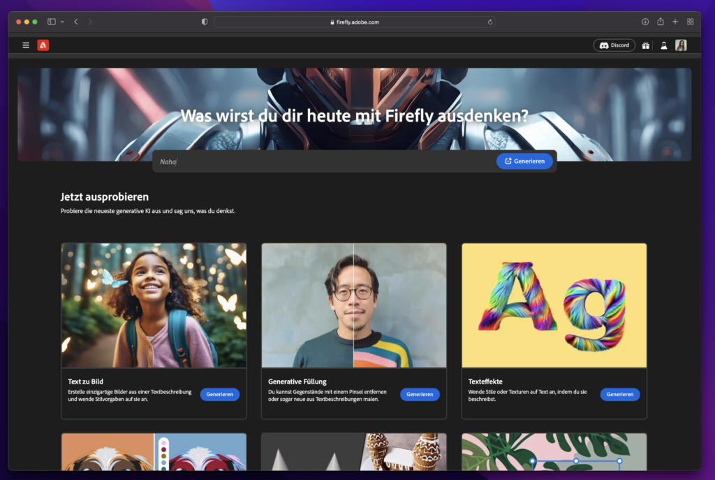
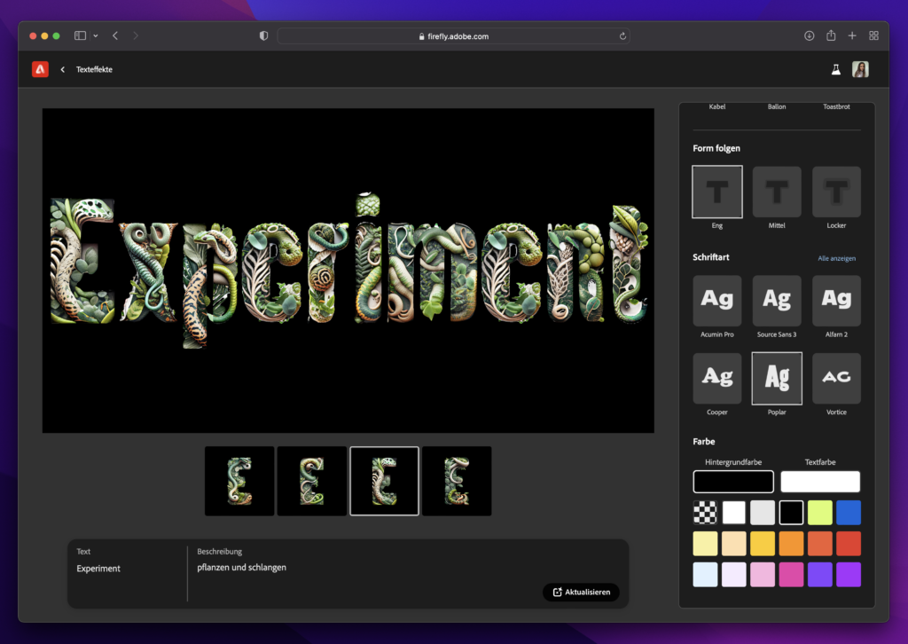
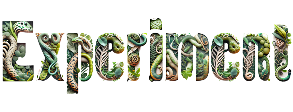
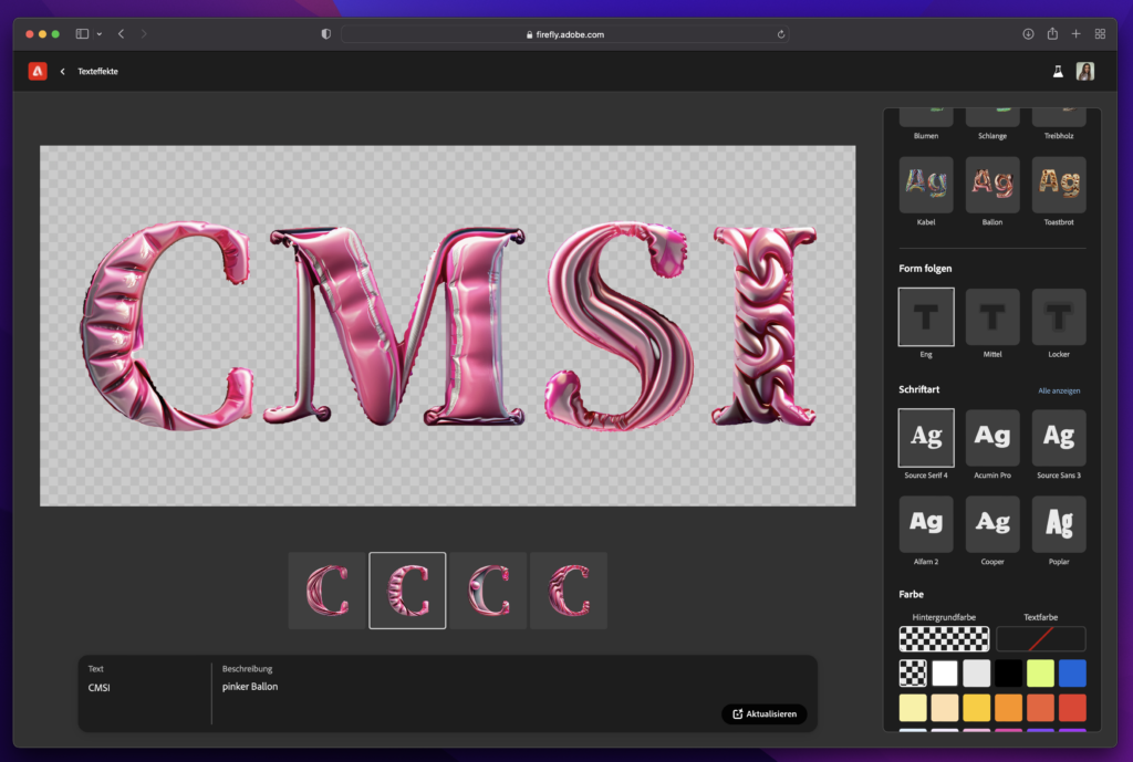
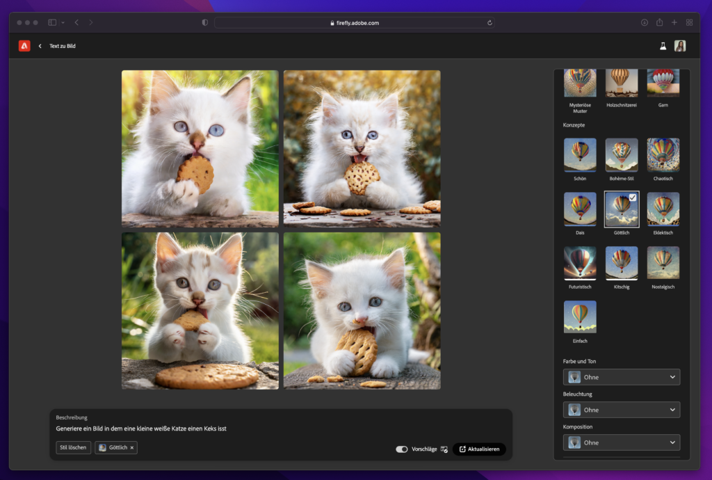
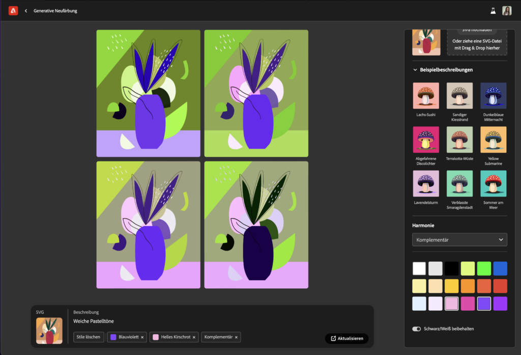
  • Adobe Firefly: Adobe’s answer to AI allows you (at the moment) amongst other things to generate images from text or apply textures to words (Adobe Creative Cloud, n.d.). However, both features seem to do not add more options to creating typefaces than the aforementioned tools.

Unfortunately, the main problem using software-solutions that are available on the market to date seems to be the lack of control over the input used to train the AI, if we want to create usable letters. Some designers have, however, already tried to train their own AIs, with many of them using StyleGAN, a style-Based Generator Architecture for Generative Adversarial Networks developed by NVIDIA (NVlabs, n.d.).

In order to get a better overview of all the developments in the AI sphere and to broaden my understanding of what is currently possible, I decided to try out different tools. For this experimentation, I began using the arguably most popular text-to-image AI available: Midjourney.

First experiment: Midjourney

To start it off, I gave the Midjourney Bot the simple brief “the letter ‘A’ in black on a white background” leading to this outcome:

Unfortunately, Midjourney returns images that have textures, color splashes or a 3D effect, so I adjusted my prompt to the following: “the letter ‘A’ in black on a white background as a flat shape –no texture or 3D effect”, which lead to clearer shapes.

As a next step, I tried to give the AI more detailed input on the type of letter it should produce, adding “in a Serif style” to the prompt.

Midjourney offers several commands other than prompts to play with the images it creates. I tried out creating variations of a letter I liked (Fig. 4) or varying regions (Fig. 5), with the latter leading to the closest thing of typographic variations.

A little less successful was my attempt at creating a matching letter ‘B’ to the ‘A’ midjourney created, the output was just any kind of ‘B’ with little resemblance to the original letter.

Also when asking the AI to create multiple letters within one picture, the software was not able to fulfil my command in the way I imagined it.

As a last trial, I uploaded a picture of three sample letters in a decorative style to Midjourney as a reference image (Fig. 8) and prompted the software again to create the letter ‘C’. Sadly, this only lead to a more “creative” 3D output in the first instance (Fig. 9), and when adding the finer definition to the prompt regarding the styling, to some form of usable shape but not letters of the Latin alphabet (Fig. 10).

Learnings from this experiment:

  • As of today, and with the current knowledge I have for using the AI, I can generate letter forms with Midjourney.
  • However, only single letters can be created and it is difficult to create a second, matching one.
  • Only minor influence on the style of the letters is possible; adding a reference image is not working properly.

As fun as this first experiment was, it seems to me that Midjourney is in the moment not really of use within the creation of typefaces or type setting, but I will explore the possibilities more deeply in the future.

References

  • Adobe Creative Cloud. (n.d.). Adobe Firefly. Retrieved November 15, 2023, from https://www.adobe.com/sensei/generative-ai/firefly.html
  • Jalali, A. (n.d.). Putting AI to work: The magic of typeface pairing. Monotype. Retrieved November 15, 2023, from https://www.monotype.com/resources/expertise/putting-ai-work-magic-typeface-pairing
  • Marini, I. (n.d.). iKern: Type metrics and engineering. iKern. Retrieved November 15, 2023, from https://www.ikern.space/
  • NVlabs. (n.d.). GitHub – NVlabs/stylegan: StyleGAN – Official TensorFlow Implementation. GitHub. Retrieved November 15, 2023, from https://github.com/NVlabs/stylegan
  • Shaydullina, A. (2023, June 7). Artificial intelligence and real type design. type.today. Retrieved November 15, 2023, from https://type.today/en/journal/fontsai

Impuls 4: Word Press Photography Vienna 2023

Representing major news events and important moments overlooked by the mainstream media in 2022, the 2023 World Press Photo Contest winning works call attention to some of the most pressing issues facing the world today – from the devastating documentation of the war in Ukraine and historic protests in Iran, to the realities in Taliban-controlled Afghanistan, and the many faces of the climate crisis in countries ranging from Morocco to Australia to Peru to Kazakhstan.

The 24 regional winners and six honorable mentions – covering stories from the front lines of conflict, culture, identity, migration, memories of lost past and glimpses of near and distant futures – were selected by an independent jury out of more than 60,000 entries by 3,752 photographers from 127 countries. 

Blog #3

Digitale Barrierefreiheit: Entwicklung

Die Entwicklung trägt mit 80% am meisten zur Gewährleistung von digitaler Barrierefreiheit bei. Der HTML Code muss sauber aufbereitet sein, und alle Tags müssen sinnvoll verwendet werden.

Eine gängige und schnelle Methode zur Erstellung von HTML-Code ist die Verwendung von Div-Containern. Allerdings ist ein Code, der ausschließlich aus “divs” besteht, für E-Reader nicht informativ und kann nicht eindeutig identifiziert werden. Um die Barrierefreiheit zu gewährleisten, muss der Code so strukturiert sein, dass er von Hilfstechnologien interpretiert werden kann. Dies erfordert den sinnvollen Einsatz geeigneter HTML-Tags, um eine korrekte Lesbarkeit durch assistierende Software zu ermöglichen.                          

Das Gerüst eines Codes kann mit einem Haus und seinen Innenräumen verglichen werden:

Beispiel <div></div><div></div><div></div><div></div><div></div>

Betritt man das Haus, und man steht vor weiteren Türen, die nicht beschriftet sind, weiß der E-Reader nicht wo er zuerst hineinsehen soll, was sich darin befindet (ob es möglicherweise sogar irrelevant ist?) ob er den Raum betreten möchte und wie lange er sich in einem Raum aufhalten möchte. So muss er jede Tür öffnen, und nachsehen.

Beispiel: <section><div><h1><h2><p></p></h2><h1></div><article><img><h1><h2><p></p></article></section>

Sind die Räume allerdings beschriftet und haben sogar eine Kurzbeschreibung an der Wand hängen: “Hier geht’s zum Menü, darin befindet sich eine Sitemap mit diesen Links, ein Bild in Form eines Logos und zwei Icons, die auf die Social-Media Plattformen Facebook und Linked In verweisen.“ damit weiß der E-Reader und somit auch die Person, dass man auf diesem Weg zum Menü kommt. In einem anderen Raum befindet sich zum Beispiel ein Web-Shop oder andere Bereiche einer Website.

Keine Automatischen Slideshows einbauen,

welche nicht bedienbar sind! User*innen sollen selbst weiterklicken können, da sehbeeinträchtigte Menschen durchaus mehr Zeit brauchen können, um Bilder zu erkennen und E-Reader sonst nicht mitlesen können.

Mehrere Optionen für User*innen bereithalten

Zudem soll es auch mindestens zwei Auswahlmöglichkeiten geben, was die Ausgabe der Bedienhilfen betrifft. Mehr Sinne geben nicht nur mehr Information, sondern inkludieren mehr Menschen. Wenn ein Video beispielsweise nur vorgelesen werden kann, aber es keine Untertitel oder schriftliche Beschreibung zu dem Video gibt, werden Gehörbeeinträchtigte automatisch ausgeschlossen.

Eingabemasken

Füllt man bei Eingabemasken ein Feld falsch aus, reicht es nicht, wenn dies mit einem roten Rahmen gekennzeichnet ist. Zusätzlich sollte ein Text unter der Eingabemaske erscheinen, der beschreibt, wieso das Feld falsch ausgefüllt wurde. Zudem ist es wichtig, dass es nicht am Ende des Formulars beim „Abschicken“ geprüft wird, sondern sobald die Eingabe von den Vorgaben abweicht.

Der Tastaturfocus

Die Tabulatortaste und die Pfeiltasten dienen als unterstützende Bedienhilfe, um durch die Website und Links zu navigieren. Es ist wichtig, dass der aktuell ausgewählte Tab klar und deutlich hervorgehoben wird, und dies geschieht durch den Tastaturfokus.

Es sei darauf hingewiesen, dass die Handhabung des Tastaturfokus bei Pop-ups, wie beispielsweise Cookie-Bannern am Anfang der Seite, herausfordernd sein kann. In solchen Fällen kommt es nicht selten vor, dass Benutzer*innen, sobald sich das Pop-up öffnet, sich zwar im Pop-up-Menü mithilfe der Tabulatortaste orientieren können, jedoch Schwierigkeiten haben, wieder aus dem Pop-up herauszukommen. Dies erfordert eine spezielle Programmierung, um eine reibungslose Navigation für alle Benutzer*innen zu gewährleisten.

Skiplinks / Sprungmarken

Es ist empfohlen, Skiplinks (sogenannte Sprungmarken) einzubauen, um User*innen eine schnellere Navigation anzubieten, ohne dass sie sich, wenn sie in den Footer wollen, durch die gesamte Website mit der Tabulatortaste klicken müssen.

Diese Skiplinks können im Code mittels Anker ( <a href=“https://examp.le“ id=“anker“>Das ist ein Anker</a> ) gesetzt werden, damit sich Menschen mit taktiler Behinderung nicht durch das unendliche Menü klicken müssen, bevor sie zum eigentlichen Content gelangen.

In der Website https://www.hilfsgemeinschaft.at/ beim Drücken der Tabulatortaste öffnet sich ein solcher Skiplink. Die Hilfsgemeinschaft stellt hier ein best Practise dar. 

Veranschaulicht: Drücke taste 0, um im Hauptinhalt zu bleiben. Drücke Taste 1, um ins Hauptmenü zu gelangen. Drücke taste 3, um ins Suchfeld zu gelangen. Drücke Taste 4 für Kontakt daten… usw.

Best Pratices

https://www.hilfsgemeinschaft.at/
https://www.blindenverband.at/
https://www.myability.org/
https://www.kraft-rucksack.at/

Worst Practice/ Bad Practice

https://polizei.gv.at/

Wie sieht der nächste Step aus?

Den Beginn des dies semestrigen Bloggens möchte ich damit verwenden, kurz zu wiederholen, was ich vorhabe. Da ich das Thema als Masterarbeitsthema weiterverfolgen möchte, stehen noch so manche Entscheidungen vor mir. 

Da mein Thema (Beeinflussung und Manipulation durch von Werbung) sehr groß und vielfältig ist, muss eine Eingrenzung stattfinden. Beim Feedbackgespräch mit Gabi Lechner haben wir festgestellt, dass eine Spezialisierung auf ein Unterthema hilfreich wäre. Sie fragte nach meinen Interessensgebieten und Wünschen, wo die Reise hingehen soll. Natürlich liegt es im Endeffekt bei mir für was ich mich entscheide, aber es war gut mit einer komplett fremden Person darüber zu reden und ihre Sichtweisen einzuholen. 

Der Plan für dieses Semester ist, mich in unterschiedliche Unterthemen einzulesen und zu recherchieren, um die endgültige Entscheidung für die Masterarbeit zu erleichtern. Ich möchte diese Lehrveranstaltung nutzen, Themen auszuprobieren, zu wählen oder wegzulegen. Auf den Outcome bin ich schon sehr gespannt. 

Auf der Suche nach visuellen Lösungen: Gendern aus der Perspektive eines Designers/einer Designerin

Mein Gespräch mit Gabriele Lechner war sehr Hilfreich im weiteren Vorankommen mit meinem Thema. Das Gespräch half mir, wichtige Aspekte zu klären und eine weitere Vorgehensweise festzulegen.

Im Mittelpunkt meiner Masterarbeit steht die Fragestellung: “Wie kann man aus Sicht eines Designers/einer Designerin das Gender-Thema optisch lösen?”

Ungefährer Aufbau der Arbeit: aktuellen Situation und dem Kontext des Gender-Themas im Design. Dabei wird die Bedeutung von Veränderungen beleuchtet und warum diese notwendig sein könnten.

Mögliche Quellen könnten sein: Interviews mit Genderbeauftragten, Interviews mit Designer:innen, die ihre Ansätze zur Integration von Gendern in ihren Designs teilen.

Das übergeordnete Ziel meiner Arbeit besteht darin, eine Art von Leitfaden zu erstellen, der Designer:innen eine bessere Umsetzbarkeit des Genderns auf visueller Ebene ermöglicht. Als praktischer Bestandteil könnte eine Werksarbeit dienen, in der die aufgestellten Thesen durch die Gestaltung einer Kampagne exemplarisch angewendet werden.

Weitere Vorgehensweise:

  1. Forschung zu Medienpraktiken: Ich plane, verschiedene Medienformate zu analysieren, darunter Magazine, Plakatwerbung, Wissensbücher, Kinderbücher, Blogs und Unternehmenspräsenzen in sozialen Medien. Dies soll mir Einblicke darüber verschaffen, wie unterschiedliche Medien das Thema Gendern in ihrer Gestaltung behandeln.
  2. Literaturrecherche: Eine wichtige Grundlage meiner Arbeit wird die Analyse von “Typohacks” von Hannah Witte sein, um bewährte Methoden im Bereich des geschlechtergerechten Designs zu identifizieren. Diese Erkenntnisse werden in meine Forschungsarbeit einfließen.
  3. Forschungsfrage verfeinern: Durch eine vertiefte Sichtung von Literatur und Recherche zu bereits existierenden Arbeiten in diesem Bereich, beabsichtige ich, meine Forschungsfrage zu verfeinern und zu präzisieren.

Impulse 2 – OpenAI Dev Days

When I wanted to start writing my second impulse, I noticed that the talk held by OpenAI concerning AI topics and the company itself I wanted to cover had been removed. As luck would have it, I also noticed that OpenAI had held multiple keynotes as part of their Dev Day on November 6th, which have since been uploaded to their YouTube channel.

I watched the opening keynote as well as part of their product deep dive. During the keynote, they discussed some updates concerning ChatGPT for enterprises, some general updates and performance improvements to the model and most importantly to me, introduced GPTs. GPTs is a new product that is a part of ChatGPT which allows users to train specialised versions of ChatGPT for personal, educational and commercial use.

The user can prompt the model with natural language, telling it what it should specify in, upload data the model should know about and reference and call APIs. The user can also tell the GPT to have certain “personality” traits, which the developers show off during the deep dive by creating a pirate-themed GPT. They jokingly claim that this specific demo/feature is not particularly useful but I believe it shows off the power behind the model and could come in handy for my potential use.

I could train a custom GPT for scriptwriting, training it using scripts of movies I like (and of which I can actually find the script of), and train a different one on storyboarding, supplying it with well-done storyboards and utilising the built-in DALL-E 3, or train another model that just specialises in ideas for short films. I think this feature alone has further solidified ChatGPTs dominant position as the go-to text based AI and will definitely use it for my Master’s project.

Links

Dev Day Opening Keynote

Product Deep Dive

The Business of AI

Changing my Master’s thesis – Storytelling with mixed media in music videos with the underlying theme of attention “Triggers”

The reason for changing my thesis was the lack of interest for the first topic. As I have thought more about it I have realised that it is not something I want to do mainly further in life. Music, mixed media and video editing are more of a path that I want to follow, therefore in the absence of my blog posts I have developed a new thesis which is more tailored towards my future interests.

A helpful bit of information would also be that I produce the music myself with a colleague from Cologne, Germany. Therefore all the rights for the song shouldn’t be an issue for later publishing.

The Vision

The core idea is to delve into the realm of mixed media and hybrid storytelling within the context of music videos. The primary focus revolves around dissecting how elements such as color, texture, and various experimental techniques can influence mood, capture attention, evoke emotions, and enhance memorability.

Attention “Triggers” – a Modern Social Media Phenomenon

In the era of fleeting attention spans, I aim to explore the phenomenon of attention triggers in videos, specifically tailored to the modern generation. The plan is to investigate the frequency of triggers, occurring every 2-3 seconds, and how they captivate the audience.

Framing the Narrative: “Wallpaper” Moments

An intriguing concept is to view the music video as a series of potential “wallpapers.” Each frame, when paused, should be a visual masterpiece, encapsulating the essence of the narrative and offering viewers a moment to reflect on the artistic brilliance within. The inspiration for this choice was the animated movie “Spider-Man: Into the Spider-verse”.

Further steps

From the first feedback round I have gathered some points for the further development of my project.

  • Historical Inquiry:
  • Investigate the historical evolution of mixed media, focusing on its emergence and key milestones.
  • Collage Techniques:
  • Conduct a literature review on existing works and scholarly discussions about collage techniques in mixed media.
  • Michel Gondry Analysis:
  • Analyze the works of Michel Gondry, particularly exploring the video linked here, to extract innovative approaches and narrative strategies.
  • Best Practices Examination:
  • Analyze best practices at the intersection of music videos and mixed media storytelling, seeking patterns and innovative approaches.
  • Psychological Triggers Exploration:
  • Explore psychological triggers in video content, particularly in the psychology section of the library, to understand cognitive and emotional dimensions influencing audience engagement.
  1. Utilize Springer Link:
  • Access scholarly resources on Springer Link to gather theoretical foundations, empirical studies, and insights related to mixed media and music video storytelling.
  • FH-bibliothek Online Exploration:
  • Leverage online resources from fh-bibliothek, accessing scholarly databases and digital archives to broaden source materials for the research.

Impuls 2: Adobe MAX Vorstellung

Opening Keynote -GSI | 10.10.2023 (2h)

First Shantanu Narayen the Chair and Chief Executive Officer of Adobe starts the show: “Our lives are becoming more and more digital. People are flooding every channel every medium with their creativity. AI is accelerating this shift. It is making us even more creative and even more productive.”

This has been the year of AI, especially for Adobe! Adobe Firefly, Adobe Express, … Adobe has always focused on developing art and how to develop the technologies for it. Smaller, as well as big enterprises can use these technologies. He outlines, that he thinks that AI will never replace human creativity, but it is a very inspiring time to tell your story how you experience it.

They then go on with many reviews and TikToks made about the new Photoshop Generative Tool and how it blows peoples mind and saves them time.


He then hands over to David Wadhwani. The President of Adobe. He starts talking about Adobe Firefly. It is a playground to experience new AI tools. They first started in March and with the four rules:

  1. Deeply integrated into the Adobe tools
  2. Designed to be commercially safe
  3. Transparent with training data
  4. Support Content Credentials

At this time the Adobe Community has already generated 3 Billion pictures. Some artists still share their concerns, if AI will lessen their jobs. “Painting is dead” – Paul Delaroche; when he shot his first photography in the 1800s. So as we see here in this example, new technologies don’t have to replace others. As a matter of fact while AI also strongly influenced Video Production and is implemented in Adobe Premiere Pro now, the jobs for Video Producers/Cutters are as high as never before.

Adobe Firefly is a family of models. The first one started in March with the Firefly Image Model. This is used to generate pictures of a text prompt. Next came the Firefly Vector Model which gives you the power to generate vector designs with giving the tool a text prompt. And finally, the Firefly Design Model. This gives you the ability to design templates from text prompts, which can be used within the Adobe applications.


Then Ashley Still came on the stage. There are four approaches to AI. 

First – Creative work is fueled by exploration. Iterating and developing the right idea to bring a message to live. Iterating is time consuming. With Firefly, iterating should become faster. With colors, images, sketches, video and more. 

Second – Productivity. Mundane tasks can be done by AI so designer can focuse their time on creative work.

Third – creative control. As a designer you are given the precise control, to create you’re the project you were concepting in your head before.

And fourth – the community has always been our source of inspiration. With the Beta Versions user had the opportunity to give their own feedback.


Then the Presentation about the new Version of Photoshop started. Ashley outlined the innovations of Photoshop during a timeline and the Generative fill tool, as the innovation of the year 2023.

Generative fill is after five months of existing, already the most used feature in the application.

Afterwards Anna McNaught showed the power of the features in Adobe Photoshop. She did some adding and removing with the generative fill tool. She said that the selection is as important as the text prompt. Also, editable gradients are a new feature. She then went on with how adjustment presets work. She finished her speech with the quote: “Now I can spend less time pushing pixels and more time creating art”

The Lightroom mobile App is absolutely exploding. What’s new in Lightroom? Adjustable Lens Blur, HDR Curves, Denoise and more. 

They then went on to Adobe Illustrator. In June Adobe launched the recolor feature. People started to ideate with recolor and then did the final product manually. The next major feature in Adobe Application is Adobe Firefly Vector.

  • What font is used in this screenshot? Just use Retype!You can finally convert outlined text back to editable text.
  • When you have something to color, you can use generative recolor. Type in what you are thinking and take the best option. Then you can still overwork the colors.
  • Text to vector. With this feature you can generate illustrations, icons, shapes,… by typing a text prompt. You can also define the colors, the style etc. It comes out with very clean vector lines.

They then went on to video editing. Premiere Pro gives you an automatic transcript. So you can for example find keywords you are searching for easier. With new features you now can enhance the sound so much!


Which is very interesting, is that you can already direct upload your content to Instagram or tiktok with the new Adobe Express features!

They then tried the text to template tool. Everything is layered and ready to work with. It opens right away in Adobe Express. 

You can translate your design now in over 40 different languages! You just choose the languages you want to translate, and it automatically generates the design in your picked languages.

Experiments with Adobe Firefly

As I already heard on the Adobe MAX presentation Adobe Firefly is giving us new opportunities to design faster and more efficient. I also heard that it will stay complete free to use until January 2024, after that you’ll have a limited amount of credits. So I started to experiment with the new features. As you can see there are different features you can try. The presenter of Adobe MAX called Adobe Firefly therefore as a sort of “Playground”.

For now your are able to generate picutres while typing in a prompt, you can experiment with generative fill (which we already are familiar with from the first Photoshop Beta Version this year), we can do effects on typography and we can do generative recolor. 3D to picture and text to vector are still developing.

I first started with the effects on typography feature. I played around with different effects and font choices. You can decided the background color or even export the type with a transparency, which I found really cool!

What I learned is, that it all depends on the prompt (… well same for all AI tools). But if you’re giving the tool the right prompts and you choose the right parameter on the right column you can really achieve some nice images. I specially found the tool interesting because just last year I experimented with Cinema 4D and tried to learn how to do textures on letters and so on. So if this tool still enhances a bit/ or I learn to right better prompts. I won’t have to learn more about Cinema 4D to do these cool textured letters. I just can type in my prompt and let the AI do my work which sounds amazing!

After that I tried the text to image tool. This is the tool I really thought will come next from Adobe when I was trying out Midjourney in spring this year. I was shocked how is it is to use. Because with the earlier versions of Midjourney you had to now some sort of vocabulary to get the picture generated you are imagining. I know that Midjounrey already got updated and now is more user friendly. But I think this tool from Adobe is even more easy to use. You just have to click on the style oder the color or texture, which you are imaging. So you don’t have to have that much knowledge get to a satisfying result.

I then also tried the recolor feature. I did not have any SVG by hand so I used an example-Illustration of theirs. The tool is easy to work with. I wished you can choose the colors on your own. But for now you are stuck with the few colors they already arranged for you. But I am sure that this will be fixed in the next updates. For me this was the least breathtaking tool, but I am certain, that you can save a lot of time. Especially while still being in the concept-phase and trying different approaches, this can be easily used to try out first ideas very fast and efficient.

Impulse #3 – Audio Workshop

I got the chance to take part in a music workshop where we build three types of microphones:

  1. Binaural Microphone
  2. Piezo Microphone
  3. Electromagnetic Field Microphone

If you want to build one of the microphones on your own, you will need the following parts.

Binaural Microphone:

  • 2x electret capsule mod. CME-12 (or similar omnidirectional)
  • 1x mini stereo jack male solderable aerial 3.5 mm
  • 1m coaxial audio stereo cable

Piezo Microphone:

  • piezoelectric ceramic disc buzzer model 27EE41
  • 1 mini mono jack male solderable aerial 3.5 mm
  • 1m coaxial audio stereo cable (separate each channel into two we only need one channel)

Electromagnetic Field Microphone:

  • 1 magnetic inductor (choose the one with the highest power)
  • 1 mini mono jack male solderable aerial 3.5 mm
  • 1m coaxial audio stereo cable (separate each channel into two we only need one channel)

Additional Equipment:

  • soldering iron
  • solder wire
  • electrical tape

While the piezo- and electromagnetic microphones will be connected via mono audio cable and jack, the binaural microphone needs a stereo cable and jack. The following soldering example refers to the piezo microphone but will be for all three microphones the same.

At the beginning you need to remove at the endings of the cable a small part of the outer insulation (see image below). Now you can see a red insulated wire and a loose wire around it. While the loose wire when twisted together acts the negative pole, the red insulated wire acts as the positive pole.

After this step you can start to solder one end of the cable on to the piezo microphone. The red wire should be soldered on to the silver area and the other one on to the golden area. It is important that each cable is only connected to one of the areas and doesn’t overlap with the second one.

Note: For additional protection of the solder points you can put hot glue on the entire surface, as the contact surface for the microphone is the back side.

The final step will be to solder the second end of the audio cable on to the audio jack. The red wire (positive pole) needs to be soldered in the inner part of the jack and the loose wire (negative pole) needs to be soldered on to the outer part (see image below).

Now put the cover back on the audio jack and test your new microphone.

Here you can listen to an example recording I made by scratching on a wooden plank.