– by Elena Waschl
@Erik Spiekermann
Schrift ist sichtbare Sprache – Schrift ist Marke
Schrift ist mehr als alphanumerische Mitteilung – sie ist ein Bild > besonders in Kombination mit Farbe
Hausschriften eines Unternehmens:
– soll serifenlose Familie
– Antiqua
– genügend Schriftschnitte
Fonts = Container für Zeichen
>> man kann Sonderzeichen, Pfeile für Leitsysteme, Prüfzeichen, Icons eigene Symbole, etc.
Schrift ist key in der Kommunikation.
@Petra Kiedaisch
Corporate Books = alle Arten v. gedruckten Publikationen d. v. Unternehmen herausgegeben werden – mehr als 48 Seiten & für besonderen Anlass* gedacht.
*Handbücher, Geschenkbücher, Berichte, Dokumentationen, Vorstellungen, Statements, Fachbücher & Strategie
Wert und Haltung d. Unternehmens auf ungewöhnliche Weise zu zeigen.
>C*-Book mit bestenfalls mit Speziallisten (Fachautoren, Institutionen, Herausgeber) gestalten (Glaubwürdigkeit und kein PR) >> brauchen aber genaues Briefing um wirklich Konzeption und Wertehaltung d. Unternehmens zu verstehen!
Faktentransfer & Storytelling
@Paul Paulsousek
CD Handbuch >> ist nicht eine Ergänzung des Produktes sondern IST das Produkt
Die Anwender sollen verstehen & nutzen lernen
Dh. es geht nicht um Dokumentationswerk & Gestaltung sondern um Kommunikationsaufgabe
- Vollständig
- Widerspruchsfrei
- Verständlich*
*Für wen? Versch. Zielgruppen die untersch. Beziehungen zum Unternehmen haben… einfach nur „Aufschreiben“ zu „dokumentieren“ wird zu wenig sein! Immerhin soll Handeln und Verständnis einer Zielgruppe verändert werden. = KOMMUNIKATION = dh Dialog statt Monolaog!
Einen echten Dialog kann man aber nicht planen (versch Faktoren wirken > Konstellationen, Anforderungen, etc. auch Feedback ist möglich die das CD noch verändern) > genau aufgrund dieser Tatsache wird die Gültigkeit des CD infrage gestellt – ein CD muss sich öffnen f. Einflüsse der Zielgruppe! Es muss dialogfähig werden!
Sicher gibt’s strikte CI’s aber diese haben flexibel-feindliche Kultur / erstarrt / bleibt geg. Innovationen wsl verschlossen
Probleme d. klassischen Lehre:
1. Geprägt von der klassisch Visuellen Klammer!
nötige Varianz liegt in den Inhalten > Problem: Inhalt und visuelle Klammer schnell Widerspruch geraten & geminderte Wirkung des Inhaltes kann passieren
2. Identität & Persönlichkeit vom Unternehmen im Design wiederspiegeln.
Und falls das Design Balance von Anders- und Ähnlichkeit sowie Touch moderne & Trends > kann man immer ungefähr eine zeitliche Zuordnung treffen wann das CD erstellt wurde.
Medien & Markenumwelt:
Die Dokumentation des CD sollte offen & flexibel sein & bleiben!
dh automatisch = STATISCHE DATEIEN nicht mehr Zweck erfüllen
Empfehlungen:
- Es kommt immer anders als man denkt… kann in Anwendung des Verwenders schon mal anders interpretiert werden.
- Differenziere! Stimme die Kommunikation des Designs auf Ihre Anwender (Kenntnisse & Fähigkeiten) ab! Vermeide Annahmen! Laie & Profi?!
- Organisiere Kompetenzen! Moderiere das CD und spiele nicht Aufsichtsrat od. Polizist. Achte auf Reaktionen.
- Stetige Auffrischung des CD’s für Anwender > besonders Einführungszeitraum. Newsletter? Folder?
- Dokumentiere deine auftauchenden Probleme und lege dir ein FAQ-Archiv an!
- Lasse die Zielgruppe am Prozess mitarbeiten um neue Ansichten zu generieren
- Nicht Eindruck erwecken = du weißt alles am Besten – CD lebt von den Menschen die es benutzen – kein starres system!
- Sei misstrauisch
- Corporate Design ist was in der Kommunikation des Unternehmens passiert!
@Andreas Uebele
Ordnung, Offenheit & Oberfläche
>ORIENTIERUNGSSSTEME sind Kommunikationssysteme!
dh. Kommunizieren mit Mensch, Ort, Geschichte, etc.
Komplexe Orientierungssysteme = Königsdisziplin!
>>Typografie, Interior Design, Produktdesign, Statik, Baurecht, Farbe, Licht, Ton, Sprache & Bild
Key points
- Zeitgemäße & projektrelevante Designelemente
- Analoges (passives) = funktioniert bei stromausfall, kann ignoriert werden, erfordert hohen Aufwand bei Änderungen
- Digitales (aktives) System = fordert auf zu interagieren, ist schneller bei Änderungen
Je offener ein Werk ist (je mehr unterschiedliche Gewerke mitwirken) desto reicher wird es auch
Die Orientierung also das Wegfinden ist die Hardware – das Stimmung schaffen in einem Raum die Software
Kläre folgende Fragen am Entwicklungsstart eines Orientierungssystems:
- Wer hat Zugangsberechtigung, Nutzertypen?
- Kann mein Nutzer lesen?, welche Sprache
- Wer sucht welches Ziel?
- Gibt es architektonische Schlüsselpunkte?
- Benennung der Ziele des Nutzers / Besuchers?
- Flexibilität?
- Wechselnde Nutzung?
- Budget
- Zeitplan
- Wird atmosphärische Aufladung gewünscht?
- Gibt es bestimmte Räume?
Man muss ganz unvoreingenommen starten und durch die Augen des Nutzers denken – was will ich?!
Selbsterklärend! / Pflege?! /
Entscheidungen wirklich begründen!
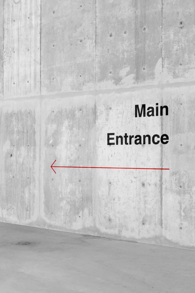
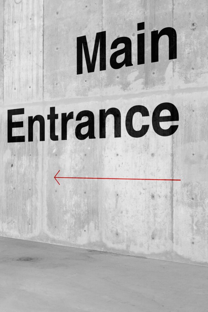
https://www.uebele.com/de/projekte/orientierungssystem/mensa-morgenstelle.html#5
Der Betrachter sieht nur das was er zur Orientierung benötigt, er soll rasch verstehen und trotzdem soll das Gesamtbild wirken & „schön“ sein.
@Jons Messedat
*C-Architecture (CA)
Bestandteil der Corporate Identity – soll nachhaltig gestaltet sein und nach innen und außen die Unternehmensphilosophie spiegeln.
Bestandteile der CA:
- Gestaltungskonzept des Gebäudes
- Raumkonzept
- Präsentationskonzept
ALS STRATEGIE!
Die Herangehensweise um die Corporate Architecture als Strategie zu führen läuft folgend ab:
1. Recherche = Analyse des IST ZUSTAND > SOLL ZUSTANDS – Selbstbild vs. Fremdbild
2. Entwicklung = Die Kernwerte & Haltung herausfiltern & in Anschauliche Form bringen (Orientierung)
3. Integration = definierten Standards in Leitbild gegossen die Grundlage für externe sind
4. Begleitung = Kontrolle & Überdenken
Die Herangehensweisen:
- Prägung durch 1 Architekten (= Handschrift wird in Verbindung mit Unternehmen gebracht)
- Zusammenarbeit mehrerer Architekten (= versch Persönlichkeiten = versch. Erscheinungsbilder)
- Ausdruck v. Unternehmensleitsätzen (= Definition v. Erscheinungsbild / Haltung = Deckungsgleichheiten zw. Inhalt & äußere Erscheinung v. Unternehmen)
- Assoziation mit Unternehmensinhalt (= In Architektur Hinweiselemente zum Tätigkeitsfeld = externer kann Assoziationen & firmenspezifische Eigenschaften / Markenwert bilden)
- Architektur als Abbild (= Extremfall Gebäude ist symbolhafte Gestalt der Firmenleistung / Produkt)
- Wiedererkennbarkeit durch Wiederholung ( = an allen Standorten Wiedererkennbarkeit)
- Kommunikation von Markeninhalten (Werte im Sinne eines Brandings zu kommunizieren – emotionale Bindung, zus. Veranstaltungen / Inszinierungen / etc. die zu Kultur / Sport auch zuordnenbar sind)
Komponenten der CA
ÄUSSERE ASPEKTE:
- Standort & Sichtbarkeit
- Integration in den Kontext
- Gebäudeform, Hülle & Fassade
- Einsatz v. Schrift Grafik, Farbe, etc.
- Tag – und Nachterscheinung
- Außenanlage
- Materialeinsatz
- Pflege & Wartung
INNERE ASPEKTE:
- Gestaltung d. Erschließungselemente (Eingang)
- Organisation der Innenräume
- Innovative (Büro)Konzepte
- Gestaltung der raumbildenden Elemente
- Einsatz v. Schrift Grafik, Farbe, Licht etc.
- Auswahl v. fixen & losen Mobiliar
- Integration v. Kunst & Handelswaren
- Produktpräsentation
- Material
Bleibe Flexibel aufgrund neuer Tendenzen & Trends kann Design auch veralten! Gerade bei Gebäuden wichtig!
So zb Integration v. Kunstsammlungen Installationen flexibel halten
Bestandteil Auch zB Firmengeschichte aufgreifen & inszinieren = internes Museum / Shops? Etc.
Quelle:
Corporate Identity & Corporate Design _ Das Kompendium
Hrsg. Matthias Beyrow / Petra Kiedaisch / Norbert W. Dadrop