The paper examined the concept of feedback musicianship, which involves the use of feedback in musical performance and composition. The authors of the paper were inspired by Bebe and Louis Barron’s cybernetic explorations, the screaming sound of Jimi Hendrix’s guitar, and the systems design of David Tudor or Nic Collins. The Barrons were a husband and wife duo who pioneered electronic music, creating custom-built instruments to explore the relationships between machines and humans. Jimi Hendrix was an influential guitarist known for his use of feedback and distortion. David Tudor was a composer and performer who worked with electronic music and designed instruments and systems, often collaborating with John Cage. Nic Collins is a composer and performer who works with homemade electronic instruments and circuits and wrote a book on the intersection of DIY electronics and experimental music.
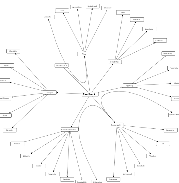
To gain insight into their practice and the underlying theoretical framework, the authors interviewed a group of contemporary feedback musicians. They discovered that feedback musicianship has evolved over time, influenced by scientific and theoretical ideas of the time, and that today’s feedback musicians are interested in exploring systems, agency, design, complexity, and post-human (as one of the interviewees was reported to have said “I’m interested in the instrument being in the way of my intent”) in their work.
A mindmap of representation of key terms as analyzed from the interviews. by Thor Magnusson, Chris Kiefer, and Halldor Ulfarsson. source:https://nime.pubpub.org/pub/feedback#nszoex43a83
The discussion of post-humanism and the de-centering of humans in global ecology systems is an intriguing aspect of the paper. According to the authors, this trend is related to the renewed interest in building feedback systems as an artistic practice. The interviewees expressed a desire to relinquish control over their performances, preferring to play “with” rather than “on” an instrument.
However, some of the paper’s proposals may be impractical in practice. For example, many musicians may find it difficult to abandon traditional musical values such as virtuosity and mastery. Additionally, while the authors suggest that the new complexity science is the current theoretical framework of feedback musicianship, it is unclear how widely this approach is adopted in practice.
In conclusion, the paper offers an intriguing examination of feedback musicianship and its evolution over time. While some of the ideas presented may not be feasible or widely adopted, they do provide an intriguing starting point for further discussion and exploration of the subject.
The design of a bespoke musical interface designed to engage the public’s interest in wildlife sounds by Andrew R. Brown
I liked that this project used smooth real-time mapping of human gesture data to synthesis the sound of wildlife calls. As seen in the P.L.A.C.E performance https://www.youtube.com/watch?v=uKgLrrI-MEU it forces the musician to move in unusual ways to produce sounds which makes the performance interesting to watch. I liked the idea of the inventor to design the Call as an a compact and inexpensive device design with minimal gestural dimensions in order to be suitable for use by the general public in community workshops or for infrequent personal interaction, thus sparking creativity.
The User Interface of the Opject seems simple enough to be easily learnable. For the hardwear design I like that it is a handheld objektiv and that the size was kept as compact as possible to minimize resource usage in production. As the software was built with an Arduino it still feels very much like a replicable project. The gestural interface spoke to be as we already produced our own prototypes last semester with our phones using the sensors. So I could imagine myself being able to construct something like this someday.
Kritiker behaupten dass durch die Vielseitigkeit und dem enormen Wachstum an Touchpoints die CI am Ende sei. Sie sei schwierig zu koordienieren und letztlich haben Konsumenten ein Bewusstsein erschaffen dass Unternehmen grundsätzlich im eigenen Interesse handeln und damit sinkt Vertrauen und Glaubwürdigkeit.
ALTERITÄT
Beschreibt die Handlungen einer Gruppierung in Bezug auf rituelle und visuelle Zeichen, um sich eine Identität zu schaffen welche sich von anderen differenziert. Alterität erscheint in der Wissenschaft vom Menschen und seiner Entwicklung (Anthropologie).
ANGEMESSENHEIT
Ist bestimmt eines der essentiellen Schlagwörter zur Beurteilung von Design(Maßnahmen). Es ist jedoch kein absoluter Wert und kann je nach Medium in sehr breit gesät werden (untersch. Inhalte – untersch. Lautstärke – untersch. Medium). Es drückt oft subjektive Empfindungen aus.
AUTHENTIZITÄT
Echtheit – Stimmigkeit. Die Anzahl an kritischer und hinterfragender Konsumenten nimmt zu, im Zuge dessen ist es aus Unternehmersicht umso wichtiger transparent und ehrlich zu sein.
AUTOR
Eine jeder Schaffender ist Autor seines Werkes. Die Inhalte die er kreiert bestehen aus Geschichten. Menschen mögen gute Geschichten.
AUTORITÄT
Auf Leistung oder Tradition beruhende Einfluss einer Person oder eines Unternehmens und das daraus resultierende Ansehen.
BRAND
Funktional gesehen ein Zeichen, Name, Bild oder/und Klang. Steht stellvertretend für den/die Schaffende(n). Unterscheidet und Repräsentiert. Nach Kai-Uwe Hellmann sind Markenfunktionen: a.) Unterscheidungs- und Identifizierungsfunktion b.) Entlastungs- und Orientierungsfunktion c.) Garantie- und Vertrauensfunktion d.) Prestige- und Identitätsfunktion e.) Kommunikations- und Inklusionsfunktion
CHUZPE
Unverfrorenheit, Dreistigkeit, Unverschämtheit die von Designern ausgehen sollte um intelligentes Design zu erschaffen.
… Fortsetzung folgt 😉
Quelle:
Corporate Identity & Corporate Design _ Das Kompendium Hrsg. Matthias Beyrow / Petra Kiedaisch / Norbert W. Dadrop
Augmented Reality (AR) ist eine revolutionäre Technologie, die reale Umgebungen durch Überlagerung digitaler Elemente in Echtzeit verbessert. Sie ist ein innovativer Weg, um interaktive Erlebnisse zu schaffen, die die Nutzer auf eine Weise ansprechen, wie es traditionelle Medien nicht können. QR-Codes und AR-Apps sind zwei beliebte Möglichkeiten, um auf Augmented-Reality-Erlebnisse zuzugreifen. Wenn Sie Menschen dazu bringen möchten, einen QR-Code zu scannen oder eine AR-App oder webbasierte AR zu nutzen, um eine erweiterte Erfahrung mit einem Kunstwerk oder Poster zu machen, finden Sie hier einige Tipps für den Anfang.
QR-Codes und Augmented Reality (AR) werden in der Kunstwelt immer beliebter, um das Erlebnis des Betrachters zu verbessern. Durch die Einbindung von QR-Codes oder AR in ein Poster oder Kunstwerk können Künstler den Betrachtern ein erweitertes, interaktives Erlebnis bieten. Es kann jedoch eine Herausforderung sein, Menschen dazu zu bringen, einen QR-Code zu scannen oder eine AR-App oder webbasierte AR zu verwenden.
Machen Sie es visuell ansprechend: Der QR-Code oder AR-Marker sollte optisch ansprechend und deutlich auf dem Poster oder Kunstwerk zu sehen sein. Dadurch wird die Aufmerksamkeit des Betrachters geweckt und er wird ermutigt, den Code zu scannen oder die App zu öffnen.
Geben Sie klare Anweisungen: Stellen Sie sicher, dass Sie klare Anweisungen zum Scannen des Codes oder zum Zugriff auf die AR-Erfahrung geben. Verwenden Sie einfache Sprache und Bilder, um den Prozess so einfach wie möglich zu gestalten.
Schaffen Sie einen Anreiz: Bieten Sie eine Belohnung oder einen Anreiz für das Scannen des Codes oder die Nutzung der AR-App. Dies könnte ein Rabatt, ein kostenloser Download oder der Zugang zu exklusiven Inhalten sein.
Soziale Medien nutzen: Nutzen Sie Social-Media-Plattformen, um den QR-Code oder die AR-App zu bewerben. Teilen Sie Bilder und Videos des AR-Erlebnisses, um Aufmerksamkeit zu erregen und die Leute zu ermutigen, es auszuprobieren.
Machen Sie es teilbar: Stellen Sie sicher, dass das AR-Erlebnis auf Social-Media-Plattformen geteilt werden kann. Dies wird die Nutzer dazu ermutigen, ihr Erlebnis mit ihren Freunden und Followern zu teilen und so die Aufmerksamkeit für Ihr Kunstwerk oder Poster zu erhöhen.
Referenzen:
“Augmented Reality in Art: 5 Real-Life Examples” von Anton Volkov, Medium, 2021. “Warum Augmented Reality die Kunst für immer verändern wird” von Todd Brison, Medium, 2020. “How Brands Are Using Augmented Reality to Engage Consumers” von Debbie Stephenson, Forbes, 2021. “Die Zukunft der Kunst ist Augmented Reality” von Janelle Burger, Artrepreneur, 2019. “The Power of Augmented Reality for Art and Artists” von Chris Peters, Architizer, 2019.
Als jemand, der sich sowohl für Kunst als auch für Technologie begeistert, hat mich das Potenzial von Augmented Reality (AR) in der Kunstwelt fasziniert. Im vergangenen Semester habe ich mich eingehend mit diesem Thema befasst und viel darüber gelernt, wie AR das Erlebnis der Kunstbetrachtung verbessern kann.
Im weiteren Verlauf meiner Recherche möchte ich weiterhin verschiedene Aspekte von AR in der Kunst erforschen. Ein Thema, das ich besonders interessant finde, ist die Frage, wie man Menschen dazu bringen kann, AR für die Kunst zu nutzen. Obwohl AR das Potenzial hat, der Kunst eine ganz neue Ebene der Interaktivität zu verleihen, zögern viele Menschen noch, sie zu nutzen. In meinem nächsten Blogbeitrag werde ich verschiedene Strategien untersuchen, wie man Menschen zur Nutzung von AR ermutigen kann, z. B. indem man Anreize bietet oder den Prozess so einfach wie möglich gestaltet.
Ein weiterer Bereich, der mich interessiert, sind die Vor- und Nachteile der Verwendung von AR für Poster. AR-Plakate können zwar unglaublich fesselnd und auffällig sein, erfordern aber auch, dass die Betrachter ein Smartphone oder ein Tablet haben, was nicht jedem zur Verfügung steht. In meinem Blogbeitrag werde ich die Vor- und Nachteile der Verwendung von AR für Plakate untersuchen und erörtern, wie Künstler und Designer einige der potenziellen Nachteile überwinden können.
Neben der Erforschung dieser Themen interessiert mich auch, wie AR in Kinderbüchern eingesetzt werden kann. Kinderbücher sind bereits ein hochgradig interaktives Medium, und wenn man AR hinzufügt, könnte man sie auf eine ganz neue Ebene heben. In meinem Blogbeitrag werde ich mir einige Beispiele für AR in Kinderbüchern ansehen und die potenziellen Vorteile und Herausforderungen des Einsatzes dieser Technologie in diesem Kontext diskutieren.
Schließlich freue ich mich darauf, am Ende des Semesters selbst mit AR-Tools zu experimentieren. Ich plane, mein eigenes AR-verbessertes Kunstwerk oder Poster zu erstellen und den Prozess in einem Blogbeitrag zu dokumentieren. Dies wird mir die Möglichkeit geben, meine Forschung in die Praxis umzusetzen und die Möglichkeiten und Grenzen dieser aufregenden Technologie aus erster Hand zu erfahren.
Insgesamt freue ich mich darauf, meine Forschung zu AR in der Kunst in diesem Semester fortzusetzen und neue Ideen und Perspektiven zu diesem faszinierenden Thema zu erforschen.
Designing a good interface, good means the degree of usability, requires knowledge of design rules and experience with interactions. Patterns can also be used to document and share existing design knowledge. Design pattern libraries are good because they capture the most important aspects of the problem and offer a solution approach. The structure of the pattern is scalable and can be applied to other and broader problems. The interest in creating patterns and creating a pattern language for user interface design was already present in 1994. (Rijken 1994, Bayle 1998). Several different approaches to building model libraries were made by different people around the turn of the millennium. (Mahemoff and Johnston 1998). Mahemoff proposes the following categories: task related patterns, user related patterns, user interface element patterns and system-based patterns. Common Ground (Tidwell 1998) or the Web patterns collection (Perzel and Kane 1999), Martijn van Welie/Hallvard Trætteberg (2000). But in 2000 there was still none that had become established. The reason is that there was no agreement on a format and focus.
With the introduction of the iPhone in 2007 and the hype that followed, it became necessary to design software and its interface for mass use on these devices. Erik Nilsson presented a pattern library for mobile patterns in 2008. He drew his insights from the problems encountered during the development of the projects UMBRA (UMBRA is a graphics software technology company founded 2007 in Helsinki, Finland. Umbra specializes in occlusion culling, visibility solution technology and provides middleware for video games running on Windows, Linux, iOS, PlayStation 4, Xbox One, PlayStation 3, Xbox 360, Wii U, handheld consoles, and other platforms. In 2021, Amazon acquired Umbra. Information copied from Wikipedia) and FLAMINCO (web pattern library from Nilsson!? – no information found) appeared.
He refers to three main challenges that the small touch screen poses. He has classified these as the three main problem areas.
use of screen space.
interaction mechanisms.
design as a whole.
Each pattern is divided into one of these 3 problem areas, within these problem areas there are smaller units of problem areas. This division into problem areas helps to concentrate on individual aspects of a larger problem. It becomes difficult when the collection grows. It needs a good problem structure to find matching patterns. The connection between problem and solution was a challenge because there is always more than one solution to a problem and the solution can always be applied to several problems. This results in either a lot of repetitions or a lot of cross-references, which affects the readability of the pattern collection.
Main problem area
Problem area
Description and individual problems (with connected UI design patterns)
He also thinks separately about UI components such as buttons, tabs, scrollbars etc. and their adaptation to touch interaction. The patterns collection was presented by Erik Nilsson at the HCI International conference in 2007 and at the IASTED HCI conference in 2008. [1]
Pattern collections:
In 2008 there were a few pattern collections, including some on Mobile UI design patterns.
Jenifer Tidwell created her website in 1999. According to the information on the website, there should be a new website, but the new website does not show much content.
Alexander’s intention with the design pattern in architecture was to involve the inhabitants of a house and give them a tool to communicate their needs to the architect. His approach was user centred. He created a structure for his architecture pattern consisting of name, ranking, picture, context, problem statement, problem description, solution, diagram (graphical explanation), references. So, the structure is very similar to the structure used in software and HCI pattern. Software patterns consist of name, context, problem, solution, examples, diagrams, and cross-references. In software development, however, the pattern language was not intended to involve users in the process, but rather to allow developers to communicate with each other. The idea of UI patterns as described by Alexander influenced Norman in Psychology of Everyday Things (published 1988; p. 229). Apple’s Human Interface Guidelines also referred to it, and the Utrecht School of Arts used patterns in their teaching. (In the year 2000, however, there was still no binding pattern language.) [1]
Jenifer Tidwell recognised 1997 in her article A Pattern Language for Human-Computer Interface Design that designing user interfaces requires a systematic approach. She also mentioned that the creation of good design solutions often worked better when the designers were talented but, above all, experienced. As in any other discipline, designers in the user interface field benefited from studying and adopting the work of other designers and applying already successful solutions. Reinventing solutions is not only time-consuming, it can also lead to results that do not meet the desired expectations. Tidwell speaks of bizarre solutions that are the result of reinventing common designs. Experienced designers, on the other hand, use their knowledge of design principles and process to make ideas feasible in a new context. Experience, on the other hand, requires time and making mistakes to gain the knowledge. In her first article on the subject, Tidwell argues that there should be a simpler solution, a shortcut. She sees this shortcut in the introduction of design patterns along the lines of software development and architecture. The advantages for designers are that they can draw on accumulated knowledge and have a common language that simplifies communication within the team and with the client, thus reducing misunderstandings. In addition, new solutions can come about when creatives are forced to stay within a certain framework and focus on that one task. Design patterns could also form the basis for frameworks for programming. Design patterns also represent advantages for the entire community of HCI designers. The usability of an interface design could be discussed on this basis – if the solution works or not. The patterns could also take over working solutions from other analogue fields and exchange them in an interdisciplinary context. Solutions that already work well elsewhere can also be helpful in user interface design. This has already been done (e.g. metaphor for the desktop) but it would be possible on a more abstract level. We could also learn from solutions that have been dismissed for various reasons, e.g. due to unfashionability. The exchange of ideas could be greatly facilitated and made accessible to a broader community. It would be easier to build on existing results and find new solutions more quickly, innovatively and across sectors. [2]
Basically, all these ideas are not new, they have just not yet been sufficiently emphasised and systematically introduced in this young discipline. It is no secret that our knowledge is based on the knowledge of our ancestors, that we learn quickly and easily through imitation. That this behavioural pattern: learning by imitation also extends to this new discipline is therefore no surprise. What is important in these beginnings of design patterns, however, is the systematic approach in which a broader mass can benefit from prior knowledge and insights. As has been shown throughout humanity, the more people have access to existing knowledge and can build on it to develop new ideas, technologies, and approaches, the faster we develop. For me, this is also a call to form a worldwide community that supports each other, analogous to the beginning of globalization and the start of the WWW.
In her article, Tidwell proposes an approach for a design pattern library for the first time. Analogous to software patterns, each design pattern should include the problem to be solved, the context of use, a primary rule, and good and bad examples. However, it is important to note that these descriptions are not recipes, nor should the design patterns reference the GUI directly. Just as a user need should not include a design suggestion to leave the design space as open as possible, the pattern should not be too prescriptive either. For Tidwell, one of the most important points in terms of acceptance of a pattern is if the basic concept can be applied in other disciplines (also analogue). If the pattern works in a different context, if it would work outside the HCI/GUI environment, it is most likely a good solution. (example)
In the same way, the pattern language can also be used to analyse existing interfaces. The structure of the pattern language itself is easy to understand. But to use it, you need to understand the purpose of the solution and the factors that are relevant to solving the problem. It is also important to make the process iterative. Tidwell’s intention for the development of a pattern language is to ensure a high level of quality in the interaction between human and machine aka the software. High quality is when the user has a successful and satisfying experience. This means that the content has been adequately prepared and presented for the user so that the user fully understands the content and is able to use it. Furthermore, the software guides and supports the user to the necessary extent and pace in their task. Successful software supports in such a way that the user can fully concentrate on his task and the software “to fade from the user’s awareness”. If these two goals are met and learnability, user empowerment, and enjoyability are added, the criterion of “high-quality interaction” is fulfilled. Tidwell divides the patterns into “primary patterns” from which larger patterns can be composed. The content Narrative, High-density Information like Maps, tables, and charts or as Status Display the state of something that will change like clock or dashboard. The primary patterns for actions can be Forms, Control Panel, WYSIWYG Editor, Command-line, Social Spaces like Newsgroups and Chat Rooms. The action primary patterns are very limited with the things users can do. A control panel with one button reduces the complexity to this one action, where the button can be used multiple times in many ways. Tidwell says that unlike the pattern languages that evolved from Alexander’s theory, this language can be arbitrarily combined and used on a larger or smaller scale. Form filling can appear as the main action on the page, or only as a small secondary action – depending on the context. (p. 11) In her article, Tidwell has compiled an approximately 70-page collection of patterns, which she has structured according to the method Example, Context, Problem, Forces, Solution, Resulting Context, Notes.[2]
Tidwell called her pattern language Common Ground. Common Ground (Tidwell 1998) or the Web patterns collection (Perzel and Kane 1999) are pattern collections that were created around this time. Martijn van Welie and Hallvard Trætteberg created their own pattern collection around 2000. In their article they criticise the lack of user perspective in the pattern collections of Tidwell, Perzel and Kane. They have created their own collection to compensate for this lack. And they present a different format that can remedy this deficiency. They focus more on the end-user and the problems they may have when using the software. For them, usability is the focus of the pattern language. Tidwell’s language is more for designers than users, while they want a solution which is more user centred. Their argument cannot be dismissed: If a pattern fits for a user, it fits for a designer, but the reverse is not always the case.
The focus of this pattern collection should be on user centred design and usability. For this reason, it is very important to consider the how and the why in the format. In the pattern the description must explain how the solution works and why it is a good solution. The focus on user centred design is also important to ensure usability and not to put the interests of the stakeholders above those of the users. Banners and splash screens for advertising purposes are considered a good solution at the time but are neither important for usability nor certainly do not enhance the user experience. The pattern collection has been structured with reference to Norman’s interface principles formulated in 1988.
Visibility – Gives the user the ability to find out how to use something simply by looking at it.
Affordance – Refers to the perceived and actual properties of an object that indicate how to use the object.
Natural Mapping – Creates a clear relationship between what the user wants to do and the mechanism by which they can do it. To complete my task, I need to select this option, enter this information, and then press this button….
Constraints – Reduces the number of ways to perform a task and the amount of knowledge required to perform a task, making it more manageable. Oh no, what do I have to enter here? Ok, I only have these choices….
Conceptual models – A good conceptual model is one where the user’s understanding of how.
how something works matches the way it works. This way the user can confidently predict the effects of their actions.
Feedback – Indicates to the user that a task is being performed and that the task is being performed correctly.
Safety – The user must be protected from unintended actions or errors.
Flexibility – Users can change their minds and each user can do things differently.
The increase/improvement of usability should be in the foreground when creating the pattern and should cover the following criteria: learnability, memorability, speed of performance, error rate, satisfaction, and task completion. These are called usage indicators and each pattern must cover at least one of these indicators.
Structure of Wellie:
Progress ( by Martijn van Welie, p. 7)
Problem Description
Usability Principle which it confirms.
Context
Forces
Solution
Rationale
Examples
Known Uses
Counter Example
Related Patterns
Example for this pattern: Problem
The user wants to know whether or not the operation is still being performed as well as how much longer the user will need to wait.
Usability Principal Guidance
Feedback
Context
Systems tasks that take a long time (typically more than a few seconds) and must be completed before the next tasks can be started.
Forces
The performance of the operation cannot always be controlled/avoided by the user (or designer), e.g. because it relies on an external system or hardware, which may fail, block or have low performance.
The users do not want to wait need clear feedback on the progress and estimated time to completion.
The users may not be familiar with the complexity of the task. During the operation the user might decide to interrupt the operation because it will take too long.
Solutions
Show that the application is still working and give an indication of the progress. Provide feedback at a rate that gives the user the impression that the operation is still being performed e.g. every 2 seconds using animation. Additionally, provide a valid indication of the progress. Progress is typically the remaining time for completing, the number of units processed, or the percentage of work done. The progress can be shown using a widget such as a progress bar. The progress bar must have a label stating the relative progress or the unit in which it is measured.
Rationale
By providing new feedback at a rate around 1 or 2 seconds, the user can see whether the application is still processing and has not died. The progress indication gives feedback on how long the application will remain in this state. Combining these two aspects relieves the user’s worries. Leaving one of the two out would not solve the user’s problem. The solution increases satisfaction because the user knows what is going on and how much longer the user needs to wait. It increases the sense of control. The pattern also avoids additional system load by avoiding retries from users.
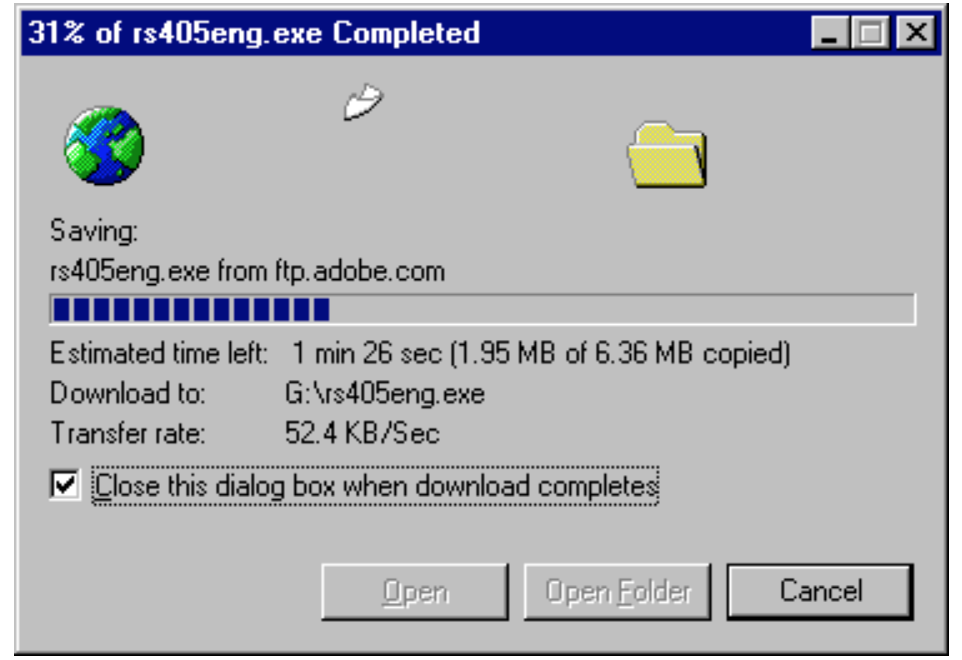
Examples When downloading a file using Internet Explorer 5, the user is presented with this dialog. It shows the progress in percentage as well as the amount of kilobytes of received data. Additionally, the estimated time left is shown and updated couple of seconds. An animation of a flying document shows that the download has not stalled. Known Uses Netscape’s Download box, Apple’s file cop [3]
[1] Jan O. Borchers. 2000. A pattern approach to interaction design. In Proceedings of the 3rd conference on Designing interactive systems: processes, practices, methods, and techniques (DIS ’00). Association for Computing Machinery, New York, NY, USA, 369–378. https://doi.org/10.1145/347642.347795
[2] A Pattern Language for Human-Computer Interface Design, Jenifer Tidwell, May 17, 1997, p. 1-5
[3] INTERACTION PATTERNS IN USER INTERFACES, Martijn van Welie, Hallvard Trætteberg, 2000
Ambisonic systems represent a revolutionary approach to capturing, processing, and reproducing audio that offers immersive, three-dimensional sound experiences. Developed in the 1970s by Michael Gerzon, Ambisonics aims to create a faithful representation of sound fields, allowing listeners to perceive audio as if they were present in the original recording environment.
At the core of Ambisonic systems is the concept of encoding sound into spherical harmonics, which accurately represent the direction, intensity, and spatial characteristics of audio sources. This encoding captures the full three-dimensional sound field, including height information, making it ideal for immersive audio reproduction in formats such as virtual reality, augmented reality, and 360-degree videos. Ambisonic systems typically consist of a microphone array designed to capture sound from all directions, known as a soundfield microphone. These microphones record the audio scene with precision, preserving spatial cues that are crucial for realistic reproduction. The recorded signals are then encoded into Ambisonic format using mathematical algorithms, such as B-format, which represents sound information in terms of W (omnidirectional), X (front-back), Y (left-right), and Z (up-down) components. During playback, Ambisonic signals can be decoded and rendered through a variety of speaker setups or binaural headphones, recreating the original sound field for listeners. Advanced processing techniques, such as head-tracking and room simulation, further enhance the immersive experience by adapting the audio to the listener’s position and environment. Ambisonic systems are widely used in applications where accurate spatial audio reproduction is essential, including gaming, cinematic VR experiences, live music recording, and spatial audio installations. As technology continues to advance, Ambisonics remains at the forefront of immersive audio innovation, promising even more lifelike and captivating soundscapes in the future.
A contemporary underwater music composer Michel Redolfi, said that: “Music in the water fills the void of the silence. Sound means life and when music is broadcast underwater, it’s a playful life sign. In addition, your sensory system is boosted by the bone conduction listening, which is very energetic and soothing at the same time. Music in the water opens the body and mind.“ [Redolfi]
Joel Cahen is the UK-based sound and visual designer who founded the traveling “deep listening” event Wet Sounds. Wet Sounds transforms swimming pools into spaces for music, light and performance experienced by entering the water and moving freely below and above the water surface. In 2008, Joel Cahen introduced a selection of immersive underwater sounds from all around the world for the first performances of Wet Sounds.
“Wet Sounds pieces are archived online. A few are hydrophonic recordings—so that the fact that they were played back under water raises the question of whether these are compound or redundant underwater pieces (and what happens when we listen in air?). “ – anthropologist Stefan Helmreich poses this question in his article “Underwater music: tuning composition to the sounds of science”.
A pioneer of underwater sound experimentation was John Cage, which approach as mixing subjective and scientific methods.
“in his collaboration with Lou Harrison, Double Music (1941), in which Cage specified the use of a “water gong (small—12”–16” diameter—Chinese gong raised or lowered into tub of water during production of tone).” Cage traces his use of the water gong to 1937 at UCLA, where, acting as an accompanist, he sought a solution to the problem of providing musical cues to water ballet swimmers when their heads were under water. (Kahn 1999, 249–50; see also Hines 1994, 90) “
The next one was a Sound installation artist – Max Neuhaus:
“In Water Whistle [1971–1974], water was forced through whistles under water to produce pitched sounds that could be heard by the audience only when they submerged themselves. In Underwater Music [1976–1978], he modified this technique by using specially designed underwater loudspeakers and electronically generated sounds, which were composed through a combination of scientific experiment and intuitive, creative decisions.” (Miller 2002, 26)
Sources: 1. Stefan Helmreich – Underwater music: tuning composition to the sounds of science 2. Stefan Helmreich – An anthropologist underwater: Immersive soundscapes, submarine cyborgs, and transductive ethnography 3. Sonja Roth – An exploration of water in Sound Art
Mein aktuelles Projekt dreht sich um analoge Fotografie. Meine Hauptfrage lautet: Ist analoge Fotografie im digitalen Zeitalter noch relevant? Während meines ersten Semesters bin ich zu dem Schluss gekommen, dass analoge Fotografie wieder im Trend liegt. Letztes Semester wollte ich einen meiner Filme entwickeln, hatte jedoch leider nicht die richtige Ausrüstung. Dabei bin ich auf Cyanotypie gestoßen. Cyanotypie ist eine alternative Methode zur Herstellung von stabilen fotografischen Bildern und basiert auf Eisen anstelle von Silber, das in der traditionellen Fotoentwicklung verwendet wird. Ich erforsche diesen Prozess genauer.
CYANTYPE
Cyanotypie, auch bekannt als Blaudruck, ist ein fotografisches Druckverfahren, das im 19. Jahrhundert entwickelt wurde. Es wurde von dem englischen Astronomen und Botaniker Sir John Herschel entdeckt und von der britischen Fotografin Anna Atkins populär gemacht.
Die Cyanotypie basiert auf der Reaktion von zwei chemischen Verbindungen: Eisen(III)-ammoniumcitrat und Kaliumhexacyanidoferrat(III). Diese Verbindungen werden auf ein Papier oder einen anderen geeigneten Träger aufgetragen. Das Objekt oder die Vorlage wird dann auf das beschichtete Papier gelegt und mit UV-Licht, normalerweise Sonnenlicht, belichtet.
Durch die Belichtung reagieren die chemischen Verbindungen miteinander und bilden ein blau-weißes Bild. Der Prozess erzeugt charakteristische blau-weiße Töne, die das Markenzeichen der Cyanotypie sind. Der Name “Cyanotypie” stammt von der blauen Farbe (Zyan) des fertigen Drucks.
Cyanotypien wurden hauptsächlich für technische Zeichnungen, Landkarten und Blaupausen verwendet. Später entdeckten Künstler und Fotografen die kreative Anwendung der Cyanotypie als Kunstform. Die Technik bietet eine große gestalterische Freiheit und ermöglicht die Erzeugung von Bildern mit einem markanten, kontrastreiche Erscheinung.
Heutzutage wird die Cyanotypie immer noch von einigen Künstlern und Fotografen verwendet. Es hat sich zu einer alternativen Druckmethode entwickelt, die sowohl analoge als auch digitale Vorlagen nutzen kann. Darüber hinaus wird die Cyanotypie oft in der Kunstpädagogik eingesetzt, um Schülern das Verständnis für die fotografische Geschichte und die experimentelle Gestaltung zu vermitteln.
Die Cyanotypie ist ein faszinierendes Verfahren, das eine einzigartige ästhetische Wirkung erzeugt und die Kreativität derjenigen anregt, die sich mit dieser Technik beschäftigen.
Schritte für die Entwicklung
Schritt 1 Mischen der Cyanotypie-Auflösung
Cyanotypien werden hergestellt aus zwei Komponenten: Kaliumferricyanid und Eisen(III)-ammoniumcitrat. Diese werden mit destilliertem Wasser vermischt und vermengt.
Schritt 2 Vorbereiten der Leinwand Papier, Pappe, Textilien oder ein anderes natürlich absorbierendes Material wird mit der Lösung bestrichen und im Dunkeln getrocknet.
Schritt 3 Druck der Cyanotypie Objekte oder Negative werden auf das Material gelegt, um einen Abdruck zu erstellen. Die Cyanotypie wird mit UV-Licht gedruckt, z. B. durch die Sonne, einen Leuchtkasten oder eine UV-Lampe.
Schritt 4 Verarbeitung und Trocknung Nach der Belichtung wird das Material durch Spülen mit Wasser bearbeitet. Der fertige Druck wird getrocknet.