I decided to try and install a Stable Diffusion client on my personal machine. This seemed like an essential step in enabling me to conduct meaningful experiments concerning workflows in media design. I am currently working as a freelance motion designer and wish to utilise AI in a way that can benefit my workflow without affecting my creative integrity.
Installing
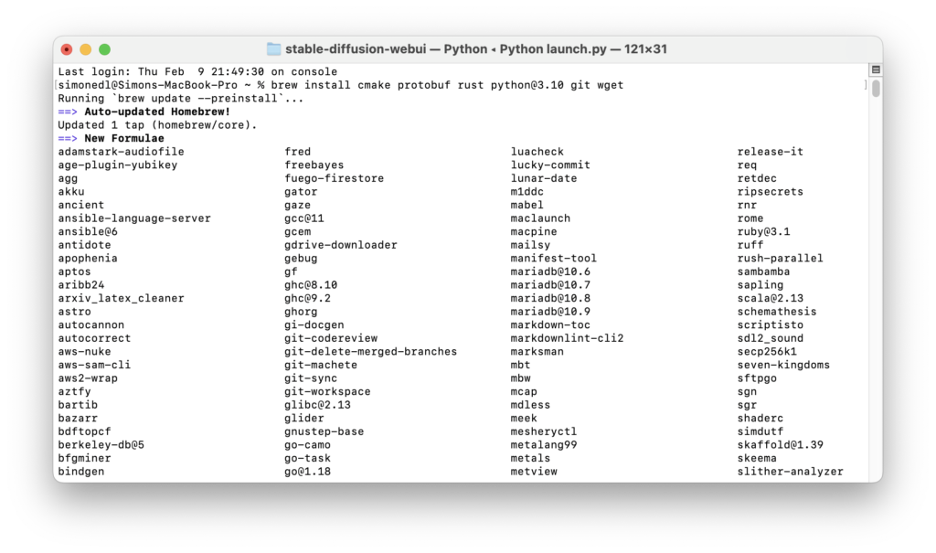
Following https://github.com/AUTOMATIC1111/stable-diffusion-webui/wiki/Installation-on-Apple-Silicon#downloading-stable-diffusion-models, I installed Stable Diffusion on through Homebrew, a package management software for macOS and Linux that is installed using MacOS’ Terminal. I already had Homebrew installed from an older experiment so I was able to skip this step. Next, I used Homebrew to install Python 3.10 with
brew install cmake protobuf rust python@3.10 git wget
Afterwards, I needed to clone Stable Diffusion’s Web UI repository with
git clone https://github.com/AUTOMATIC1111/stable-diffusion-webui
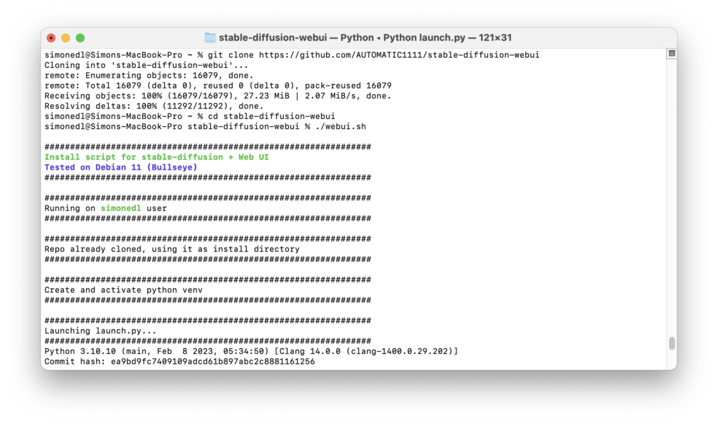
The next step was to download a model for Stable Diffusion. In this context, a model describes the training data the Stable Diffusion AI will use to generate its images. Running Stable Diffusion online grants the user access to Stable Diffusion’s own model, a gigantic data set that would be far too large to download on a personal machine. I decided to go for an analogue photography inspired model called ‘Analog Diffusion’ I downloaded from https://huggingface.co/models?pipeline_tag=text-to-image&sort=downloads. I placed the .ckpt file in /Users/user/stable-diffusion-webui/models and then ran
cd stable-diffusion-webui
followed by
./webui.sh
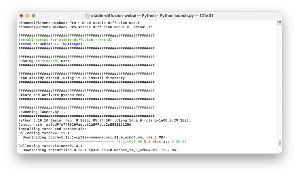
to run Stable Diffusion’s Web UI. This created a virtual Python environment while downloading and installing any missing dependancies. To relaunch the web UI process later, I will need to run
cd stable-diffusion-webui
followed by
./webui.sh
To update the web UI I would need to run
git pull
before running
./webui.sh
The terminal had now successfully launched the web UI on my local URL http://127.0.0.1:7860. I was all set to start generating my own AI art.
Text-to-image usage
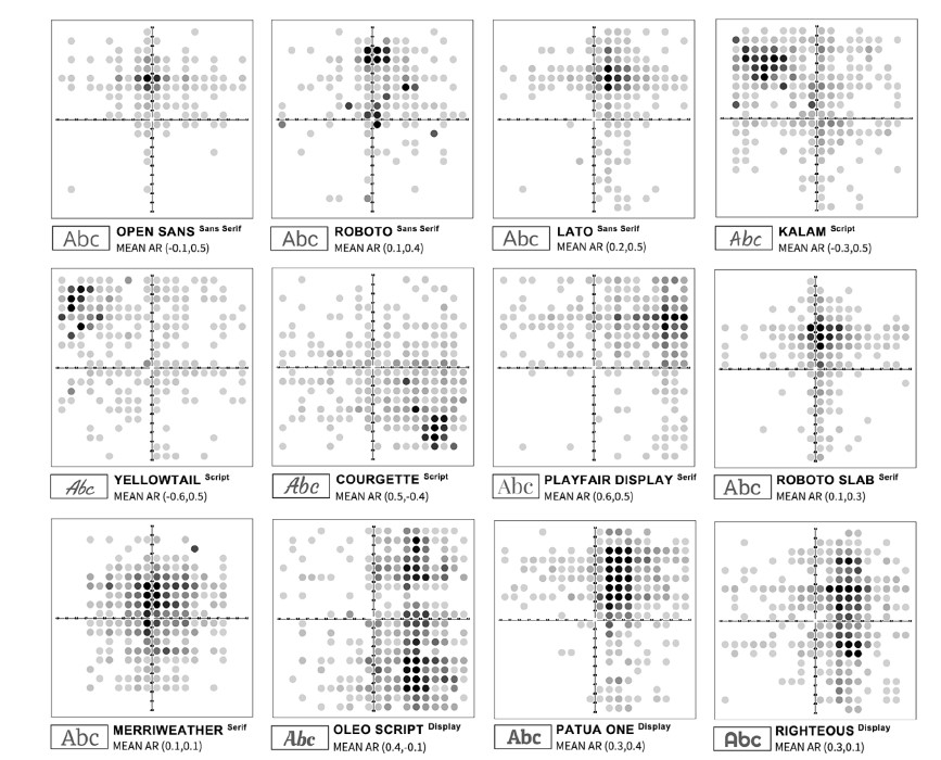
Feel free to judge the quality of my first prompts yourself. Stable Diffusion has many parameters that I still needed to understand to get the best results possible. For this first result, I provided the prompts “pin up girl, pool party, vintage, 50s style, illustrated, magazine, advertisement” as I hope to use it for a client of mine who has requested collages in the style of 50s pinup illustrations and vintage advertisements.
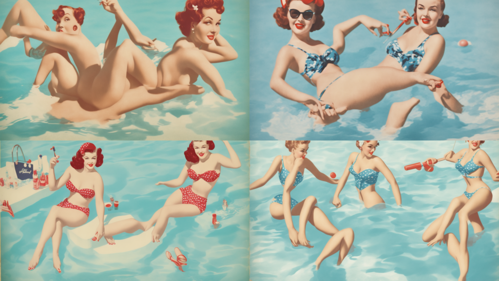
Apart from the generation prompts, Stable Diffusion also allows for negative prompts, it seems to be common practice to provide the AI with negative prompts specifically worded to exclude bad anatomy such as “bad anatomy, deformed, extra limbs”. Combining this with a lowered resolution to cut down on processing time, I was able to create these, much more promising results.
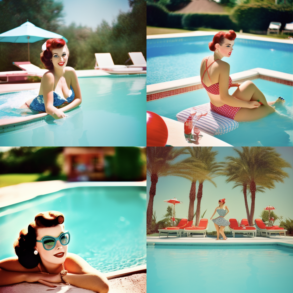
Ultimately and unfortunately, none of my attempts seemed to produce usable results. A different approach was in order.
Image-to-image usage
Stable diffusion also includes the option to include images the model should base its renderings on. This seems like additional work, however, I’ve found this method more promising as opposed to relying on text prompts alone. Given that the models local stable diffusion needs are much more limited in their application, the text prompts need to be all the more specific and complex.
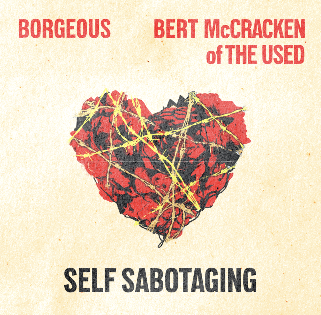
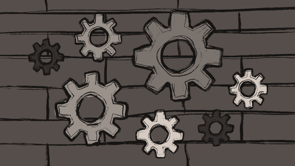
I attempted to have the AI create a rendering of a heart made of roses, wrapped in barbed wire, a motive requested by a client to be used as cover artwork. After my text-to-image attempts created dissatisfying results, I decided to crudely sketch the motive myself and feed it into the AI alongside the text prompts, resulting in usable generations after very few iterations.
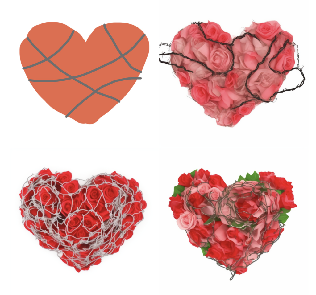
After some adjustment inside of Adobe Photoshop, I was able to get a satisfactory result for the artwork. This middle ground of additional human input seems to aid the AI in its shortcomings, providing an interestingly effective method of using it.